
My living room had nice furniture and decent lighting but it still felt like a waiting room. Took me embarrassingly long to figure out it was missing texture. Every surface was smooth, every color was flat, and nothing invited you to actually sit down. After I added a few handmade vintage pieces everything felt like it had a story.
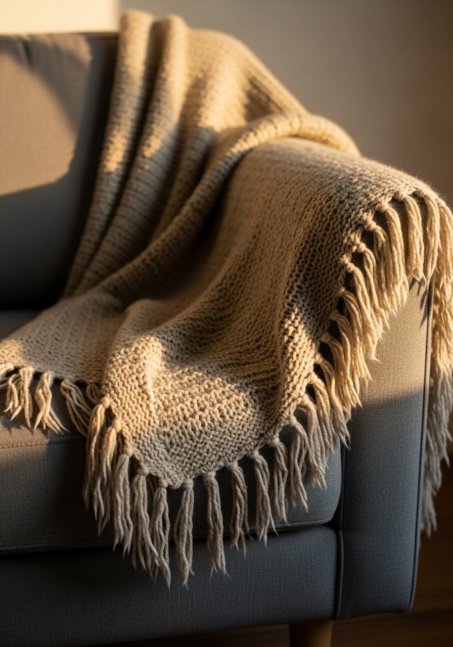
The moment I draped a chunky vintage wool throw over my sofa the whole room stopped looking flat. Textiles are tactile anchors, and they set the vibe. For a living room or guest room, aim for a 60/40 ratio where at least 40 percent of visible seating has layered textiles. I used a large chunky knit throw in cream that cost less than a splurge pillow and did more visual work than any art piece I tried first. Common mistake is buying a throw that is too small. Go 50 by 60 inches minimum for a standard sofa. A quick photo tip, phone cameras crush texture in bright sunlight. Shoot in soft afternoon light to show the weave.
Handmade Macrame Wall Hanging For A Boho Corner
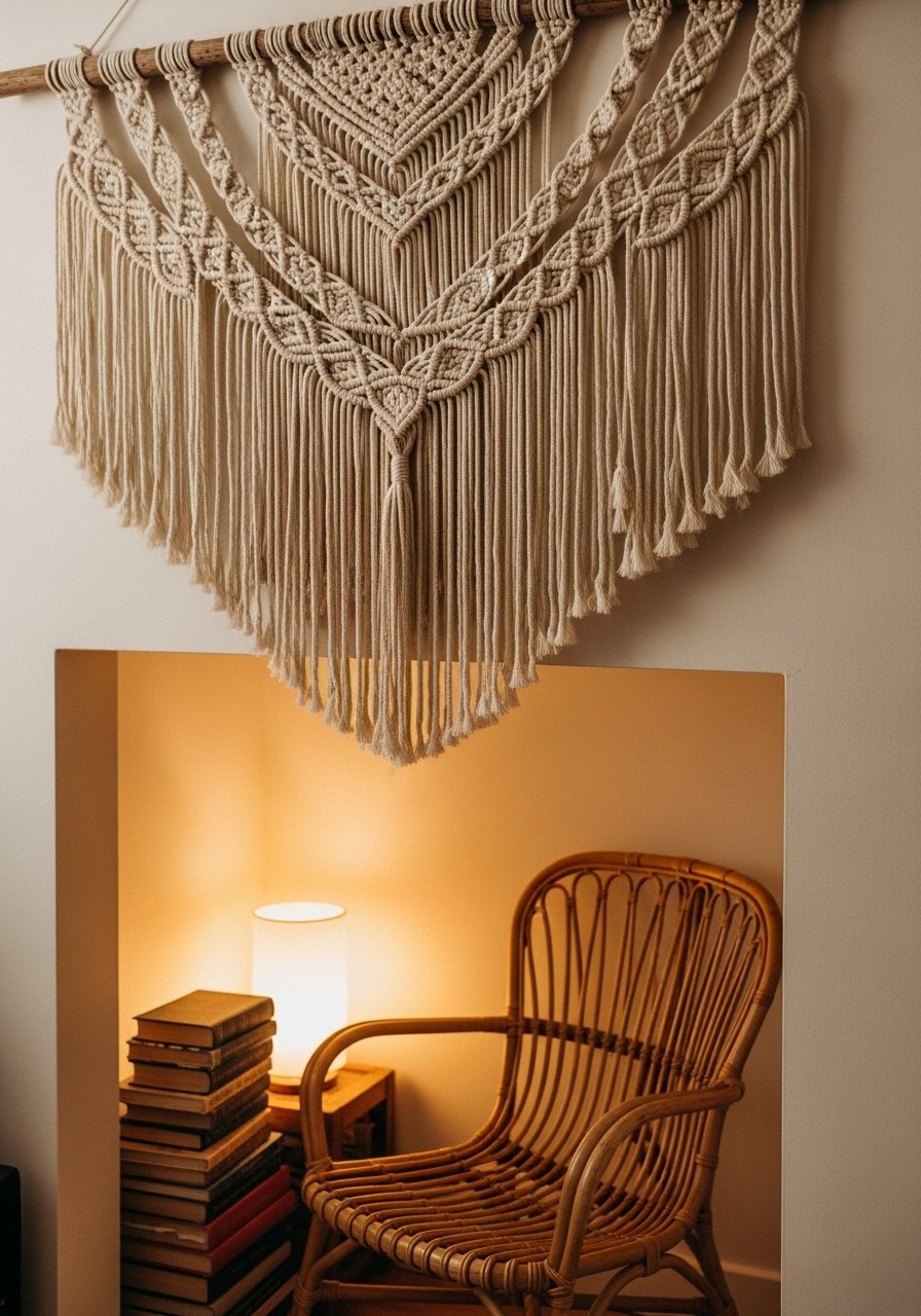
Most people hang art too high. I learned that when I moved a large handmade macrame lower, the nook finally read as intentional. Macrame gives vertical texture and works great in a bedroom or a hallway. I picked a 30-inch wide piece to balance a single chair and it filled the wall without needing a frame. I recommend a hand-knotted macrame wall hanging under $80 for a real handmade look. A mistake is matching the macrame exactly to wood tones. Let it contrast with the wall color by at least two shades so the knots show. For scale, a 3:1 height to width ratio usually feels right over a chair.
Hand-Painted Ceramic Vases On Open Shelves
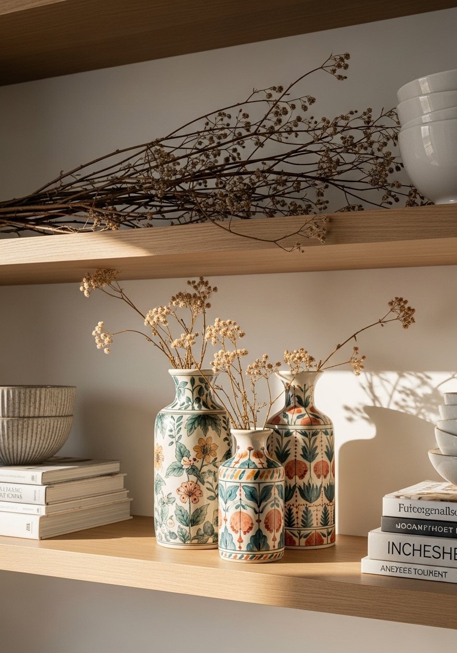
I stopped buying mass-produced vases when I found a set of imperfect hand-painted ceramics. They make shelves feel curated, not staged. Use an odd number on a shelf, and keep heights varied: try a 10-inch vase, a 7-inch bud vase, and a 4-inch bowl. I like to mix a statement hand-painted ceramic vase set with thrifted glass to keep the look layered. The common mistake is matching all ceramics to the same color family. A tiny contrast, even a single navy stroke, makes the set read intentional. Photo note, gloss glazes reflect light, so place them where glare won’t hide the handwork.
Repurposed Wooden Crate Coffee Table In A Rustic Entry
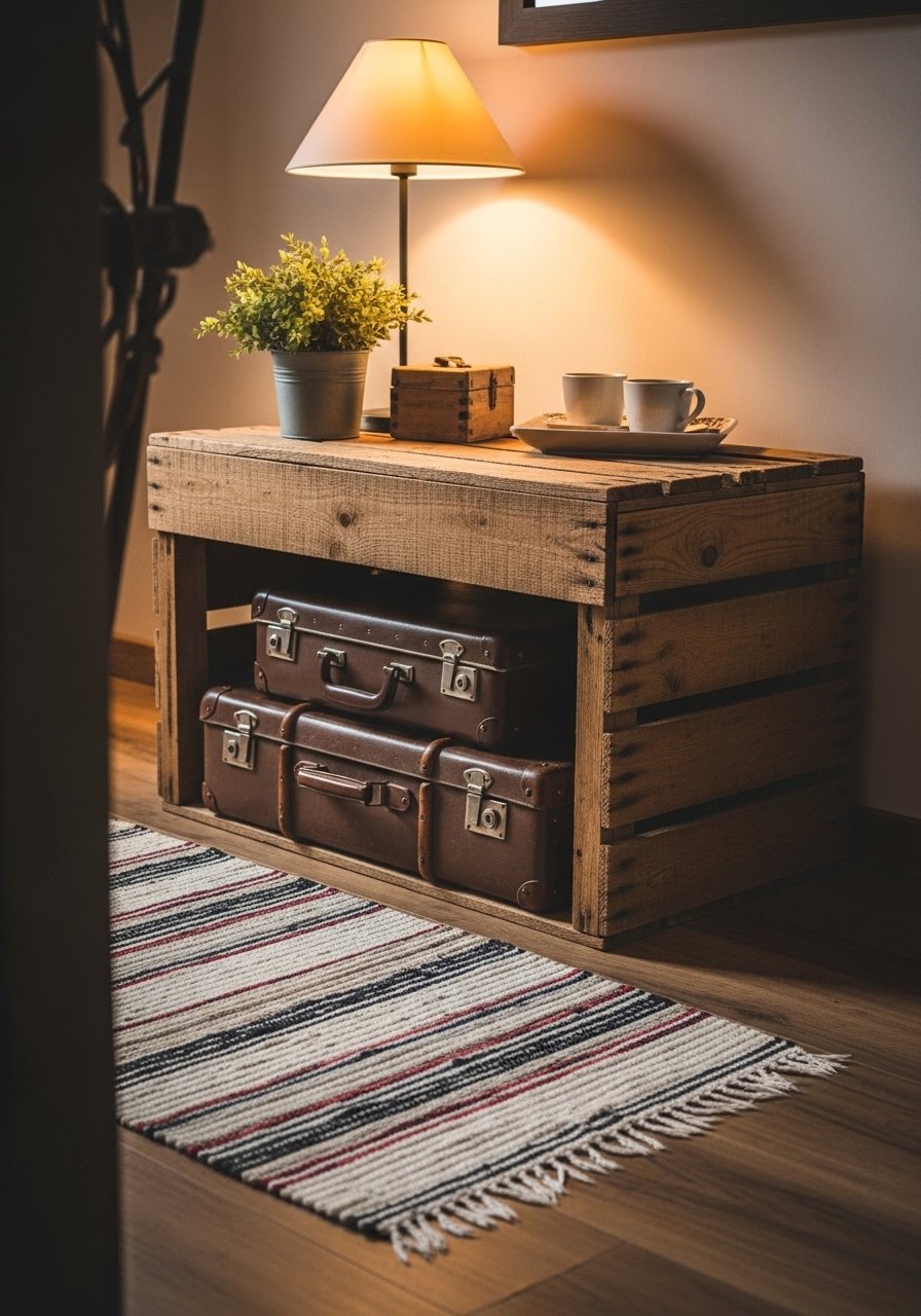
My entryway used to be a dumping ground. I found a vintage wooden crate and turned it into a low table with caster wheels. It gave scale and storage at once. For a coffee table, I recommend a crate about 36 inches long and 16 to 18 inches high, which fits in front of most sofas. I sealed mine with a matte clear coat and topped it with a leather tray to protect the wood. People often make the mistake of leaving it raw in high traffic. A simple seal prevents splinters and keeps patina when wet spots happen. Pair this with the jute rug idea below for a rustic but grounded look.
Framed Vintage Linens As Bedroom Art
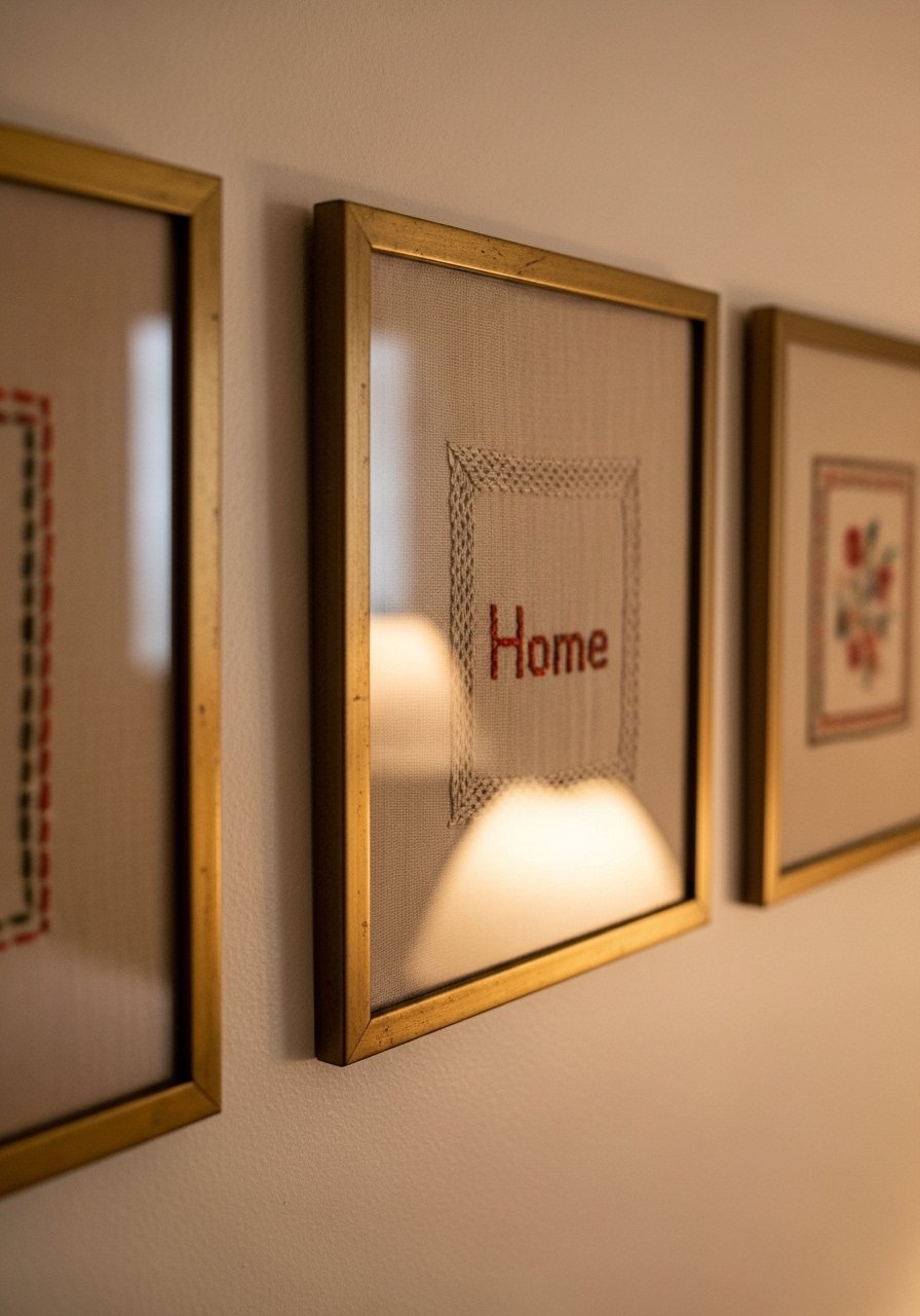
Framed linens were a game for my guest room, because they read like art and cost next to nothing from flea markets. I used 11×11 inch frames to keep the stitching readable. The trick I learned is to mount linens on acid-free board so they lay flat and do not sag after a few months. I bought a set of brass picture frames to match existing hardware. Common mistake is stretching the linen too tight. Keep a few gentle folds visible. A small detail most articles skip, vintage linens age differently under glass, so rotate them out of direct sunlight about every three months.
Distressed Brass Lighting For Warmth In Dull Rooms
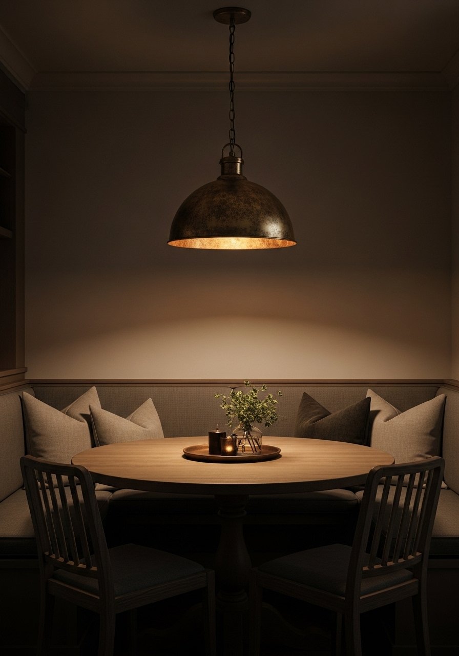
There was a dark corner in my dining area that felt cold until I swapped a chrome fixture for a distressed brass pendant. Warm metals change how a room reads, especially under soft bulbs. I installed a 10-inch diameter brass pendant for a small table and it warmed everything within a three-foot radius. I bought a distressed brass pendant that cost about $120 and it did more than repainting. People often pick bulbs that are too bright. Use 2700K bulbs and dimmers when possible. Mixing this with the vintage mirror idea amplifies light without making the space feel busy.
Handwoven Jute Rug Layering In The Dining Area
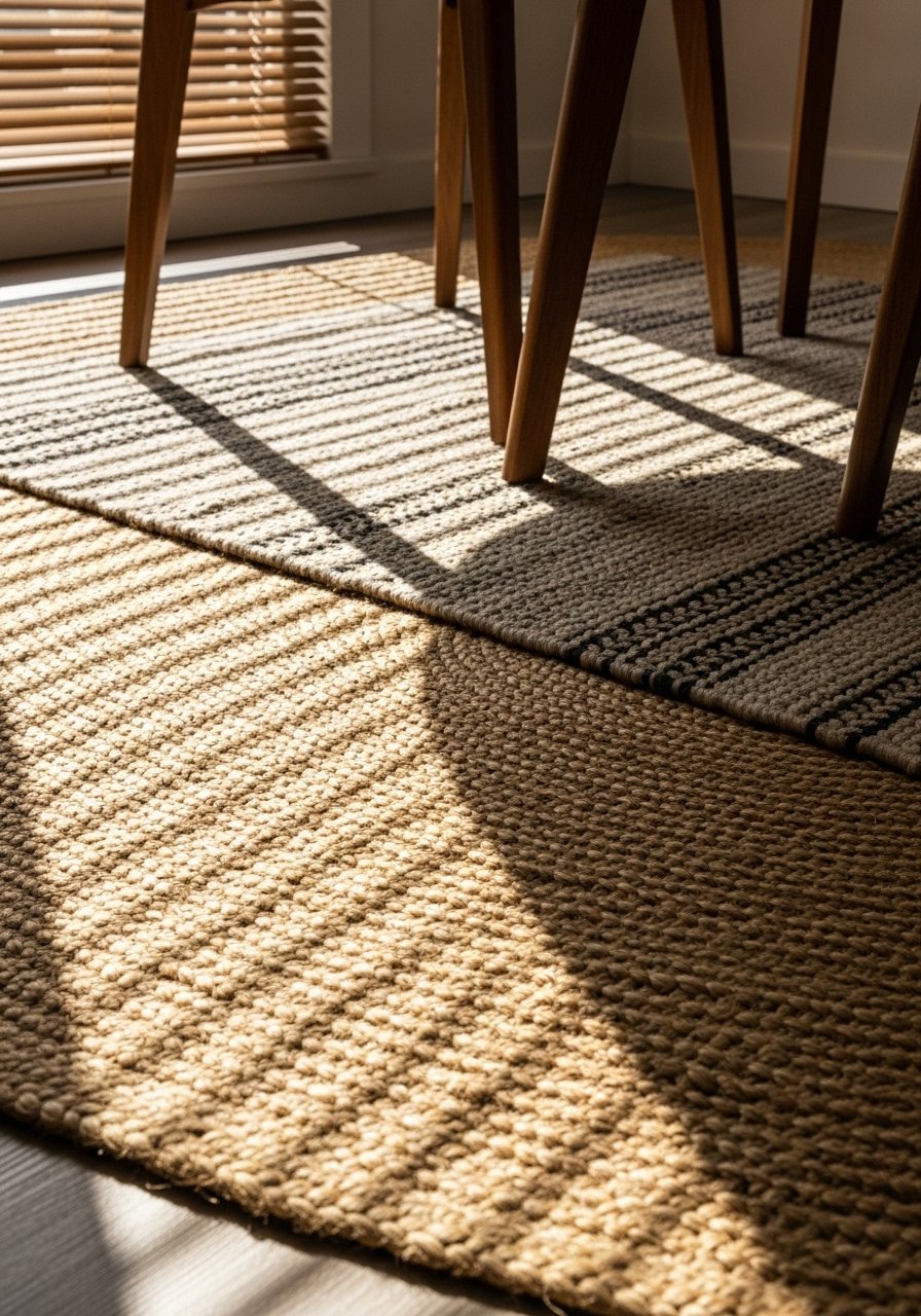
I used to think rugs were one thing. Then I layered a 6×9 handwoven jute with a smaller patterned flatweave and the table finally felt anchored. For dining tables, start with a rug that extends 24 inches beyond the chair on all sides. Jute brings texture and tolerates crumbs. I bought a 6×9 handwoven jute rug for under $150 and a smaller 4×6 patterned rug on top. A common mistake is choosing jute with too dark a tone next to walnut floors. Aim for a contrast of at least two shades so the layering reads intentional. Quick stat I notice, about half of homes I visit skip a rug under their table and the room looks visually chopped.
Vintage Mirrors To Open A Small Hallway
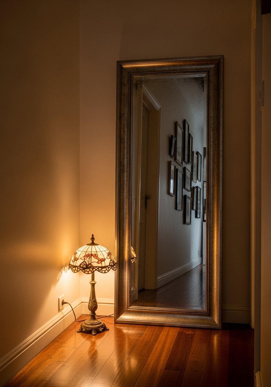
There was a tiny hallway that always felt claustrophobic until I leaned a 28×40 vintage mirror against the wall. Mirrors add depth and double light sources. For a narrow hall, a mirror that is at least 70 percent of the wall height creates the illusion of space. I bought a distressed vintage-style mirror and hung it with a french cleat for safety. Common mistake is hanging a mirror opposite a window and creating glare. Instead angle it so it reflects a door or a framed textile. Pair this with layered lighting like the brass pendant from earlier for the best effect.
Clay Tile Trivet And Pottery For A Lived-In Kitchen
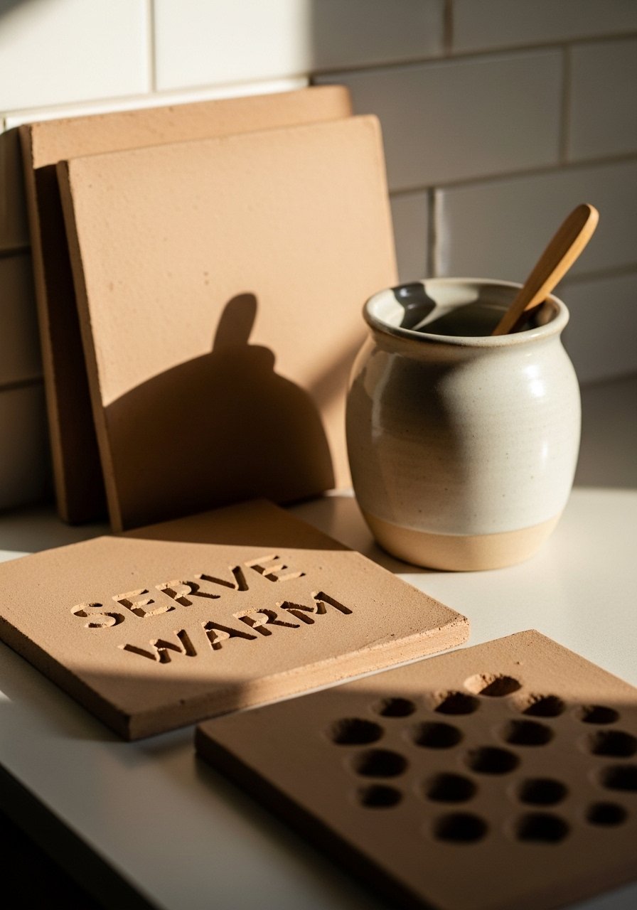
I stopped using store-bought trivets when I found hand-painted clay tiles. They protect surfaces and act as countertop art. For real use, choose tiles around 6 inches square and grout them into a wooden tray if you want a larger surface for hot pans. I kept a set of clay tile trivets near the stove for quick use. A common mistake is buying glazed tiles that scratch counters. Look for matte finishes or use a cork backing. Small tip, pottery holds heat differently, so add a thin silicone pad under hot items to avoid marks on aged butcher block.
Your Decor Shopping List
- Honestly the best $30 I spent. Chunky knit throw in cream 50×60 inches for sofas and guest chairs
- For the macrame corner, handmade macrame wall hanging 30 inch under $80
- Shelf styling essential, hand-painted ceramic vase set in mixed heights
- Rustic furniture piece, wooden crate on casters roughly 36×18 inches. Similar finds at flea markets and HomeGoods
- Framing solution, brass picture frames set 11×11 inches for linens
- Lighting pick, distressed brass pendant light 10 inch plus 2700K bulbs
- Rug base, 6×9 handwoven jute rug for dining or living rooms
- Kitchen detail, hand-painted clay trivet 6 inch set of two
Shopping Tips
White oak beats dark wood in current feeds. White oak floating shelves look fresh and layer well with vintage pieces.
Grab velvet pillow covers in a pair for $15 each. Swap them seasonally and the room feels different without a major purchase.
Curtains should puddle or kiss the floor, never hang halfway up. 96-inch linen panels are my go-to for 8 to 9-foot ceilings.
A single large plant beats five small ones. Invest in an artificial fiddle leaf fig 6ft if you want height without upkeep.
If you buy vintage textiles, get acid-free mounting board sheets to preserve embroidery when framing.
Frequently Asked Questions
Q: Can I mix boho textiles with mid-century furniture without it looking messy?
A: Yes. Keep a consistent color ratio, for example 80 percent neutrals and 20 percent accent color. Use similar scales of pattern, and pick one dominant texture like wool or linen so the look reads collected not chaotic.
Q: What size rug do I actually need for the layered rug look?
A: Bigger than you think. For a sofa and coffee table, aim for at least 8×10 so front legs sit on the rug. Layer a smaller 4×6 on top for pattern. Jute underlay works well because it grips and prevents slipping.
Q: How do I care for vintage linens used as wall art?
A: Mount them on acid-free board and keep them out of direct sunlight. Rotate pieces every three months if they sit in strong light. If they smell musty, air them out gently before framing.
Q: Should I mix metals or match them?
A: Mix them. A consistent finish on 60 to 70 percent of visible hardware with 30 to 40 percent contrast in picture frames or lamps looks intentional. Mixed metal frames are an easy start.
Q: Real plants or faux for vintage styling?
A: Both. Real snake plants and pothos handle neglect. Use a tall faux plant where you need permanent height and low light. A faux fiddle leaf fig adds drama without care.
Q: How do I photograph textured pieces for online selling or sharing?
A: Avoid harsh overhead light. Use morning or late afternoon sun, shoot close-ups for texture, and include a common object like a coffee mug for scale. Phone cameras can flatten texture, so tilt the piece slightly relative to light to show depth.
