
My walls felt like the last thing I hadn’t finished. Posters were stacked in the closet. I liked the art, but hung pieces felt random, or the cluster made the room look messy and small.
I learned that posters can make a room feel lived-in, warm, and intentional—if you think about scale, rhythm, and a few small layers.
How to Decorate a Room With Posters Tastefully
This is the method I use every time a room feels unfinished. You’ll learn how to pick scale, build a simple layout, and add frames and layers so posters read like part of the room. The result looks calm, balanced, and personal—no complicated measuring or dozens of small frames.
What You'll Need
- Poster frames, black metal, 16×20 (set of 2) (~$25–45)
- Poster prints, abstract line art, 18×24 (set of 2) (~$15–40)
- Floating frame, wood finish, 24×36 (~$30–70)
- Command picture hanging strips, large 16‑pack (~$8–15)
- Gallery ledge shelf, white oak look, 36-inch (~$25–60)
- Matte poster backing board, acid-free, 18×24 (~$8–20)
- Small ceramic vase, neutral glaze, 6-inch (~$12–30)
- Soft throw in oatmeal, 50×60 (~$25–60)
Step 1: Pick one focal wall and keep the rest calm
I always start by choosing one wall to feature posters. It might be above a sofa, bed, or narrow hallway. That wall becomes the visual “room” for art, so the rest of the room stays simple.
Visually, this stops the posters from competing with furniture and keeps the eye focused. A common miss is trying to spread too many posters across multiple walls—your room then reads as busy, not intentional. Avoid cramming art into every corner.
Step 2: Decide scale first—one large or a small cluster
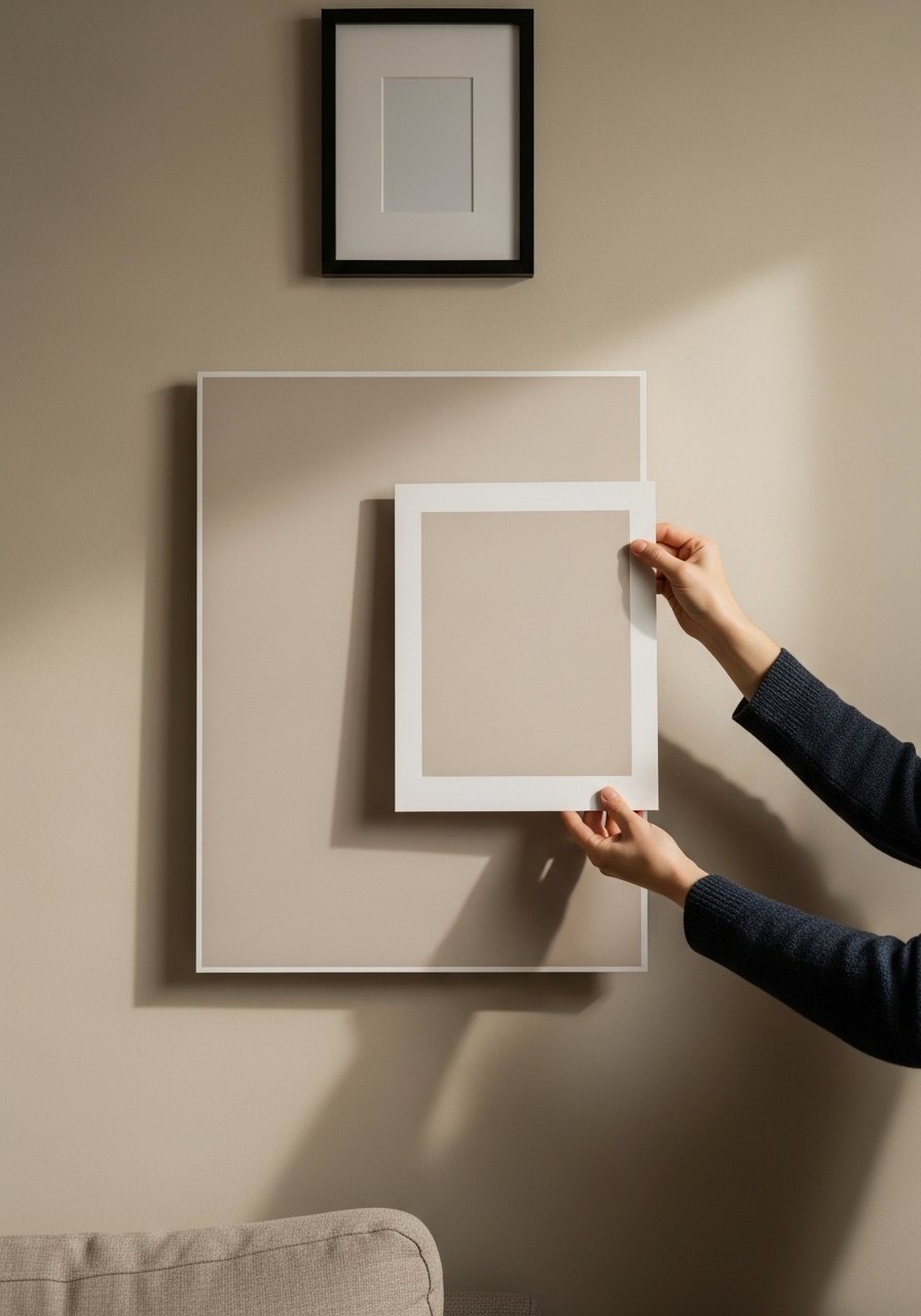
I test scale by holding the poster(s) at eye level. One large poster (24×36+) reads calm and simple. A cluster of smaller posters needs consistent spacing and a dominant piece to anchor it.
What changes visually is weight and rhythm: a large piece gives a restful pause; a cluster gives movement. People often pick too-small posters above wide furniture. Don’t make that mistake—if the poster looks lost, it needs to be bigger or grouped.
Step 3: Choose frames and matting that match the room’s tone
I prefer simple frames and a white mat for posters. Thin black metal feels modern and clean; warm wood brings an organic modern or Japandi note. Matting gives breathing room and makes cheap paper feel curated.
The visual result is quieter, more intentional art. One insight: consistent frame color unifies varied prints. A small mistake is mixing too many styles of frame—don’t pair ornate gold with thin black unless you plan a deliberate contrast.
Step 4: Lay out spacing and height with furniture in mind
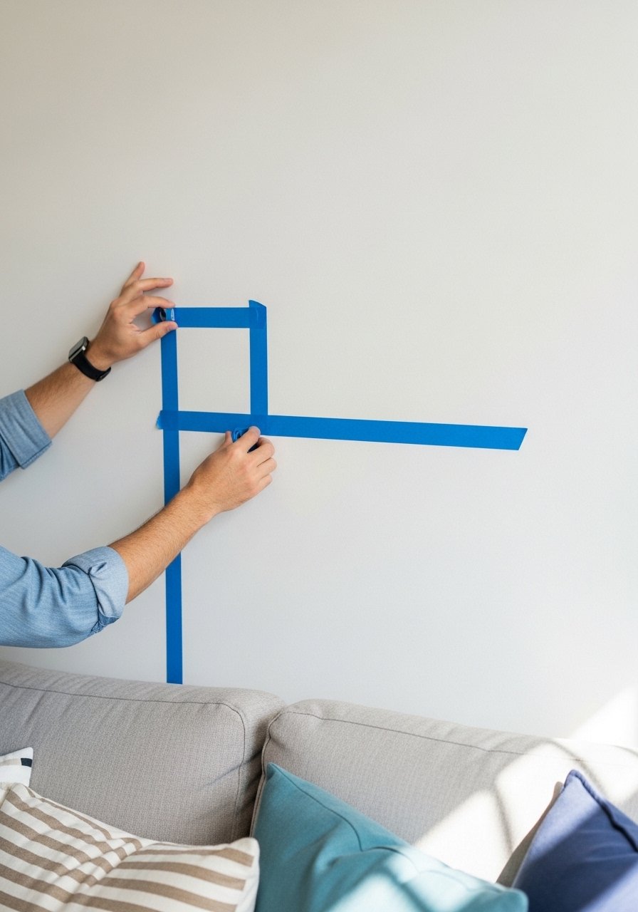
I measure from the top of nearby furniture—usually posters sit 6–12 inches above a sofa or console. For clusters, keep 2–3 inches between frames for a compact feel, or 4–6 inches for airier spacing.
Visually, correct height lets the eye move from furniture to art naturally. Many people hang art too high, breaking that flow. Avoid the “art too high” mistake—stand back and check from a normal sitting position.
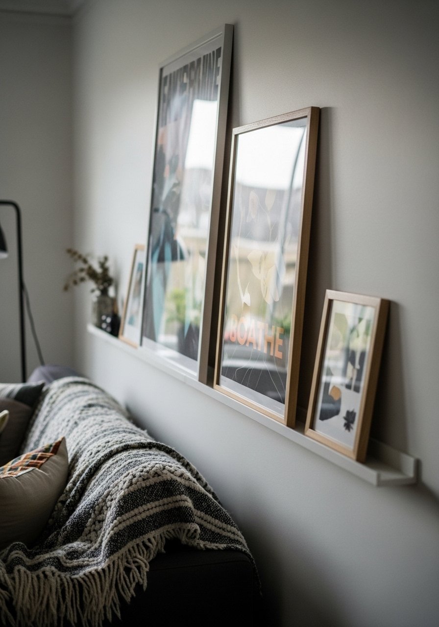
Step 5: Layer posters with a shelf and a few small accessories
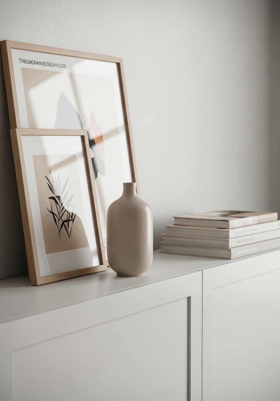
I like a gallery ledge so I can lean posters and swap them easily. Add one small vase, a stack of books, or a plant for life. This makes posters feel like part of the room, not museum pieces.
Layering changes the mood from flat to lived-in. One thing people miss is scale of accessories—use small items so the poster remains the star. Don’t overcrowd the ledge; leave negative space to keep it calm.
Common mistakes and how to avoid them
One mistake is mixing too many frame styles. Pick two finishes max—one for large pieces, one for small accents. Another is poor scale: too-small posters over wide furniture look like afterthoughts.
- Hanging art too high—stand back and check from a seated view.
- Crowding frames—give each piece breathing room.
- Not matting mid-priced posters—mats make a big visual difference.
Adapting this method to small rooms or tight budgets
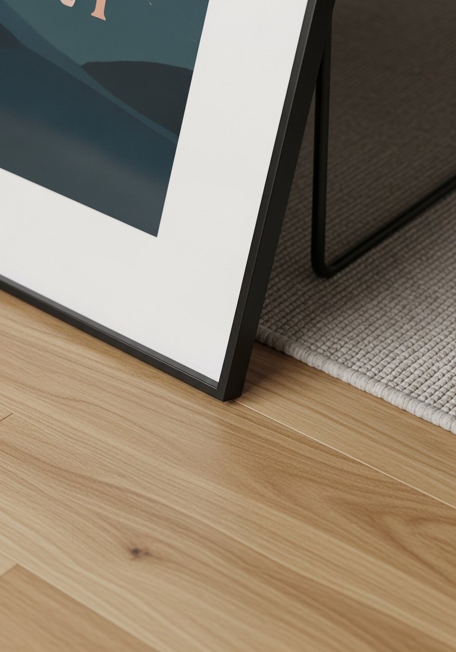
I do this differently in compact spaces. Choose one medium poster rather than a cluster. Leaning a framed poster on a shelf saves wall space and hardware.
On a budget, I use simple black frames and mat board to create a cohesive look. Secondhand posters, prints from indie artists, or printable art work well. Focus on scale and placement—those matter more than expensive frames.
Mixing posters with what you already own
I match poster tone with existing textiles. If you have warm wood furniture, pick posters with warm neutrals or add a wood frame. For minimalist furniture, stick to line art or monochrome prints.
- Use one repeating color from pillows or rugs in the art.
- Keep one frame finish consistent across the room.
- Let a large poster anchor smaller, collected pieces so the room reads intentional.
Final Thoughts
Start with one poster and a simple frame. It’s low-commitment and shows you how scale, placement, and a little layering make posters feel intentional. Once that feels right, you can add a second piece or a small ledge.
If you want an easy place to begin, try a neutral abstract print in a thin black frame—simple, calming, and easy to swap out.
