
I still get that moment where a room looks finished on paper but feels empty in real life. Shelves bare, cushions wrong scale, DIY pieces shouting “homemade” instead of fitting in.
I learned to edit, layer, and place what I make so it reads calm and intentional, not crafty. This is how I do it.
How to Decorate a Room With DIY Decor That Looks Store-Bought
You’ll learn the small choices that make handmade pieces read refined: editing, consistent palettes, layered textures, and smart placement. It’s achievable with simple pieces and a few strategic DIYs. The result: a room that feels intentional, cozy, and quietly modern.
What You’ll Need
- Chunky knit throw in oatmeal, 50×60 (~$40–65)
- Linen pillow covers in soft gray, 20×20 (set of 2) (~$22–38)
- Natural rattan tray, 16-inch (~$25–45)
- Faux fiddle leaf fig tree, 5–6 ft (~$80–150)
- Brass taper candle holders, set of 2 (~$25–55)
- Ceramic table lamp with linen shade, warm white (~$45–120)
- Woven seagrass basket, medium (~$30–65)
- Wood gallery frame set, 8×10, natural (~$25–50)
Step 1: Find and commit to a focal anchor
I start by choosing one anchor in the room—usually the sofa, a console, or a window seat. I move pieces so everything faces or supports that anchor. That single decision changes how every DIY piece reads: it feels like it belongs to a composition rather than being an add-on.
People often miss how much negative space around an anchor matters. Don’t cram every small handmade item onto the anchor; let each piece breathe. The mistake is turning the focal point into a cluttered pinboard.
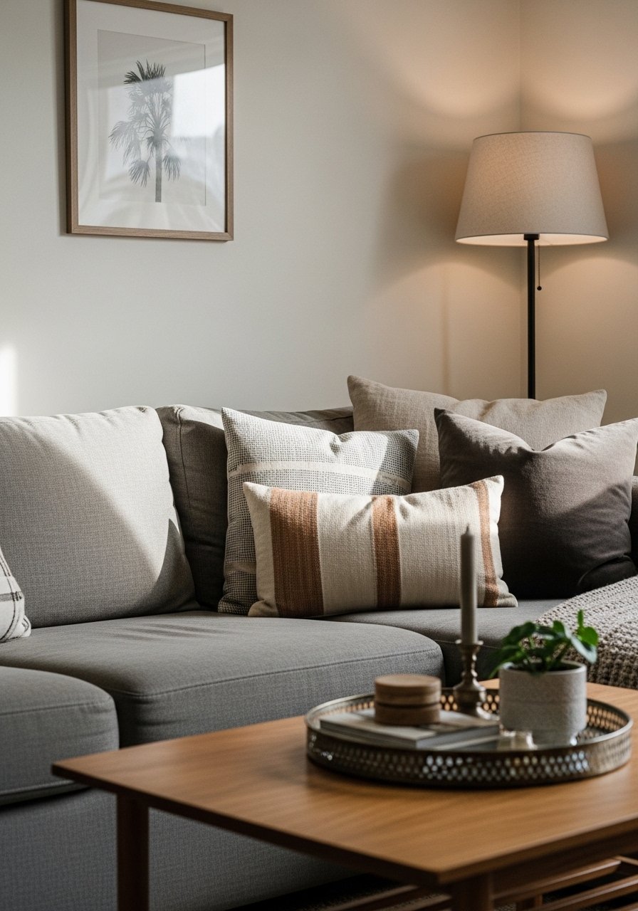
Step 2: Layer textiles for a cohesive, store-like finish

I layer at least two textile textures and three sizes: seat cushions, lumbar or 20×20 pillows, and a throw. Using a limited palette—say soft gray pillows with an oatmeal chunky knit—keeps things calm and cohesive. It makes my DIY cushions look edited, not homemade.
One insight I rely on: scale matters more than matching. Mix a large throw with smaller pillows. Avoid the mistake of making everything identical—matched sets read mass-produced, not curated.
Step 3: Edit and style surfaces with intentional vignettes
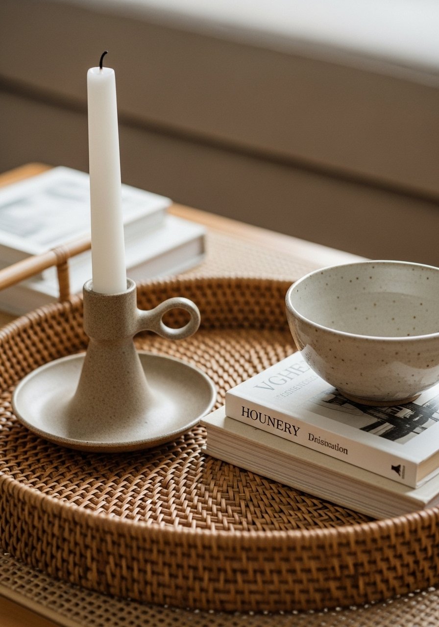
I treat trays and tabletop groups like small rooms. I anchor a tray (I like rattan) and place objects in odd numbers: a candle holder, a book, and a ceramic bowl. That creates a balanced, store-bought look because everything has a purpose and a place.
People skip the edit and scatter things randomly. One insight: leave one-third of the surface empty to avoid visual chaos. The common mistake is lining objects in a row—vary the heights and keep the composition relaxed.
Step 4: Introduce height and life with plants and baskets
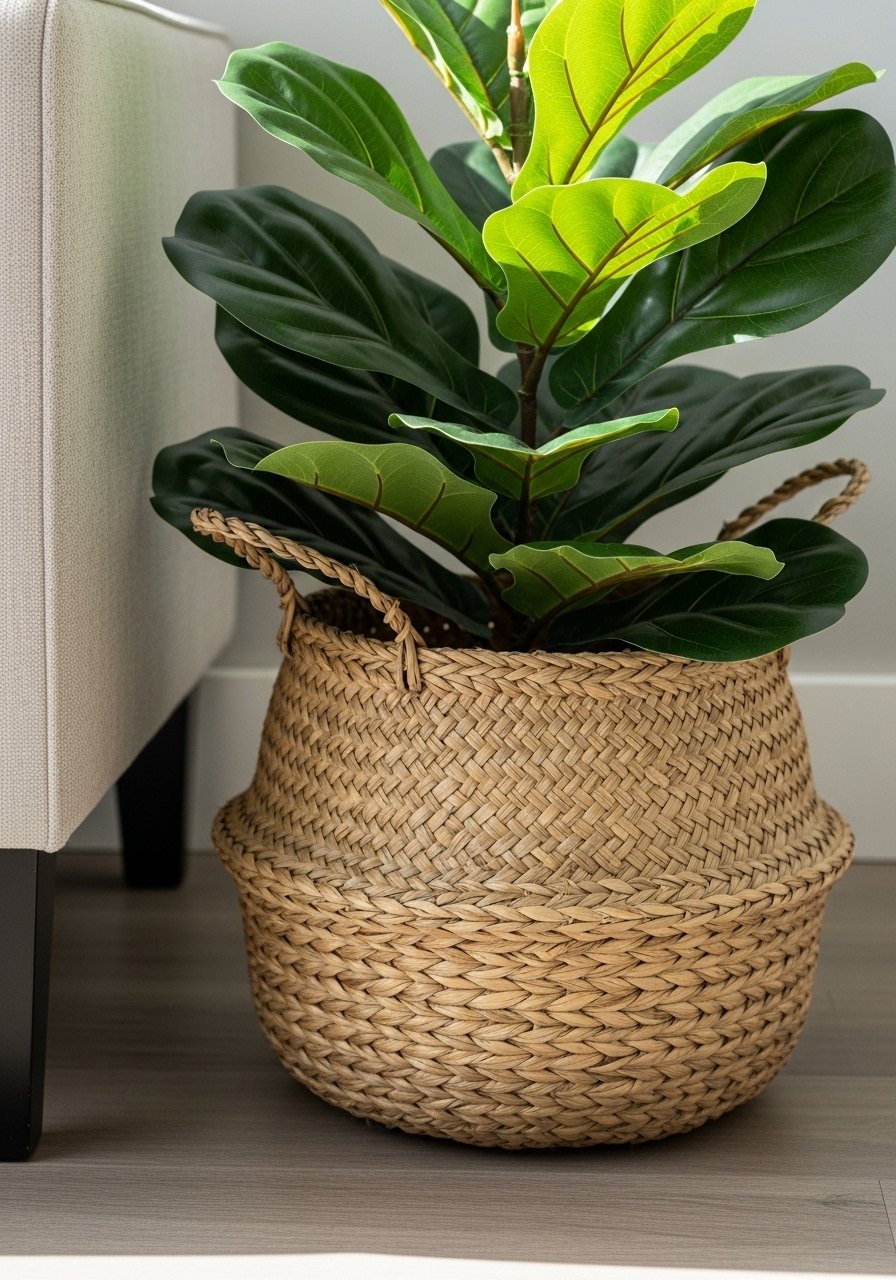
I add a tall element—real or faux—to give the room vertical balance. A faux fiddle leaf fig in a woven basket feels intentional and lasts without upkeep. The basket also grounds the piece and hides a nursery pot or stand, which makes the whole setup read like a store display.
Insight: the base matters as much as the plant. A cheap plastic pot shows; a basket or ceramic planter elevates the look. Don’t pick a plant too small or too large for its corner—scale is the silent rule-breaker.
Step 5: Layer lighting and add the final finish
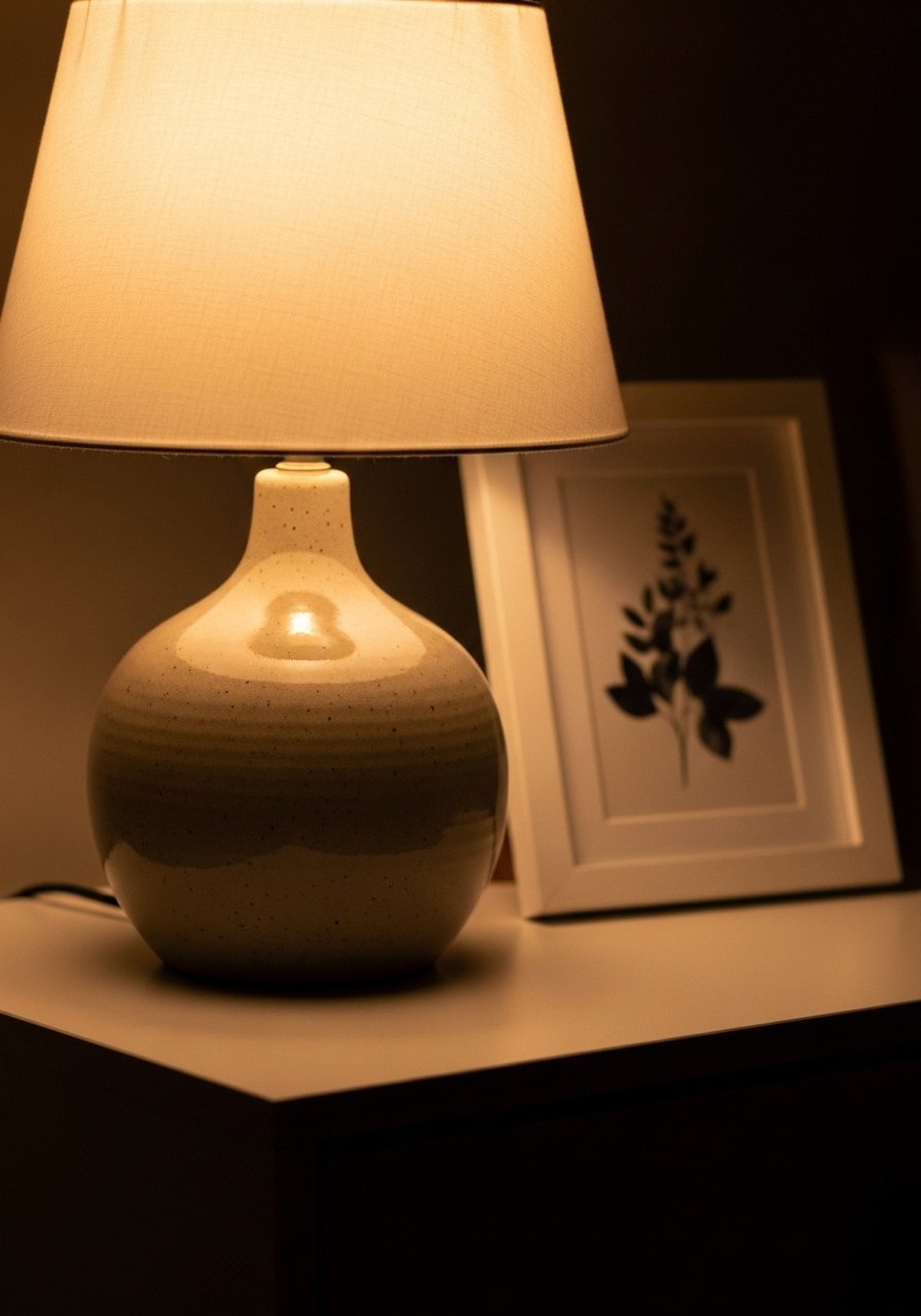
I finish by checking light layers—ambient, task, and accent. A ceramic lamp with a linen shade next to a sofa instantly softens a room and makes DIY pieces read intentional. I use warm bulbs and place lamps to balance darker corners.
One insight: lighting sets the mood and hides imperfections. The mistake is relying only on overhead light—add at least one table lamp to make handmade decor feel considered.
Common mistakes I see and how I fix them
I often find people try too many DIYs at once. The result reads busy, not curated. I edit down to two or three handmade elements and repeat their colors or textures elsewhere.
- Overmatching: everything the same color reads flat. I mix tones within a palette.
- Underscaling: tiny pieces on a big wall look lost. I scale up or group similarly sized items.
- Random placement: scatter equals chaos. I create balance with symmetry or intentional asymmetry.
How to adapt this for small rooms or a tight budget
I work the same way in small spaces, just with smaller moves. One large throw and two pillows can do the heavy lifting. Swap big faux trees for a tall floor lamp or a single art print.
Budget swaps I use:
- Replace a faux tree with a well-placed floor lamp.
- Use a smaller framed print instead of multiple frames.
- Choose a mid-priced lamp and save on accent accessories.
Mixing DIY with what you already own
I never force new DIYs to replace everything I own. Instead, I look for a single feature to update: a lampshade, a basket, or a set of pillow covers. That small change pulls older pieces into the same visual language.
Practical tips I use:
- Match one finish (wood, brass) across the room.
- Repeat a texture (linen, rattan) three times.
- Keep a consistent color undertone—warm or cool—so handmade items feel intentional.
Final Thoughts
Start small. Replace one pillow, add a tray, or drape a chunky knit throw in oatmeal and see how the room settles. I promise the edits feel doable and reveal where the next small change should be.
Take your time. When DIYs are placed with scale, space, and repeated textures in mind, they stop shouting homemade and start reading like thoughtful, store-bought pieces.
