
I stared at my cookie-cutter kitchen for months before realizing the problem wasn't the layout. It was the clutter, clashing metals, and cold lighting. A few simple edits—swap black hardware for warm brass, add open white oak shelves, and introduce linen textiles—made the room feel calm and collected. These 22 neutral kitchen ideas are what I used over weekends and small splurges to create a timeless look that still feels modern.
These ideas focus on warm, clean neutral kitchen decor with a modern farmhouse and Scandinavian lean. Most items are under $150, with a few appliance or lighting splurges around $200-350. These looks work best for full kitchens, kitchen islands, breakfast nooks, and small galley kitchens. I’m leaning into organic textures and warm wood tones this year — everywhere I look showrooms and catalogs are doing the same — so I kept materials tactile and the palettes tight.
What You'll Need to Get This Look
Textiles & Soft Goods:
- Linen dish towels set of 4 in oatmeal (~$24)
- Linen blend café curtains, 36 x 63 inch (~$30 per pair)
- Natural fiber runner rug, 2×6 ft (~$45)
Wall Decor & Shelving:
Lighting:
Kitchenware & Styling:
Budget-Friendly Finds:
- Peel and stick wallpaper panels, linen texture (~$28)
- Similar options available at Target and HomeGoods for quick swaps.
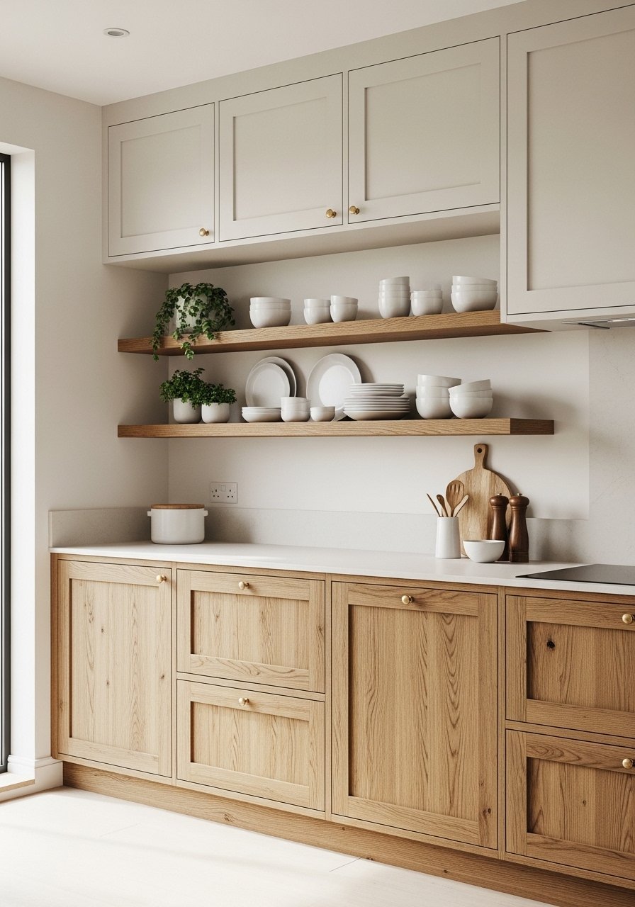
Airy White Cabinets With Warm Wood Accents — Modern Farmhouse
Style/Vibe: Modern Farmhouse
Budget: $$$
Best For: Full kitchen / island
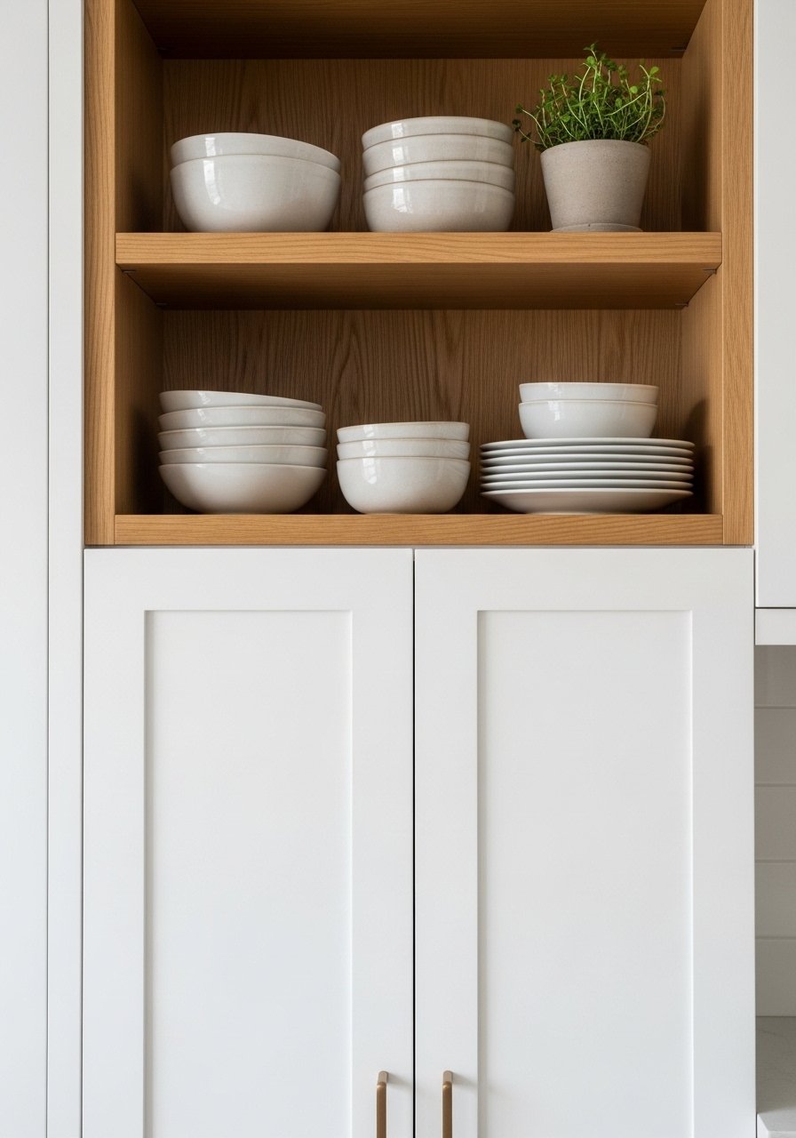
I painted my cabinets Simply White and paired them with stained white oak shelves to warm the space. The contrast keeps things bright but grounded — warm wood tones are trending hard this year and they actually soften clinical whites. I used white oak floating shelves to display everyday plates. Avoid over-accessorizing: three to five curated objects per shelf looks intentional. Too many items make the shelves read cluttered instead of calm and minimalist.
Open Shelving Styled With Neutral Ceramics — Minimalist Kitchen
Style/Vibe: Minimalist
Budget: $$
Best For: Nook / island wall
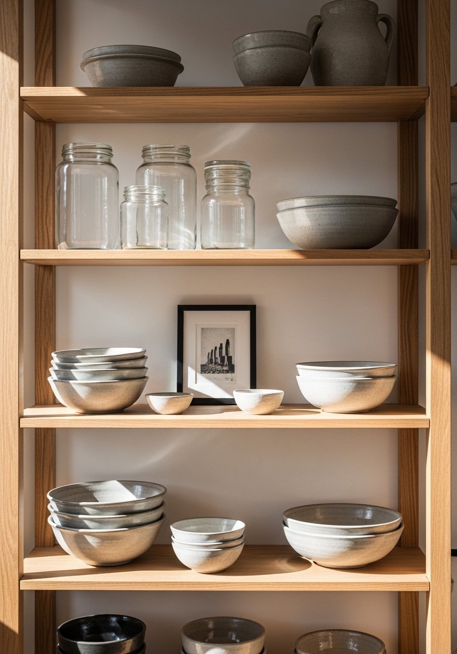
Open shelves are where my kitchen personality shows. I grouped bowls and mugs in odd numbers and kept a row of clear jars for grains. These neutral ceramic bowls anchor the shelf visually. Tip: store bulk items in matching containers to keep a cohesive look. A common mistake is mixing too many colors — stick to two neutrals and one material, like ceramics and glass, for harmony and visual calm.
Marble-Look Countertops With Subtle Veining — Elegant Neutral Finish
Style/Vibe: Elegant Transitional
Budget: $$$
Best For: Countertops / island
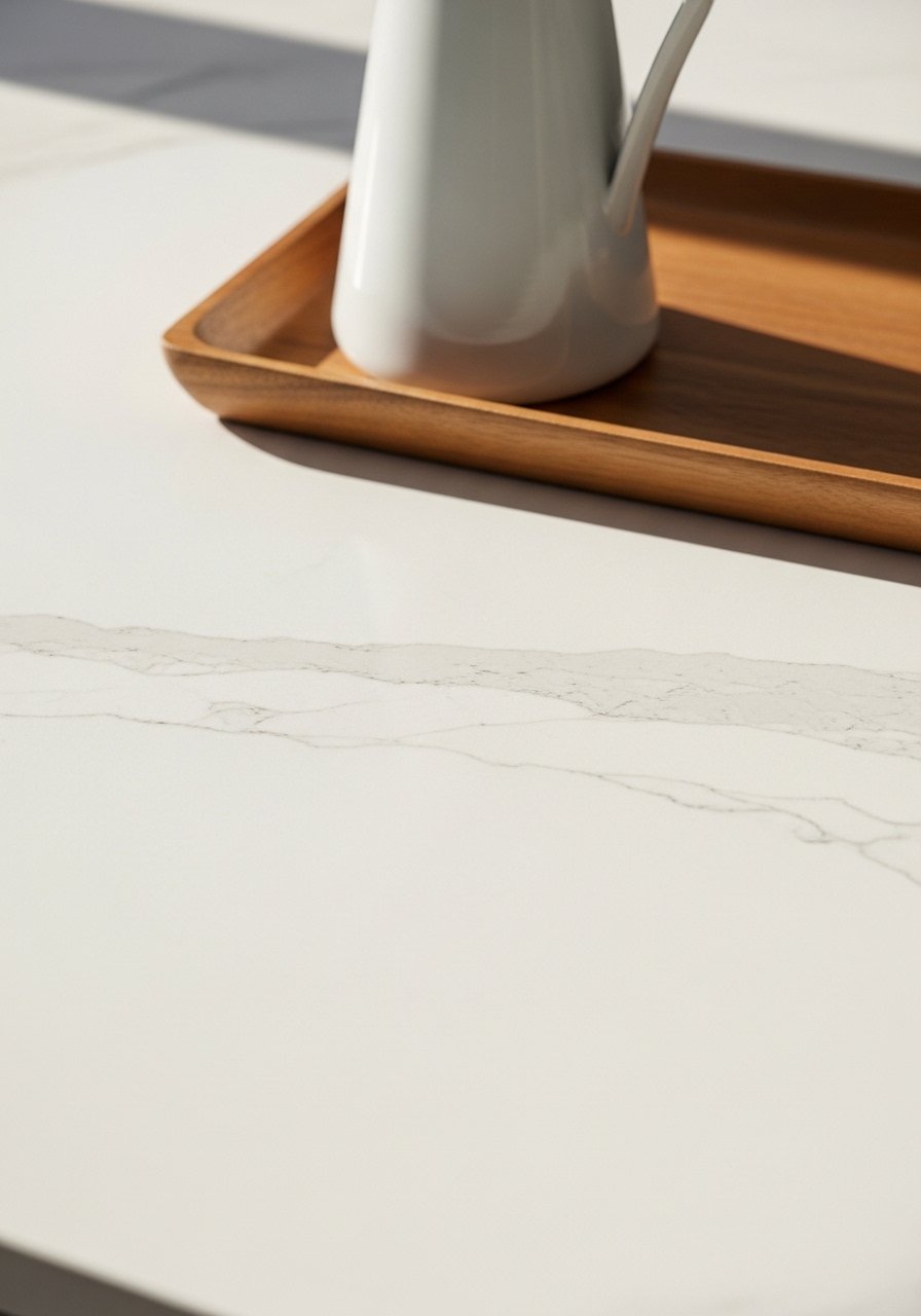
I love pale veined counters because they read timeless without being cold. Choose a marble-look quartz for durability and low maintenance — it reads classic and keeps the palette neutral. Pair with warm brass hardware for gentle contrast. One mistake is picking heavy, busy veining; opt for subtle patterns so your countertops complement, not dominate, the room. Add small wooden accents like an oak cutting board to bring texture.
Linen Window Treatments for Soft Light — Coastal Neutral
Style/Vibe: Coastal / Light-filled
Budget: $$
Best For: Kitchen windows / breakfast nook
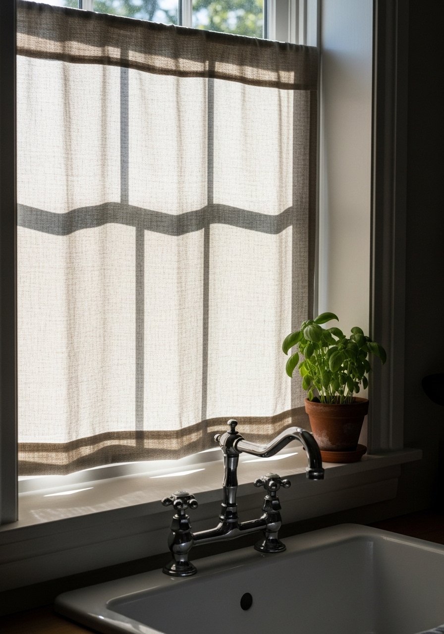
I swapped out heavy blinds for linen café curtains and the kitchen instantly felt softer. Linen diffuses light while keeping privacy — perfect for morning coffee. I used linen blend café curtains in oatmeal. Don’t hang curtains too high in a small kitchen; keep them at window frame height to preserve sightlines. A common error is choosing shiny fabrics that reflect glare — stick to matte linens for organic texture and a neutral, airy vibe.
Stoneware Dish Stack as Countertop Art — Rustic Neutral Styling
Style/Vibe: Rustic Artisan
Budget: $
Best For: Open counter / shelf
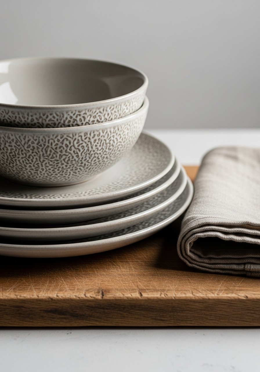
I stopped hiding everyday dishes and started styling a small stack of stoneware near the sink. Stoneware’s matte textures create a handcrafted focal point that feels curated. These neutral stoneware bowls are durable yet pretty enough to leave out. Avoid stacking more than four pieces; too tall a pile looks unstable. This small artful cluster adds warmth and keeps the kitchen feeling lived-in, not staged.
Rattan Pendant Over Kitchen Island — Boho Neutral Lighting
Style/Vibe: Boho / Warm
Budget: $$
Best For: Island / dining area
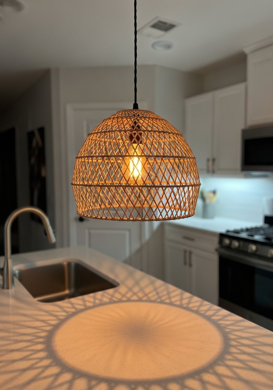
A rattan pendant brings organic texture and a relaxed vibe above my island. The woven shade softens light and complements wood accents. I installed a rattan pendant light shade and used warm LED bulbs. The mistake I see is picking pendants that are too small for the island — scale matters. Choose a shade with about one-third the island length for balanced proportion. The warmth of rattan pairs beautifully with neutral ceramics and linen textiles.
Two-Tone Cabinets in Cream and Oak — Transitional Balance
Style/Vibe: Transitional
Budget: $$$
Best For: Full kitchen
I painted my uppers cream and kept the lowers as natural oak to ground the room while keeping it bright. Two-tone cabinetry adds subtle interest without bold color. Use consistent hardware — I chose warm brass to tie the look together. One pitfall is mismatched undertones; ensure wood stain and paint undertone harmonize. Try a sample cabinet door to test. This approach reads layered and intentional, giving the kitchen depth without losing the neutral, timeless feel.
Textured Backsplash in Neutral Tones — Modern Subtlety
Style/Vibe: Modern Minimal
Budget: $$
Best For: Backsplash / small galley
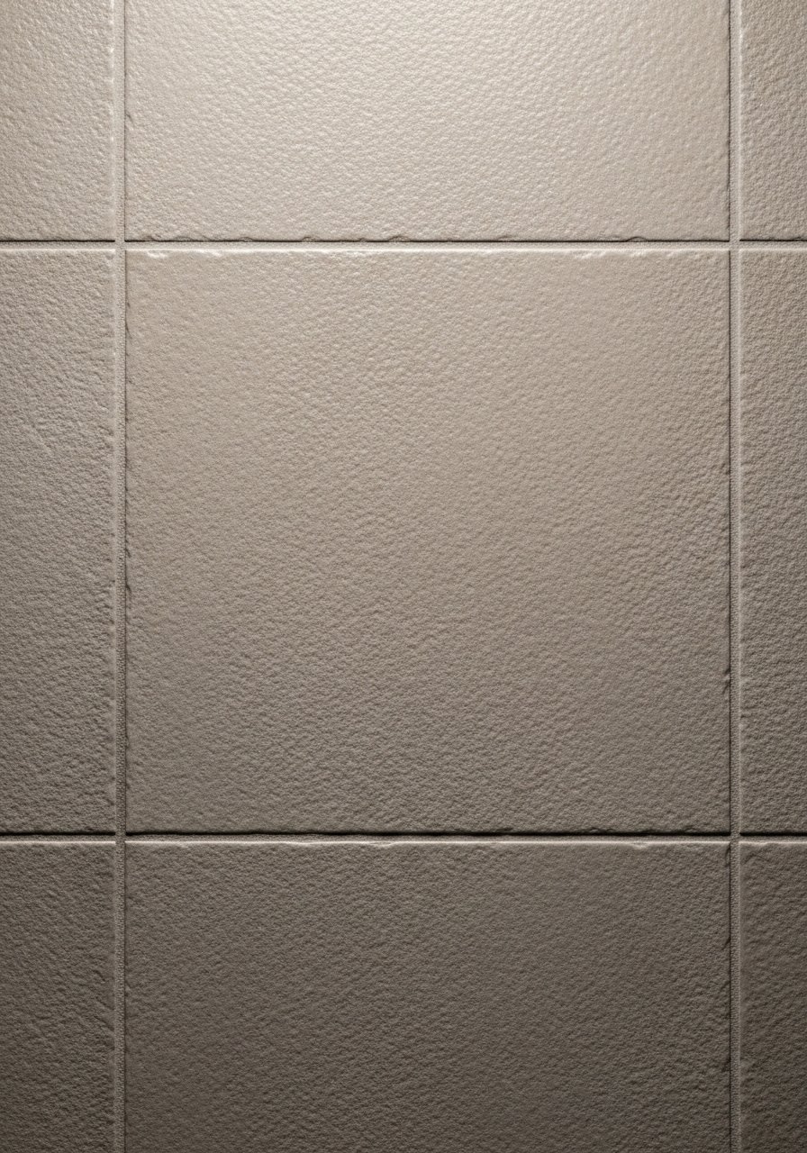
A textured, neutral backsplash can add interest without shouting. I used elongated matte tiles laid in a stacked pattern to keep things calm. The texture reads like fabric on the wall and pairs with simple cabinetry. Avoid glossy tiles that reflect every smudge — choose a matte or honed finish for practicality. If you like removable options, try peel and stick linen wallpaper panels for a renter-friendly texture fix.
Matte Black Hardware for Gentle Contrast — Industrial Neutral Mix
Style/Vibe: Industrial-Modern
Budget: $
Best For: Cabinets / drawers
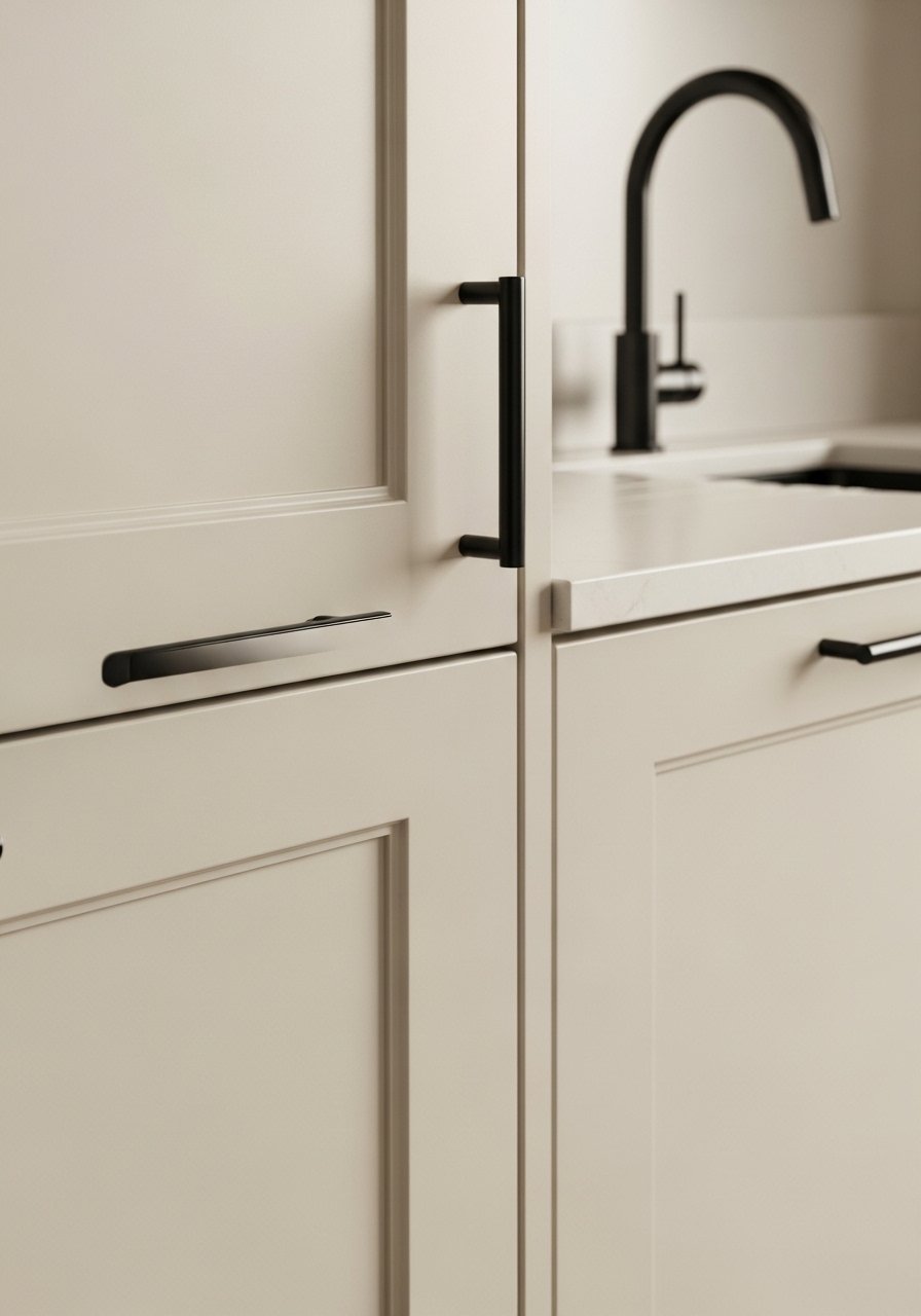
Swapping dated knobs for matte black pulls added that subtle contrast my kitchen needed. Black creates definition against soft neutrals and reads modern rather than heavy. I combined a matte black faucet with black cabinet hardware. A common mistake is overdoing black — limit it to focal points like hardware or a light fixture so the room keeps its light, airy feel. Mixing metals carefully keeps the palette interesting.
Hidden Appliance Garage for Clean Counters — Minimalist Practicality
Style/Vibe: Minimalist Practical
Budget: $$$
Best For: Countertop organization
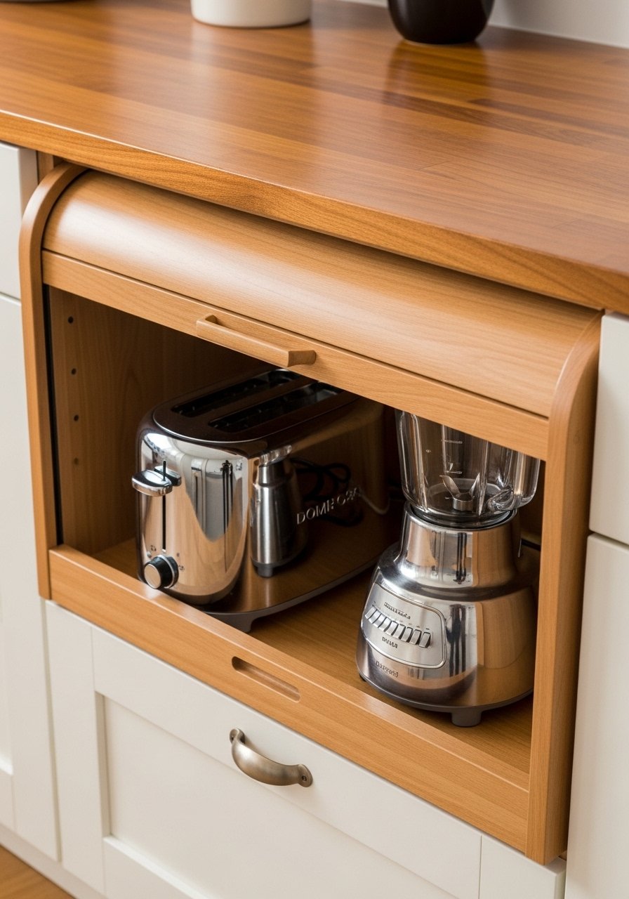
I installed a small appliance garage to hide the toaster and keep counters clear. It visually simplifies the kitchen and reduces visual clutter. Use a roll-up door or cabinet with an easy pull. The mistake is forgetting ventilation — leave a small gap for heat. If you can’t rework cabinetry, a pretty basket or a neutral storage box set keeps devices contained. Clean counters make a neutral palette feel intentional and calm.
Natural Fiber Rug Runner for Warmth — Scandinavian Cozy
Style/Vibe: Scandinavian Cozy
Budget: $
Best For: Galley kitchen / sink area
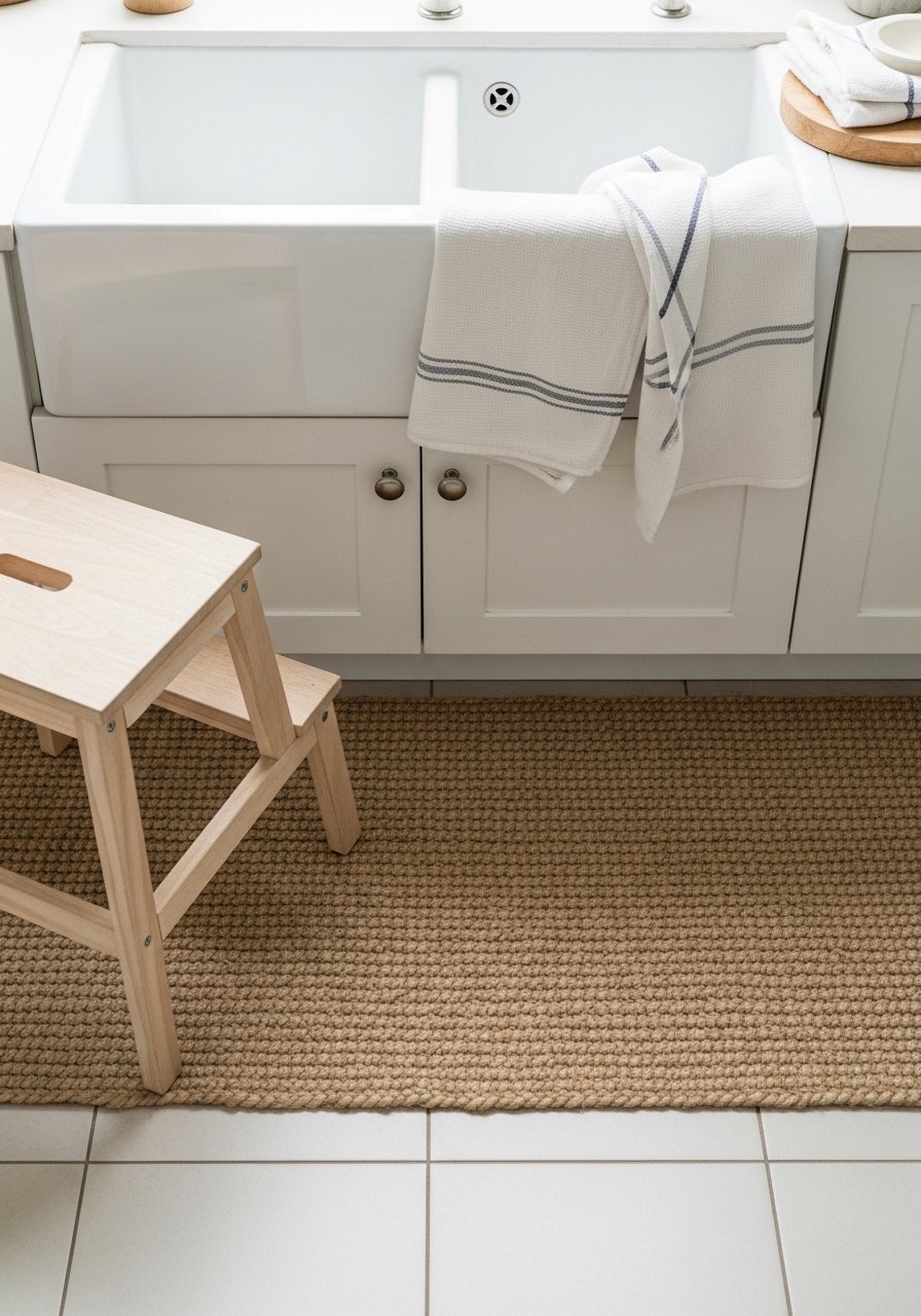
A jute runner underfoot softens tile and adds warmth to a galley kitchen. I chose an 2×6 natural fiber runner that complements wood tones and linen textiles. This natural fiber runner hides crumbs and defines pathways. Avoid rugs with slick backs unless you add a non-slip pad. Too many patterns compete with the neutral palette; a single texture rug maintains the calm, comfortable feeling I wanted.
Layered Lighting for Task and Ambience — Contemporary Function
Style/Vibe: Contemporary Functional
Budget: $$$
Best For: Entire kitchen
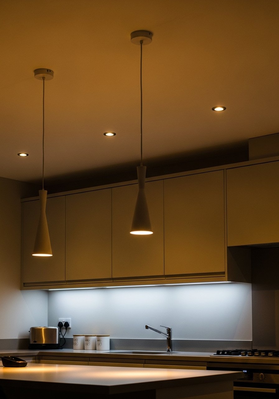
I learned lighting is the difference between a pretty photo and a usable kitchen. I combined pendants, under-cabinet LEDs, and dimmed recessed lights to control mood and function. Use warm white LED bulbs for a cohesive glow. I installed LED warm white bulbs and a slim under-cabinet strip. Avoid harsh, cool lighting — it makes neutrals look drained. Layering light creates depth and keeps the space comfortable for both cooking and lingering.
Tray Vignette With Cutting Boards and Candles — Cozy Countertop Styling
Style/Vibe: Cozy Neutral
Budget: $
Best For: Countertop / island vignette
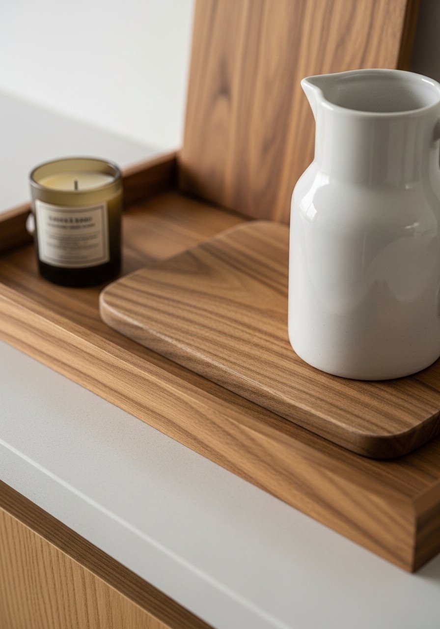
A small tray by the stove organizes oils, salt, and a candle — and it looks thoughtfully styled. I group items in odd numbers and vary heights for balance. I use a solid oak cutting board as the base and a neutral ceramic pitcher for utensils. The mistake is leaving the tray overflowing; keep only essentials to read intentional. This tiny vignette makes countertops feel considered and tidy without sacrificing practicality.
Monochrome Herb Garden on a Windowsill — Fresh Neutral Greenery
Style/Vibe: Fresh Minimal
Budget: $
Best For: Windowsill / breakfast nook
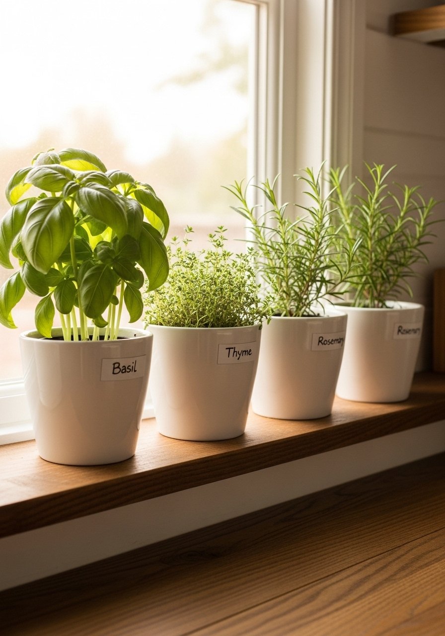
I grouped identical white pots with herbs for a tidy, monochrome garden that reads fresh against neutrals. Use matching planters to keep the look cohesive and label them for clarity. I used small white ceramic pots that hold three herbs. Don’t mix too many pot styles; variety here creates visual noise. Fresh herbs add both scent and color without breaking the neutral palette, and they’re useful while cooking.
Neutral Pattern Mixing With Micro-Prints — Subtle Visual Interest
Style/Vibe: Eclectic Neutral
Budget: $
Best For: Towels / seat cushions
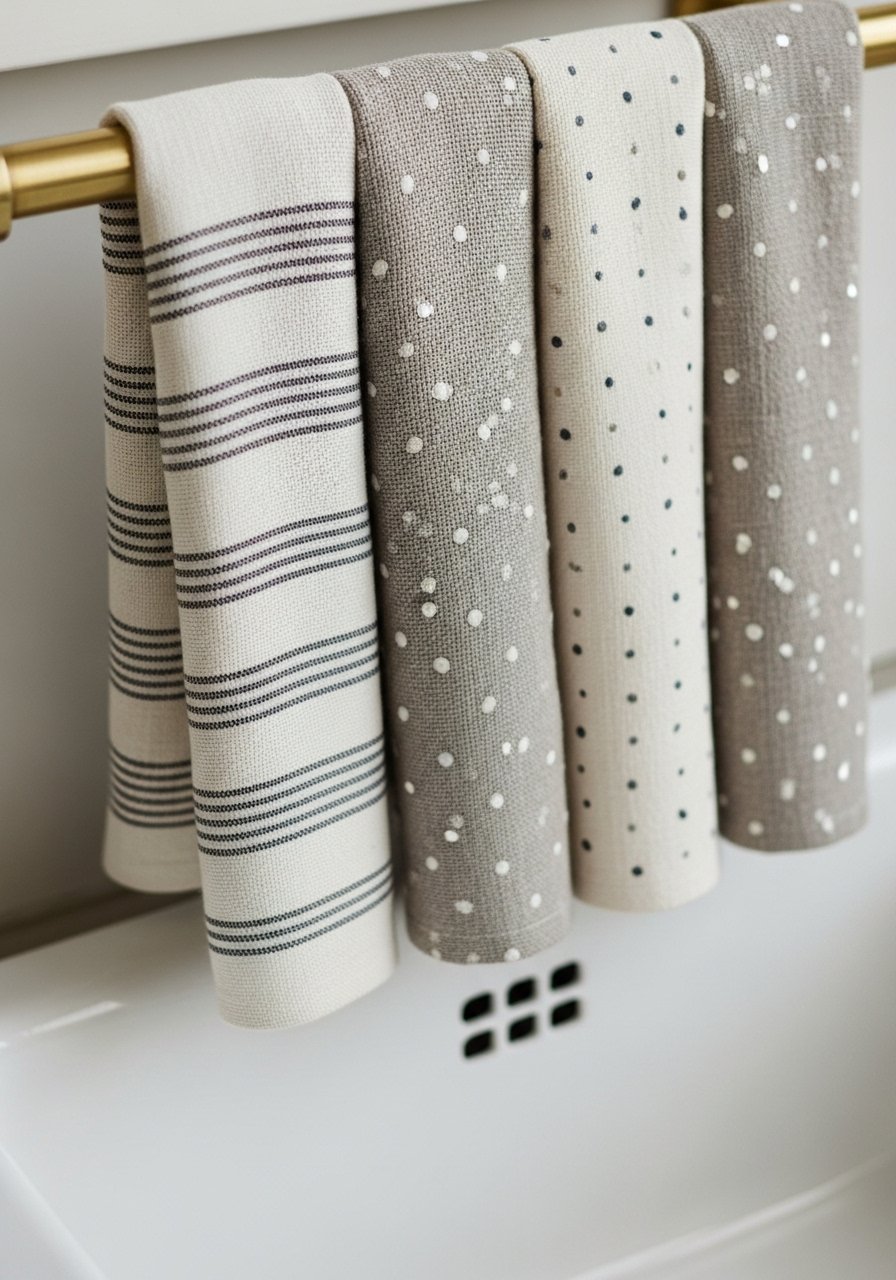
I mix tiny-scale patterns—pinstripes, small checks—on towels and cushions to introduce rhythm without color shifts. Keep all prints in the same tonal family to maintain a calm look. I swapped in linen dish towels in oatmeal and stripe and the kitchen felt layered, not busy. A common mistake is mixing large-scale patterns with small ones; stick to micro-prints together and let one larger texture, like a woven rug, anchor the room.
Oversized Round Clock to Fill Empty Wall — Vintage Neutral Accent
Style/Vibe: Vintage Minimal
Budget: $
Best For: Breakfast nook / wall above island
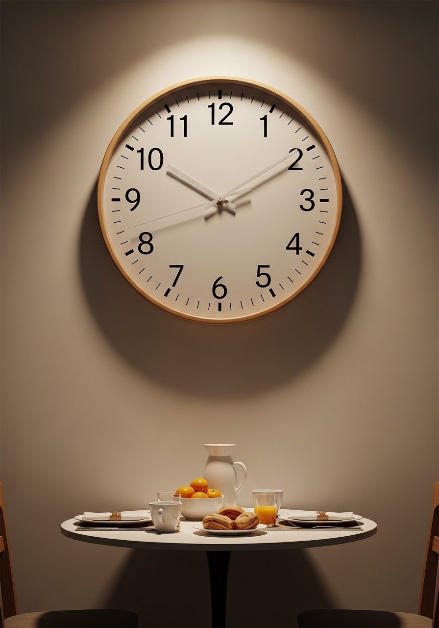
An oversized round clock adds scale and a focal point without jarring color. I picked a 24-inch wood-framed design that complements my floating shelves. This 24-inch wood wall clock feels quietly timeless. Avoid ornate frames that clash with a minimalist kitchen. A simple, neutral clock brings personality and function, especially in an open-plan space where you want one clear accent rather than multiple small items.
Sculptural Ceramic Pitchers as Decor — Artful Counter Pieces
Style/Vibe: Artful Neutral
Budget: $$
Best For: Open shelf / countertop
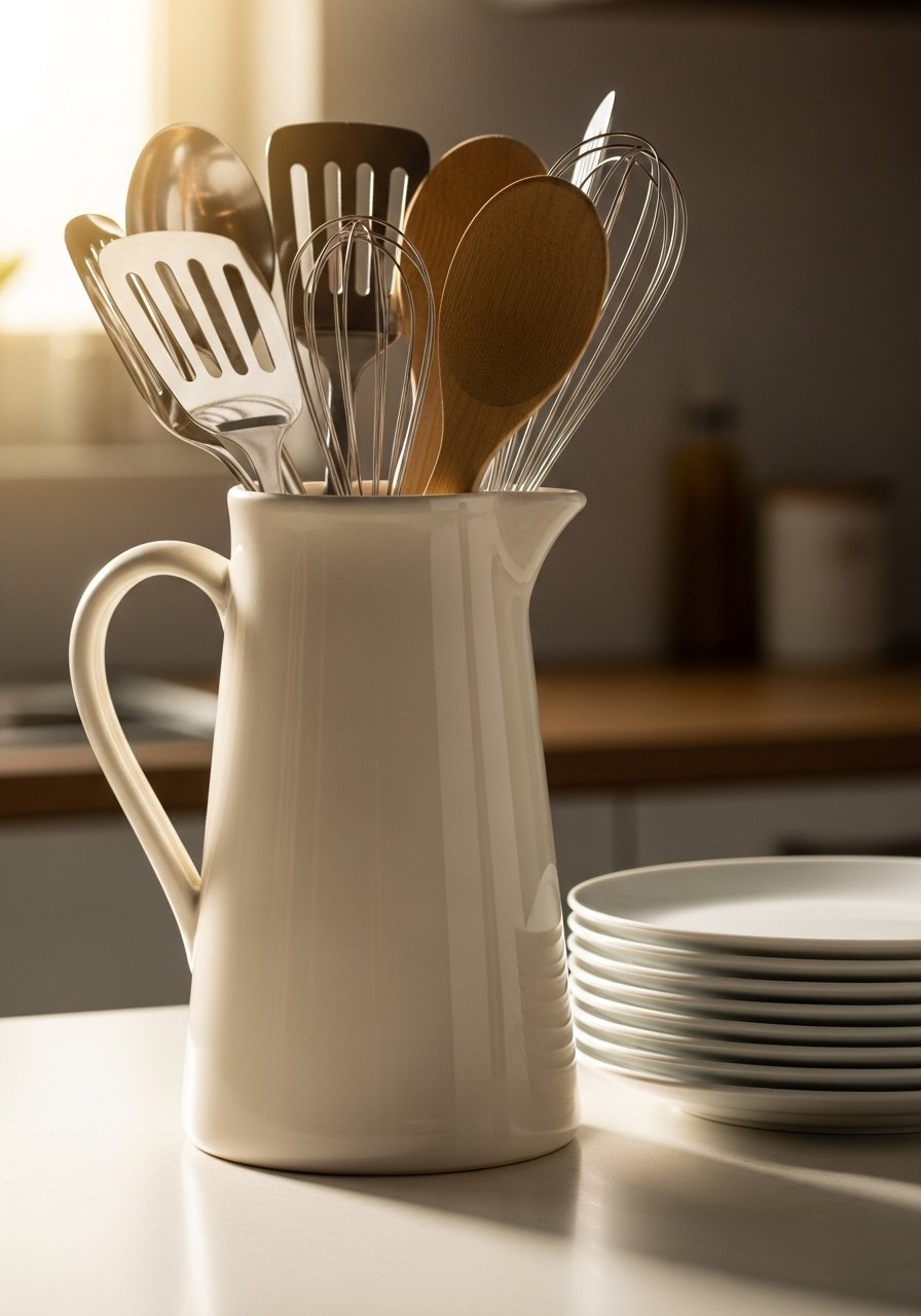
I swapped a cluttered utensil jar for a tall sculptural pitcher and it made the tools look deliberate. Ceramic pitchers are sculptural and practical. I use a neutral ceramic pitcher to corral wooden spoons. Avoid tiny containers that disappear—pick a piece with presence. This single artful object elevates everyday items and keeps counters feeling curated while still functional.
Soft-Edge Bar Stools in Leather or Linen — Modern Seating
Style/Vibe: Modern Casual
Budget: $$$
Best For: Island seating
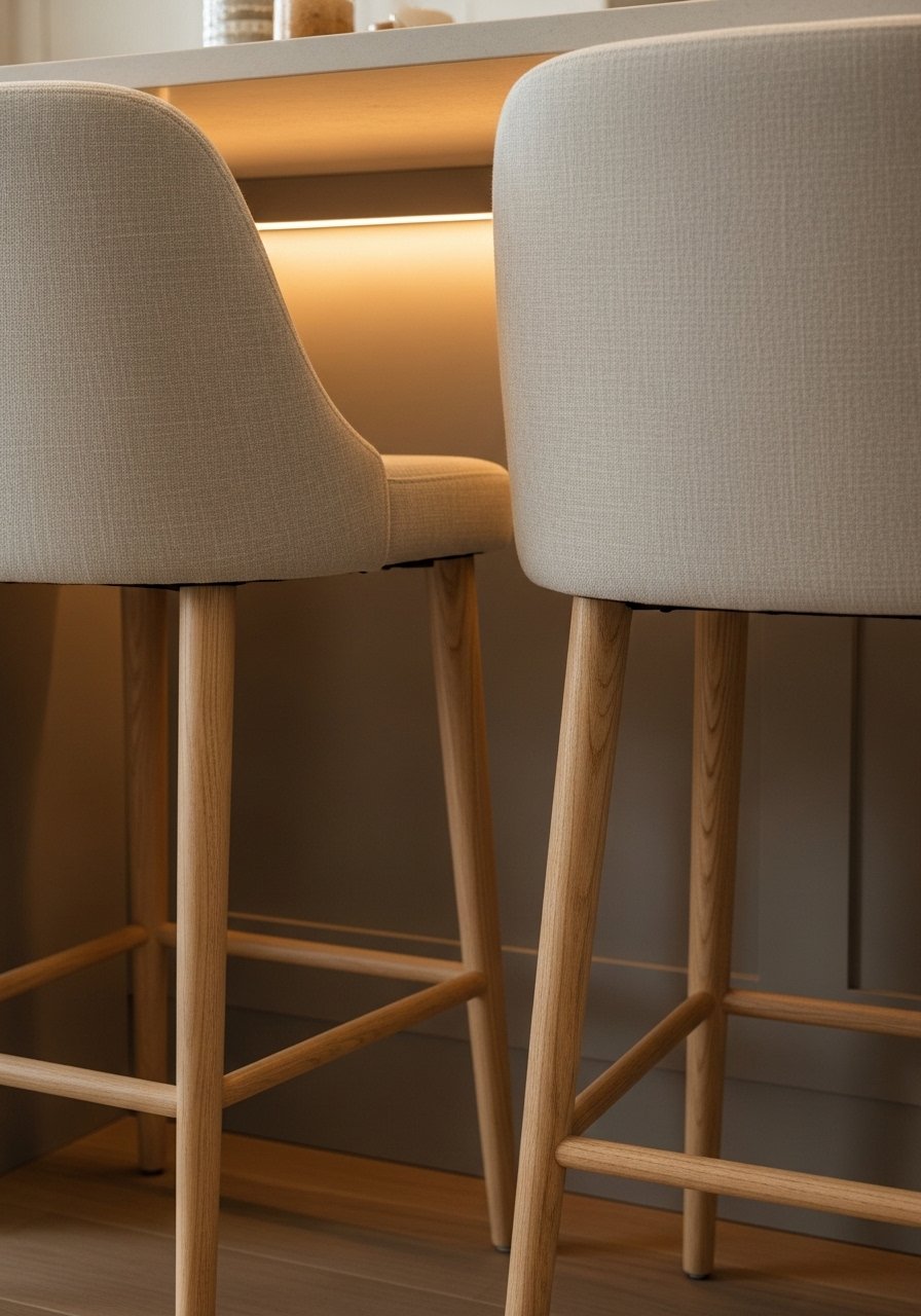
I replaced metal stools with soft-edge stools in linen and oak legs for comfort and warmth. Choose stools with backs for lingering guests and breathable fabrics for long-term wear. These linen counter stools with wood legs balance comfort and style. A common mistake is selecting stools too tall or without footrests—measure your island overhang carefully. Comfortable seating makes the kitchen feel like an invitation to pause, not just a place to cook.
Neutral Wallpaper for an Accent Nook — Quietly Bold
Style/Vibe: Modern Classic
Budget: $$
Best For: Pantry door / small wall
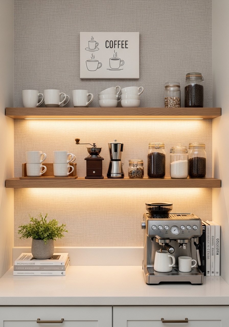
I papered a narrow pantry wall with linen-textured neutral wallpaper to add depth without color. Peel-and-stick options make it renter-friendly. I used peel and stick linen wallpaper panels behind my coffee station. The trap is using a pattern that competes with cabinetry; pick a subtle texture. This small wallpaper application reads intentional and gives the eye a place to rest while keeping the overall kitchen palette calm.
Open Fridge Styling With Clear Containers — Organized Neutral Look
Style/Vibe: Practical Minimal
Budget: $
Best For: Refrigerator / pantry
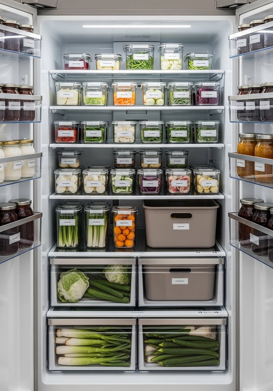
I style my fridge like a tiny open shelf—matching clear containers and labels make food look tidy and calm. Use uniform sizes and clear labels for a serene view every time you open the door. I use clear food storage containers set for grains and snacks. Don’t overcrowd shelves; leave breathing room so items are easy to find. An organized fridge reduces stress and keeps the neutral kitchen aesthetic consistent even inside appliances.
Hidden Drawer for Linens and Placemats — Practical Storage Hack
Style/Vibe: Practical Chic
Budget: $$
Best For: Base cabinet / island drawer
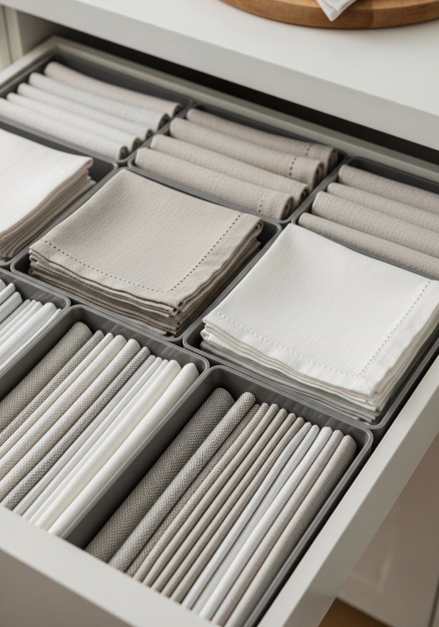
I added a shallow drawer near the prep area dedicated to linens and placemats. It’s a small luxury that keeps surfaces free from stacks. Use dividers to keep napkins crisp and flat. I keep a set of linen placemats folded neatly inside. The common mistake is overfilling the drawer—leave space for air so linens don’t wrinkle. This subtle storage move keeps styling quick and maintains the neutral, uncluttered feel.
Gallery of Small Prints in Slim Frames — Personal Neutral Wall
Style/Vibe: Personal Minimal
Budget: $
Best For: Small wall / breakfast nook
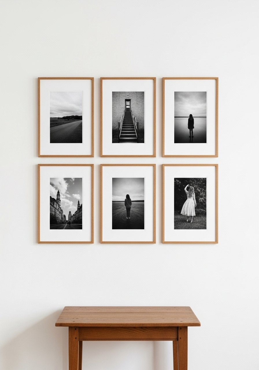
A small gallery of black-and-white kitchen prints adds personality without color noise. I thrifted frames and used fresh mats for a polished look. Mixing small frames in a grid keeps the wall calm. I used slim oak frames set. Avoid uneven spacing; measure and lay things out on the floor first. This approach personalizes the kitchen while preserving a restrained, timeless neutral aesthetic.
Shopping Tips for These Looks
Buy textiles in neutral sets: I swap dish towels and napkins seasonally. These linen dish towels in oatmeal and stripe are affordable and soften a kitchen instantly.
Invest in one statement light: A rattan pendant or oversized fixture makes a room feel finished. I used a rattan pendant shade above my island.
White oak over dark stains: I see white oak everywhere in 2026 — it keeps neutrals warm. These white oak floating shelves are a simple swap.
Contain clutter with matching bins: Uniform storage inside cabinets reads calmer. Try this clear storage container set.
Choose durable matte finishes: Matte counters and tiles hide smudges. These matte subway tiles are renter-friendly peel-and-stick.
Thrift frames, buy new mats: Vintage frames plus fresh white mats give a gallery look on a budget.
Frequently Asked Questions
Q: How do I make a neutral kitchen feel warm and not sterile?
A: Add warm wood tones, textured linens, and a single woven pendant. I used white oak floating shelves and linen towels to soften stark whites and bring in organic texture.
Q: Can I have both open shelves and closed cabinets?
A: Yes—mixing a couple of open shelves with closed storage feels balanced. Keep the open shelves styled with matching ceramics like these neutral ceramic bowls to avoid visual chaos.
Q: What’s an easy renter-friendly upgrade for a neutral kitchen?
A: Peel-and-stick linen-texture wallpaper behind a coffee station or inside a pantry adds depth without painting. I used peel and stick linen wallpaper panels and it made a big visual difference.
Q: How can I make a small kitchen appear larger?
A: Use a light paint, reflective surfaces like a round mirror, and slim-profile furniture. A 36-inch round mirror helps reflect light and visually opens the room.
Q: Should I match metals throughout the kitchen?
A: Mixing metals is more current — pair warm brass with matte black accents. Start small with mixed-metal frames or hardware like this mixed metal picture frame set to test the look.
Q: Are faux plants okay in a neutral kitchen?
A: Absolutely. High-quality faux plants give height and greenery without upkeep. I use a 6-foot faux fiddle leaf fig for drama where sunlight is limited.
