
My kitchen used to be the place I walked through without looking. One afternoon I stacked three mismatched plates on a peg rail and everything felt less like a corridor and more like a room someone lives in. It took tiny moves, not a full renovation, to make the walls feel intentional and inviting. Here are ideas that are low effort and actually look like they belong.
These ideas lean modern farmhouse with a hint of contemporary, and most projects are under $75 with a few splurges around $120. They work for small galley kitchens, open-plan cook zones, and even a breakfast nook that needs a personality boost.
Cozy Plate Cluster for Above the Sink
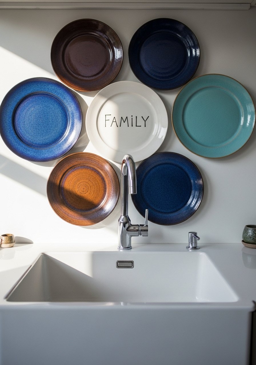
I started with plates because they are cheap, vertical, and practical. Hang three to five plates in a loose triangle, keeping the cluster about 6-8 inches wide for a single-basin sink. That rule of three makes a display that feels curated not cluttered. A common mistake is spacing plates too evenly. Let them breathe. Use adhesive plate hangers for renters or small nails if you own the wall. Ceramic plate hangers are under $10 and save drywall drama. Pair with the pegboard herb idea later for a functional pairing.
Minimalist Pegboard Wall for Utensils and Art
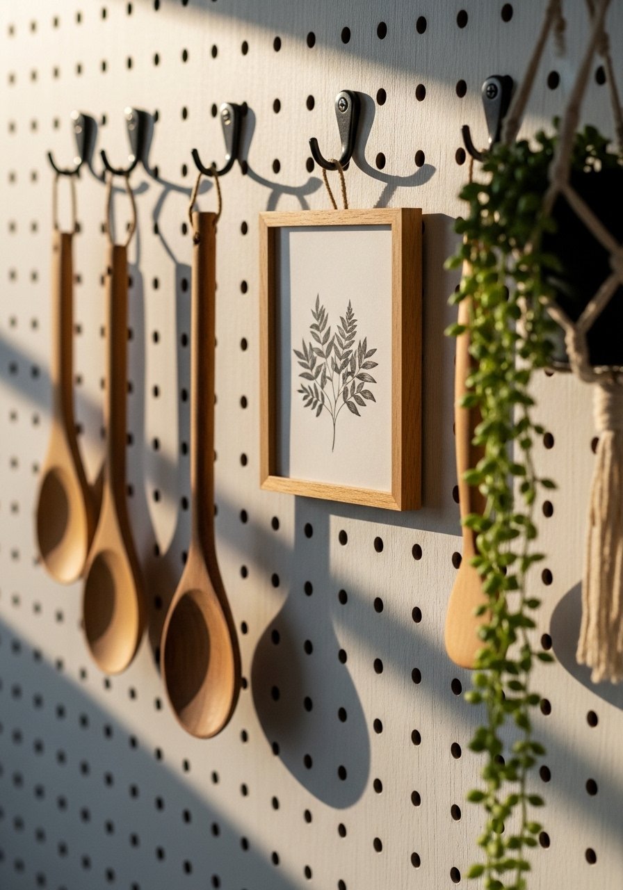
A painted pegboard gives you movable storage and a place to hang one-off art. Paint it 10-15 percent darker than the wall so it reads as a panel. My mistake at first was filling every hole. Leave negative space to keep it from looking like a tool shed. Use brass hooks and a slim shelf to display a small framed recipe. Pegboard hooks and shelf set are cheap and modular. This works great in a prep area and pairs with the floating shelf idea for layered depth.
Floating Shelves with an 80/20 Color Ratio
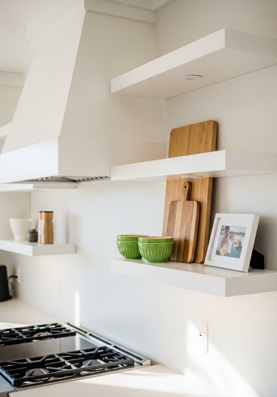
Floating shelves are where decor and storage meet. Stick to the 80/20 color rule, meaning 80 percent neutral ceramics and one or two 20 percent pops like a green bowl or blue vase. Keep shelf depth at 10-12 inches for most kitchens so plates fit and things don’t stick out. The usual mistake is overstuffing. Aim for three well-spaced objects per shelf for a calming look. I keep white ceramic bowls and a single colored pitcher on rotation to change the mood quickly.
Magnetic Spice Rack Art for a Functional Statement
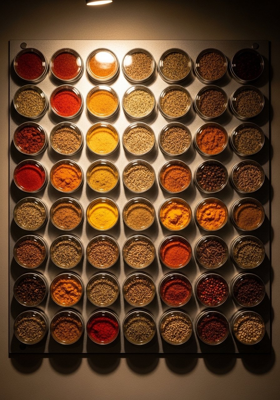
If you hate countertop clutter, mount magnetic spice tins like art. Use a 24×36-inch metal sheet painted the same color as the wall for a floating effect. The grid spacing should be 2 inches between tins for a tidy look. People often cram different label styles together and it looks messy. Pick matching clear-top tins so the spices read as color instead of type. Magnetic spice tins set makes this quick and useful, and it keeps your seasonings within arm’s reach.
DIY Herb Rail for a Living Wall Feel
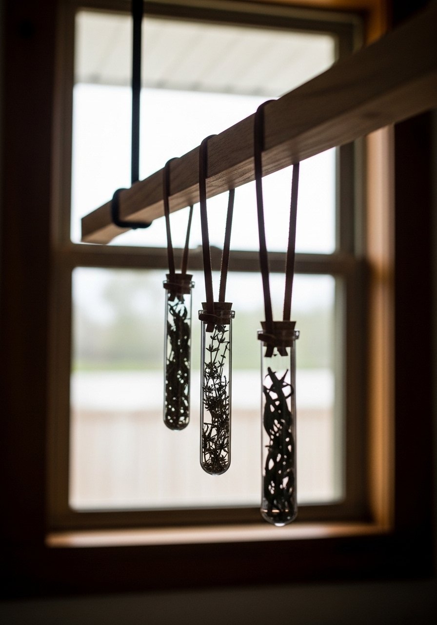
Fresh herbs are an easy way to add living texture. Mount a 24-36 inch rail and hang three small planters evenly spaced, center at about 60 inches from the floor so you can tend them without a stool. A common frustration is plants that die fast. Pick resilient herbs like rosemary or thyme and rotate them to brighter spots for a week before rehanging. Glass herb planters with leather strap look handmade and cost less than a single bouquet.
Chalkboard Panel for Menus and Scribbles
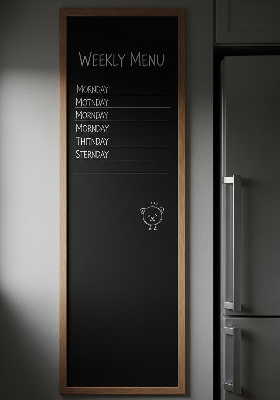
A chalkboard panel adds a practical, writable surface and a graphic black rectangle that anchors a breakfast zone. Paint a 2×3 foot area with chalkboard paint and frame it with thin wood trim. My mistake was writing small. Use big block letters or it reads as noise. This is perfect for grocery lists and a rotating quote, which I change weekly. Small chalkboard paint kit is about $12 and comes with brushes and primer.
Vintage Cutting Board Gallery for Rustic Charm
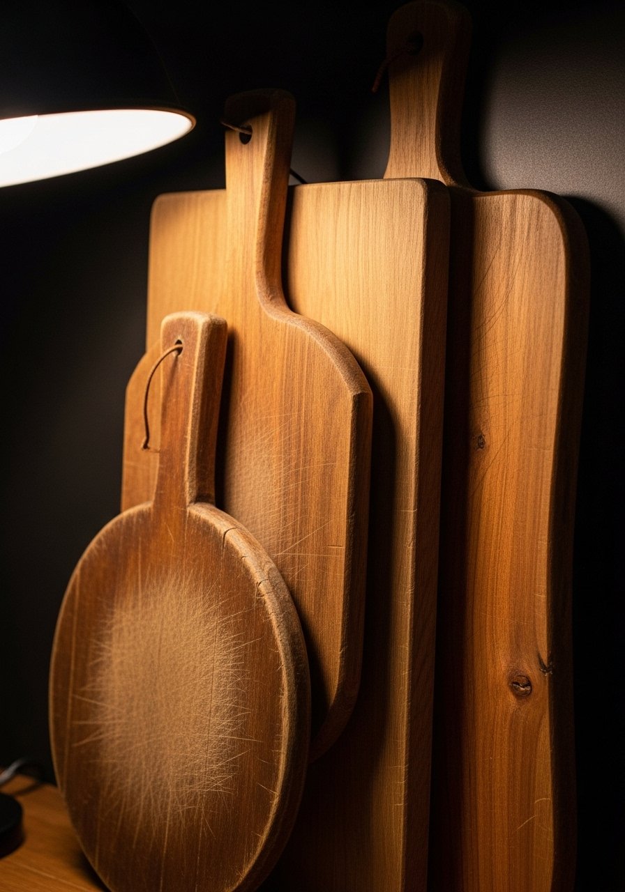
An easy thrift find becomes instant wall texture when you group cutting boards of different woods. Stick to a 2:1 vertical to horizontal ratio so the display feels deliberate. The common mistake is matching everything too closely. Mix oak with walnut and one painted board for contrast. Hang with thin brass picture hooks so the wood breathes. Brass picture hooks pack keeps the boards secure without heavy hardware.
Framed Recipe Prints for a Sentimental Gallery
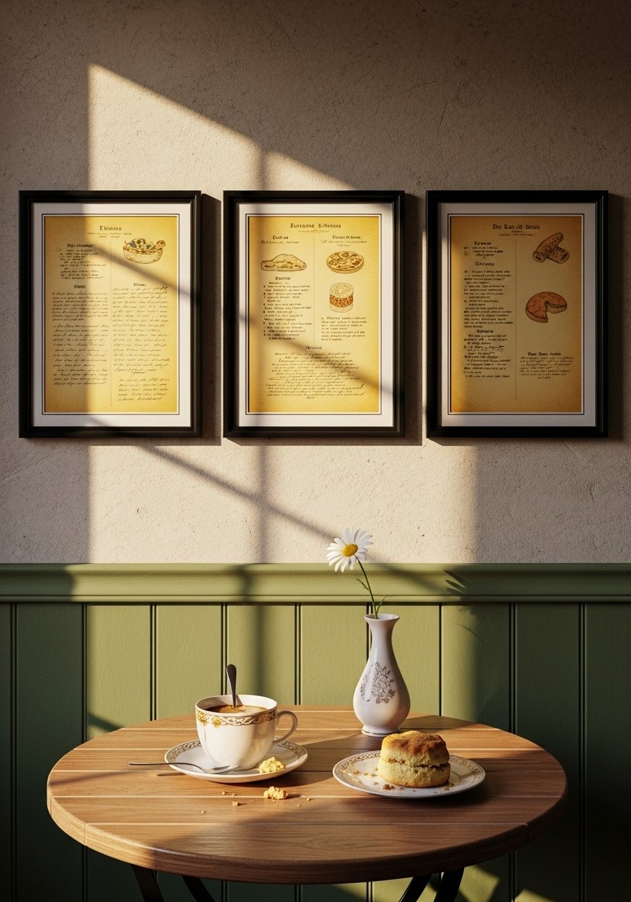
I framed my grandmother’s recipes and hung them near the coffee station. Choose 5×7 frames and keep 2-3 inch spacing between frames. The trick is not to use museum glass; slight glare adds warmth. A common misstep is using frames that are too ornate against modern cabinets. Use simple frames and matting to let the handwriting take center stage. 5×7 black frames set make this feel intentional without being precious.
Textile Wall Hanging for a Soft Kitchen Corner
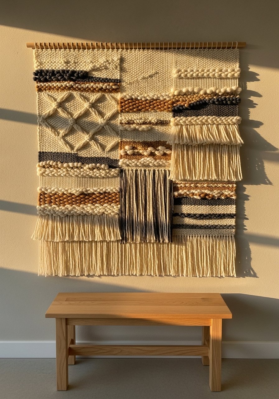
Textiles stop kitchens from sounding metaphorically hollow by adding actual texture. A 24×36-inch woven hanging over a narrow bench or bistro table softens the space and cuts echo. The usual mistake is hanging textiles too low. Keep the centerline at eye level, about 60-65 inches. I pair mine with the floating shelf idea for contrast. Handwoven wall hanging in cream and tan is often under $60 and feels more crafted than mass produced.
Statement Clock for a Functional Focal Point
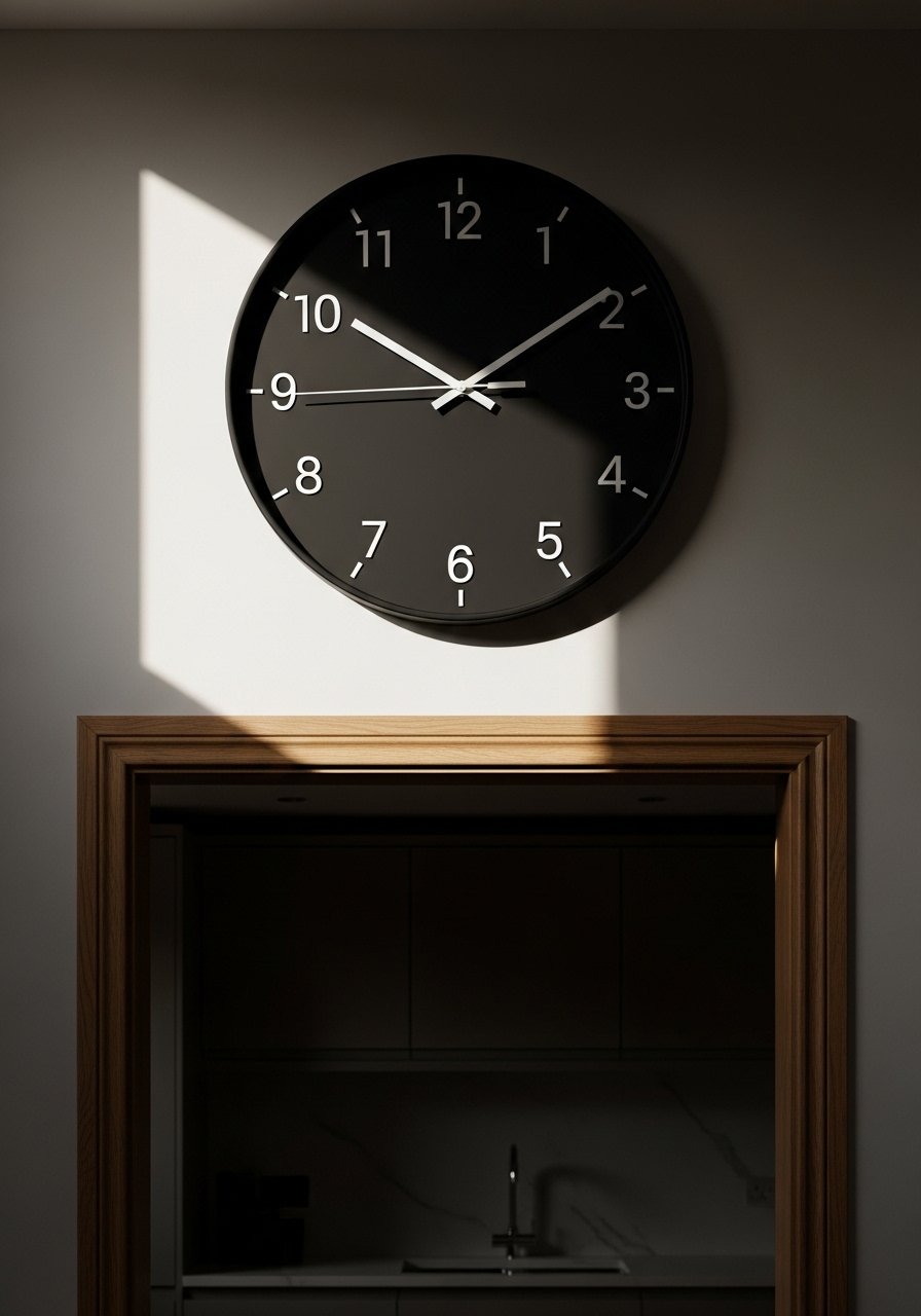
A large clock gives you instant scale and a focal point without fuss. Pick one about 20-24 inches for most kitchens so it reads from the stove and dining area. The mistake is buying a delicate clock that disappears. Go bold and matte. I use a clock that people comment on because it ties in metal finishes. 24-inch wall clock matte black is a simple swap with big visual return.
Repurposed Window Frame Mirror for Depth
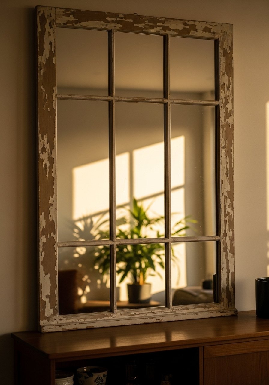
An old window frame with mirrored panes gives the illusion of a second window and bounces light into a dark corner. Aim for a frame the same width as the furniture below for balance. Many people hang mirrors too high. The bottom edge should be 4-6 inches above the counter or shelf. Rustic window-frame mirror feels collected and opens a tight kitchen without needing new windows.
Removable Wallpaper Panel for a Pop Behind Shelves
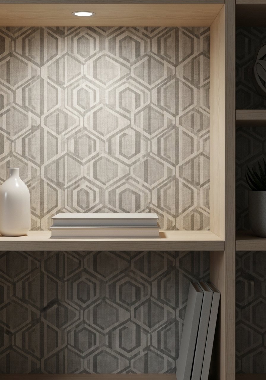
If you rent, a removable wallpaper panel makes a big statement without commitment. Cut a 24-36 inch vertical strip behind an open shelf run. Pick a pattern one or two shades darker than the wall so it reads as depth not contrast. People often paper the whole room and regret it. Keep it as a framed panel instead. Removable geometric wallpaper peel and stick comes in small rolls and is renter-friendly.
Rail with Hooks for Mugs and Towels
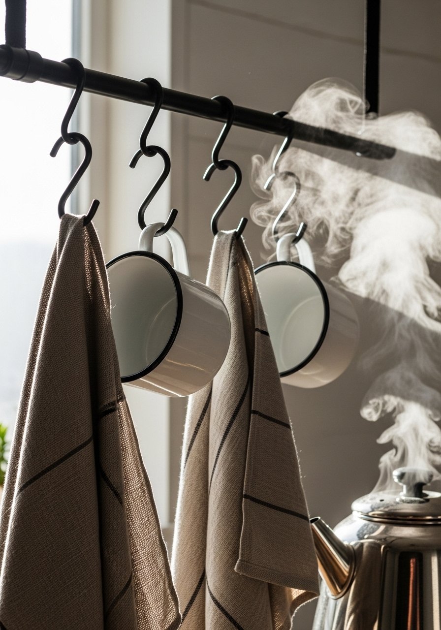
A simple rail installed 4-6 inches below upper cabinets keeps mugs and towels accessible and decorative. Use odd numbers of mugs for visual interest and stagger heights. A common error is hanging too many items so nothing stands out. Kitchen rail with S-hooks is a $15 fix that adds daily charm and frees countertop space.
Layered Mini Gallery for Kid-Friendly Walls
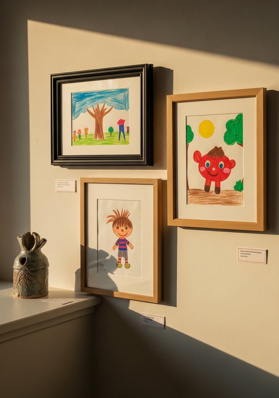
If you have kids, curate their art instead of covering the whole fridge. Use three small frames and rotate the work monthly. Keep mats consistent and frames 2-3 inches apart for a tidy look. Parents often default to magnets and chaos. A tidy mini gallery shows respect for the art and makes the kitchen feel lived in. Small museum-style frames set makes rotating pieces painless.
Under-Cabinet Accent Lighting for Wall Art
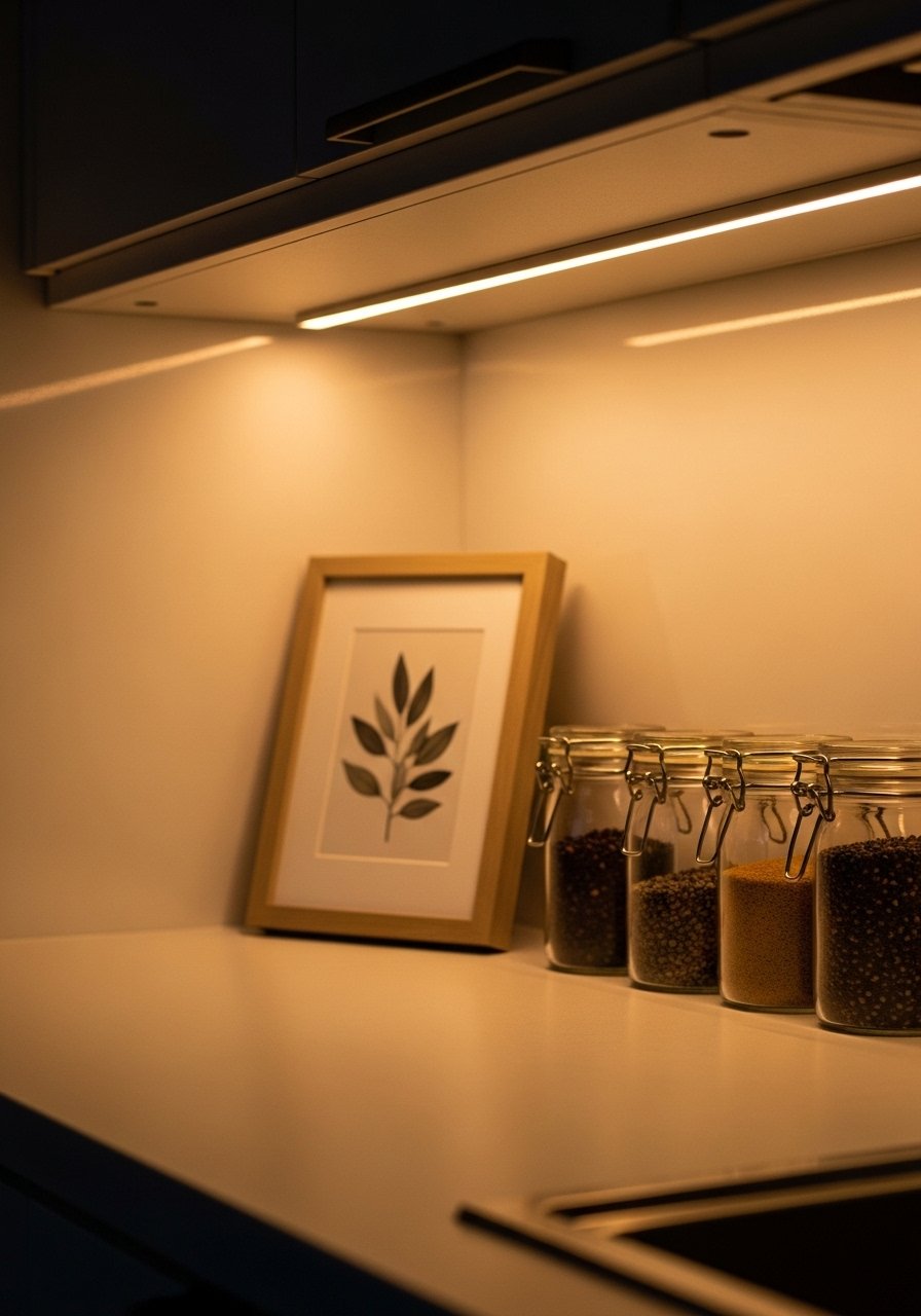
Task lights double as art lights. Install a slim LED strip under a cabinet to wash light down a small wall display. Use warm 2700K bulbs so ceramics and wood look rich. The mistake is using harsh white light which flattens color. Under-cabinet LED strip warm white is easy to hide and makes every wall grouping feel curated.
Mosaic Tile Panel as a Color Anchor
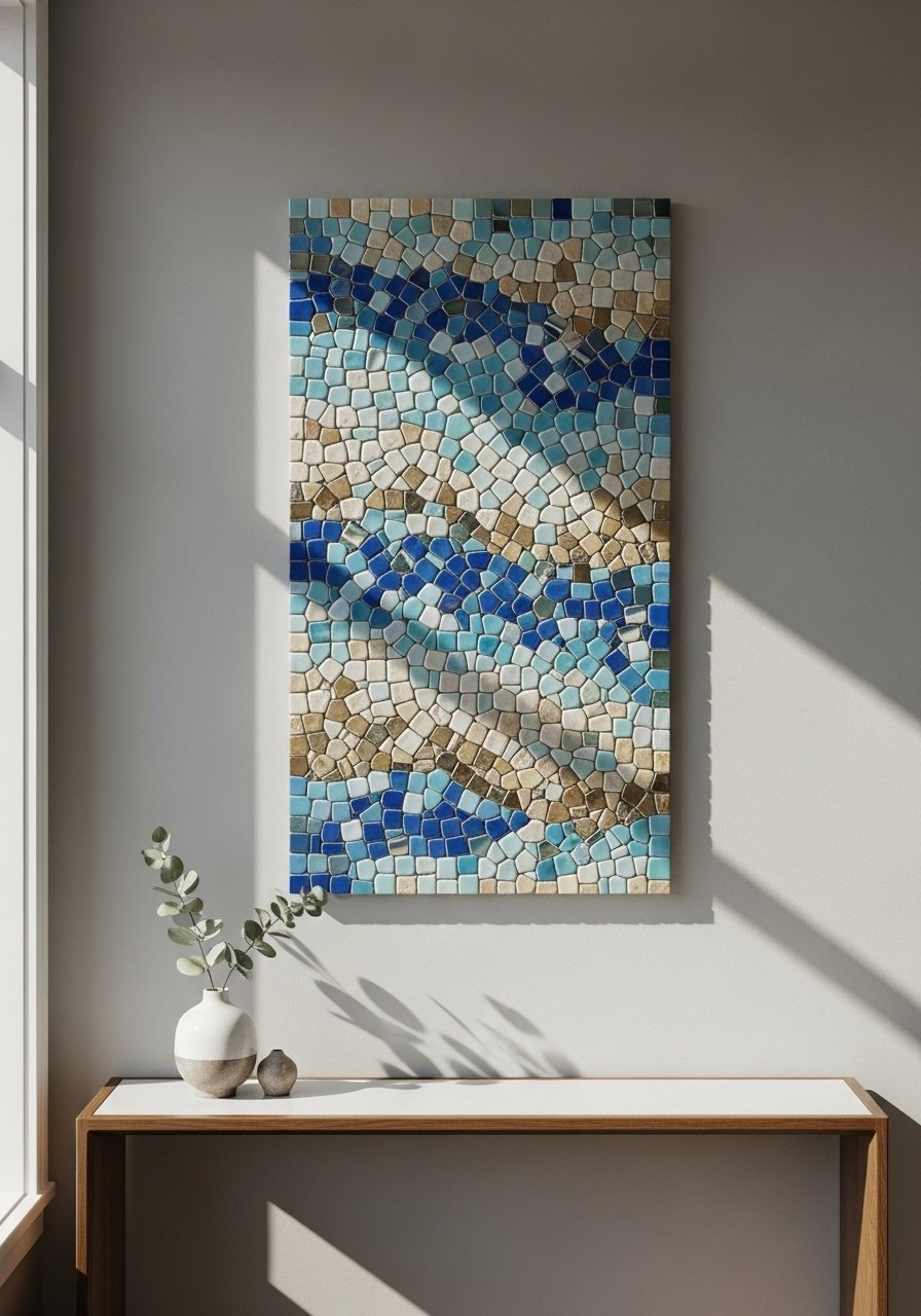
If you want color without commitment, mount a 12×24 inch mosaic tile panel framed in wood as wall art. This gives the effect of an accent backsplash without tiling the whole wall. Use grout color to tie into your palette. People often pick tiny tiles that read busy. Choose larger mosaic pieces and let them be the only pattern on that wall. 12×24 mosaic tile sample gives the look for under $50.
Your Decor Shopping List
Textiles
- I use handwoven wall hanging in cream and tan (24×36 inches). Softens echo and is under $60
- Linen tea towels, set of 4 in natural and slate for rotation
Wall Decor
- 5×7 black frames set for recipe cards, thin mats included
- Rustic window-frame mirror 30×20 inches, painted wood
Storage & Hooks
- Pegboard hooks and shelf set for modular storage
- Kitchen rail with S-hooks 24-inch rail
Lighting & Plants
- Under-cabinet LED strip warm white cut-to-fit
- Glass hanging herb planter with leather strap for a trio of herbs
Budget Finds
- Ceramic plate hangers pack under $10
- Magnetic spice tins set for a colorful grid
Shopping Tips
White oak beats dark wood in 2026. Design feeds have shifted completely. White oak floating shelves look current, not dated.
Grab pegboard hooks and shelf set for $20. Start small and add one shelf at a time so the wall never looks overworked.
Curtains should puddle or kiss the floor, never hang halfway up. Lightweight linen panels 96-inch are right if you want vertical drama near a dining nook.
Everyone buys five small succulents. One single 6-foot fiddle leaf fig faux tree has ten times the visual impact and zero watering anxiety.
If you are worried about drilling, use command picture hanging strips for lightweight frames and textiles. They hold surprisingly well and remove cleanly.
Frequently Asked Questions
Q: Can I mix rustic wood and modern metal in a kitchen wall display?
A: Yes. Mix textures and keep a consistent color ratio. Use an 80/20 rule where 80 percent of pieces are neutral woods or ceramics and 20 percent are metal or color. For example, pair a wooden cutting board with a matte black clock.
Q: What height should I hang art above a counter?
A: Aim for the centerline of art at about 60 inches from the floor. If it sits above a counter leave 4-6 inches of space between the bottom of the frame and the surface so it reads as separate from the work plane.
Q: How do I make a gallery wall feel cohesive in a small kitchen?
A: Use consistent matting or frame color and keep spacing tight at 2-3 inches. Rule of three still applies for odd groupings. Start with a centerpiece piece and arrange around it using paper templates on the wall first to avoid too many holes.
Q: Are removable wallpaper panels worth it in rentals?
A: Yes, especially if you cut a single 24-36 inch panel behind shelving or a coffee station. It gives pattern without commitment and is easy to remove without damage.
Q: My kitchen walls feel flat even with art. What am I missing?
A: Texture. Add a textile hanging or wooden boards and vary depths. My living room had nice furniture and decent lighting but it still felt like a waiting room. Took me embarrassingly long to figure out it was missing texture. Every surface was smooth, every color was flat, and nothing invited you to actually sit down.
Q: Should I go with real plants or faux for kitchen wall planters?
A: Both are fine. Use real herbs where you can water, and realistic faux options where light is poor. Real plants reward you with scent and use, faux plants reward you with zero maintenance.
