
I kept staring at one giant blank wall for months. I tried a single oversized print, then a crowded gallery of random prints, then a shelf with too many trinkets. Nothing felt right. It took a frustrating afternoon of taking everything down and starting over to see the real problem. I was mixing sizes, ignoring the wall's negative space, and hanging things at the wrong height.
What finally worked was thinking like I was editing a photo. Group things so the eye can rest. Give each piece room. Use texture to make the wall feel like part of the room, not an afterthought. I messed this up the first three times. The fourth try clicked.
Step 1: Find the right scale and anchor your arrangement
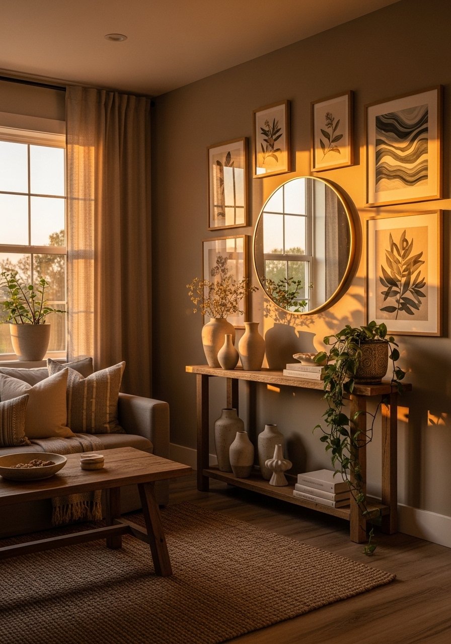
Lay art out on the floor first, same distance apart you plan to hang, so the scale feels right. For over-sofa groupings, aim for the artwork to take up about 60 to 75 percent of the sofa width. If you use a single large piece, keep the center of the frame 57 to 60 inches from the floor. Those numbers saved me after two bad attempts that looked either too tiny or like they were swallowing the room.
Common mistake: hanging based on wall size alone. Instead, anchor to the furniture below or the human eye line. The result feels grounded, not like the art is floating. The texture of a linen mat or matte frame will read differently in soft light, so test a few options before committing.
Step 2: Build a balanced composition with odd numbers and varied heights
Group objects in odd numbers, usually three or five, and stagger heights. I used to try even pairs because they felt safe. That made everything look formal and flat. Odd clusters feel natural and slightly relaxed. Keep at least 2 to 3 inches between frames, tighter only if the pieces are very small. Mix a tall item with something squat so the eye moves up and down.
A mistake I made was starting with the biggest item. Start with the piece that sets the emotional tone, not the scale. Then fill in with smaller companions. The ceramic vase in the foreground has weight in your hand, the woven basket has a rough texture, and those tactile differences make the wall feel layered.
Step 3: Add ledges and shelves for flexible layouts
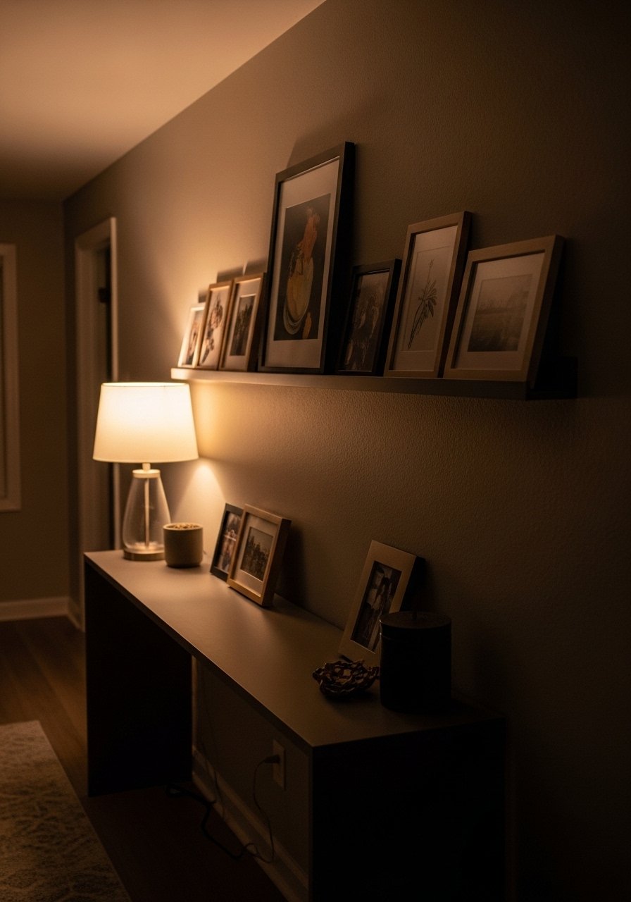
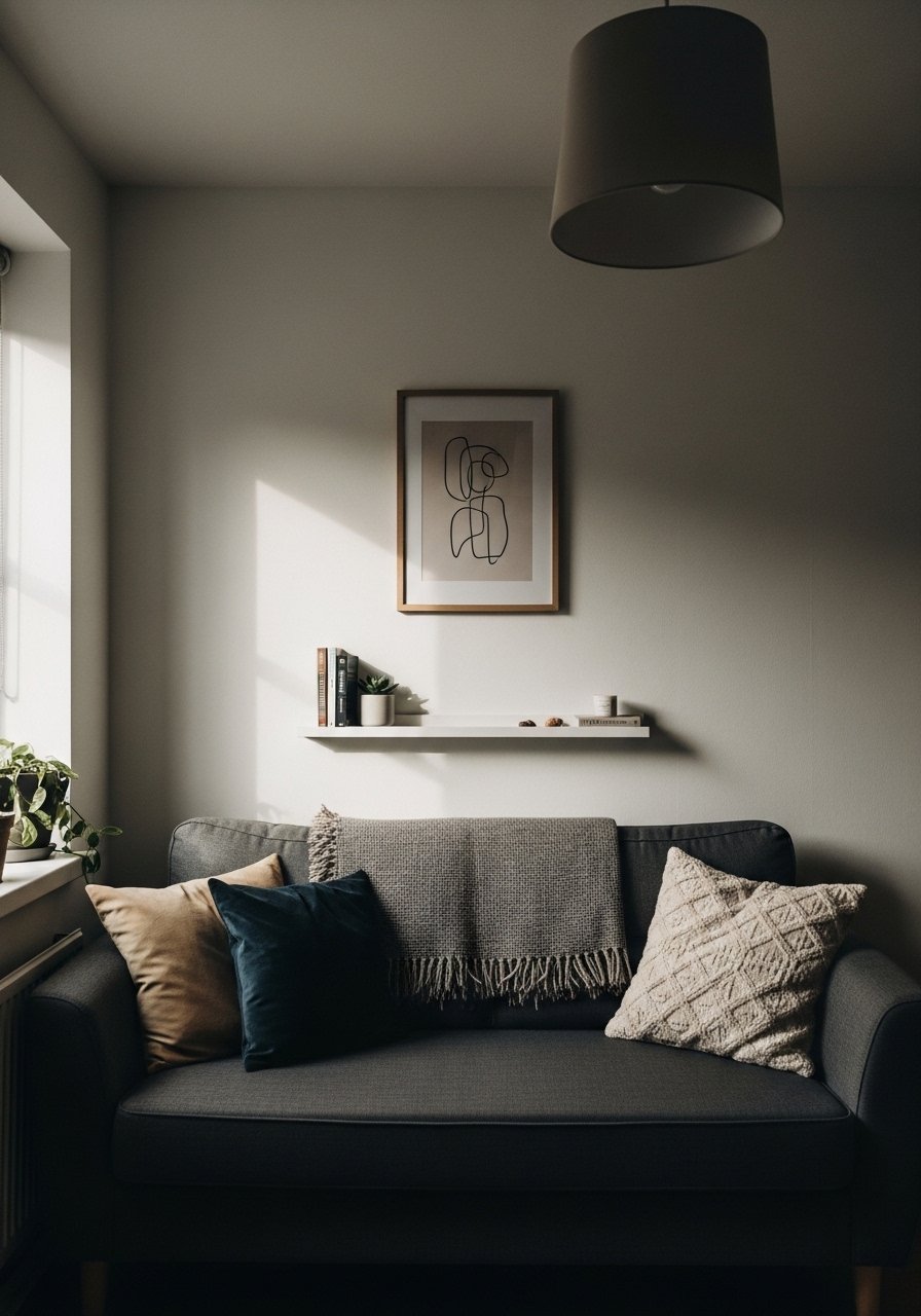
If you change your mind often, picture ledges are a lifesaver. I installed a 24-inch ledge and used it as a moving gallery. You can overlap frames, lean prints, and tuck a plant or a small sculpture in front. That overlap creates depth and keeps the wall from reading like framed wallpaper.
Common frustration: commitment fear. Shelves let you switch art without patching a dozen holes. Use a shallow ledge, 2 to 3 inches deep for frames, and keep heavier objects closer to the wall so they feel secure. I learned this after knocking a frame off the mantel twice in a week.
Try brass picture ledges, 24-inch ($18-30) for a simple, adjustable solution.
Step 4: Use texture and unexpected materials to tie the room together
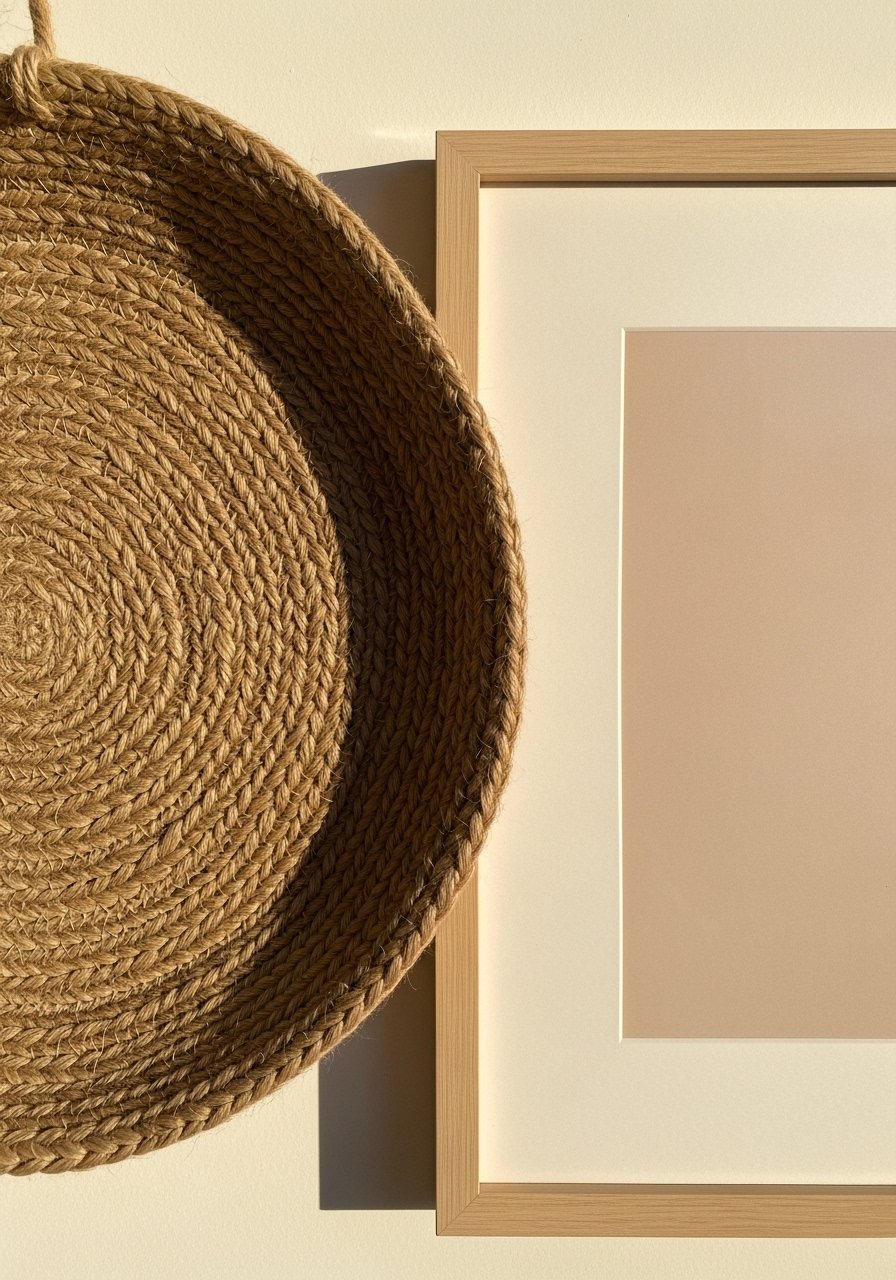
Paper and frames can feel flat. Break that with woven baskets, a small macrame, or a metal wall sculpture. The jute basket I added felt rough and a little rustic against the smooth matte frames. It picked up the rug and the throw, and suddenly the wall felt like it belonged to the room.
A mistake people make is matching materials too perfectly. Mix a cool, smooth ceramic with a nubby textile and a shiny metal to keep things interesting. One insight most skip is to repeat a material elsewhere in the room, like a brass hook or a ceramic vase on the console, so the eye reads the wall as part of a larger set.
Add height with a tall ceramic vase on the console. Ceramic vase set, matte white ($25-40) works well and feels heavier in the hand than it looks.
Step 5: Step back, live with it, and edit after a week
This part felt slow to me, but it is where good styling sticks. Put everything up, then walk away for at least a day. Live with the wall for a week. You'll notice things that bothered you in real life, like reflections at night or a frame that feels too low when you get up from the couch.
Common mistake: finishing and never revisiting. The living test shows what works with evening lamps, where your partner walks, and where the sun hits. After a week I swapped one print and moved a basket 4 inches left. Little edits make the whole thing calmer and more intentional.
Your Wall Decor Shopping List
- Brass picture ledges, 24-inch ($18-30). For flexible displays in Step 3, I keep one above my console.
- Gallery frame set, 11×14 black, pack of 6 ($35-55). Good mix of sizes for Steps 1 and 2.
- Woven wall baskets, set of 3, natural jute ($25-40). Texture for Step 4, similar options at HomeGoods.
- Ceramic vase set, matte white ($25-40). Adds height on consoles, used in Step 4.
- Adjustable picture hanging kit, 15-piece ($8-15). Use it for the exact 57-60 inch center height in Step 1.
- Framed art prints, assorted pack, 8×10 ($20-35). Easy swap for Step 5, budget-friendly.
- Small table lamp, linen shade, 14-inch ($30-60). Light affects how frames read, mentioned in Step 5.
- Rope plant hanger, natural cotton ($10-18). For adding living texture in Step 3, similar at Target.
Why Your Wall Arrangements Still Look Busy
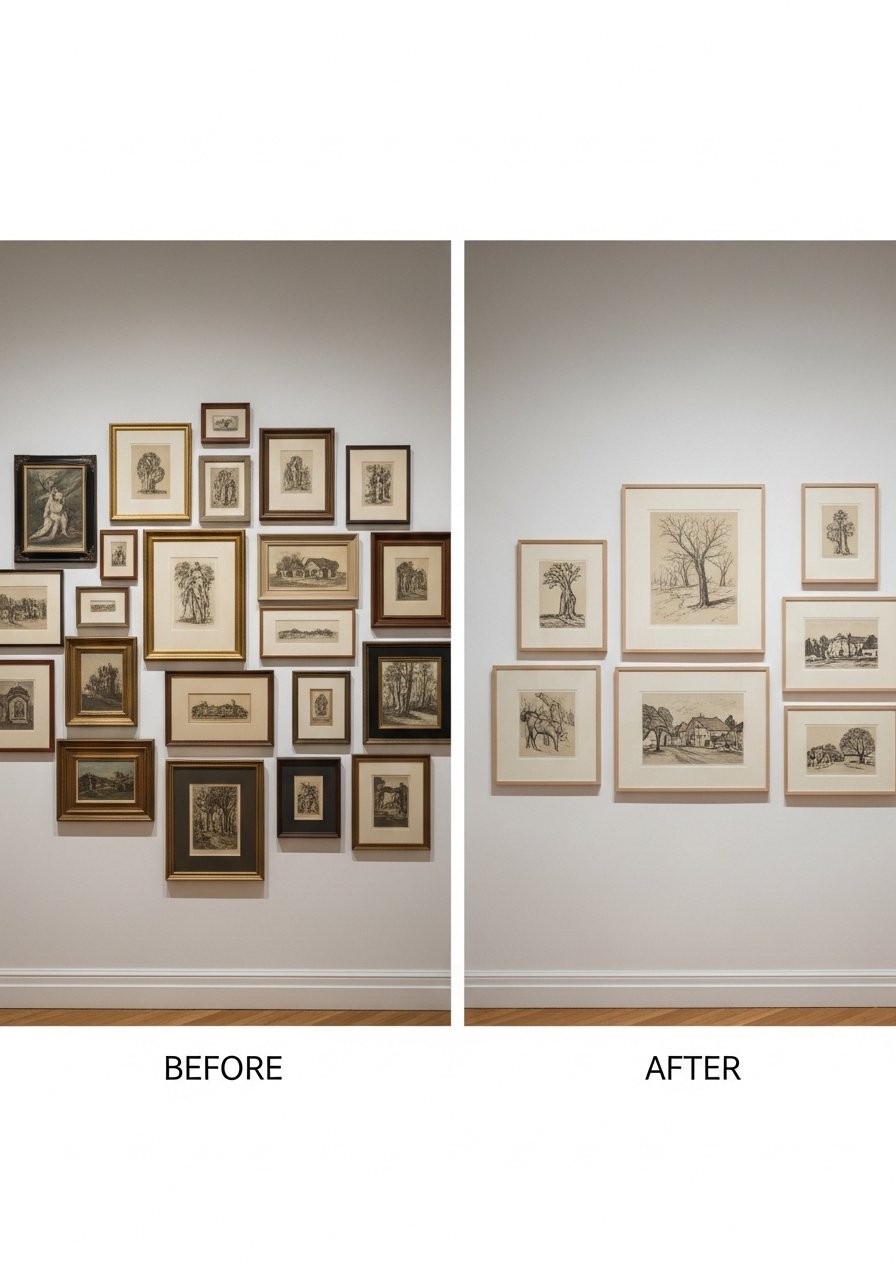
If your wall looks cluttered, it is probably missing three things: breathing room, a focal point, and material contrast. Edit by removing one or two pieces from the group, then view from the seat you use most. Make the focal piece the emotional center, not necessarily the biggest item.
Quick edits that work:
- Remove every second small print, then reassess.
- Add one tactile object, like a woven basket or a ceramic vase.
- Keep spacing consistent, 2 to 3 inches between frames for clusters, slightly wider for mixed objects.
I was stubborn about keeping every souvenir. Letting go helped more than any new purchase.
Making This Work in a Small Room
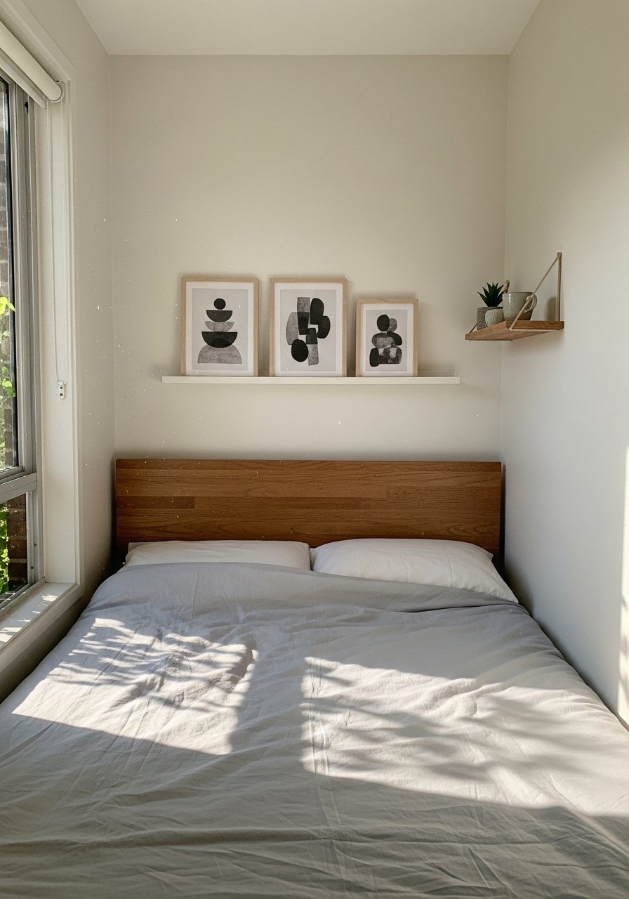
Small rooms need lighter scale and more negative space. Choose slimmer frames, reduce cluster size to three items, and position art so it does not compete with low ceilings. Instead of a 75 percent width guideline, aim for 50 to 60 percent above narrow furniture.
Tactics that helped me:
- Use vertical pieces to draw the eye up, making the ceiling feel higher.
- Swap heavy frames for simple black or white mats to keep weight visually low.
- Use a single ledge for rotateable art rather than a full gallery to limit visual noise.
Renters note: use command strips or a hanging kit designed for textured walls to avoid damage.
What This Looks Like After a Week with Kids and a Dog
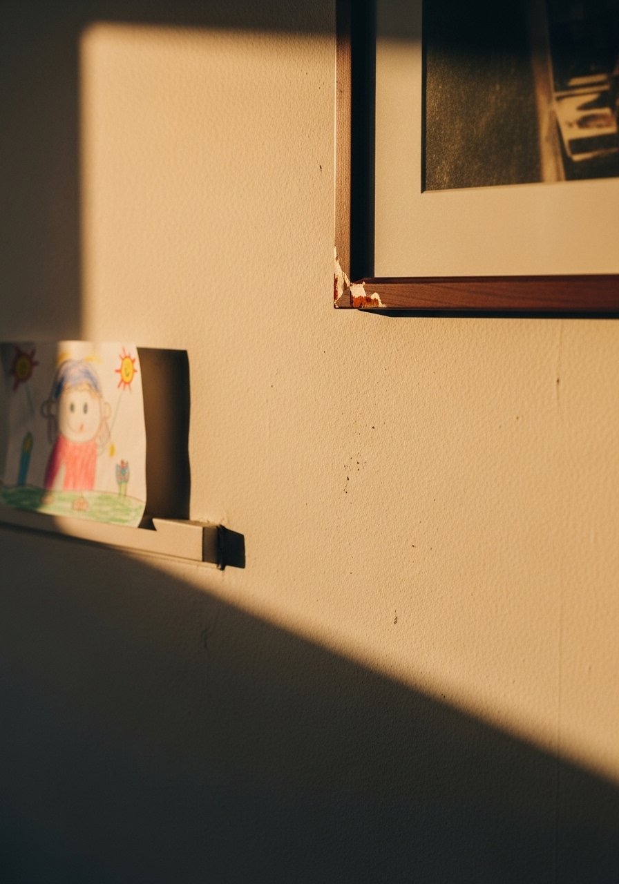
Reality will test your choices. My toddler colored a corner of a print, and the dog bumped a leaning frame once before learning his boundary. The ledge saved me because I could swap the drawing and re-center items in minutes. After a week, the wall should still feel intentional, not fragile.
Practical checks:
- Are light reflections distracting in evening lamps? If yes, swap to matte glass.
- Do lower pieces need wire or adhesive bumpers? Add them.
- Can you live with the textures you chose, like a nubby basket that catches dust? If not, adjust.
I almost skipped the living test step. Glad I did not.
Pick One Wall and Start There
Choose one wall and treat it like a practice canvas. Use the ledge from the shopping list for low-commitment swaps and follow the scale rules above. Start small, edit often, and give the layout a week of real life.
You will be surprised how much confidence a single wall gives you. After that, the rest of the room falls into place.
