
I kept changing one pillow and hoping the room would feel different. It did not. What I had was layers that were either crammed or sparse, never comfortably in between. I tried matching everything, centering art perfectly, and filling every shelf because empty space scared me. None of it worked.
What finally clicked was practicing a few small moves in the same order. I learned to place the big things first, add texture and odd-numbered groups, then edit like I was pruning a plant. It sounds simple. It was messy at first. My first attempt looked worse than before, but by the third try the room finally felt settled.
Step 1: Strip the room to see the skeleton
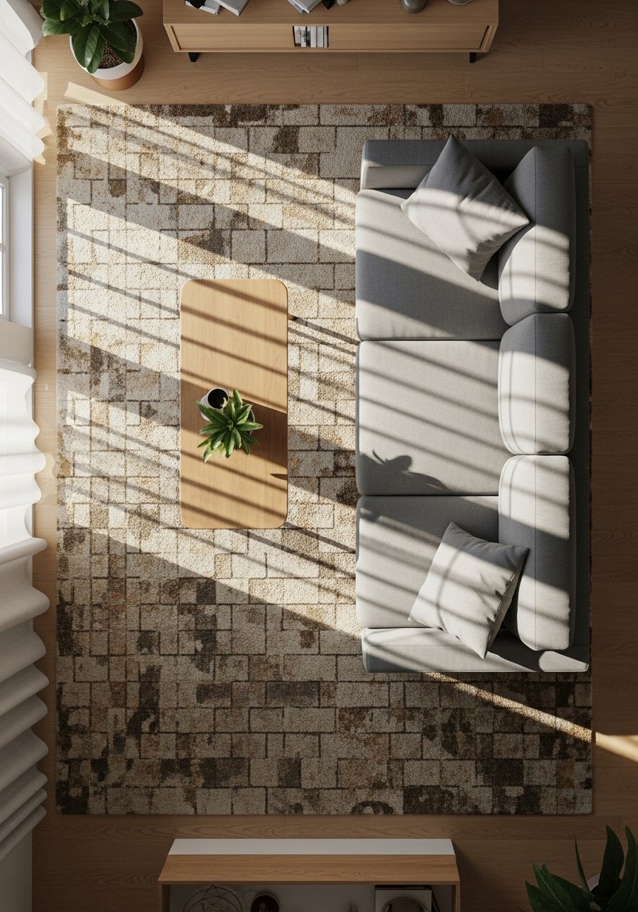
Pull furniture a few inches away from the walls and clear flat surfaces. You want to see the true proportions, not how things hide in corners. Lay down your rug and check that it anchors the seating, leaving about 16 to 24 inches of floor visible around the edges, or cover roughly 60 percent of the key seating area. The rug should feel grounding underfoot, coarse or nubby if it is jute, soft if it is wool. I used to skip this step and later regretted it. Without a clear base, everything else looks like decoration for decoration's sake.
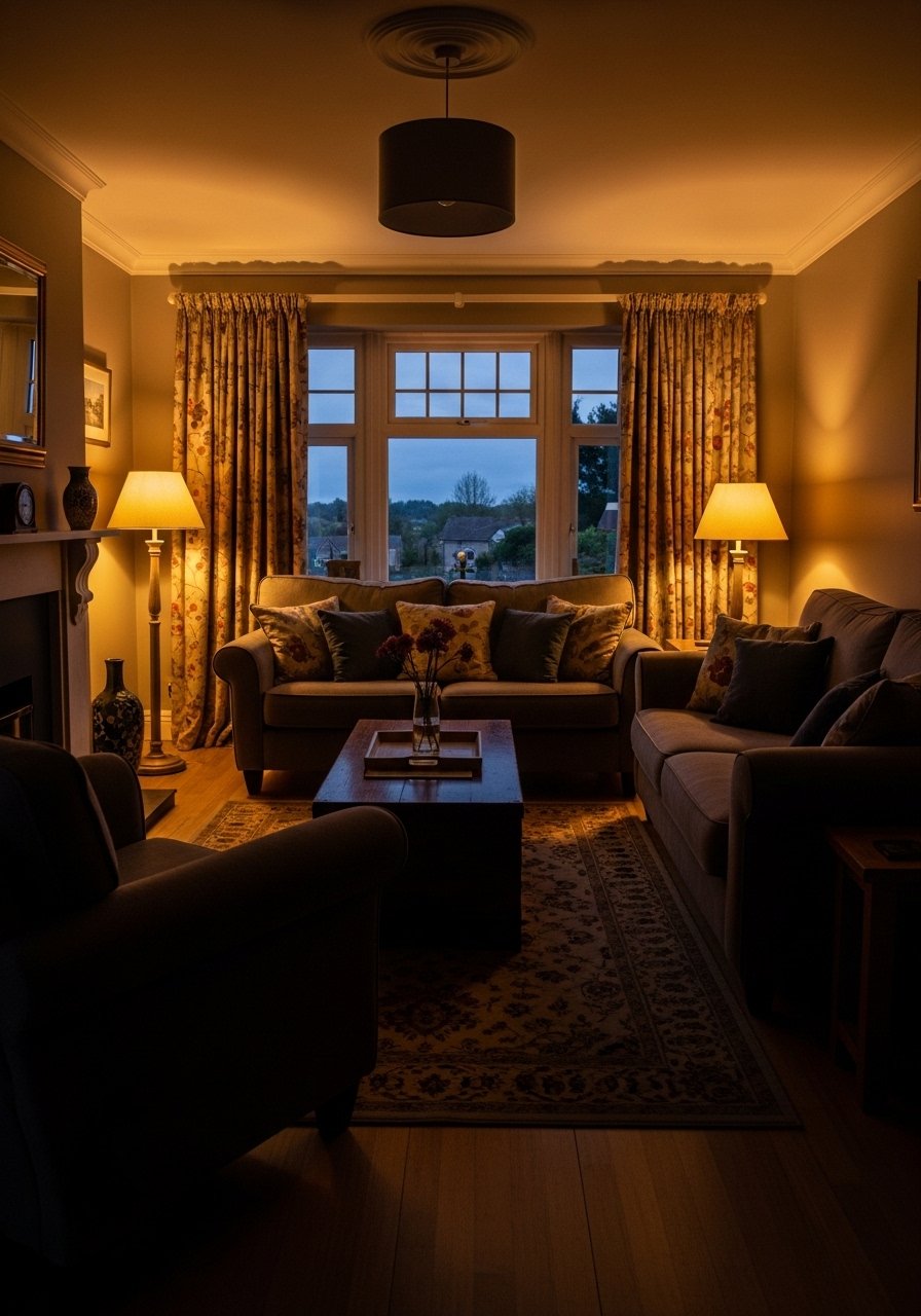
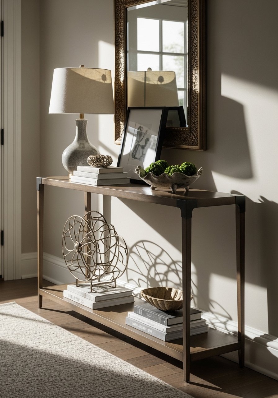
Step 2: Place the anchors, then the accents
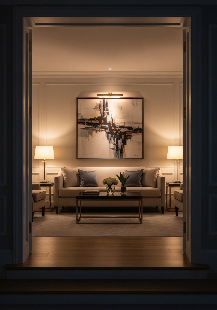
Hang large art or place a tall shelving unit before you touch accessories. Aim for your main artwork to be 6 to 8 inches above the sofa top, and about 60 to 70 percent of the sofa width. Those two measurements solved so many awkward proportions for me. Add a floor lamp or a tall plant on one side to create a 2:1 visual weight with the other side, rather than trying to mirror everything. My partner complained about asymmetry at first. Give it a week. He stopped mentioning it after he noticed how the light fell.
Step 3: Build texture and height in layers
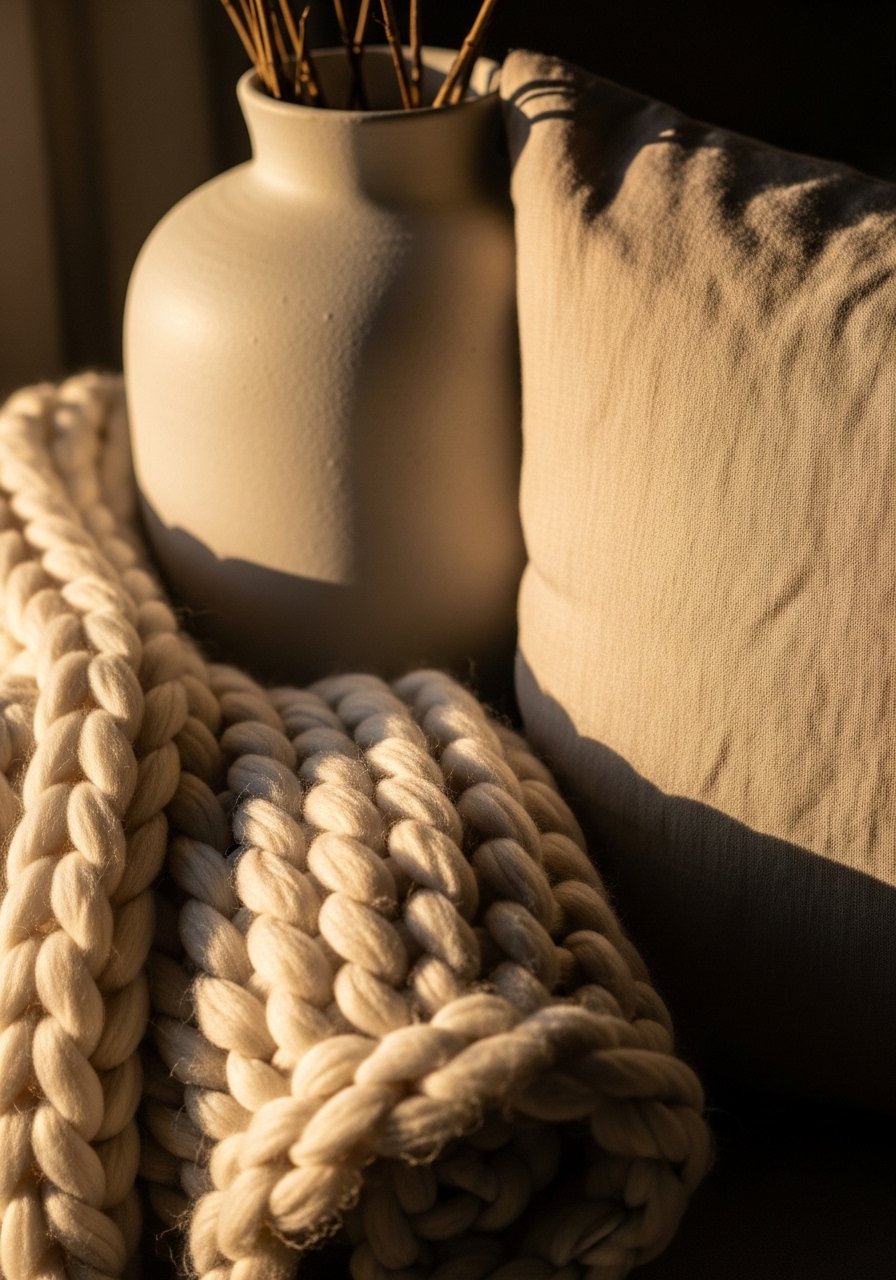
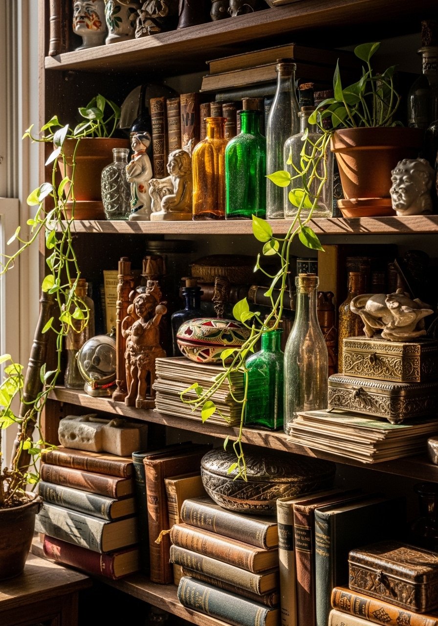
Layer textiles, art, and objects from low to high. Mix a chunky knit throw that is soft and heavy with a slubby linen pillow that is cool to the touch. For tabletop or shelf vignettes, group 3 to 5 objects and vary heights, aiming for a tallest, a middle, and a low item. A matte ceramic vase feels pleasantly cool and solid in your hands, and a woven basket adds an earthy weight. I once put everything the same height and it read flat and boring. Don't be shy about texture, but avoid repeating the same material three times in a row.
Step 4: Edit, breathe, then edit again
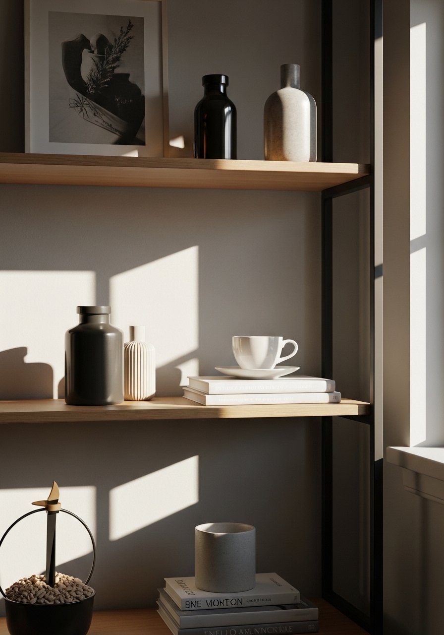
This is where people stall because it feels like subtraction after all that effort. Step back, leave the room for 10 minutes, come back, and you will suddenly notice what is too much. Leave 2 to 3 inches between small objects on a shelf so each piece can be read. One common mistake is fear of empty space. Negative space is what lets the layered pieces read as intentional, not clutter. I almost skipped this part on a weekend refresh and then spent an afternoon fixing a shelf that looked crowded.
Step 5: Live with it and make tiny changes weekly
You are not done the moment it looks good in a photo. Sit on the sofa, walk past the shelves, and notice what interrupts your eye. Swap a pillow for a firmer one if the seat feels unbalanced. Replace a vase with a shorter bowl if you keep knocking things over. I moved a coffee table accessory three times before it stopped getting bumped. Small, deliberate changes over a week are better than one big surgical swap.
What to Grab for a Layered Living Room
Jute area rug, 8×10 ($90-160). Neutral base for Step 1.
Modern art print, 30×40 framed ($35-90). Use this for Step 2, keep it 6 to 8 inches above seating.
Chunky knit throw in oatmeal, 50×60 ($40-65). Cozy hand-feel, used in Step 3 and Step 5.
Set of linen throw pillows, 18×18, sage and cream ($30-55). Texture for Step 3.
Ceramic vase set, matte white, varies 8-12 inches ($25-40). For height groupings in Step 3.
Brass picture ledges, 24-inch ($18-30). Helpful for Step 2 when you want easy art swaps.
Woven storage basket, medium, natural ($25-45). Adds weight and hides clutter, used in Step 4.
Floor lamp, arched, brass finish ($60-140). Anchors a corner in Step 2. Similar options available at Target.
Why Your Layers Look Crowded After Styling
You probably added too many small things at once. People think more small objects equal more interest. It usually reads as busy. Try removing half the smallest items, then step back. Another issue is uniform height. If everything sits at the same level the arrangement reads flat. Break it up with a tall vase or stacked books. Finally, check color balance. A simple 60-30-10 split of dominant, secondary, and accent colors helps the eye settle on a focal point.
Making This Work in a Small Room
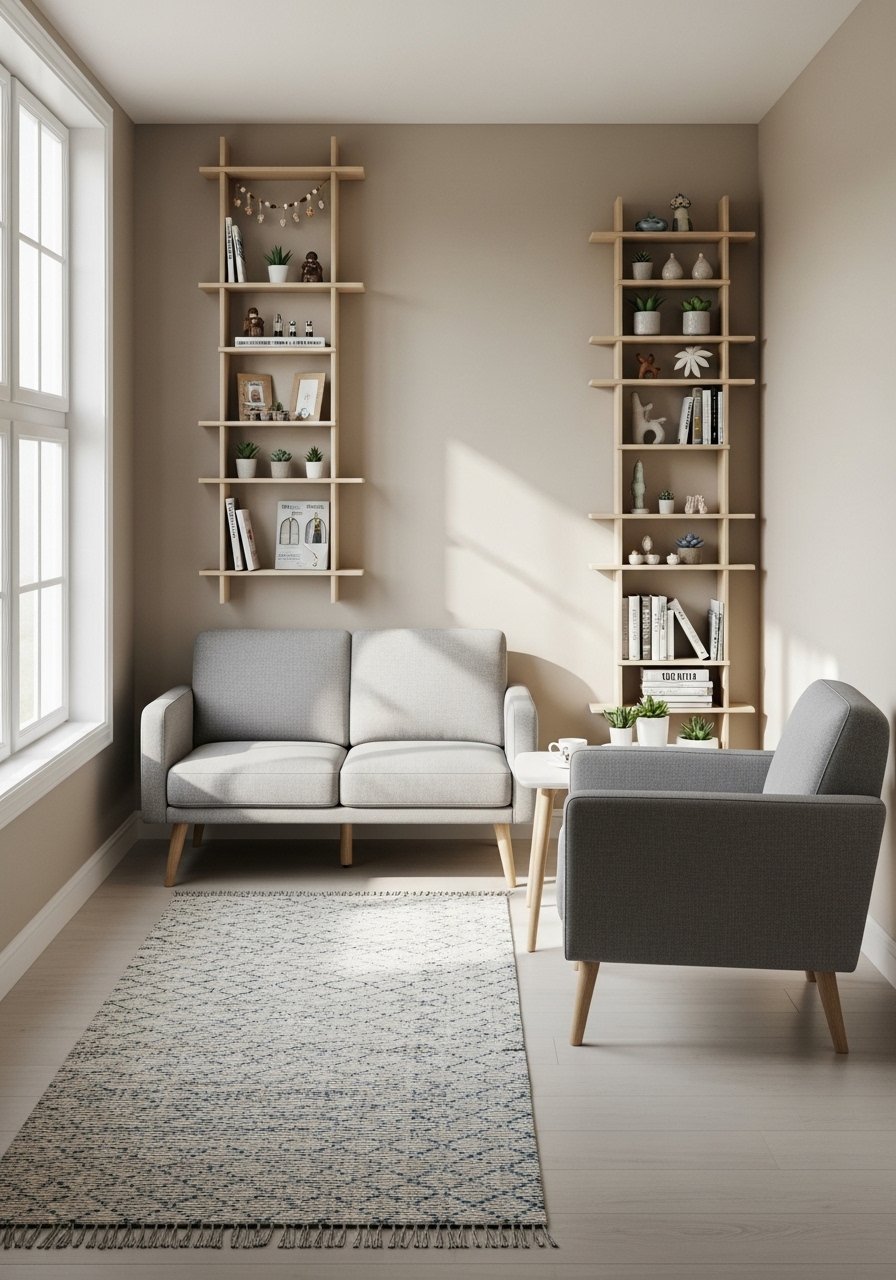
Scale is the main trick. Use a rug that fits the seating area rather than the whole room. Choose shelves with shallower depth so objects do not stick out and create visual clutter. Opt for one taller piece like a slim floor lamp instead of two bulky lamps. If you have low ceilings, keep larger textures lower on the walls and use vertical lines to draw the eye up. A woven ladder for throws can add texture without taking up extra floor space.
What It Looks Like After a Week with Kids and a Dog
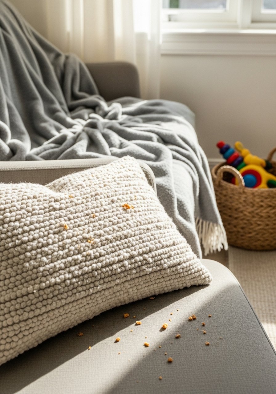
Layered rooms in real life collect small evidence of living. A chunky knit throw will trap crumbs. Boucle looks great but shows pet hair. Plan for maintenance by keeping a basket for toys and a lint roller in a nearby drawer. After a week I often move one accessory from a low table to a higher shelf to avoid spills. The goal is a room that survives daily life with minor adjustments, not one that needs a full restyle each month.
Start with One Surface
Pick one surface and complete the full process there. Anchor it, add texture and height, edit, then live with it for a week. If you are unsure, start with a console or a single shelf and try the 3 to 5 object grouping rule. You will gain confidence quickly and the rest of the room will follow more easily once one area feels right.
