Staring at a bare wall can make the whole room feel unfinished and cold. I used to push furniture against it and call it done.
Photos fix that. Figuring out how to make family pictures look intentional without the wall feeling busy is frustrating. I learned a few simple rules that add warmth and balance.
How to Decorate a Room With Photos Like a Gallery Wall
This is the method I use every time a room feels unfinished. You’ll learn how to pick one anchor piece, create a unifying thread, and place the cluster so the room reads calm and lived-in. The result leans organic modern with an earthy, personal feel.
What You'll Need
- Neutral mixed-size picture frame set, white and oak, assorted sizes (~$50–120)
- Oversized photo canvas print, 30×40 matte finish (~$80–200)
- Slim black frame set, 8×10 and 11×14 (~$40–80)
- Large round mirror, 30-inch, warm brass edge (~$60–150)
- Floating picture ledge, 36-inch natural wood (~$25–70)
- Tone-on-tone landscape photo print set, sepia/cream palette (~$30–90)
- Faux succulent trio with tray for styling shelves (~$20–50)
- Timber 16×20 frame in oak finish (~$40–100)
Step 1: Pick one oversized anchor photo
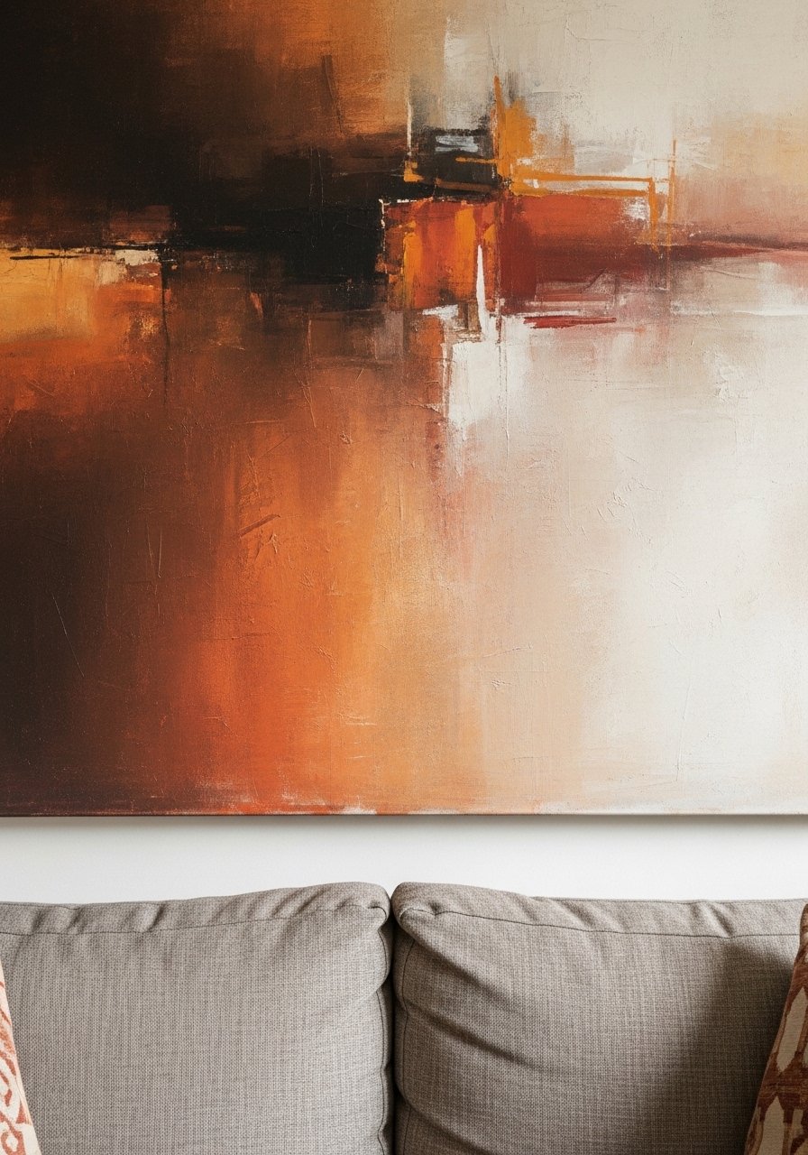
I start with one big photo that sets the mood. For me that’s usually a 30×40 canvas with warm, earthy tones or a landscape. It becomes the room’s focal point and tells the eye where to land.
Visually, the anchor makes the rest feel deliberate instead of scattershot. A common miss is thinking you need many small pictures first—scale matters more. Avoid hanging the main piece too high; it should feel connected to the furniture below.
Step 2: Choose a unifying thread
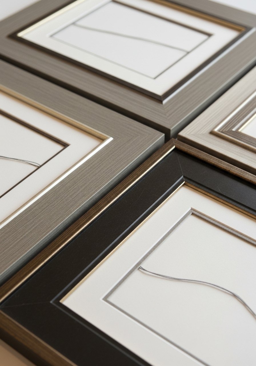
Next I decide on one thing that ties everything together—same frame color, a consistent mat, or an earthy palette. I like neutral frames with a timber accent because they feel calm and cozy.
This single rule keeps an eclectic set cohesive. People often try to match every frame exactly; that’s fine but rigid. The mistake is mixing too many finishes—limit it to two to keep the wall feeling intentional rather than cluttered.
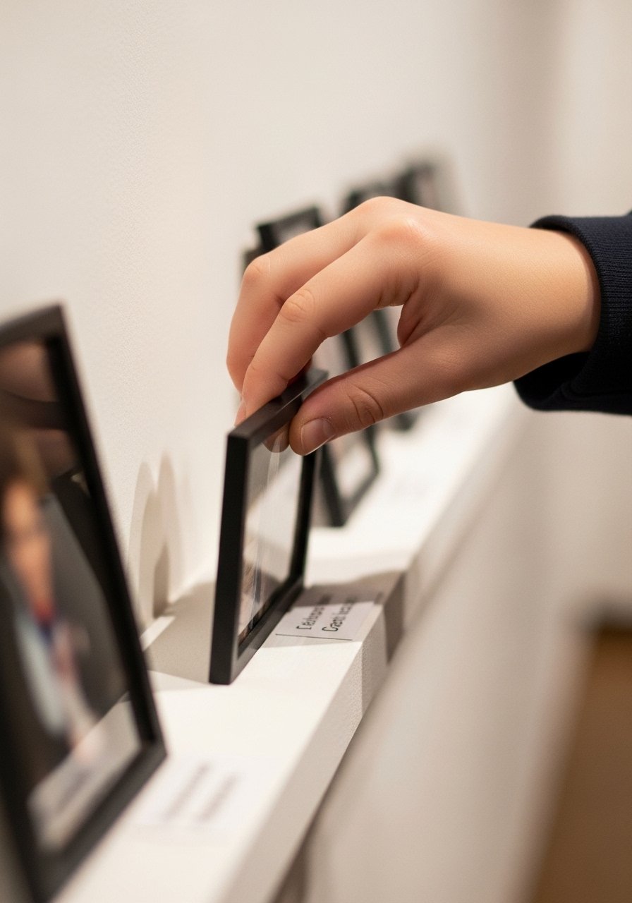
Step 3: Lay the arrangement out visually
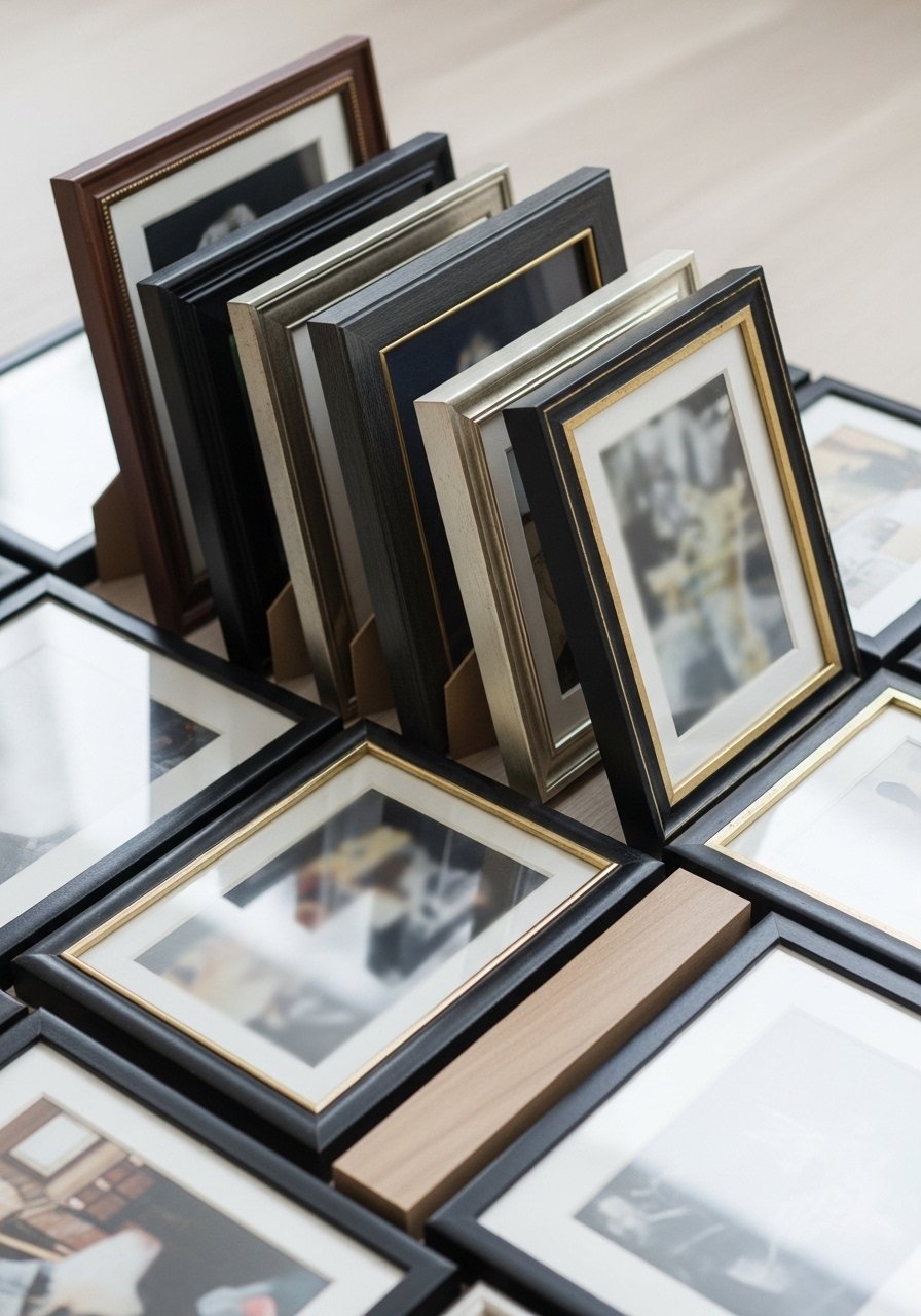
I arrange the frames on the floor or use thick paper templates on the wall so I can see the flow. I aim for odd-numbered groups and mix sizes—one large, two medium, a couple small—so the composition feels natural.
What changes is the rhythm across the wall; you stop seeing isolated frames and start seeing a single piece. One insight I learned: small gaps matter more than perfect symmetry. Avoid a rigid grid unless you want a formal editorial look.
Step 4: Anchor the cluster to furniture and sightlines
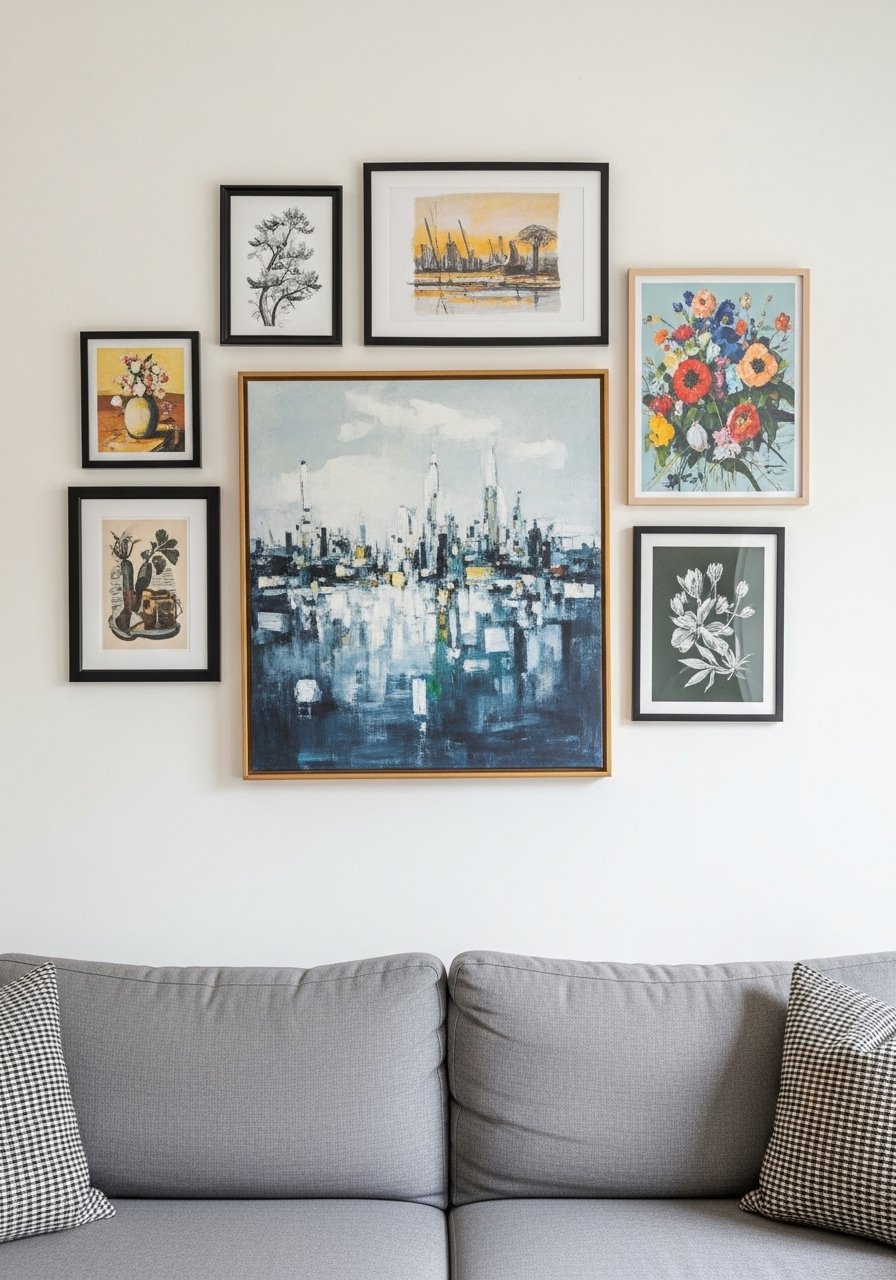
I always relate the gallery to something in the room—usually the sofa, console, or a mantel. The cluster should feel like it belongs to that furniture piece, not floating above it.
Visually this ties the wall into the room’s scale and makes the arrangement read balanced. People often hang art at arbitrary heights; instead, think about eye line and the furniture below. Don’t make the gallery wider than the piece of furniture it’s over.
Step 5: Add breathing room and a secondary element
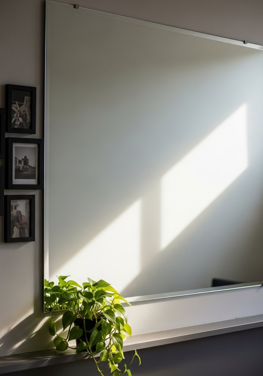
I add negative space—a mirror, a floating ledge, or a single empty frame—so the wall can breathe. A mirror doubles light, which is a small trick that makes compact galleries feel airy.
This shift softens the cluster and creates contrast. I used a large round mirror once and the whole wall felt bigger. Avoid crowding the ledge with too many objects; one plant and a low frame are often enough.
Step 6: Live with it and rotate thoughtfully
Once it’s up, I live with the gallery for a few weeks before changing anything. Rotating one piece or swapping a photo with a tone-on-tone print refreshes the mood without starting over.
This helps the wall evolve with your life. A mistake is over-tweaking—constant changes make the display feel unsettled. Small swaps, like introducing a sepia landscape or a retro family print, are all you need to shift the room’s feeling.
Common mistakes and how to fix them
I see the same missteps a lot. First, people cram everything into a tight rectangle. Fix: give each frame breathing room and vary sizes. Second, too many frame finishes. Fix: choose one dominant finish and one accent finish.
Quick checklist:
- Cut back on matching too much—aim for cohesion, not uniformity.
- If the gallery feels heavy, add a mirror or lighter-toned print.
- If you’re unsure, remove one piece; empty space can be intentional.
How to adapt the look for small rooms or renters
In a small room, scale down the anchor but keep the principle: one focal photo and smaller supporting frames. I often use a 20×30 canvas or a gallery ledge that doubles as storage.
For renters, use damage-free hooks and a ledge so you don’t need many holes. Bulky frames are replaceable—try tone-on-tone prints that read calm and keep the overall palette warm and grounded.
Practical swaps:
- Use a 24-inch mirror instead of a large canvas to reflect light.
- Lean frames on a shelf rather than hanging to avoid nails.
Budget swaps and easy updates
You don’t need designer dollars. Start with an affordable canvas print as your anchor and mix in thrifted frames painted to match. I’ve paired a $30 sepia print with nicer frames and it reads intentional.
Ideas I use:
- Swap photos seasonally—one or two changes refresh the wall.
- Paint thrifted frames in a single color for cohesion.
- Add small faux plants for a biophilic touch without maintenance.
Final Thoughts
Start with one big photo and one simple rule—same frame color or an earthy palette. Small, deliberate choices make the whole room feel lived-in and calm.
If you want a low-commitment start, try an oversized canvas print above a sofa. It anchors everything else and makes the rest of the styling easy.
