
My living room had nice furniture and decent lighting but it still felt like a waiting room. Took me embarrassingly long to figure out it was missing texture. Every surface was smooth, every color was flat, and nothing invited you to actually sit down.
These looks lean eclectic with warm-earth and jewel-toned pops. Most ideas land under $300, with a few splurges around $500. They work for living rooms, bedrooms, dining nooks, or any spot that needs personality without a full renovation.
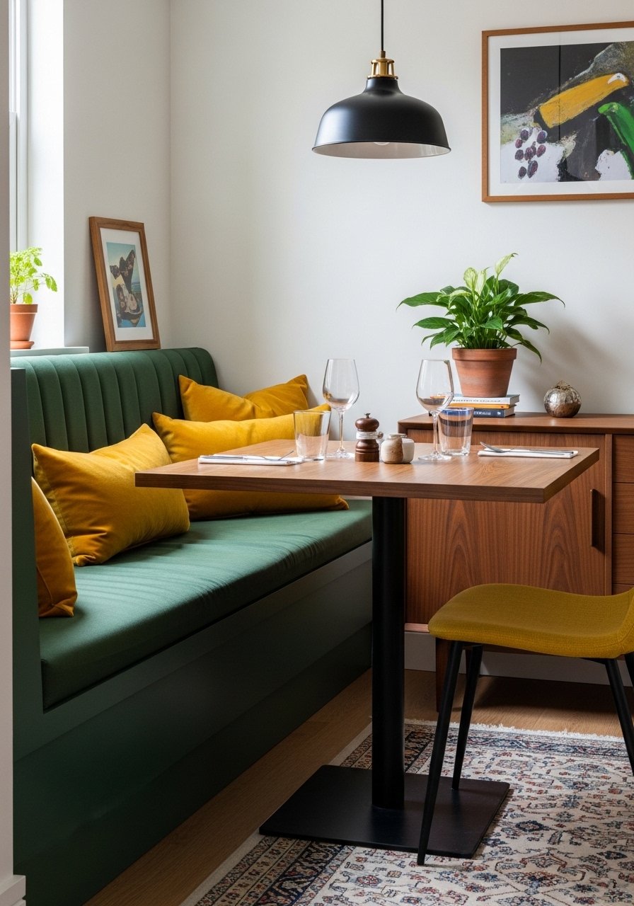
Palm Springs Tropical Punch Living Room
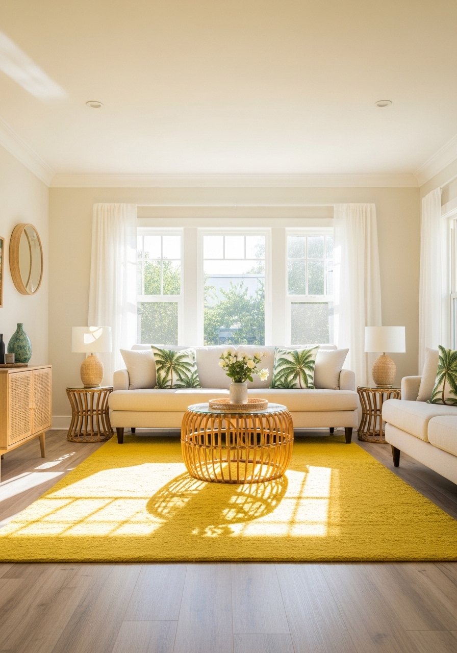
The citrine rug starts this whole Palm Springs vibe, which is why I say rug-first palettes work. Pull two colors from the rug and keep the rest neutral. I used a citrine woven rug as the anchor, then added white linen curtains and palm green pillows. Most folks blending styles hit at least three eras in one room. That is fine if one item ties everything. A common mistake is too many competing patterns. Stick to three patterns max and make sure one color repeats across them to calm the chaos.
Jewel-Toned Rug Buildout On Ivory Base
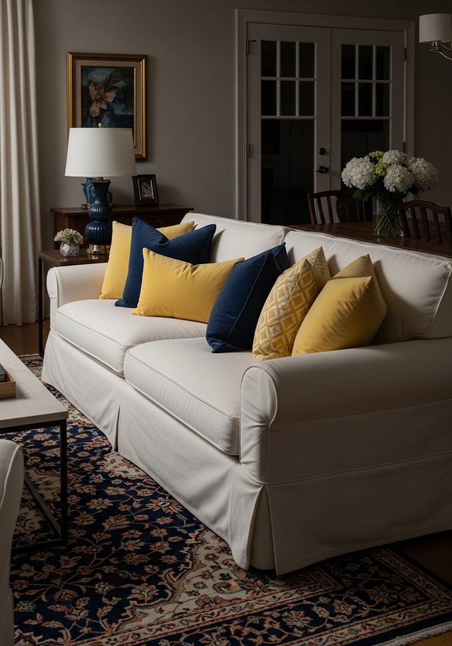
I bought a jewel-pattern rug first and made everything else answer it. The rug dictated sapphire and canary accents, so curtains, pillows, and a single art piece followed. If your room looks cheap after spending money, try swapping to velvet pillow covers in a jewel tone like these velvet pillow covers. Rule to use here is 60/40 neutral-to-accent. Too much bold everywhere makes the room shout. For renters, use tension rods and ivory panels so you get the look without drilling.
Rusty Desert Earth Layers Bedroom
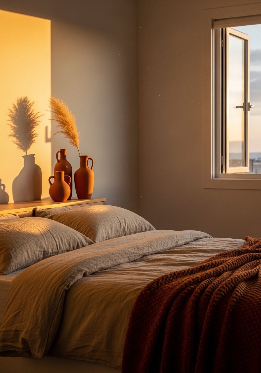
If your bedroom feels flat, warm earth tones will fix it. I layered sandy beige bedding at 60 percent of the surface and let terracotta and sienna do the rest. A cheap switch that made the biggest difference was swapping one pillow for a down-filled 22-inch linen pillow and a terracotta vase on the nightstand. For durability with pets, pick performance-linen pillow covers instead of delicate velvet. One mistake is treating terracotta as an accent when it should function as a secondary base in smaller rooms. Scale matters, especially with rugs in tight spaces.
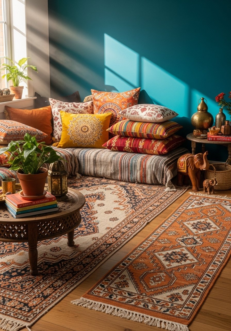
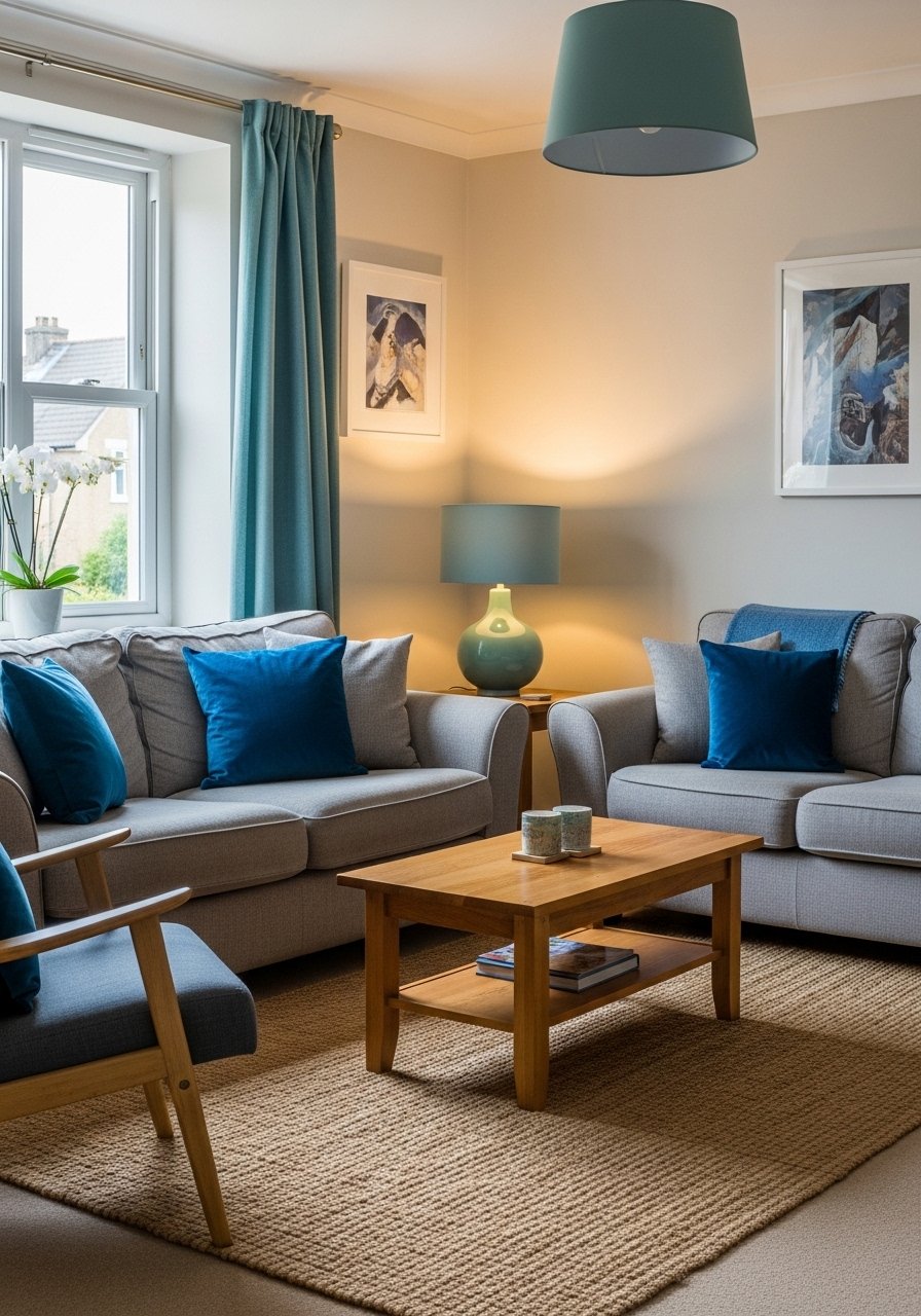
Boho Teal Black Fuchsia Lounge
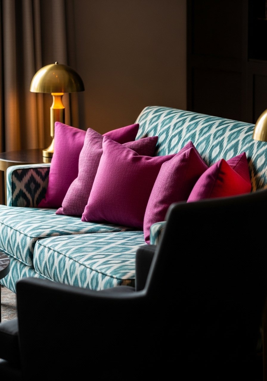
Black grounds neonish fuchsia and teal, so don’t be scared to use it. I mixed teal ikat pillows with a matte black chair and a few brass accents like this brass finish cabinet hardware to bring coherence. The like-temperature rule applies here; teal and fuchsia read as warm-cool hybrids, so pick one dominant temperature. People often overdo pattern here. Limit prints to three, tie them with one shared color, and the room reads intentional, not frantic. Swap chrome for brass if you want a softer boho edge.
Golden Yellow And Forest Green Dining Nook
My dining nook felt off until I added a walnut side table and a forest green banquette. Golden yellow cushions pop without feeling trendy because wood tones ground them. Use a 60/40 rule with a warm base and yellow accents for small spaces. I grabbed a forest green velvet pillow and a walnut candle tray to echo the table. A misstep is using too many bright accessories. One strong yellow item per seat is plenty. This combo works in dining nooks and small kitchens that need personality without chaos.
Vintage Chesterfield With Boho Pillows
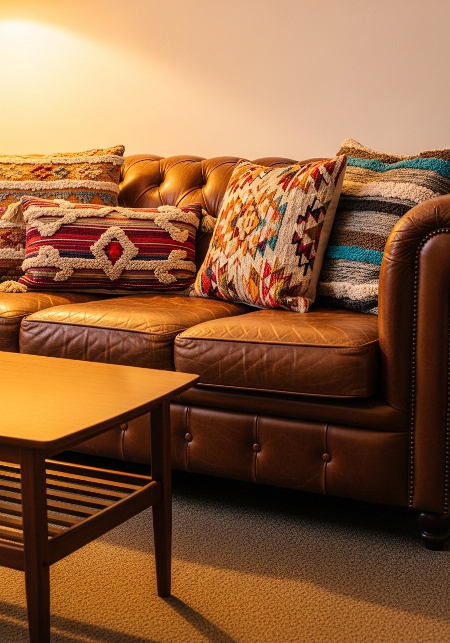
I fell in love with a secondhand Chesterfield and rescued it from looking dated by piling on boho pillows. Old-new pairings spark conversation because the textures contrast. I used a mix of linen and patterned pillows, including these paisley pillow covers. The common mistake is matching antiques to antiques. Use one true vintage piece and surround it with modern legs-on furniture to keep the room feeling lived-in, not like a set. If pets are in the house, pick wipeable leather treatments and put felt pads under legs.
Fiery Orange Feature Wall Entry
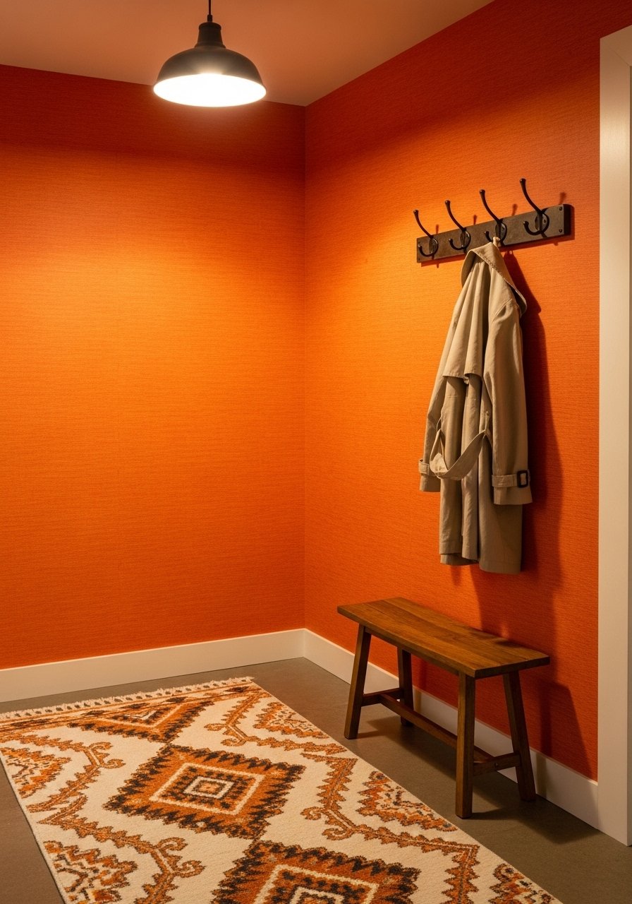
Painting one wall a fiery orange felt risky until I realized feature walls let me test bold color without commitment. I used peel-and-stick wallpaper so I could remove it in a rental. A mistake is painting all four walls and then wondering why the room feels smaller. Keep three neutral walls and let textiles reference the orange. I paired this with an ikat runner and neutral storage baskets. If lighting is cool, warm neutrals help keep the orange from looking flat. Try a sample panel first and live with it for a week.
Monochrome Blues Reading Nook
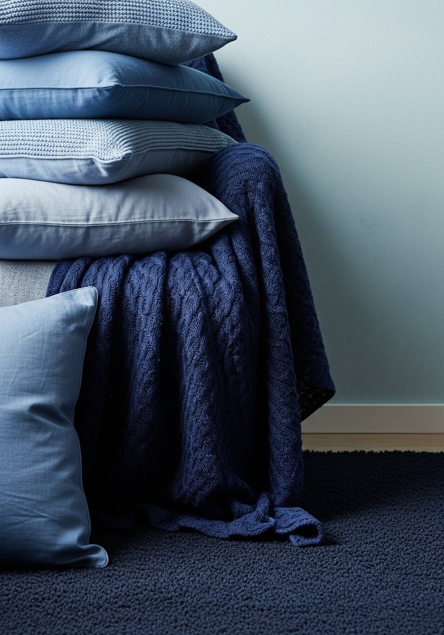
A tone-on-tone blue nook hides dust and looks cohesive in a busy household. Start with pale blue walls and layer deeper blues in throws and a navy area rug. My trick was mixing textures, like wool, velvet, and a kilim pillow, so the monochrome scheme never reads flat. People often fear monotone will be boring. It is not if you play with texture and pattern in the same color family. Over half go warm tones now for that lived-in feel, so add a warm lamp to avoid an icy vibe.
Cacao Ochre Neutrals With Greenery
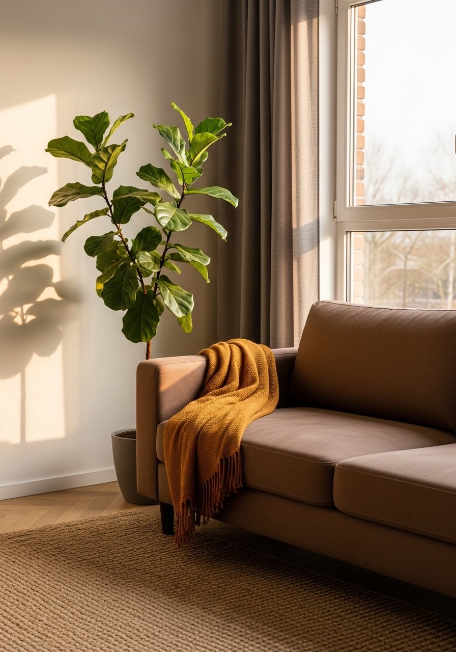
Cacao and ochre make a room feel like it has been lived in for years, not staged last weekend. I paired a cacao sofa with ochre cushions and added one large plant for contrast. One single tall plant has more impact than five small succulents. For a real-life durable look use a tan jute rug that hides wear. The photo-vs-reality note is that jewel tones can wash out in north light. If that happens, warm up the base with ochre or add a warmer bulb.
Art Deco Geometric With Midcentury Lines
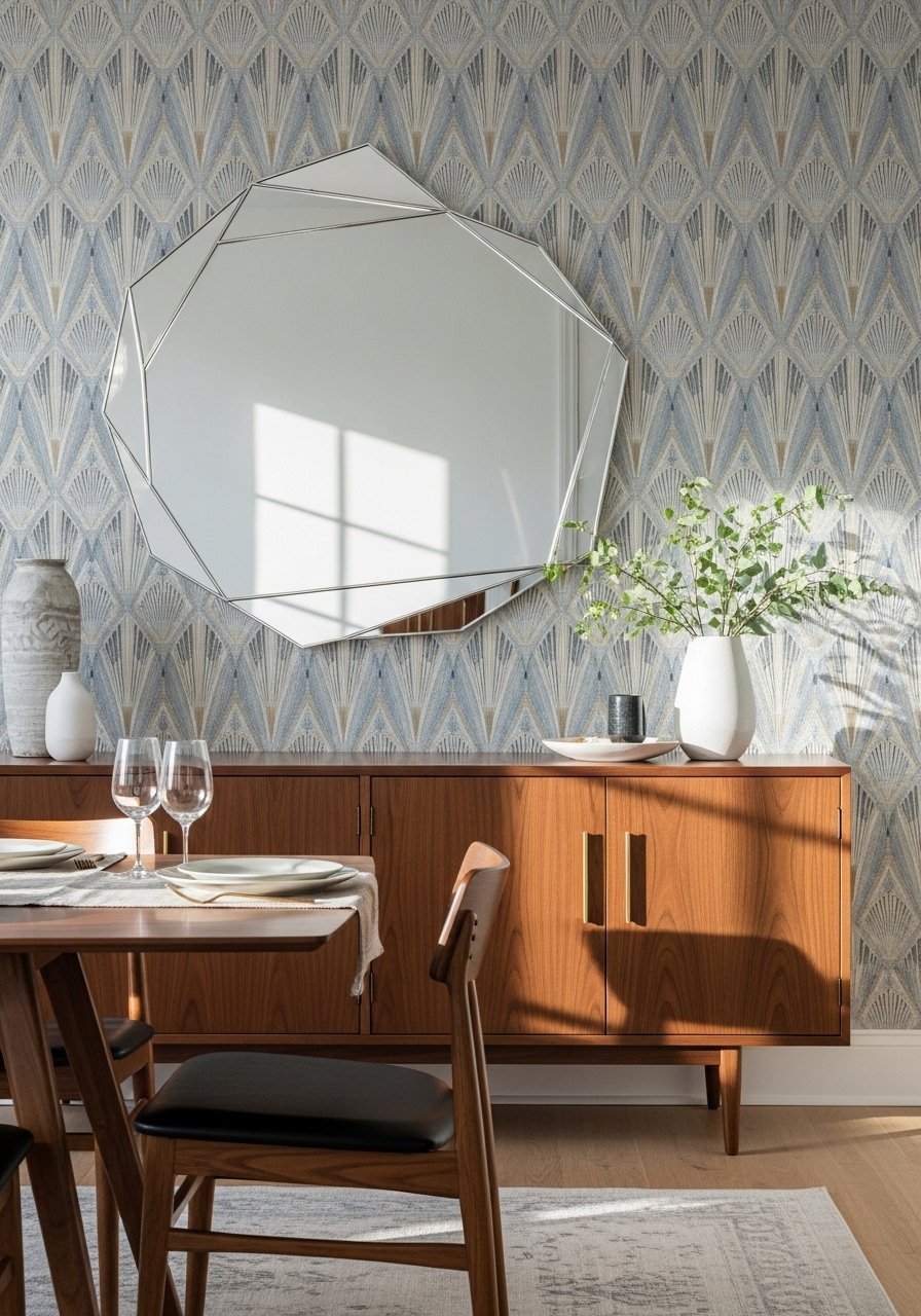
Mixing art deco wallpaper with midcentury furniture gave my dining corner the romance it needed without antique hunting. The geometric accent wall pulls color from the upholstery and makes the whole set feel intentional. I used peelable wallpaper and matched one metal from the wall art to metal pulls like these mixed finish drawer pulls. A common mistake is heavy wallpaper everywhere. One wall is enough. Use walnut or teak furniture to warm the metallics and keep the look modern yet nostalgic.
Turquoise Wall With Paisley-Geometric Mix
A turquoise wall felt scary until I limited patterns and tied them with a single palette. I painted one wall deep turquoise and used paisley and geometric fabrics that all carried a common sand color. The pattern rule saved me: three patterns max and at least one shared hue. I swapped fragile ceramics for a turquoise ceramic lamp to add height and color without clutter. For renters, use a sample pot and test its look in both day and night light. It reads very different depending on the bulb.
Coral Beige With Cactus Corner
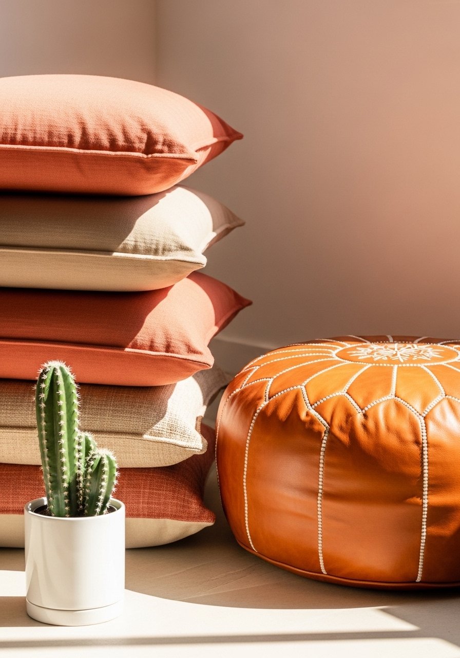
Coral-plus-beige felt fresh in my sunniest corner. The green of a cactus cuts through beige boredom and gives the palette a California edge. I used a cognac leather pouf to add warmth and a practical place to rest feet. A lot of people add color but forget texture. Try leather, linen, and a woven rug to avoid a flat look. For small apartments, scale down accessories but keep one large plant for impact. That single statement plant trick is underrated.
Sapphire Aquamarine On Tan Base
Sapphire and aquamarine feel luxe when you anchor them to a tan base. I moved an aquamarine glass lamp near the sofa and swapped in sapphire pillows. The contrast reads expensive without spending a ton. I recommend a aquamarine glass lamp because a single glass piece bounces light in a way fabric cannot. Petite rooms need the tan base to stop jewel tones from overwhelming. Jewel pops show up in most room refreshes lately, so use them sparingly and intentionally.
Muted Sage Gallery Wall Hallway
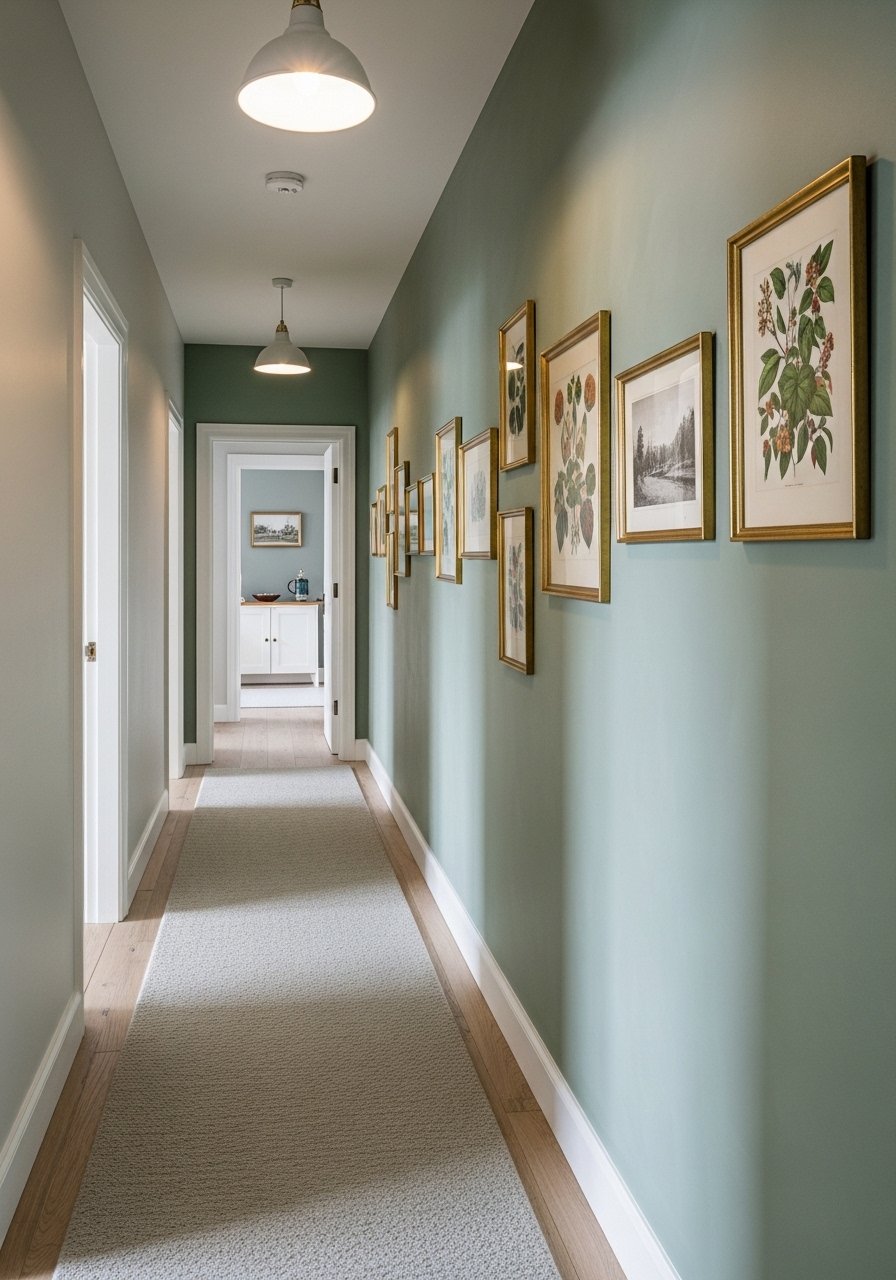
Painting one wall sage turned my hallway into a proper display area for vintage finds. Muted sage is better than stark white for showing off brass frames and older artwork. I used small brass frames and a long picture ledge like these brass picture ledges so I could swap art without new holes. A typical mistake is hanging art too high. Keep the center of the piece at eye level. For renters, a sage sample pot plus command strips is all you need to test the effect.
Patterned Rug First Studio Layout
In my studio, a patterned rug defined zones and made the whole space read as a single cohesive room. Start with the rug and pull three colors from it for pillows, a lamp, and a throw. I used a washable patterned rug so cleanup is realistic and not aspirational. A common error is buying a rug that is too small. For a studio, choose at least 5×8 but aim larger if furniture allows. I picked a washable patterned rug and it saved me from staining panic.
Your Decor Shopping List
- Honestly the best $40 I have spent. Velvet pillow covers, set of 4 in two colors for a layered look. 22-inch, down-filled option recommended
- For feature walls and renters, peel-and-stick wallpaper panels (~$30-60 per roll). Pick one accent wall only
- For the curtain trick, 96-inch linen curtain panels (~$30-50 per panel). Hang high and wide
- Citrine woven rug 8×10 for anchoring a Palm Springs palette
- Tan jute rug 8×10 for earthy bases. Similar at Target and HomeGoods
- Brass picture ledges set (~$18-30). Great for swapping prints, no extra holes
- Cognac leather pouf (~$70-150) for warmth and a casual footrest
- Aquamarine glass lamp with linen shade (~$60-120) for jewel tone bounce
- Washable patterned rug 5×8 for small homes and real life
- Forest green velvet pillow cover 20×20 for that golden-yellow pairing
Shopping Tips
- White oak beats dark wood in 2026. Design feeds have shifted completely. White oak floating shelves look current, not dated.
- Grab velvet pillow covers for $12 each. Swap them every few months and the whole room feels different.
- Curtains should puddle or kiss the floor, never hang halfway up. 96-inch linen panels are right for standard 9-foot ceilings.
- One single tall plant has ten times the visual impact of five small succulents. Try a 6-foot artificial fiddle leaf fig if you need height with zero maintenance.
- For high-traffic homes and pets, choose washable textiles. Machine-washable throw blankets save time and keep color vibrant.
Frequently Asked Questions
Q: Can I mix boho textiles with modern furniture without it looking messy?
A: Yes. Use one vintage or textured piece and surround it with modern silhouettes. Limit patterns to three and pick one color that repeats across them. That shared color is what keeps a room from looking like a flea market.
Q: What size area rug do I actually need for a living room?
A: Bigger than you think. For a standard living room go 8×10 minimum so at least the front legs of sofas and chairs sit on it. In small rooms choose the largest rug that still leaves a small border of floor.
Q: How do I stop bold colors from washing out in my north-facing room?
A: Add a warm base like ochre or cacao and use warm-toned bulbs. A warm lamp or an ochre cushion will keep jewel tones from looking flat under cool light.
Q: Can renters get these looks without painting walls?
A: Yes. Use peel-and-stick wallpaper, sample pots, tension rods for curtains, and picture ledges for art. Focus on textiles and a rug-first palette since those do most of the visual work.
Q: Should I match metals or mix them?
A: Mix them. Pick one dominant finish and let smaller pieces vary. I use brass pulls, a bronze lamp, and a couple of chrome frames and it looks intentional rather than chaotic.
Q: How do I make small spaces feel bold without overwhelming them?
A: Anchor the room with a rug and choose two or three colors from it. Keep 60 percent of surfaces neutral and reserve 40 percent for accents. Scale down decor but keep one large item, like a tall plant or a statement lamp, for impact.
