
Spent $400 on a coffee table and the room still read empty. Swapped in three pastel items on the shelves and suddenly it felt like someone actually lives here. I learned fast that pastel shelf decor is less about every piece matching and more about scale, texture, and a tiny rule I use now: 60/30/10 for color balance on the shelf itself.
These ideas lean modern cottage and soft Scandinavian. Most projects keep to under $50 per piece with a few $100 splurges for statement vases. They work best on living room shelves, entry consoles, or bedroom ledges where you want a gentle pop without shouting.
Soft Pastel Book Stack With Ceramic Accent, Living Room
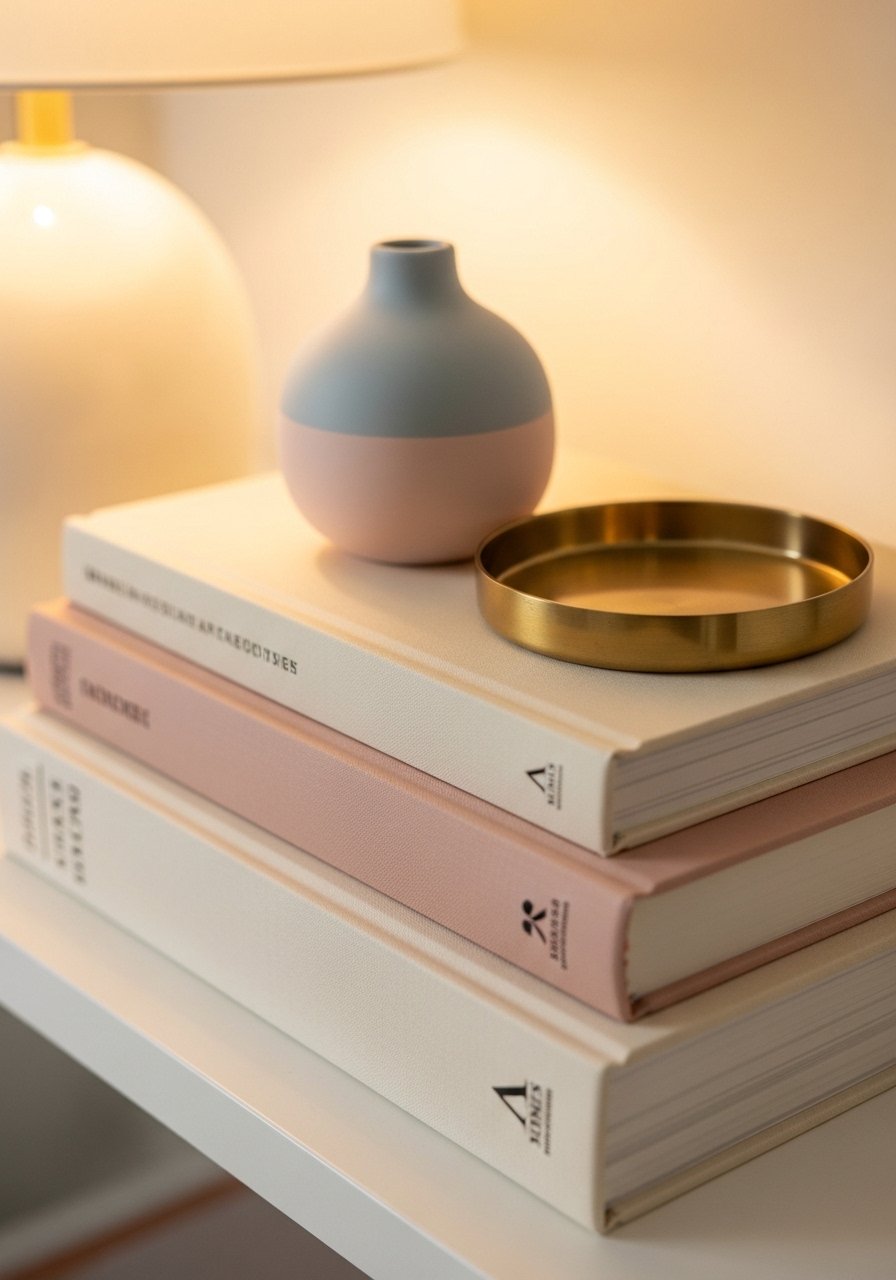
Stack books horizontally to make a little pedestal for a pastel ceramic vase. I use a 2:1 ratio, two stacks to one vase, to keep the shelf from feeling too fussy. It visually anchors that shelf section and gives you an excuse to rotate books by color. I like a matte finish so the pastels read soft under lamp light. One common mistake is putting three tiny items on a wide shelf and losing scale. Try a 5-7 inch vase for standard shelves. I picked a blush ceramic vase I linked below and it cost less than $30, which felt way better than buying a matching lamp.
Layered Pastel Textiles On Open Shelving, Cozy Living Room
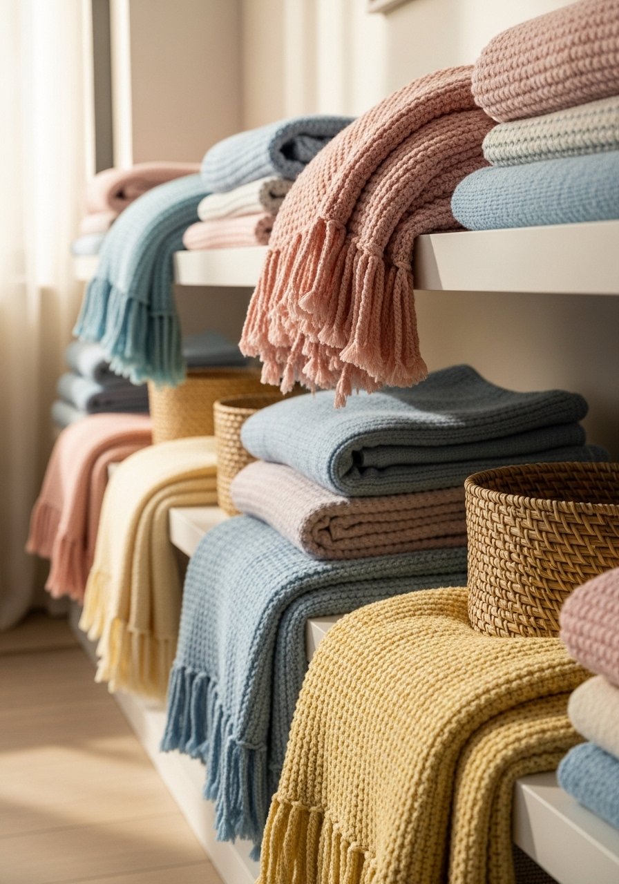
Folded textiles on a shelf add weight and a human touch. I keep one linen throw in soft mint and one chunky knit in pale peach, folded to the same height so the eye rests. A mistake I made was stacking different thicknesses without trimming edges, which looked messy. Measure the shelf depth and fold so each stack is no deeper than two-thirds of the shelf. Textiles are also a renter-friendly swap, and swapping colors seasonally is a cheap refresh. I bought a cream chunky throw for under $40 and it reads expensive when paired with a small ceramic pot of faux eucalyptus.
Pastel Planters For Height and Life, Living Room Corner
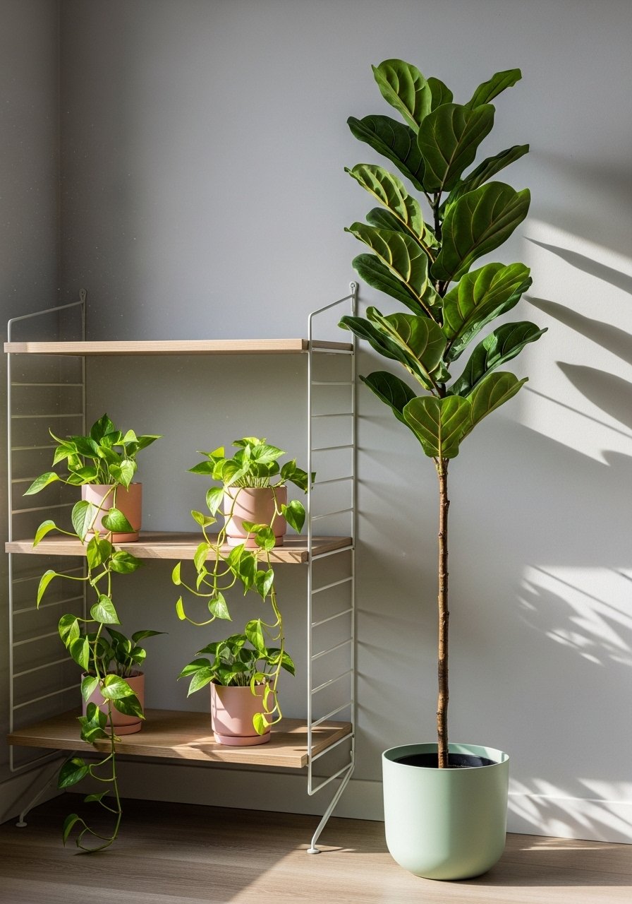
Tall plants change everything. One tall planter at the end of a shelf run creates a vertical anchor so the rest of the pastel accents feel intentional. I prefer a single 5 to 6 foot plant rather than five small succulents because it reads less cluttered. Pet owners should pick wipeable finishes and avoid fragile ceramics. If you need low maintenance, a realistic faux fiddle leaf gives the same height without care. My go-to pastel planters hold a single 6 to 8 inch nursery pot inside, so you can swap plants easily.
Artificial fiddle leaf fig 6ft
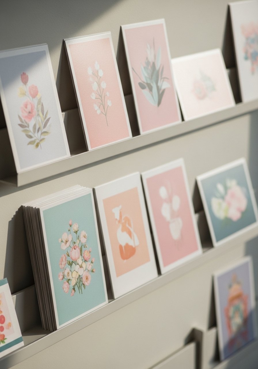
Pastel Art Leaning On Shelves For A Casual Feel, Modern Cottage Living Room
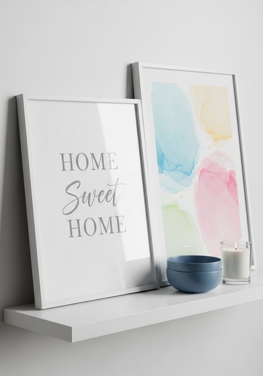
Leaning art makes shelves feel edited instead of staged. I use one larger pastel print and one small companion piece, then layer a bowl or candle in front. A frequent error is hanging everything; leaning lets you change the layout without new holes. For proportion aim for art that covers 60 to 70 percent of the shelf height when leaning. Frame styles should vary a touch, and mixing a thin white frame with a painted pastel frame keeps things cozy. I swap the print month to month depending on lamp warmth.
Blush and Mint Ceramic Trio For Symmetry, Transitional Living Room
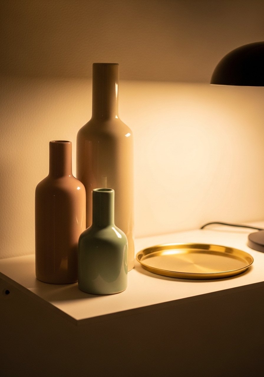
Trios are a cheat code. Three vases in graduated sizes give you rhythm and a small repeated pastel hit without overwhelming the shelf. The trick I use is an odd number and varied heights: 4 inches, 7 inches, and 10 inches. That keeps the eye moving. Most people place identical items spaced evenly which looks staged. Try grouping them close together instead, overlap a bit so they read as one composition. Matte glazes read softer under evening light than glossy ones. I link a mint vase here that pairs well with a blush bowl.
Pastel Object Pairing With Mixed Metals, Living Room Display
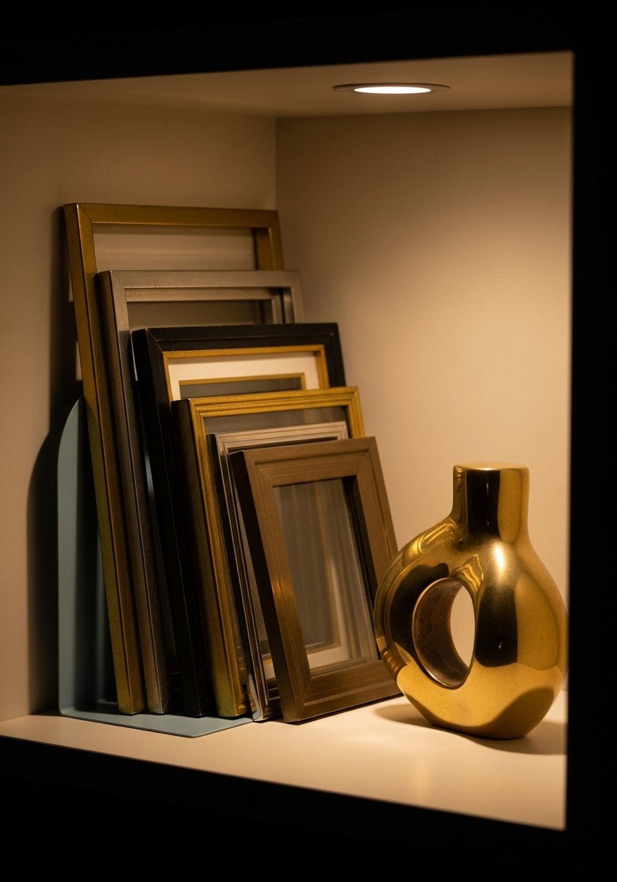
Mixing metals makes pastels look less sweet and more lived-in. I usually add one brass piece and one brushed nickel item when I have cool-toned pastels, which keeps the palette grounded. A mistake is matching every metal; that looks intentional in the wrong way. For every two pastel pieces, try adding one metal item. That 60/30/10 idea applies on the shelf too, with pastel as the 60 percent, neutral objects as 30 percent, and metal as 10 percent. A small brass dish under a pastel trinket is how I finish this look.
Book-Led Pastel Spines With Small Sculptural Accent, Casual Living Room
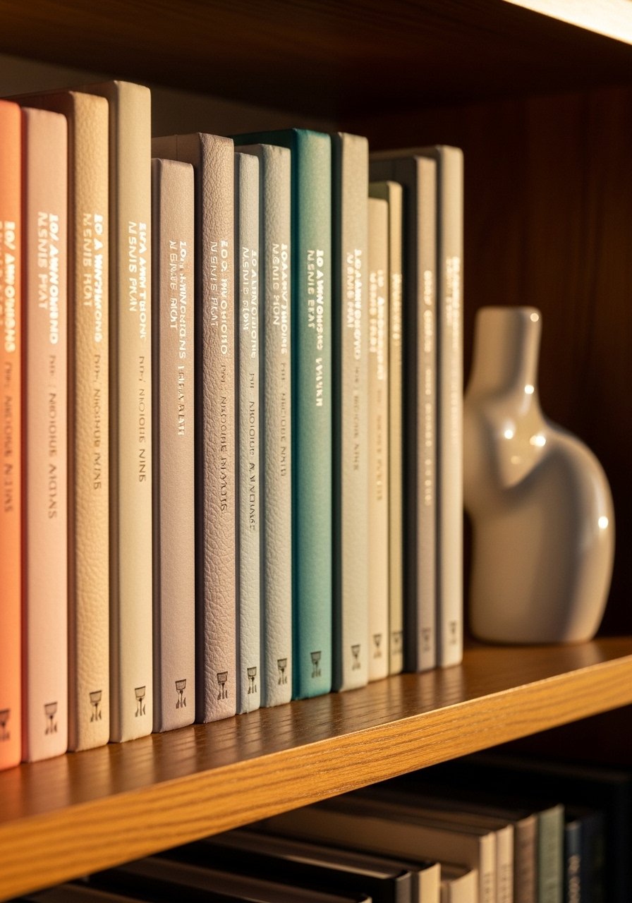
Color-coding books by pastel spines is cheap and high impact. I take three stacks across two shelves and break them with a sculptural piece to avoid the color block feeling. One mistake is ignoring scale. If your books are all the same height, introduce a horizontal stack to vary the silhouette. Also test the spines under your shelf lighting. Most matches bomb on the first go from bad lights, so check them in the morning and at night to see how the pastels shift. A small plaster bust or abstract pebble works great as a divider.
Curated Pastel Collections In Glass Boxes, Vintage-Modern Living Room
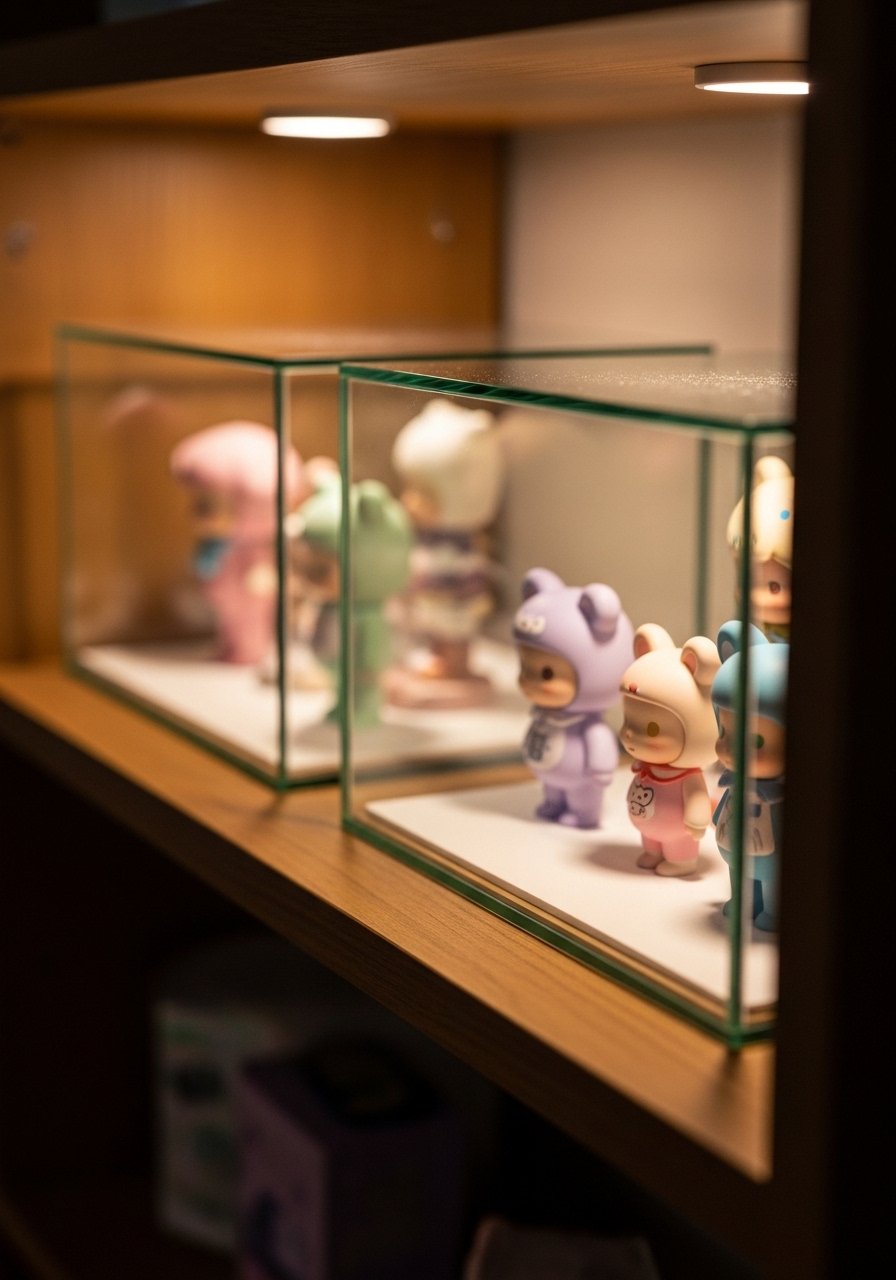
Encasing small pastel finds in glass boxes makes them feel precious and protected. I keep one box for softer items like vintage ribbons and another for small ceramics. The common mistake is overcrowding the box. Leave negative space so each piece breathes. A rule I love is no more than five items per box and one item should be at least twice the size of the others. Glass also reflects light, so pick a matte pastel inside to reduce glare. These boxes are great for mixing found thrifted items with new pieces.
Pastel Candles and Trays For Shelf Mood, Relaxed Living Room
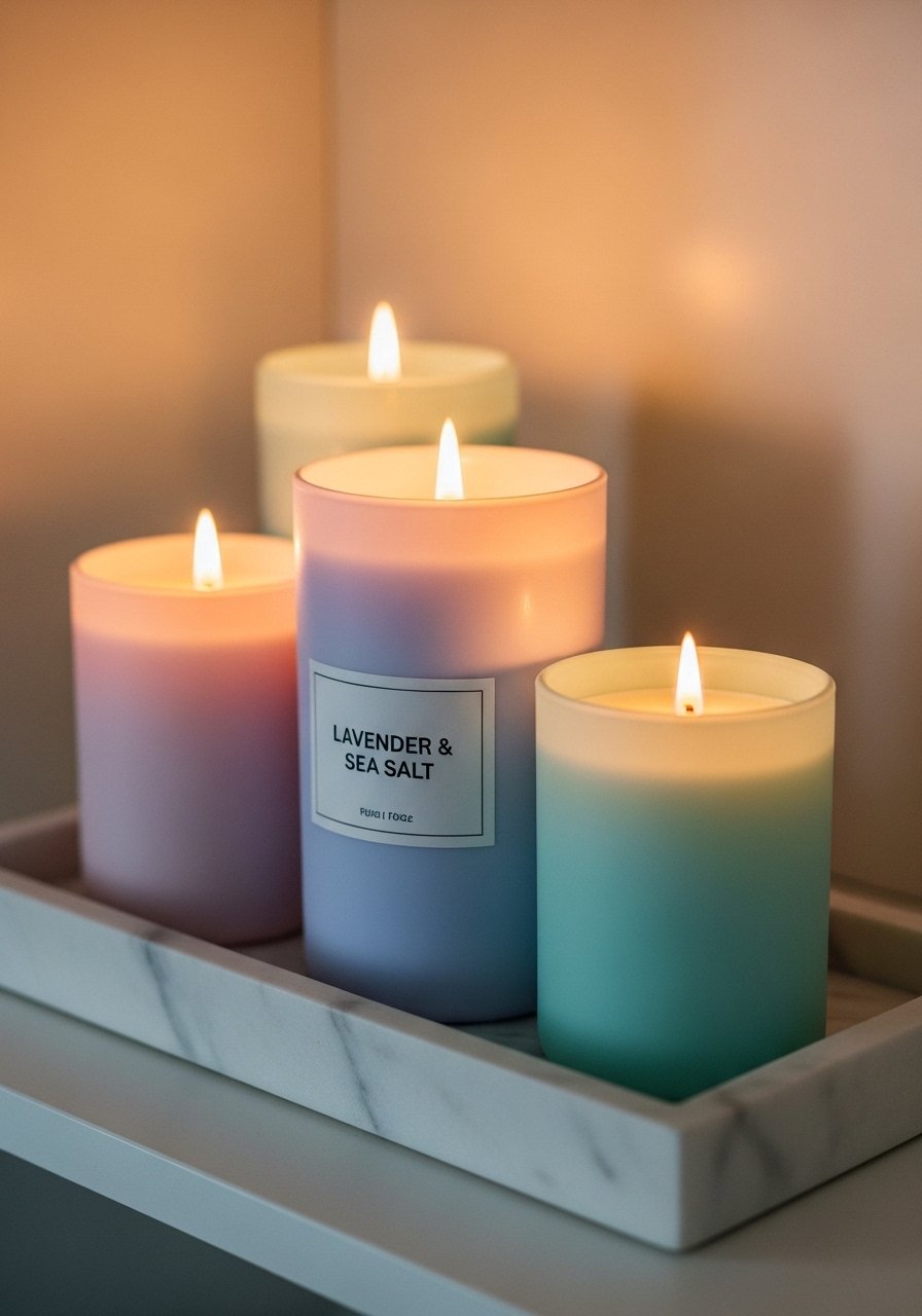
Candles add warmth and smell, which completes a pastel shelf like nothing else. I arrange a pastel candle trio on a small tray for easy clean-up. One mistake I used to make was placing lit candles in front of books. That is a fire hazard and it ages paper fast. Keep candles on trays and use battery-operated versions for long displays. For scent go subtle, and rotate the colors seasonally. A marble or brass tray helps the pastel candles feel intentionally chosen and not just leftover.
Changeable Pastel Accent With Swappable Frames, Versatile Living Room
Picture ledges that let you swap art are my renter-friendly secret. I keep a small stack of pastel prints behind the front piece and rotate them by mood. The mistake is committing to framed art only. Using ledges and thin frames lets you try prints at home, and the frame finish can be painted to match a pastel if you want consistency. If your wall color shifts under lamps, swap in warmer or cooler prints to compensate. This trick keeps the shelf fresh with minimal effort.
Mini Pastel Collections Grouped By Shape, Minimalist Living Room
Group by shape instead of color for a less twee pastel look. I pick three round objects in different pastels and place them in a small cluster. They read cohesive because the shape repeats. People often scatter similar items across shelves hoping for balance. Instead try grouping and then balancing elsewhere with a tall object. Also note that wrong gloss throws color off by half a shade easy, so pick matte finishes if you want predictable pastel reads under different lights. This technique works especially well on a slim shelf above a sofa.
Your Decor Shopping List
Textiles
- Honestly the best $40 I have spent. Chunky knit throw in cream 50 x 60 inches, acrylic-wool blend
- 22-inch linen pillow covers, set of 2 in blush and mint, insert compatible, down-fill suggestion
Wall Decor
- Brass picture ledges, set of 2 24-inch and 18-inch, easy install
- Pastel framed print "Home Sweet Home" 11 x 14 inch, white matte
Lighting and Tables
- Marble tray for shelf styling 10-inch diameter, protects surfaces
Plants and Planters
- Artificial fiddle leaf fig 6ft realistic leaves, pot included
- Mint ceramic planter, 8-inch glazed, with drainage hole
Budget Finds
- Pastel scented candle set small tins, three scents, under $25
Shopping Tips
White oak shelves read current, not heavy. These white oak floating shelves come in pairs and avoid the walnut look that can feel dated.
Grab velvet pillow covers for about $12 each. Swap them seasonally and the room has a fresh feel without a full re-decorate.
Curtains should kiss the floor, never hang halfway up. These 96-inch linen panels are the right go-to for standard 9-foot ceilings.
One tall plant beats five small ones. Artificial fiddle leaf fig 6ft gives scale and takes one corner rather than many surfaces.
Frequently Asked Questions
Q: How do I keep pastel shelves from looking childish?
A: Anchor pastels with mixed metals, natural textures, and one grounded object like a stone bookend. Mixing in raw materials stops the look from tipping into overly sweet. Use one statement piece that is neutral and matte.
Q: Can I mix warm and cool pastels on the same shelf?
A: Yes, but balance is key. Aim for a 60/30/10 approach where 60 percent is the dominant pastel tone, 30 percent neutral, and 10 percent a contrasting cool or warm accent. Test items under your evening lamp and morning light. Most matches bomb on the first go from bad lights, so check twice.
Q: What size art should I lean on a shelf?
A: Choose art that covers 60 to 70 percent of the shelf height when leaning. That proportion reads intentional and leaves space for layered objects in front.
Q: Are faux plants acceptable for pastel styling?
A: Both real and faux work. Use real for texture if you can care for them. Use faux for height and low maintenance. Artificial fiddle leaf fig 6ft is a good example when you need scale without the upkeep.
Q: How do I stop pastel pieces from looking too glossy under lights?
A: Pick matte finishes when possible. Wrong gloss throws color off by half a shade easy, so matte glazes keep pastels soft across different lamps and daylight.
Q: Where should I spend versus save on shelf decor?
A: Spend on a statement item that gives scale like a larger vase or plant. Save on rotating items like candles and small ceramics. Cross-brand hits 80% without the real chip when matching color, so aim for pieces you can swap if the hue reads off at home.
