
My living room had nice furniture and decent lighting but it still felt like a waiting room. Took me embarrassingly long to figure out it was missing personality in one corner. I started pinning anime posters in random spots and within a weekend that wall finally felt like mine. These ideas are what I learned from that messy, very fun trial run.
These looks lean eclectic and a little vintage-meets-modern. Most setups are under $100, with a few splurges around $150 for lighting or a large frame. They work for bedrooms, living rooms, dorms, or any small wall that needs character.
Eclectic Anime Gallery Wall For Bedroom
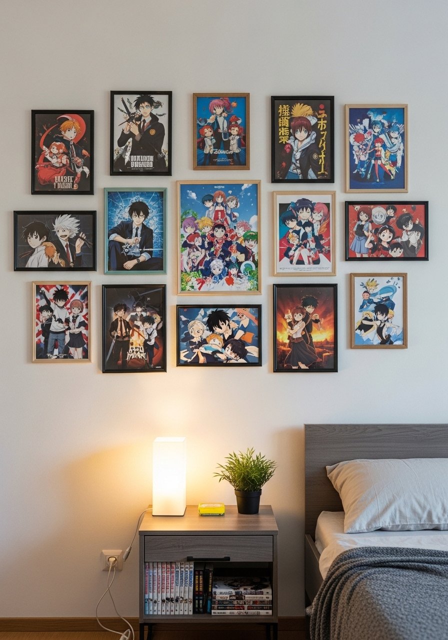
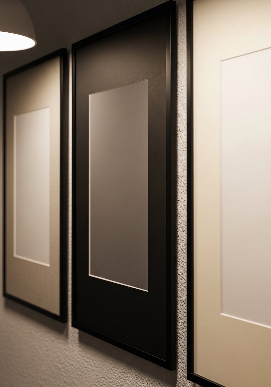
The moment I committed to a gallery wall I stopped rearranging the sofa. Start with a large central poster, then build around it with smaller 18×24 and 11×14 pieces, keeping about 2 to 3 inches between frames. I use a mix of matte black and natural wood frames to avoid everything feeling matchy. For renter-friendly hanging, I stick with command-picture-hanging-strips and measure so the center sits roughly 57 inches from the floor. A common mistake is lining everything at the top edge. That makes the display float awkwardly. Pair this with the poster ledge idea below when you want to swap prints often.
Mixed Frame Sizes With Vintage And Modern For Living Room
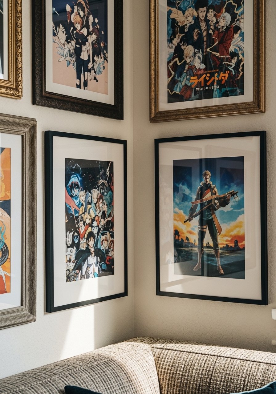
I found a cassette of discount frames at a flea market and mixed them with sleek metal frames from Amazon. The trick that makes the mismatch feel curated is a shared color thread, like a recurring teal or red across a few posters. I like metal-edge-poster-frames for the modern pieces and one ornate wood frame to anchor the set. People often try to match frame colors exactly. That is why the wall looks flat. Instead, repeat one accent color every three frames. If you want balance, follow the 80% base, 20% tweak idea when choosing frame finishes.
Layered Posters With Floating Frames For Small Spaces
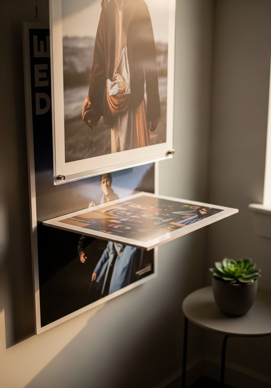
For a tiny dorm wall I layered a 24×36 matte poster behind a 16×20 floating frame. The depth adds drama without taking floor space. Floating frames make prints feel museum-level even at lower cost. I use floating-poster-frames-24×36. A rookie move is picking glossy frames that glare under lamps. Gloss finish changes how saturated it looks by a good 20-30%. Test under your bedside lamp before committing. This also solves poster glare when you want to hang near a window.
Poster Ledges With Plants For Reading Nook
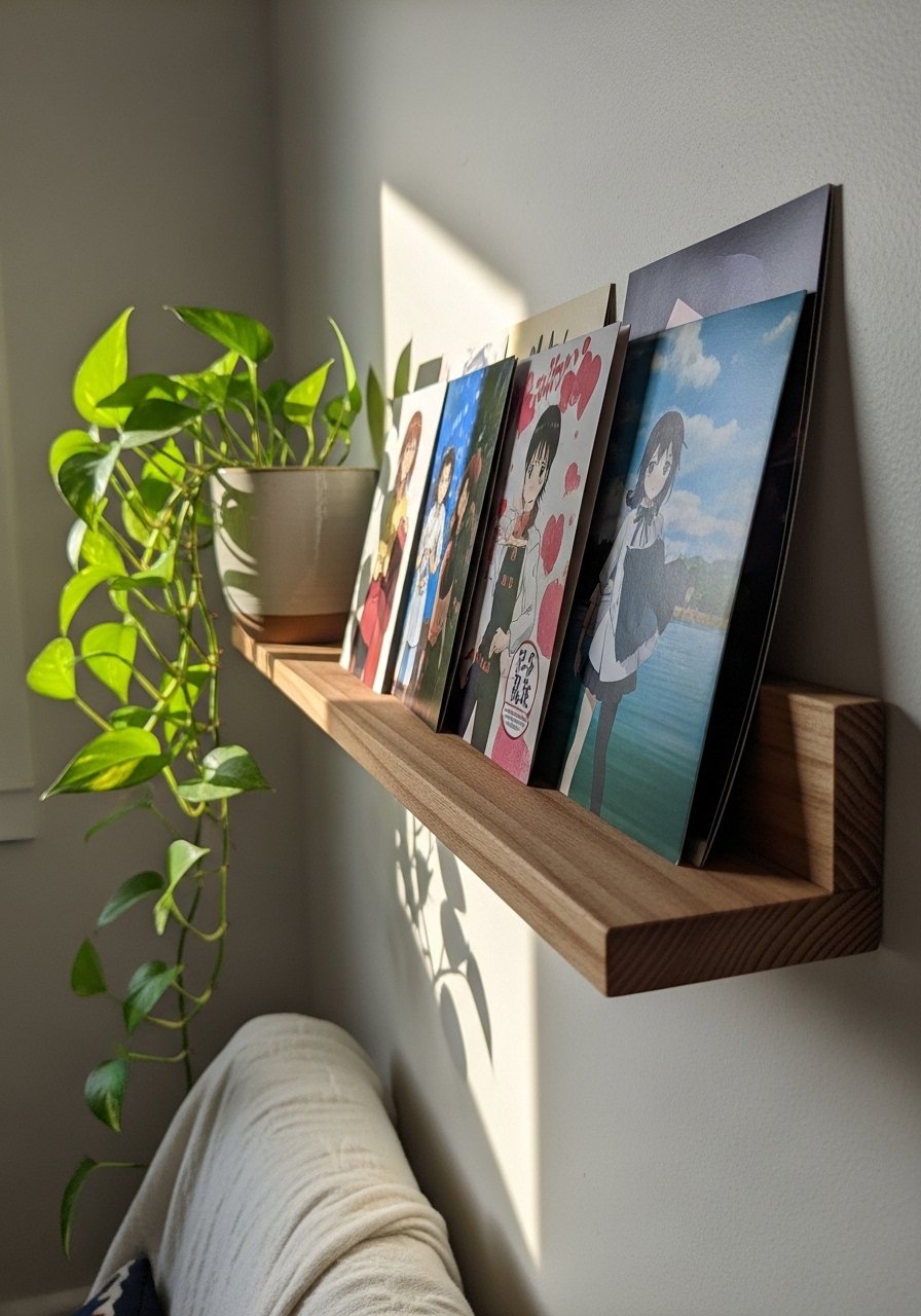
Swapping hard hangs for picture ledges turned my side chair into a rotating display. I stack one poster behind another and tuck a small plant in front for a lived-in vibe. My favorite quick buy is wall-mounted-picture-ledge-36-inch. Leave 1 to 2 inches between ledge and the lower frame edge so the plant has breathing room. The common mistake is overfilling the ledge. Keep one-third of it empty to let the eye rest. This pairs well with the mixed metals grid idea later.
Mismatched Mats And Borders For Boho Vibe
I swapped standard white mats for colored ones and suddenly the whole wall read boho instead of generic. Try a linen mat for warm tones and a charcoal mat for high-contrast anime art. Use mats in 2:3 ratio to frame sizes, for example a 16×20 print gets an 11×14 mat inside a 16×20 frame. Matting saves cheap prints from feeling flimsy. I buy acid-free-mats-16×20 for longevity. A mistake is going too bright on every mat. Keep one or two neutral mats in play to calm the palette.
Neon Accent Shelf For Studio Vibe
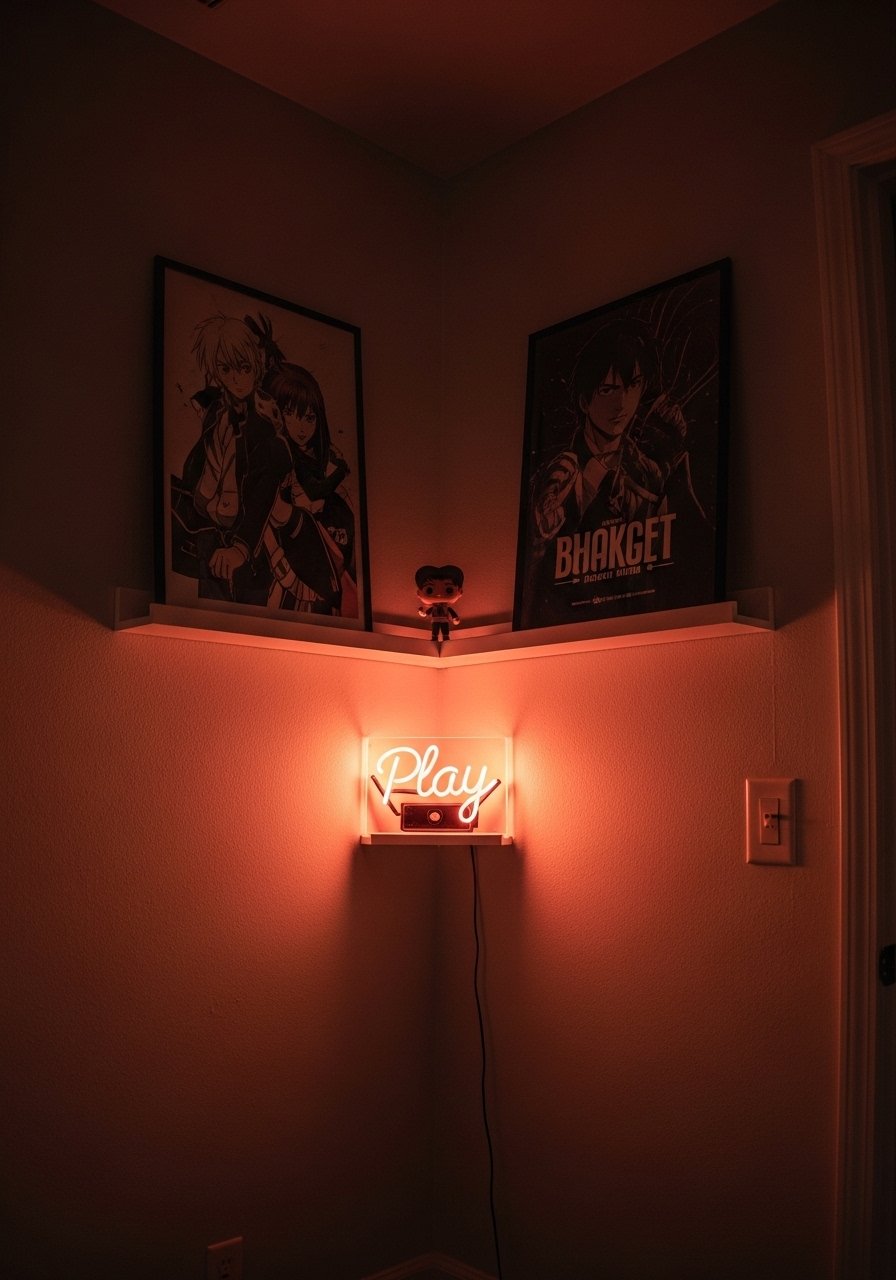
There was a night I added a tiny neon sign above my shelf and it made my posters feel intentional, not just stuck on a wall. Neon picks up colors in glossy prints especially well, so match a neon hue to a dominant poster color. I use usb-led-neon-sign-play powered by a hidden USB outlet. People forget to test neon with their room bulbs. Lighting trips up most matches, like 7 out of 10 jobs. So check how the sign looks under both daylight and lamp light.
Tapestry Backdrop With Poster Collage For Dorm Rooms
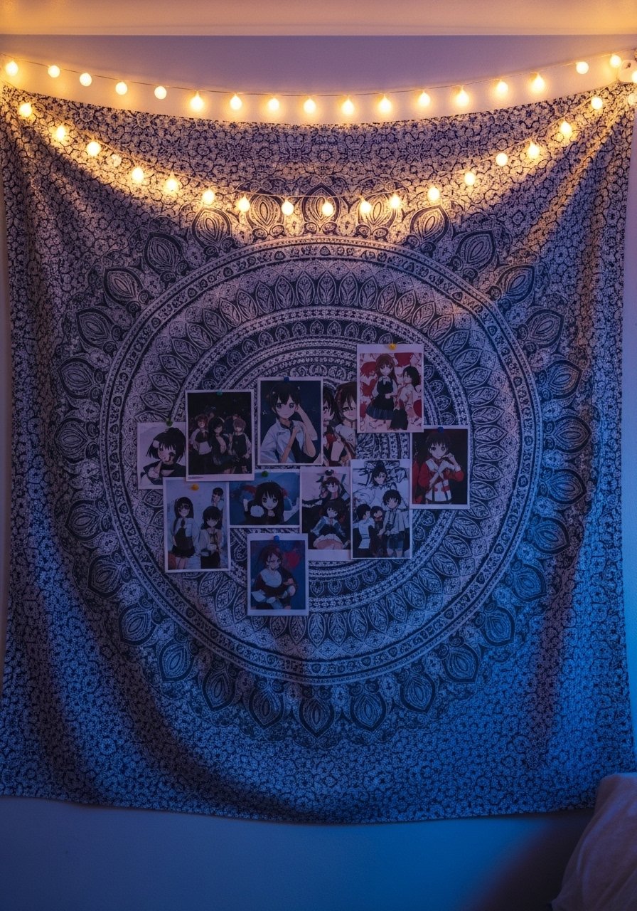
When my roommate complained our blank wall was cold, I tacked a large tapestry and layered posters on top. The fabric changes the way posters read, giving them a softer edge and hiding nail holes. Pick a tapestry color that pulls a midtone from your prints. For hanging without damage use removable-tapestry-hooks. A common error is taping directly to the tapestry and stretching it. Keep the fabric taut on a simple rod, then pin prints so they sit flat.
Color-Blocked Poster Trio Over Sofa For Eclectic Living Room
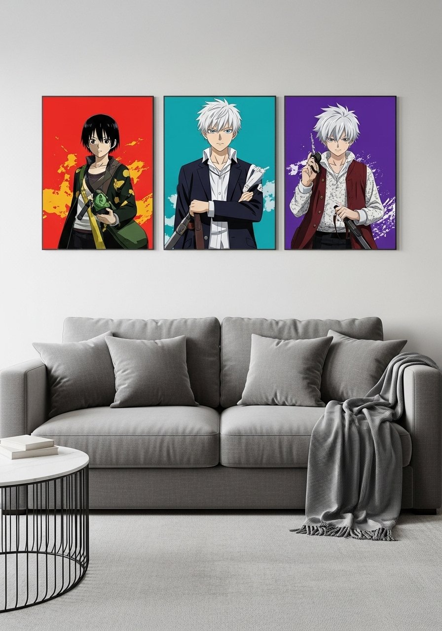
I used three 24×36 posters each with a dominant color and spaced them evenly above the sofa. The trio reads balanced because the middle poster carries the warm tone and the sides cool it. Hang them so the bottom edge is 6 to 8 inches above the sofa back. For easy swaps get large-poster-frames-24×36. Avoid using posters all with the same brightness level. Eyeball hue first, then dull with a complement if one print overpowers the others.
Oversized Single Poster With Textured Frame For Entryway
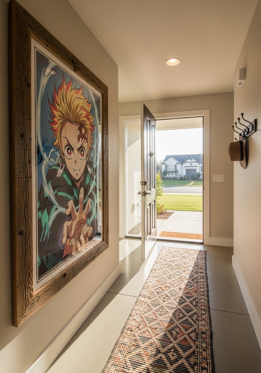
My entry used to feel anonymous until I hung a 30×40 poster in a chunky textured frame. One large piece makes a narrow hallway feel curated. Use a frame at least 2 inches wide so it reads substantial. I bought a reclaimed-wood-large-frame-30×40. The mistake is picking a print too busy for a small entry. Keep negative space around the poster and add a narrow console below for balance.
Rotating Poster Swap Station With Brass Clips For Workspace
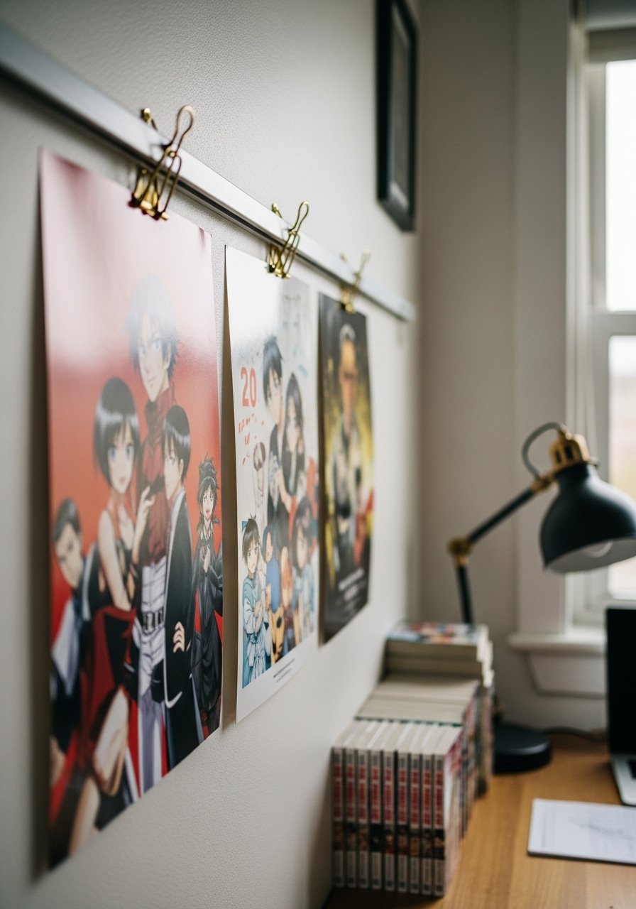
I set up a low-cost swap station using a thin rail and brass clips. It lets me rotate new art without rehanging every week. These brass binder clips look intentional and avoid puncturing prints. I recommend brass-binder-clips-large. Keep a spare set of clips so you can flip prints in under a minute. A common slip-up is clipping the same corner on every print which bends the paper. Clip near the top center so the print hangs flat. Pair this with the poster ledge for months when you want deeper layering.
Poster Grid With Mixed Metals For Game Room
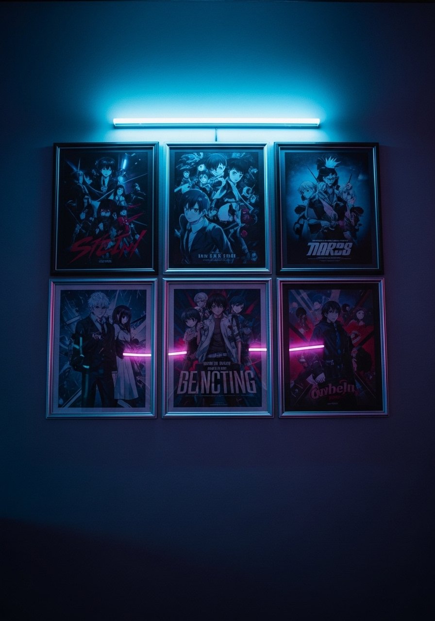
I borrowed the grid idea from record collections and used mixed metal frames to keep it from feeling too symmetrical. Use a laser level and measure spacing at 2.5 inches so the grid reads tidy. I use mixed-metal-picture-frames-set to get varied finishes in a pack. A frequent mistake is hanging without a mock layout on the floor. Lay everything out first so your eye sees the pattern before you hammer holes.
Backlit Poster Frame For Moody Bedroom
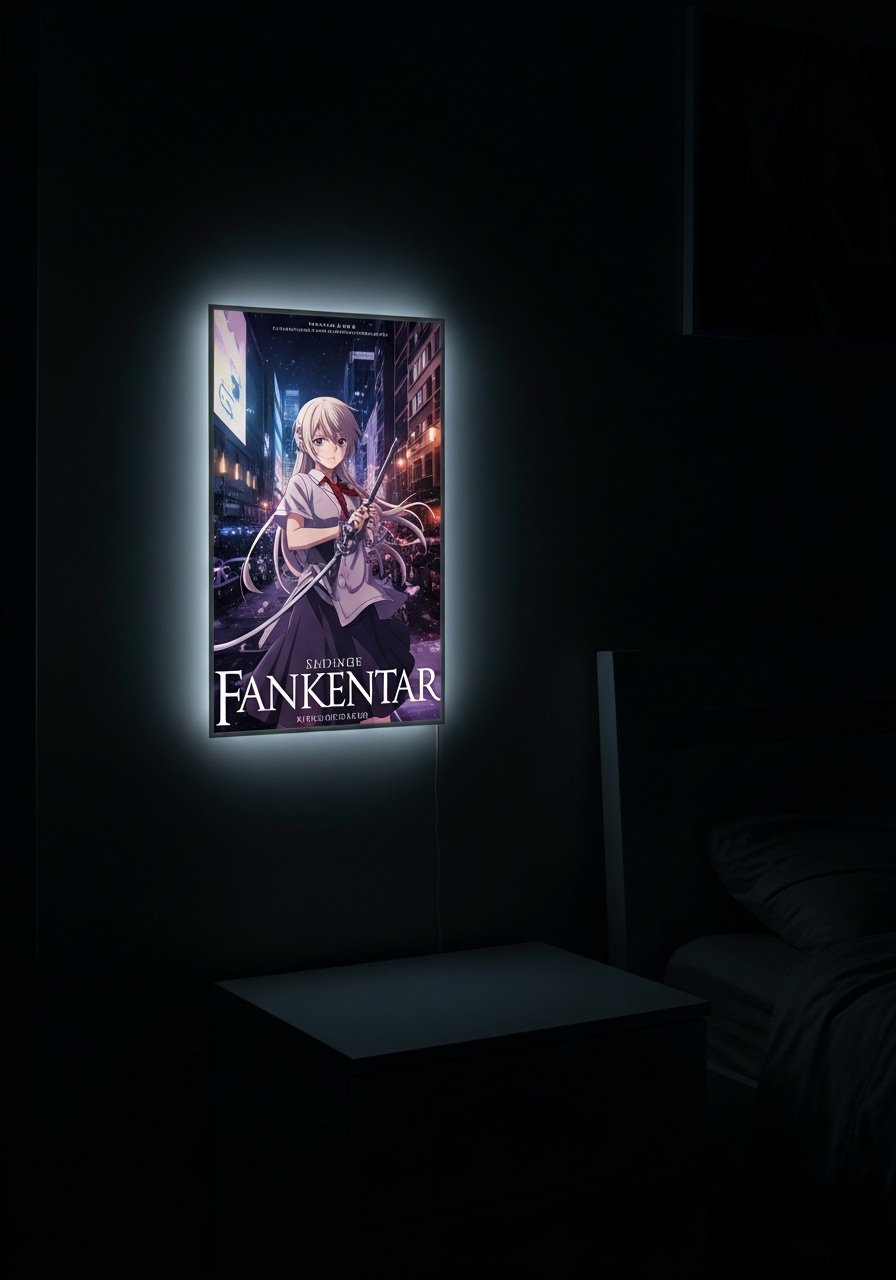
I splurged on a backlit frame and it instantly made the poster feel cinematic. LED panels give even light and make colors pop without hotspots. I use led-backlit-poster-frame-24×36. A rookie mistake is using backlight with glossy prints. Gloss sharpens reflections. Test with a cheap print first and check at night. Scan a chip and you nail it 4 times in 10 better than formulas.
Anime Poster Shelf Styling With Figurines For Display Case
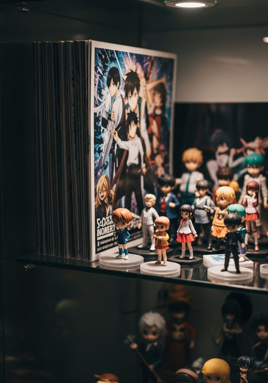
When I added figurines in front of stacked posters the whole setup read like a mini shrine. Use a shallow shelf, posters at the back and figures in front at varying heights. Keep a 1.5-inch gap between poster and figure base to avoid visual crowding. For display I recommend acrylic-display-shelf-3-tier. The mistake is clustering too many small figures which turns the shelf into clutter. Keep negative space and rotate items seasonally.
Your Decor Shopping List
- Honestly the best $20 I have spent. Command picture hanging strips for renter-safe displays
- For layered ledges, 36-inch picture ledge in white or wood grain
- For large prints, 24×36 floating poster frames in matte black
- Backlighting pick: LED backlit poster frame 24×36 for moody bedrooms
- For easy swaps, brass binder clips large and a slim rail
- Textile backdrop: indigo-tapestry-large for dorm collages, similar at Target
- Matting option: acid-free-mats-16×20 to upgrade cheap prints
- Shelf styling base: acrylic-display-shelf-3-tier for figurines and small merch
- Quick neon for accents: usb-led-neon-sign-play for studio corners
Shopping Tips
Match sheen to poster finish. Gloss hits differently in your room, so pick frames with a similar sheen. Floating poster frames are a safe bet.
Grab command-picture-hanging-strips for renter-friendly installs. They hold a surprising amount of weight and leave walls clean.
For lighting checks, pick usb-led-neon-sign-play or an LED strip so you can test color under low light and daylight. Check at both times of day.
If you want a single plant, buy real-fiddle-leaf-fig-small or a convincing faux if you travel a lot.
Frequently Asked Questions
Q: Can I mix cheap poster prints with expensive framed pieces and have it look intentional?
A: Yes. Mix sizes and repeat a color or material to tie them together. Use a single large anchor piece and treat cheaper prints with mats to make them read more expensive.
Q: How do I avoid glare on glossy posters?
A: Angle light away from the poster and test under room bulbs. Matte frames and plexiglass reduce glare. Try a cheap test print in the frame first.
Q: What size should I buy for above a sofa?
A: Bigger than you think. For a standard sofa, a 24×36 or 30×40 works well, or a trio of 24×36 pieces. Keep the bottom edge 6 to 8 inches above the sofa back.
Q: How do I hang posters without damaging walls in a rental?
A: Use command-picture-hanging-strips and removable tapestry hooks. For heavier frames use multiple strips per corner. Leave a small gap between frame and wall so humidity does not warp the poster.
Q: Can I mix anime merch like figurines with poster displays?
A: Absolutely. Put posters at the back, figures in front with a 1.5-inch gap, and rotate pieces seasonally so the shelf does not get overcrowded.
