
My living room had nice furniture and decent lighting but it still felt like a waiting room. Took me embarrassingly long to figure out it was missing texture. Every surface was smooth, every color was flat, and nothing invited you to actually sit down. I used the same idea in my home office and suddenly screenshots started piling up on my phone.
These ideas skew soft-modern and playful, with most pieces under $75 and a few splurges around $100-150. They work for dedicated offices, corner desks in bedrooms, or any small workspace that needs personality without a full renovation.
Mint Minimal Desk for a Calm Workday
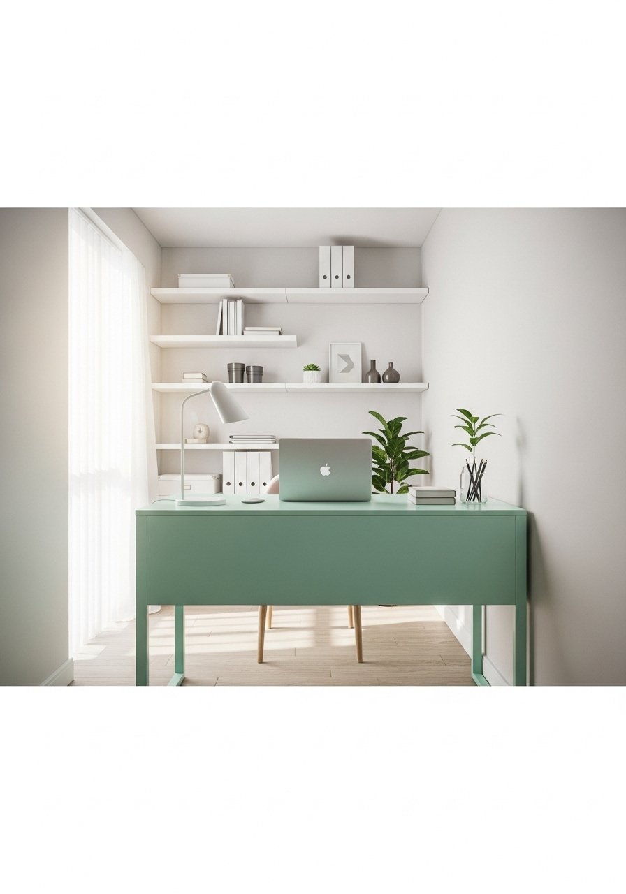
A mint desk keeps the mood calm without feeling babyish. It works because the color reads as neutral next to white shelving and wood floors. I used a mint desk mat and a slim brass lamp to avoid visual clutter. Try mint desk mat in waterproof neoprene and a compact brass task lamp. Common mistake is picking mint that is too saturated. Match hue value and keep chroma low so the desk reads soft at a distance. A 2:1 ratio of white to mint on the desk surface keeps it from overwhelming the room.
Blush Pink Cozy Nook with Layered Textiles
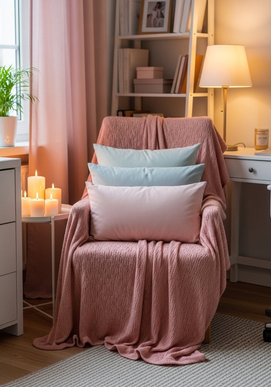
The moment I draped a chunky knit throw over my office chair, the whole corner stopped looking like a waiting room. Blush works best when it lives in textiles, not as the only wall color. I used a 22-inch down-filled linen pillow and a chunky throw to add softness. Grab chunky knit throw in cream and 22-inch linen pillow covers. People often overdo pattern. Limit patterned pieces to one per seated area and keep solids in the 80/20 ratio to anchor the look. This is perfect for small home offices and reading corners.
Lavender Accent Wall with Fabric Scan Match
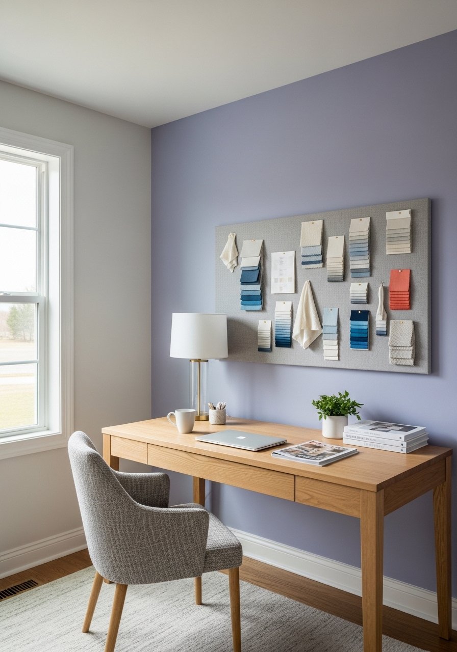
If you want lavender that actually works with your chair fabric, scan the upholstery first. Two in five start with scan apps before mixing. I used a phone scanner app and then tested three sample chips on the wall at dawn and dusk. Most matches flop on the first go because of lighting tricks. Place a 4×6 inch fabric sample on the wall and ask for a sample pot in the same base and finish. For renters test peel-off samples. The specific detail most people skip is testing the chip at both the desk lamp and natural light to check sheen shift.
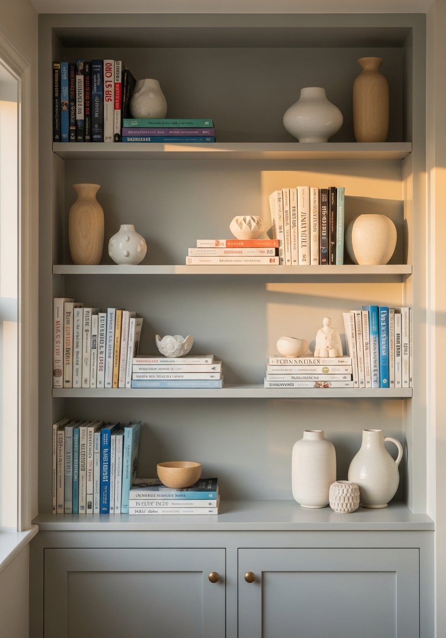
Sky Blue Shelving with White Oak Balance
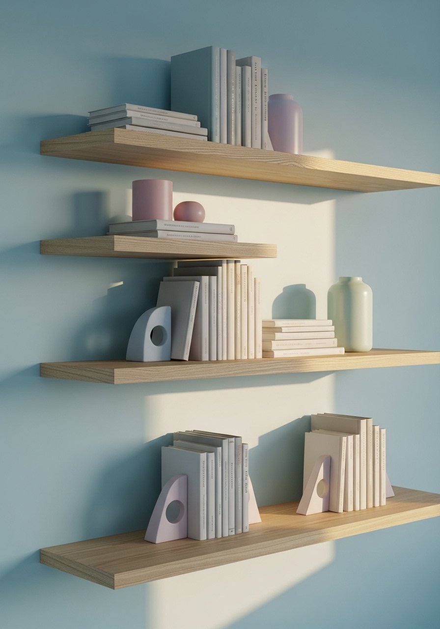
White oak shelves look current with pale sky blue behind them. I picked shelves 10 inches deep to hold a stack of books and small boxes without looking crowded. Use white oak floating shelves 10-inch depth and keep three shelves per wall for rhythm. Common mistake is too many items per shelf. Apply the rule of three for groupings and leave breathing room. Pair with the mint desk idea for a soft, layered palette that reads intentional.
Pastel Grid Gallery Wall for Small Offices
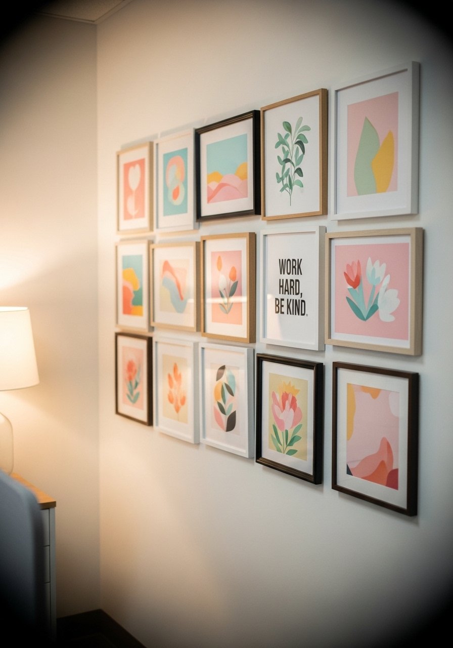
A gallery wall in pastels keeps things personal and inspiring. I used identical mat sizes for cohesion and mixed frame finishes to avoid looking matchy. Start with a 24×30 inch center print and build out with 8x10s. I used mixed metal picture frames set so I could swap art without new holes. Mistake is hanging frames too low. Keep the center line at eye height, about 57 inches. This pairs nicely with the brass lamp from the mint desk idea.
Mint and Brass Mixed Metallics for Modern Flair
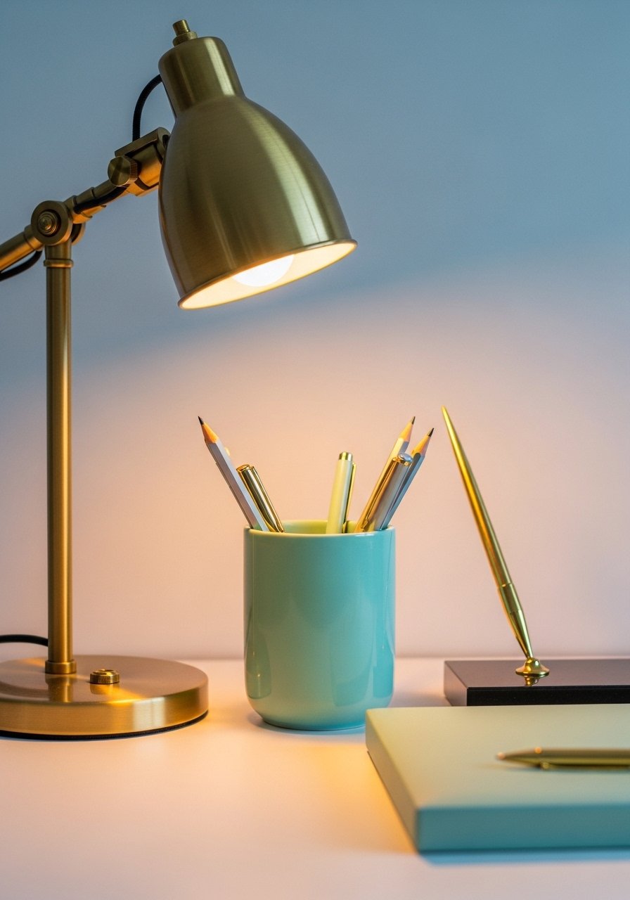
Mixing brass with brushed nickel gives pastels a grown-up edge. I added a brass lamp and nickel drawer pulls so the space reads layered. Use a small brass lamp for a warm pool of light and a nickel desk organizer for contrast. Try brass desk lamp compact and brushed nickel organizer tray. A common mistake is slapping on metallics without repeating the finish elsewhere. Repeat at least twice in the room so the look reads intentional.
Soft Yellow Task Lighting That Helps, Not Hurts
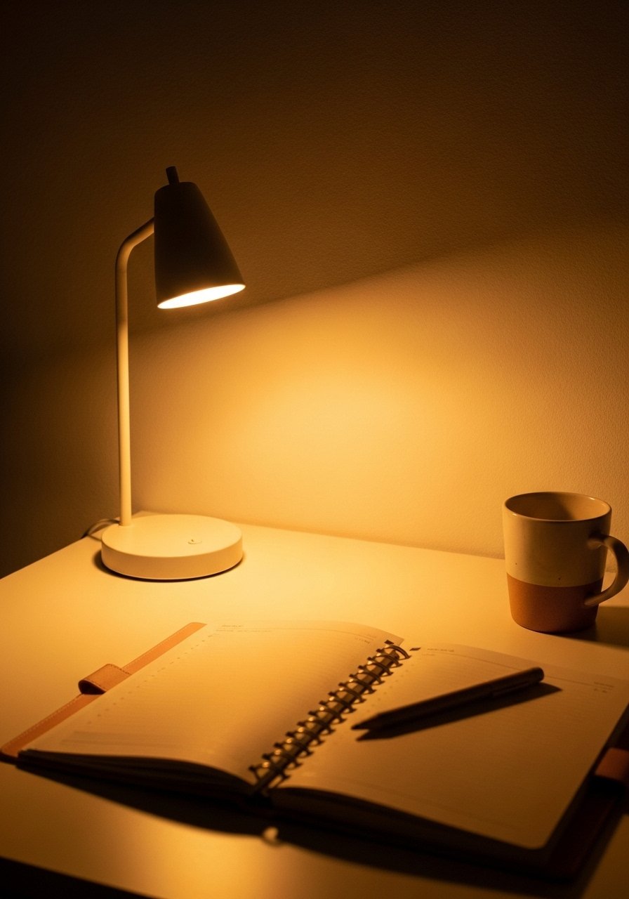
Task lighting with a warm 2700K bulb keeps pastels from looking washed out under cool LEDs. I swapped a daylight bulb for a warm LED and the whole palette popped. For a small desk pick a lamp with a 12-inch reach so the light covers your keyboard and notebook. I like this adjustable LED desk lamp. Common error is using one overhead light and no desk lamp. Layer your light and test at working distance to avoid glare on screens.
Pastel Patterned Rug Layering for Texture
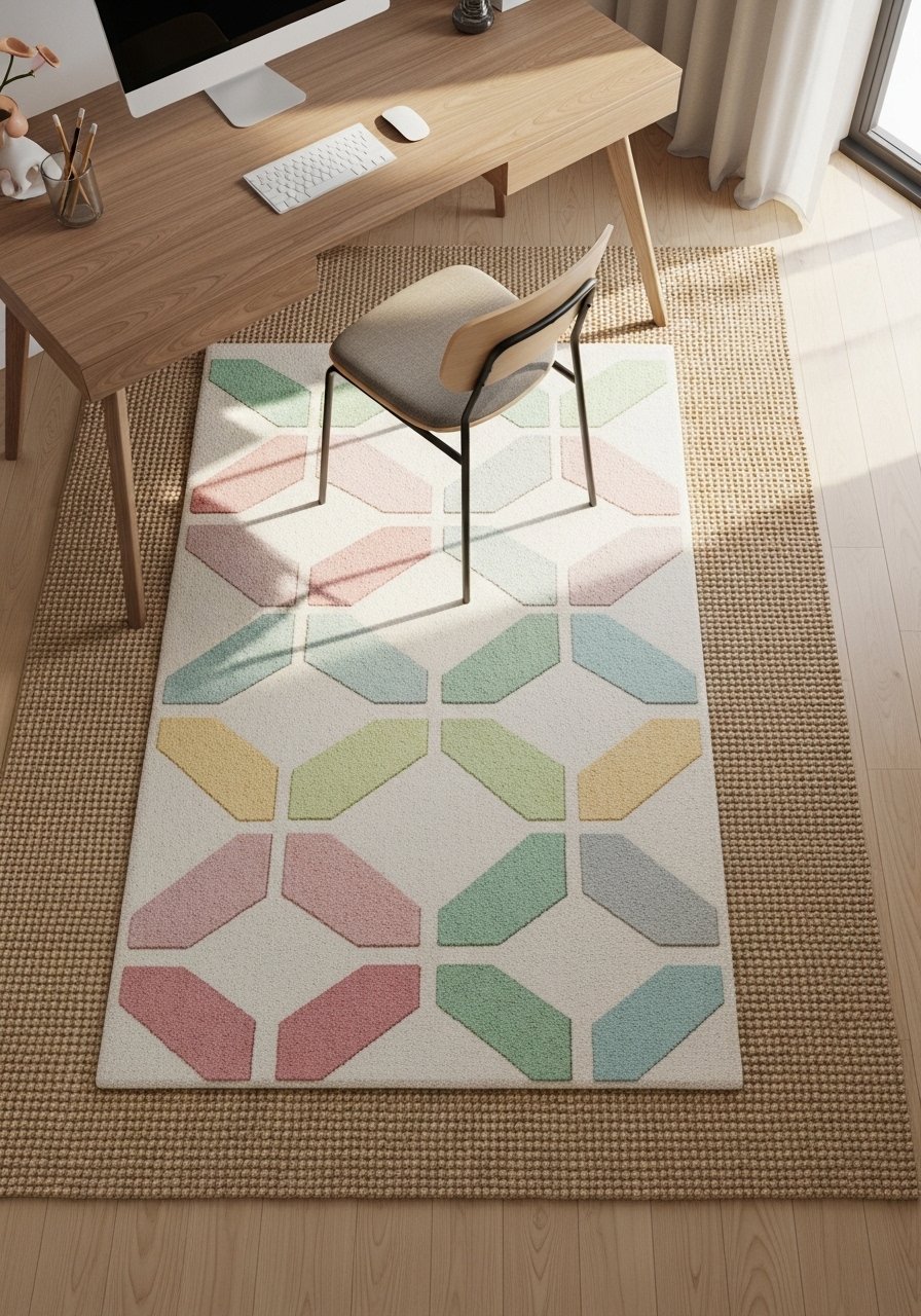
Layering a patterned pastel rug over a neutral base gives depth without chaos. I used a 5×8 patterned rug over an 8×10 jute rug so the pattern reads like an accent, not the floor. Consider 5×8 pastel geometric rug and 8×10 jute area rug. Mistake is choosing rugs with conflicting undertones. Match the rug undertone to your largest textile, usually the sofa or chair, to keep colors from clashing.
Pastel Office Plant Corner for Scale and Life
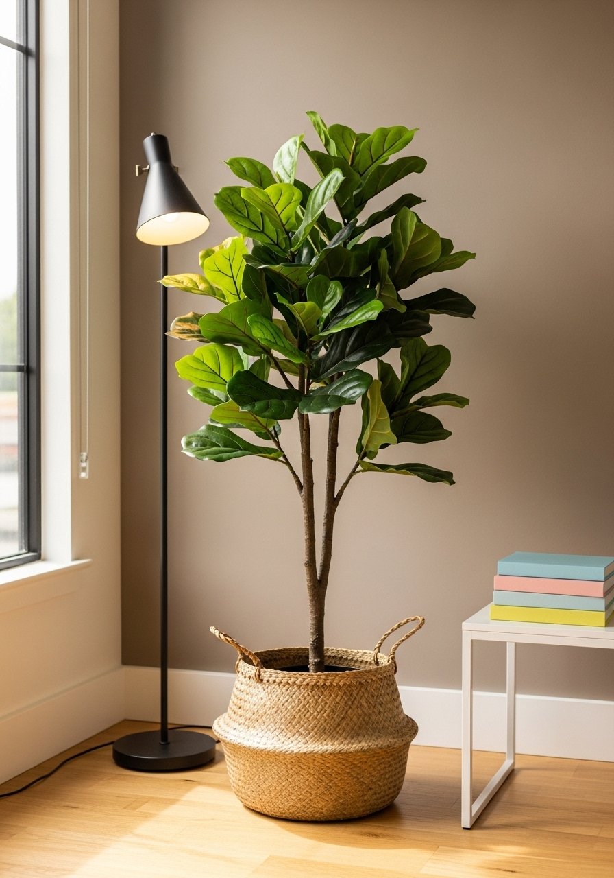
One tall plant makes more impact than five small succulents. I swapped multiple tiny plants for a single 6-foot fiddle leaf fig and the room finally had scale. Use a woven basket for texture and keep the plant 2 feet from the desk so it does not block light. Try artificial fiddle leaf fig 6-foot. Real plants work too, but if you travel a lot, faux keeps the look consistent. The specific detail most people skip is rotating the plant every few weeks so one side does not look sparse.
Pastel Bulletin Board to Capture Ideas
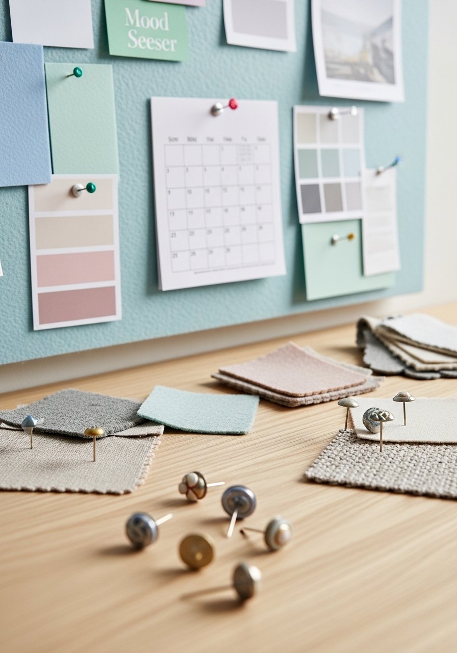
A pastel felt board is where color decisions stop feeling theoretical. I pinned fabric swatches, paint chips, and a small inspiration photo. Use a 24×36 inch board to allow future expansion. I linked mine to the lavender wall idea by pinning the same fabric sample. Get pastel felt bulletin board 24×36. People mistake cork for felt because it is cheaper. Felt hides pins and looks softer in photos, which matters if you screenshot mood boards.
Ombre Desk Accessories for a Gradient Vibe
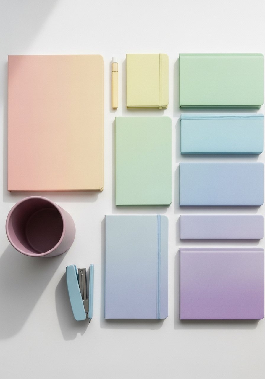
Gradient accessories make the desk feel curated even if everything is small. I grouped three desk cans in ombre and kept the darkest color closest to the laptop to ground the set. Try an ombre pastel desk organizer set. A tiny detail most guides miss is arranging by value, not shade. Place the darkest item nearest your elbow to reduce visual float.
Two-Tone Built-In Shelves with Cross-Brand Paint Match
I matched a discontinued sage base to a new brand by asking the store for a competitor formula. Over half go cross-brand to save without skimping quality. For a seamless look repaint the entire shelf face rather than spot touchups. Finish matters as much as color, so choose the same sheen. I had the local shop mix a semi-gloss for the lower shelves so they could stand up to handling. The fix many miss is repainting the full surface to hide base differences.
Pastel Curtain Trick to Add Ceiling Height
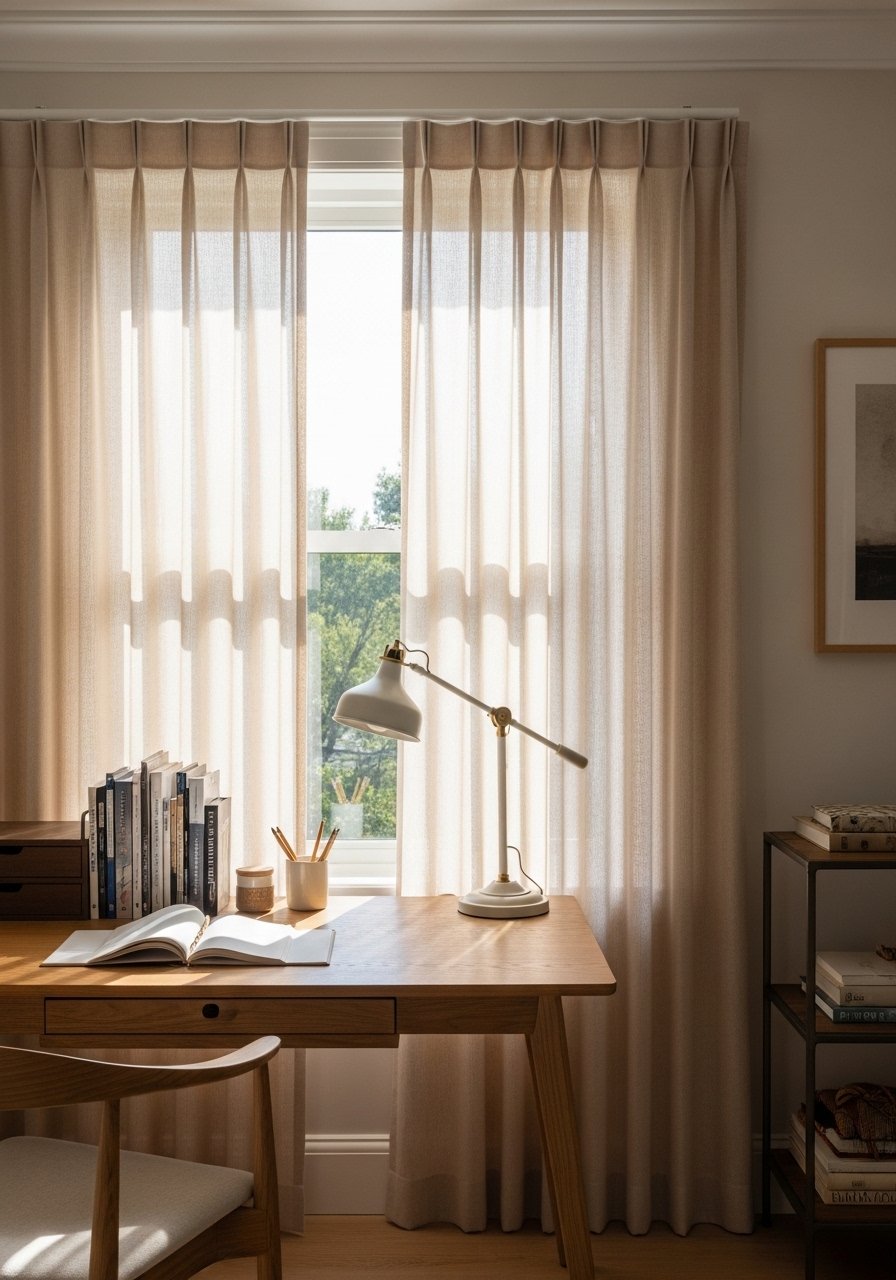
Most people hang curtains right at the window frame. That is why their rooms look shorter than they are. Hang panels 4 to 6 inches above the frame and go to the floor. I used 96-inch linen panels for a standard 9-foot ceiling and they read taller instantly. These linen curtain panels 96-inch are lightweight enough to let light through without losing privacy. A small detail people skip is getting the panels even so they puddle or kiss the floor consistently.
Pastel Tech Hideaway for a Clean Zoom Background
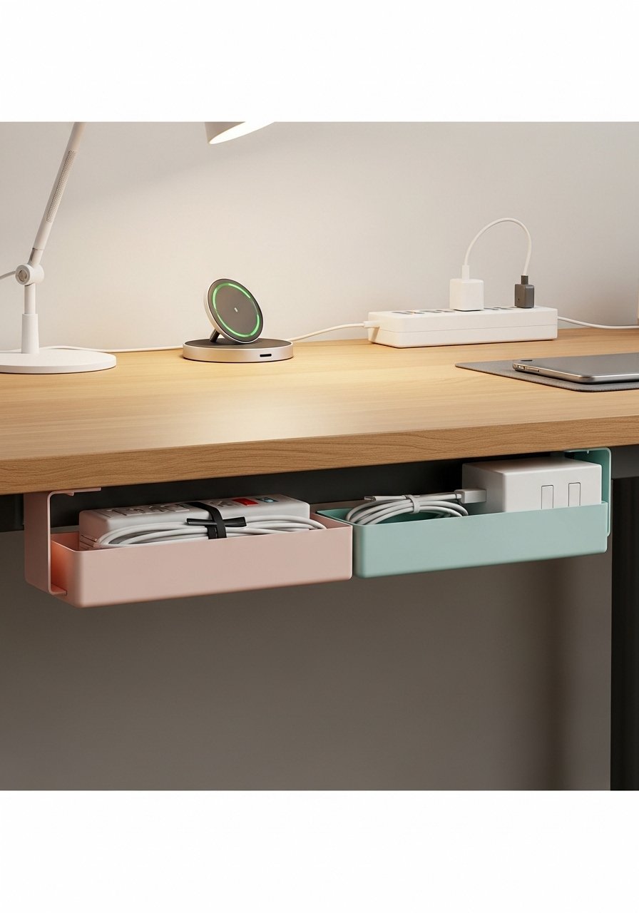
Clutter kills pastel calm. I installed an under-desk cable tray and a slim power strip so cords never show in video calls. Use a 12-inch deep tray that mounts flush and keeps the silhouette tidy. Try under-desk cable management tray 12-inch. The mistake is using colored cords that clash with pastels. Choose white or soft gray cords so they disappear against light surfaces.
Pastel Chair Swap with Cushion Layering for Comfort
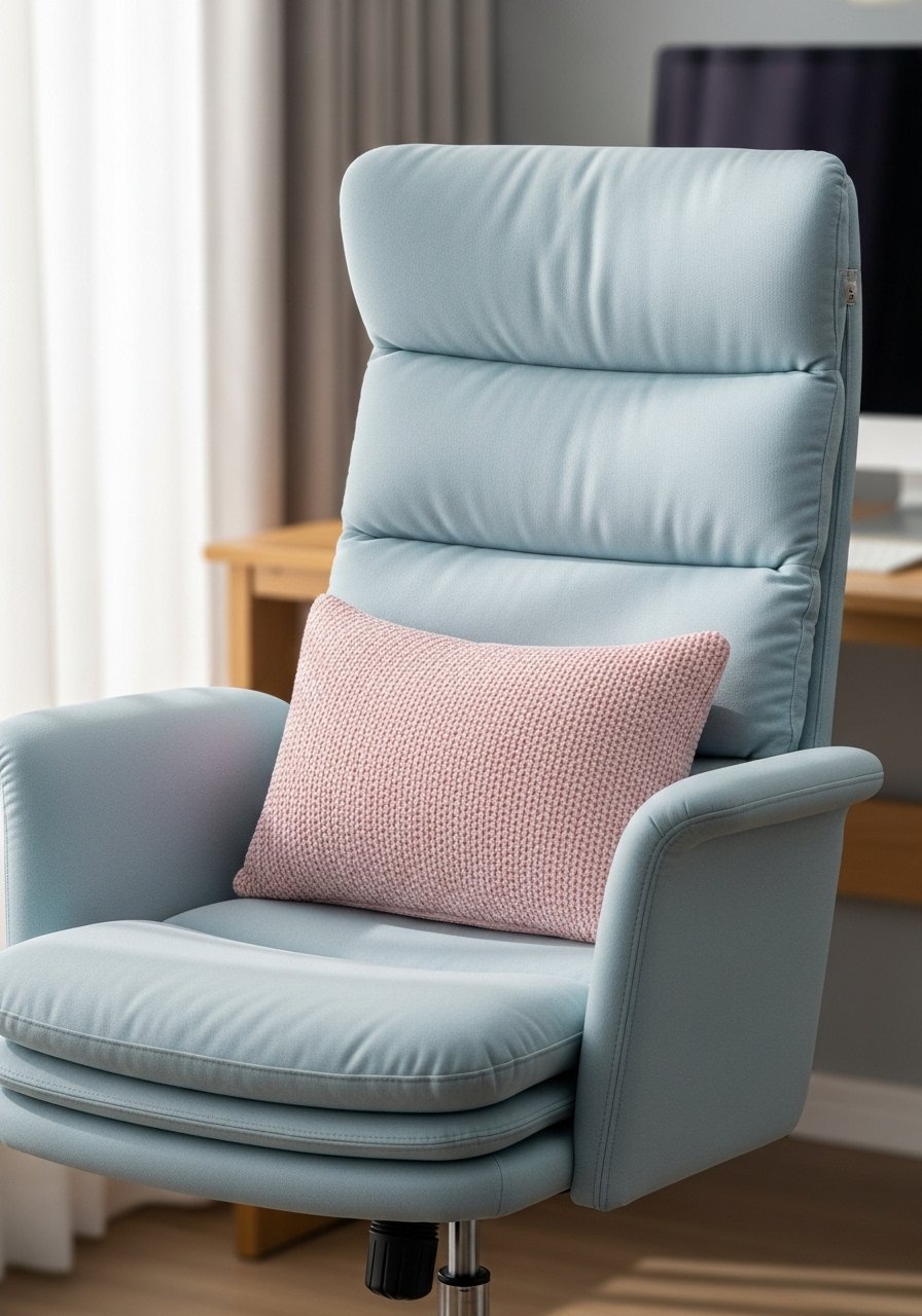
Swapping your chair changes everything. I replaced my old black chair with a pastel ergonomic option and added a lumbar pillow plus a seat cushion for extra comfort. Use a chair with adjustable lumbar and a 2-inch gel seat pad for long sessions. Consider pastel ergonomic office chair and gel seat cushion 2-inch. Mistake is thinking chair color alone will fix the look. Match textiles and repeat the pastel hue elsewhere to create cohesion.
Your Decor Shopping List
Textiles
- Honestly the best $40 I have spent. Chunky knit throw in cream for layering
- 22-inch linen pillow covers in blush, set of two
- 5×8 pastel geometric rug for under desk
Wall Decor
- For the gallery trick, use mixed metal picture frames set
- Pastel felt bulletin board 24×36 for mood swatches
Lighting
Plants and Greenery
Budget Finds
Similar at Target and HomeGoods for throws, pillow covers, and occasional decor.
Shopping Tips
Grab these velvet pillow covers for $12 each. Swap them every season and the whole room feels different.
Curtains should puddle or kiss the floor, never hang halfway up. These 96-inch linen panels are the right call for standard 9-foot ceilings.
White oak beats dark wood in 2026. Design feeds have shifted completely. White oak floating shelves 10-inch look current, not dated.
If you hate plant maintenance, go faux. One artificial fiddle leaf fig 6-foot gives instant height and a consistent silhouette.
Layer lighting for depth. Add an adjustable LED desk lamp 12-inch to your overhead light for glare-free work sessions.
Frequently Asked Questions
Q: Can I mix pastel furniture with modern pieces without it looking juvenile?
A: Yes. Repeat at least two finishes and one neutral to ground the look. Pair a pastel chair with white oak shelves and a brass lamp for a balanced mix.
Q: How do I test paint against fabric so it does not clash?
A: Pin a 4×6 inch fabric sample to the wall and view it at morning, midday, and dusk. Two in five start with scan apps before mixing. Ask for sample pots and test the same sheen you plan to use.
Q: Should I repaint built-ins or touch up spots when switching brands?
A: Repaint the full surface if you are not using the same brand. Over half go cross-brand to save without skimping quality. A full repaint hides base and sheen differences that touchups cannot.
Q: What size rug should I get for a desk area?
A: For a standard desk zone go 5×8 minimum. If the desk sits on a larger seating area consider 8×10 so chair casters remain on the rug.
Q: Real plants or faux for a home office?
A: Both. Real snake plants and pothos tolerate neglect. Use a faux fiddle leaf fig 6-foot where you need height without maintenance.
Q: Why does my paint look different once it is on the wall?
A: Lighting and finish change perception. Most matches flop on the first go because of lighting tricks. Test three swatches in your real light and check sheen before committing.
