
My living room had good furniture and decent lighting but it still felt like a waiting room. Took me embarrassingly long to realize every wall was the same height and nothing had a personality. Adding a few well-placed posters changed the whole mood without repainting or heavy carpentry. These are the posters and small tricks I actually used, with links to the pieces that worked for me.
These ideas lean modern, relaxed, and a little vintage. Most poster options are under $50, with a few framed splurges around $100. They work in living rooms, bedrooms, entryways, or a small home office that needs a quick personality fix.
Minimalist Monochrome Posters for Living Room
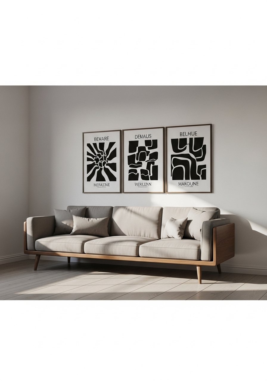
When the sofa is patterned, I go calm on the walls. A set of three monochrome posters anchors the seating area and makes cushions feel intentional. I bought a pack of black and white abstract prints and swapped frames until the grouping sat at eye level, about 56 to 60 inches from the floor to the center of the cluster. Common mistake is hanging them too high. Measure with kraft paper templates or use cheap command strips to mock it up. Test under your evening lamp too, because half the time your paint looks way different just from bulb changes and posters can shift hue under warm bulbs.
Vintage Botanical Posters for Bedroom
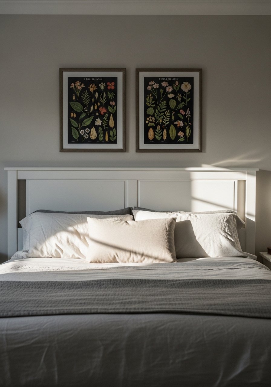
I added two vintage botanical posters above the bed and the room finally stopped feeling like a hotel. Choose vertical 18×24 prints to sit flush with a standard headboard height. I prefer matte paper so bedside reading lights don't glare. I linked a framed pair I like, the color tones read warm and soft in daylight framed botanical prints. Newer printers can shift green toward yellow, so hold the print up in the room before committing. If you rent, use small picture ledges and swap without holes.
Collage-Style Poster Grid for Home Office
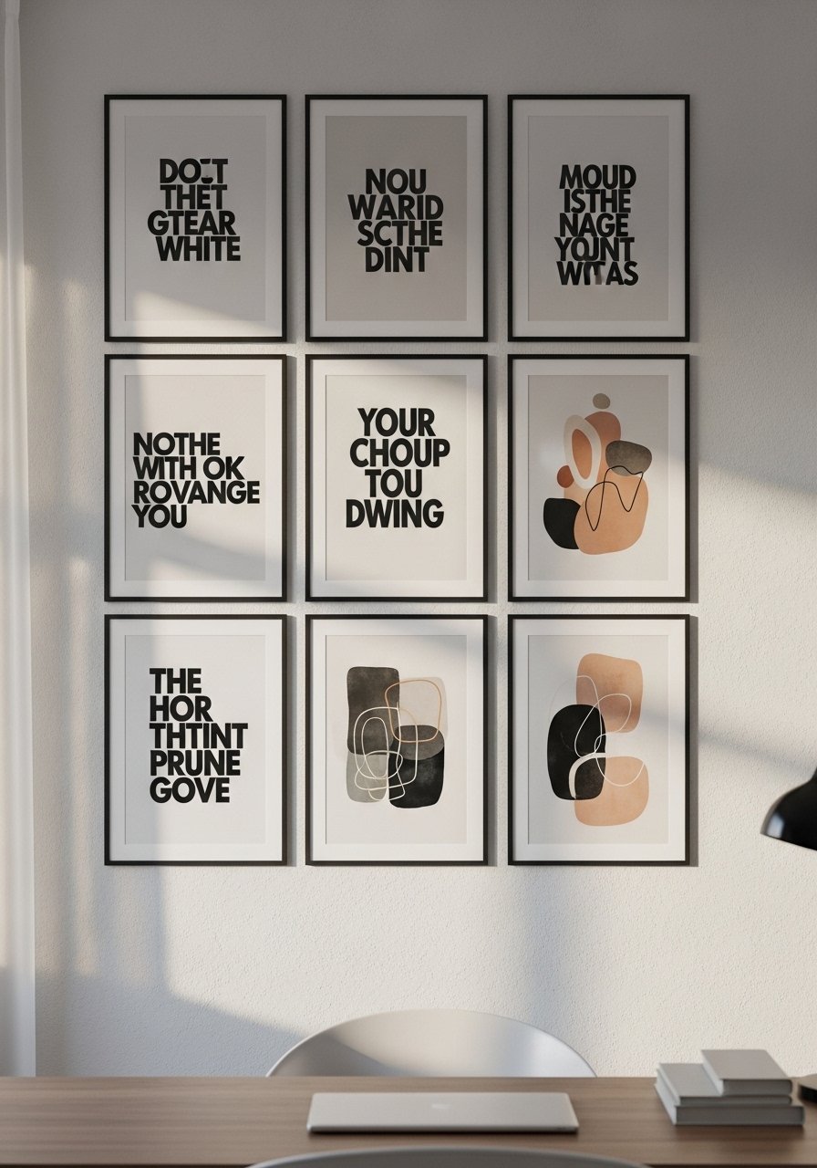
I needed energy when I worked from home. A tight three-by-three poster grid above the desk did that without cluttering the desk. Keep uniform spacing, 2 to 3 inches between frames, and build around a single color to avoid chaos. I used a mix of typographic posters and muted abstracts. The common error is random spacing. I traced the layout on kraft paper first, taped it, and lived with the templates for 48 hours because nine out of ten matches flop if you skip room lights and time tests. It saved me from rehanging.
Oversized Single Poster for Entryway Statement
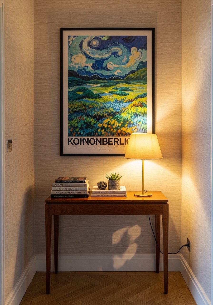
If you have a tight entry, one large poster makes the space feel intentional. I went with a 24×36 poster in a slim black frame hung so the bottom cleared the console by 6 to 8 inches. The impact is instant because one scale change tricks the eye. I recommend 24×36 framed art that arrives ready to hang. The mistake people make is too-small art in that spot. Also check the poster under your entryway bulb, light can shift tones and make a confident piece read washed out.
Layered Posters with Floating Ledges for Hallway
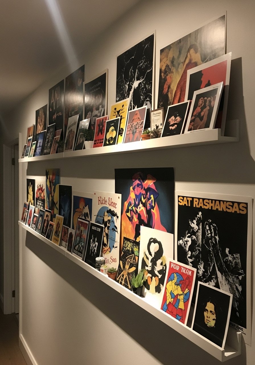
I avoid hammering holes by using picture ledges that let me layer posters. Place a larger 20×30 piece at the back and smaller 11x14s in front, overlap by about an inch so it reads curated, not cluttered. These white floating ledges are cheap and renter-friendly. Most articles say hang one at a time, but layering lets you swap seasonally without new nails. Watch for frame glare if your hallway uses a single overhead LED. Bring the physical print into the hall the night before to see how the finish reads.
Retro Film Poster Pairing for Media Room
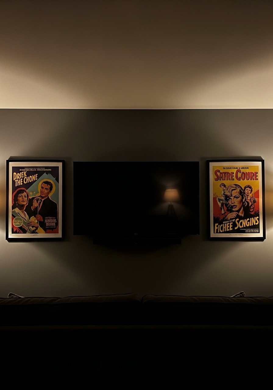
For movie nights I went bold with a pair of retro film posters. Match the poster palette to two accent colors already in the room so the TV doesn't feel like the only focal point. I used 18×24 posters framed in black and kept a 3:1 rule for color dominance, one dominant color and one supporting accent. Pick prints that are archival or high GSM paper to avoid fading from screen glow. These retro movie posters held up better than cheap paper. A common mistake is mismatched frame thickness, which reads sloppy across a set.
Pastel Art Prints for Nursery or Small Bedroom
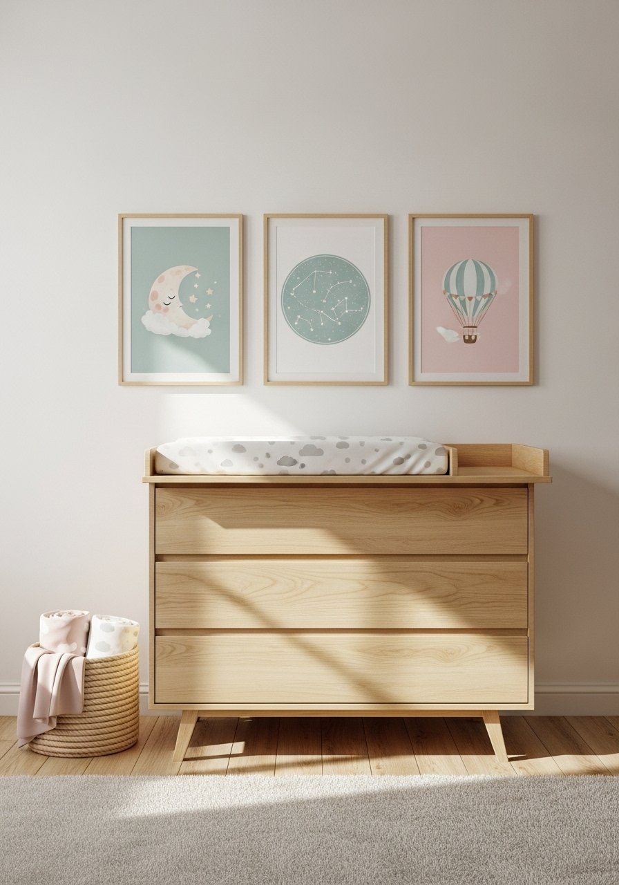
There is something about soft pastels that calms a small room. I chose 11×14 posters in powder tones and hung them at the same height as a crib rail so the eye moves horizontally. For nurseries pick matte prints and avoid glossy finishes that reflect night lights. These pastel art prints come in sets that match, which saves decision fatigue. Test the prints in both daylight and at night because your bulbs will make them feel warmer or cooler. Also, tape a tiny sample to the wall for a week to watch how kids, pets, and sunlight affect the colors.
Black Frame Gallery Wall for Modern Minimalist Bedroom
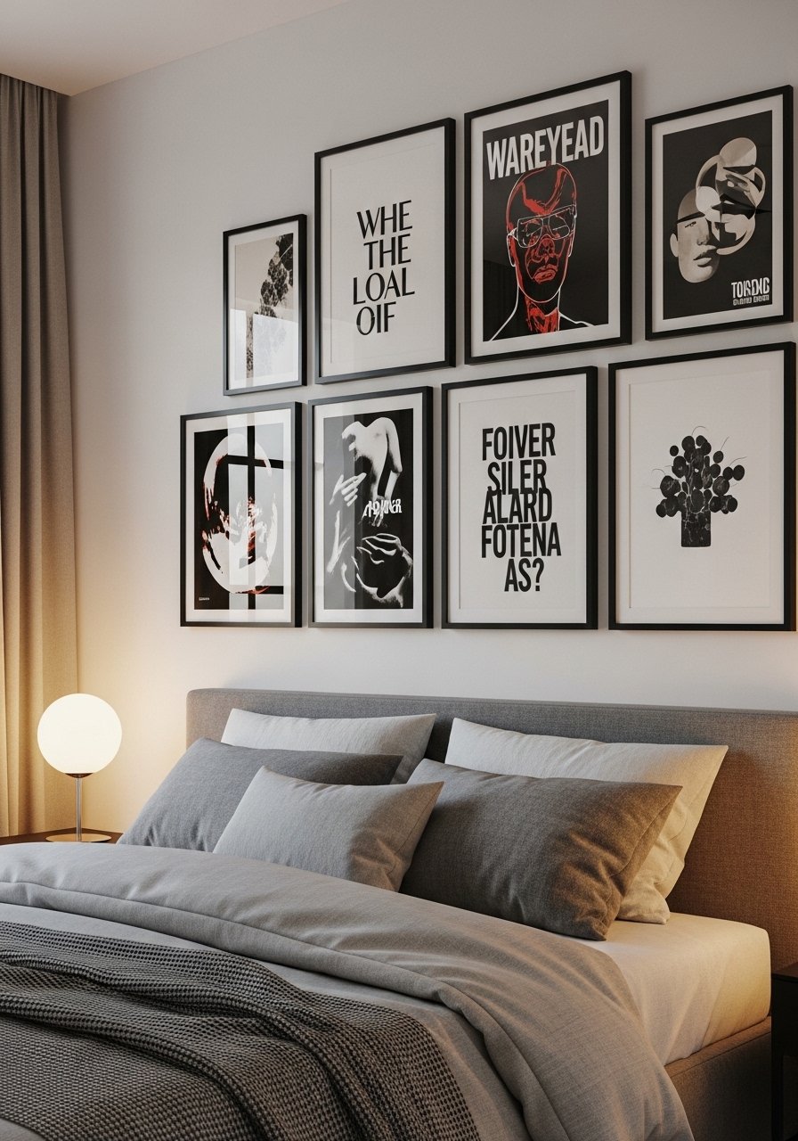
I committed to all black frames and it made a chaotic mix look cohesive. Keep frame lip width consistent and choose a single matte color family for the mats. For a bedroom aim for a cluster no wider than two-thirds of the headboard width to avoid overpowering the bed. I used black metal frames that are lightweight and easy to level. A mistake is mixing glossy and matte frames which fights for attention. If you want a cheap test, use cut kraft paper the size of each frame and live with it a few days before buying.
Custom Photo Poster Over Mantel for Living Room
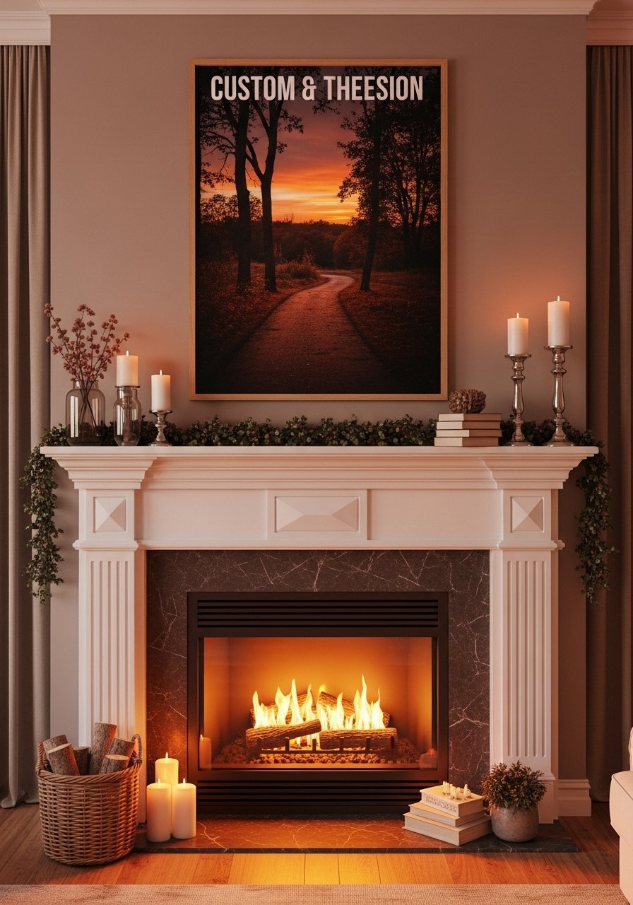
A custom photo poster over the mantel made the space feel personal without an expensive oil painting. I printed a high-resolution family photo on satin paper at 20×30 and matched the frame finish to the mantel hardware. Pro tip, boost resolution to 300 dpi and crop with a 3:2 aspect ratio to avoid unexpected cropping. I ordered through a print service and used custom poster printing for a quick turnaround. New owners often forget to check how the poster reads in candlelight. If your mantel is south-facing, expect some fade and opt for UV protection.
Typographic Posters for Kitchen Command Zone
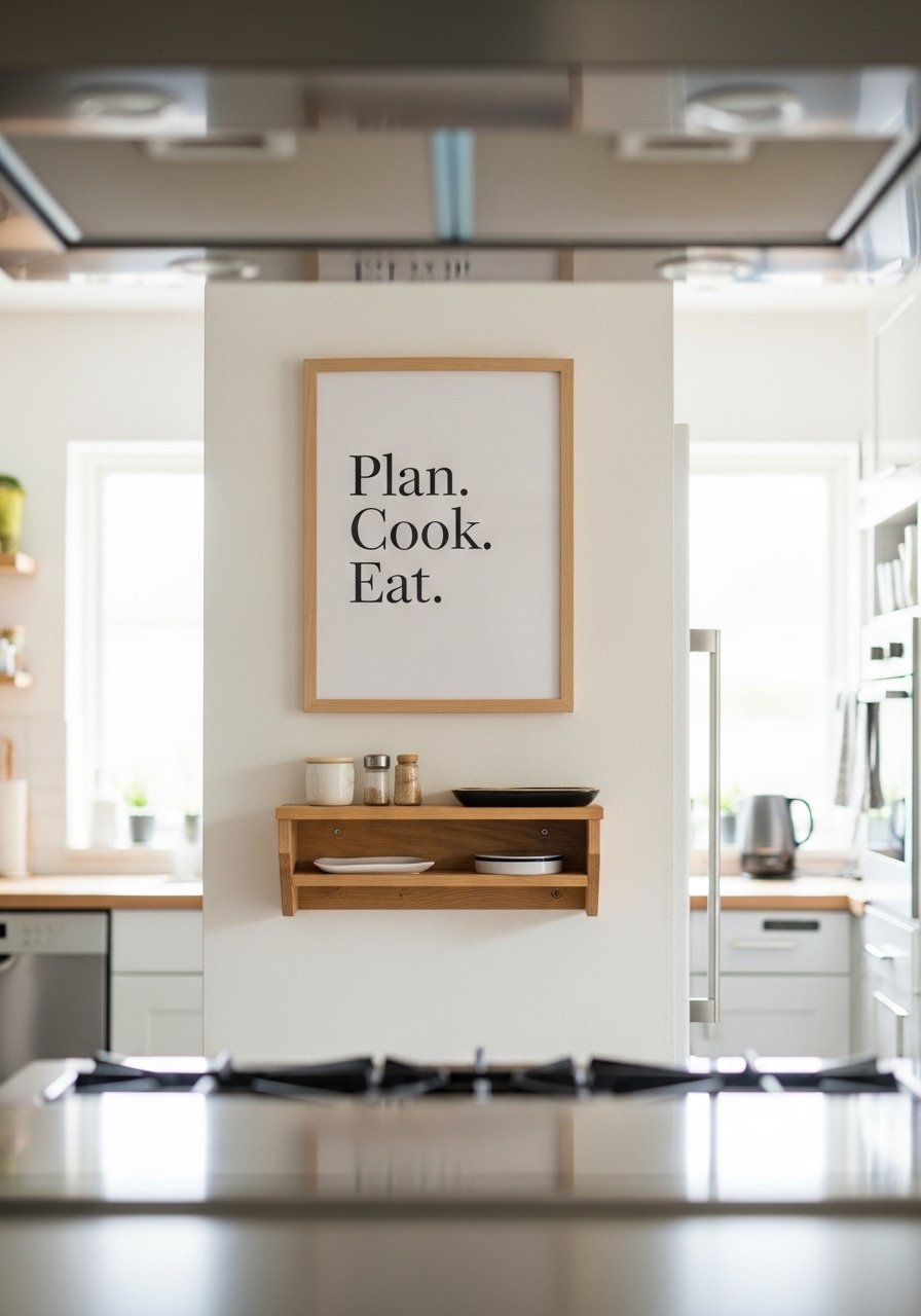
I replaced a cluttered bulletin board with a friendly typographic poster that sets the mood. Short phrases work best and keep the font large enough to read from across the room, about 36 to 48 point for a 11×14 print. I used a framed print that reads 'Plan. Cook. Eat.' to keep it simple typographic kitchen poster. People try tiny fonts and it becomes wallpaper. Also consider frame finish near the stove, metal frames tolerate kitchen humidity better than raw wood.
Collage-Poster Shelf for Kids Playroom
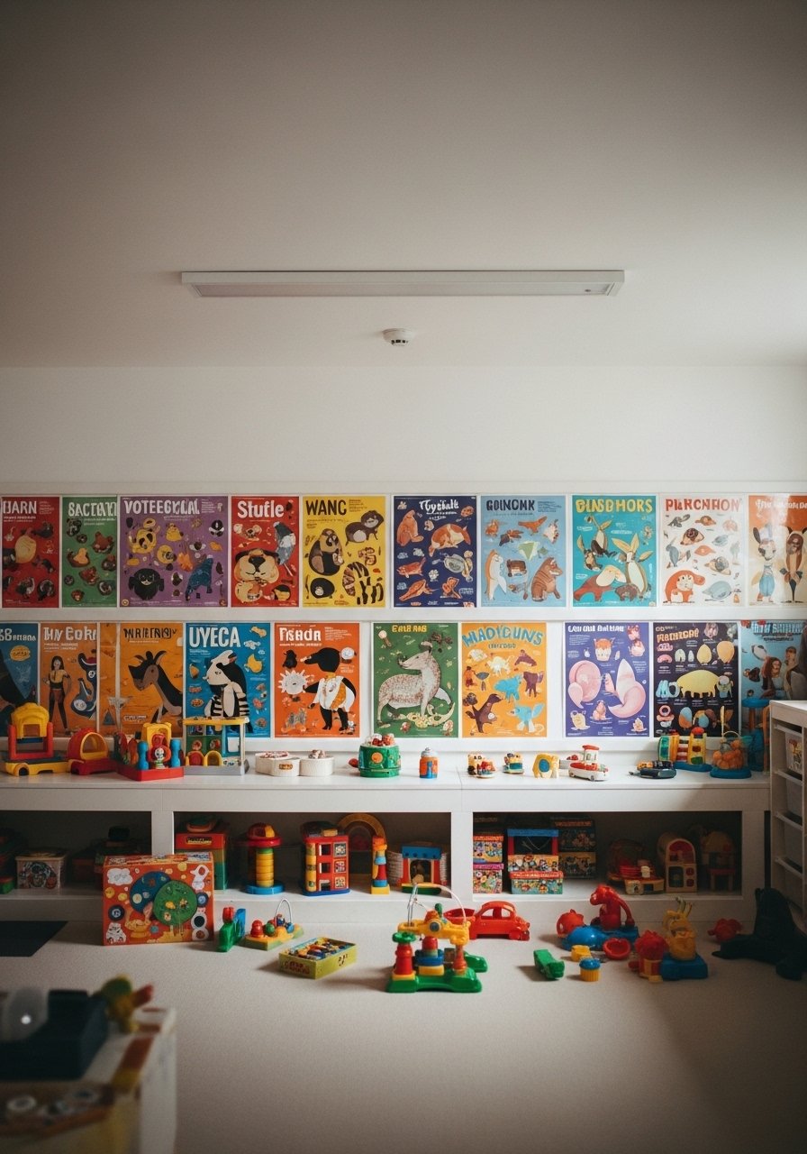
Kids need bright, changeable art. I built a low shelf and propped an ever-changing set of 8×10 posters so they can swap favorites. Use laminated or canvas prints for durability and cleanability. I keep a box of small laminated posters that the kids can grab themselves. Avoid glues or frames that can break. A tiny detail others miss is to anchor the shelf with museum wax if toys get rowdy. Rotate the prints every month to keep the playroom feeling fresh without spending much.
Metallic Accented Posters for Dining Nook
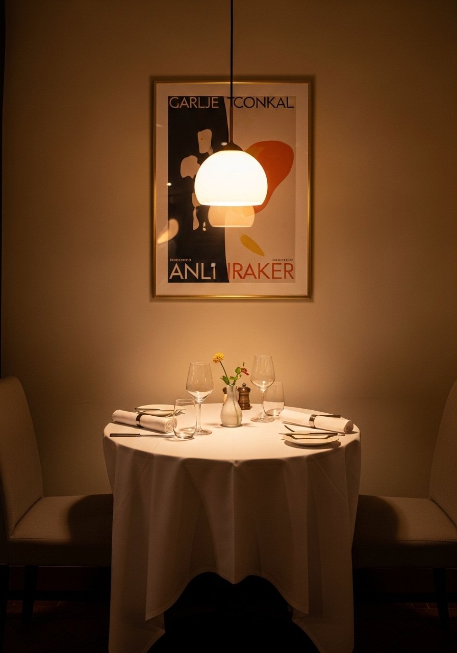
I wanted a little glam without overdoing it. A single poster with metallic accents in a thin brass frame ties to pendant lights and flatware. Pick a poster with subtle gold leaf or warm highlights and pair with a frame that matches the metal tone. I used a brass-finish frame for a unified look. Common mistake is mixing cool and warm metals in small spaces. If you have natural wood tones, test the poster against the wood sample at different times of day because lighting will influence the metal's perceived warmth.
DIY Color-Blocked Posters for Studio or Workshop
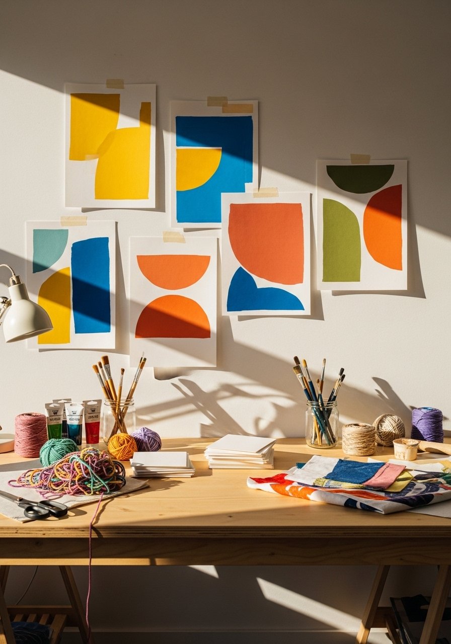
I love making posters with leftover paint and simple shapes. Use heavyweight paper and tape crisp edges with painters tape for clean lines. I work in 18×24 formats and follow a 60/30/10 rule for color balance across blocks. If you match a fabric, bring the fabric to the paint counter or use a sample scan because rival formulas nail the shade 95% of the time now and you can save money that way. Finish with a spray fixative to prevent scuffs. A common rookie move is not letting paint fully cure; give it 48 hours to dry before framing.
Your Decor Shopping List
Textiles
- Honestly the best $40 I have spent. Velvet pillow covers, 22-inch set of 2 in deep olive great for layering
- Chunky knit throw in cream, 50×60 inches (~$35-55). Drape over a sofa arm for instant softness
Wall Decor
- Found these while looking for something else. Brass picture ledges, 24-inch (~$18-25) swap posters without new holes
- Framed botanical prints, 18×24 pair for bedrooms or hallway
Lighting
- Adjustable picture light in brass finish keeps prints readable at night
Plants
- 6-foot faux fiddle leaf fig for corner height without maintenance
Budget Finds
- Typographic kitchen poster set, 11×14 (~$15-25)
- Black metal frame set, assorted sizes lightweight and budget-friendly
Splurge
- 24×36 archival framed art print for a mantel or entryway
Similar at Target or HomeGoods for many of these items if you prefer to see them in person
Shopping Tips
White oak beats dark wood in 2026. Design feeds have shifted completely. These white oak floating shelves look current, not dated.
Grab velvet pillow covers for $12 each. Swap them every 3 months and the whole room feels different.
Curtain rod height trick. Hang the rod 4 to 6 inches above the window frame to make ceilings read taller, and use 96-inch linen panels for standard 9-foot ceilings.
Everyone buys five small succulents. One single 6-foot fiddle leaf fig has ten times the visual impact.
If you rent, do 1×1 inch command strip poster tests. Lightweight poster frames, 11×14 set let you trial arrangements without holes.
Frequently Asked Questions
Q: How do I pick the right poster size for above a sofa?
A: Aim for art that spans about two-thirds to three-quarters of the sofa width. For a standard 84-inch sofa, try 56 to 64 inches total art width. Use kraft paper templates to test sizes before buying. 24×36 framed art often works as a single statement for that scale.
Q: Can I mix modern posters with vintage frames?
A: Yes, mixing works if you pick a single unifying element like frame finish or mat color. I pair modern abstracts with warm wood frames when the room has more natural textures. Keep frame lip widths close to avoid a scattered look.
Q: Will posters fade in sunlight and what can I do?
A: Sunlight and screen glow can fade prints over time. Opt for archival or UV-protected paper for south-facing walls, and rotate pieces seasonally. Test a sample in the room for a week before framing to watch how light affects color.
Q: Should I match poster colors to pillows and rugs exactly?
A: Avoid exact matching. Pick one poster color as the dominant and allow other elements to be variations of that tone. A slight warm or cool bias helps the room feel layered rather than themed. Rival formulas nail the shade 95% of the time now, so use that to your advantage when matching textiles to a poster.
Q: What is the easiest way to swap posters without new nails?
A: Use narrow picture ledges or lightweight frames that hang with one small hook. Command strips work for smaller frames, and museum wax anchors ledges against energetic pets and kids. If you rent, mock the layout with paper for 48 hours before installing.
