
Spent $400 on a new coffee table. Room still looked off. Spent $35 on a throw and three candles. Suddenly everything clicked. I started treating walls like furniture. Small shifts in scale, a mix of frames, and a couple of hand-me-downs from friends turned the whole place from boring to collected.
These ideas lean eclectic and a little boho with modern touches. Most projects are under $75, with a few splurges around $120 for an oversized print or mirror. They work for living rooms, entryways, bedrooms, and even narrow hallways that need personality.
Layered Neutrals With One Bold Accent
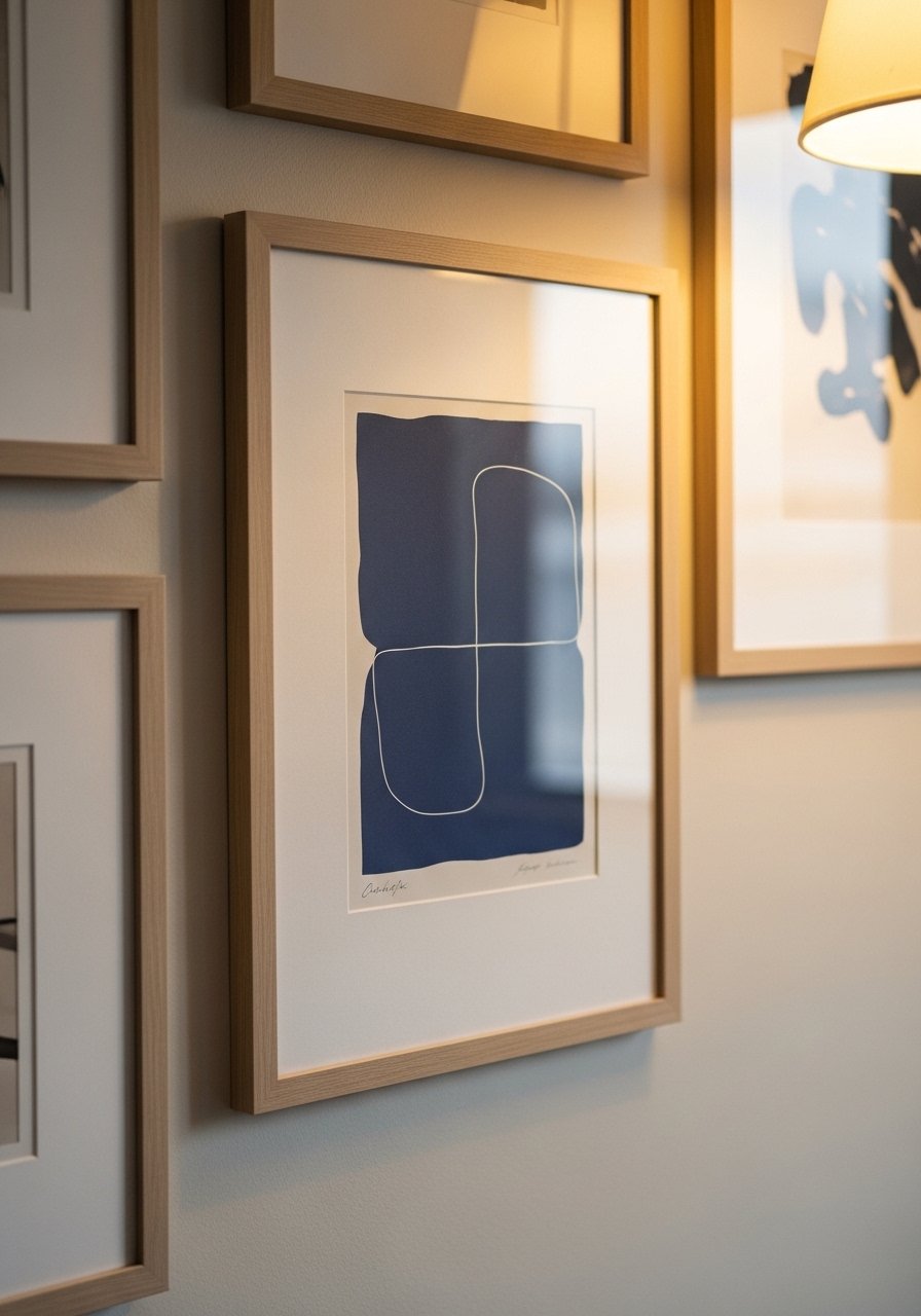
The trick I learned was to build a calm base then add one bold color so the wall reads cohesive instead of chaotic. Use 60-40-20 for color: 60 percent neutrals, 40 percent muted tones, 20 percent one punchy hue. I used 11×14 and 16×20 frames with 2 inches between pieces to keep rhythm. For frames, try black-and-wood mixed frames for under $30 a set. Common mistake is using the same mat size for every piece. Vary mats and let the bold print breathe.
Mixing Frame Styles for a Collected Look
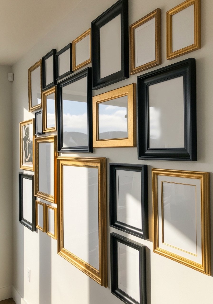
Most of my friends overmatch frames and it looks store-bought. Mixing thin black frames, gilt frames, and raw wood creates that thrifted, collected feeling. Start with a single consistent element, like matching mat color or a repeating small frame size. I like 2 to 3 frames in a row that are the same height as an anchor. Try mixed metal frames to get the look fast. A typical mistake is hanging everything at the same height. Staggering heights keeps the eye moving and makes the wall feel intentional.
Gallery Shelf for Renters and Frequent Swappers
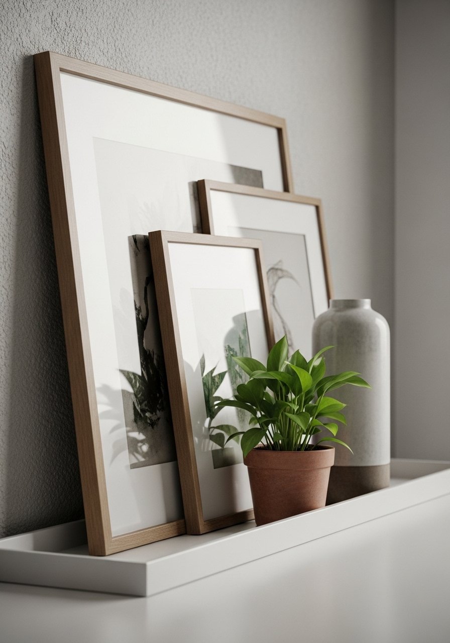
I do this when I cannot commit to nail holes. Picture ledges let you layer art, swap prints in minutes, and add small objects to break up flat frames. I use a 36-inch ledge as the base and lean two different sizes on it, then add a plant to the left. Found brass picture ledges for under $25 that look pricier. Common error is overloading the shelf. Keep the heaviest pieces toward the middle for balance. This works especially well in apartments and kid rooms.
Vintage Finds and Thrifted Art for a Budget Nook
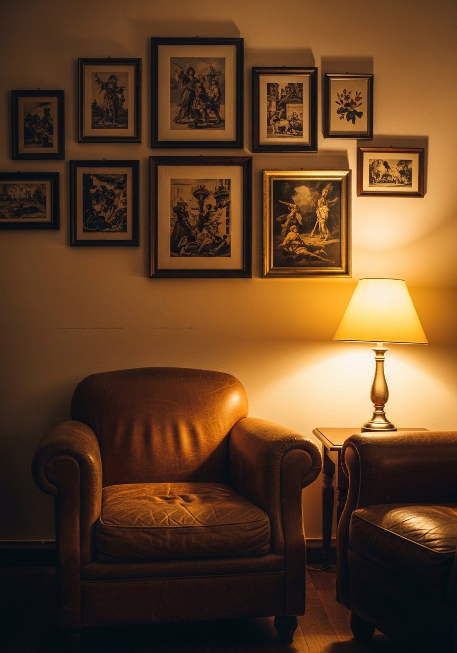
Thrift shops are my secret source for character. A mismatched set of frames and a few prints for $5 each beats one new print for $50. I learned to scan for old maps, botanical prints, and black-and-white magazine pages and reframe them in clean mats. Use affordable vintage-style frames if the originals are beat up. Mistake people make is trying to match eras. Mix decades and you get a layered, believable wall. Budget tip, spend the money on matting, not the frame.
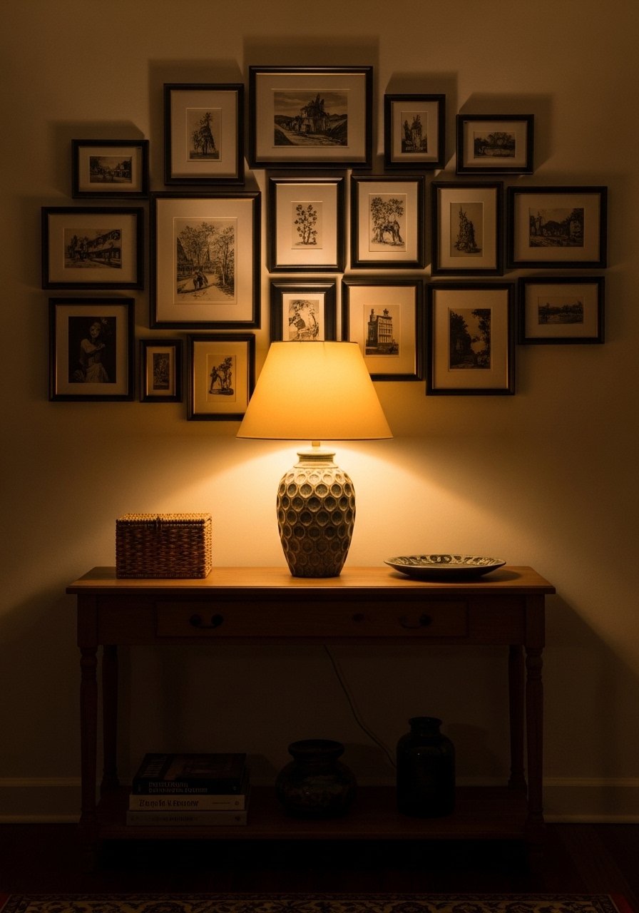
Black-and-White Photographs for a Minimal Bedroom
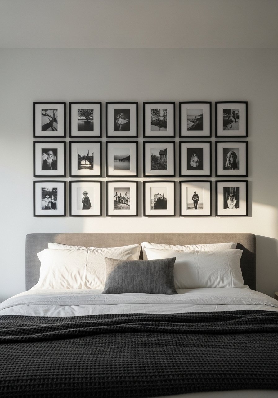
There is a quiet power to a curated set of monochrome photos. Pick a consistent frame color and mat size, then pick a dominant orientation, either all portrait or all landscape. Center of the gallery should be 57 inches from the floor for most rooms. I printed family shots at a local lab and used matte black frames to keep prices down. A common mistake is mixing shiny frames with matte photos. Stick to one finish so the images read as a single collection.
Add Textiles and Tapestries for Boho Reading Corners
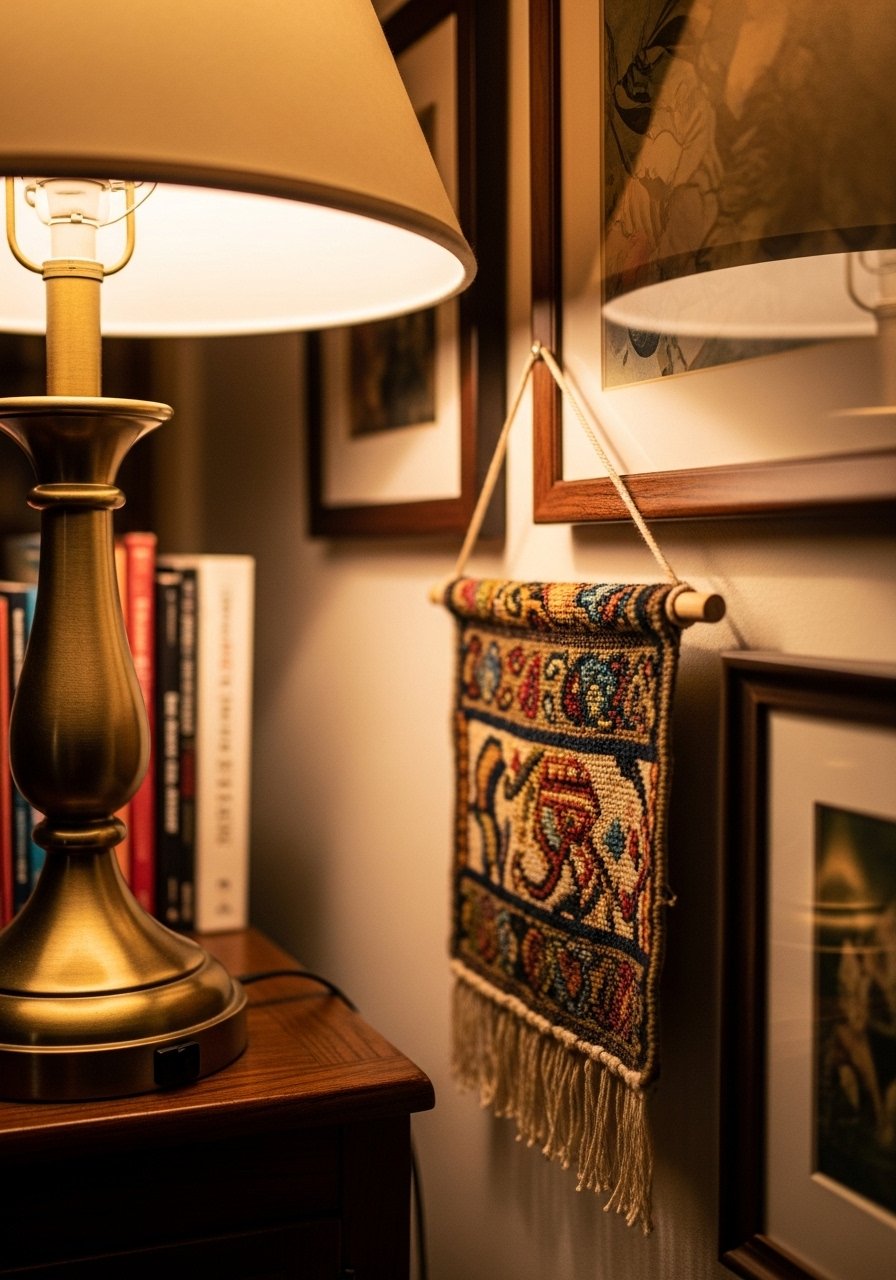
There is something about fabric that changes a wall from gallery to gathering spot. I hung a 30×40-inch woven piece amid framed art and the space instantly felt lived-in. Use two smaller frames around the textile to make it feel intentional. I used small brass rod hangers to keep installation simple. A mistake is placing the textile too high. The bottom edge should sit around eye level so it reads with the rest of the gallery. This is great for bedrooms and reading nooks.
Floor-to-Ceiling Grid to Make Ceilings Feel Higher
Most people hang curtains right at the window frame. That is why their rooms look shorter than they are. The same logic applies to gallery walls. Stack art vertically and keep the top row close to the ceiling to pull the eye up. Use 8×10 frames in a 3×4 grid with 1.5 to 2 inches between frames. Lightweight 8×10 frames keep the wall from feeling heavy and allow more pieces without extra reinforcement. Avoid placing the grid too low, which collapses the perceived height.
Mirrors Mixed With Art to Brighten a Dark Hall
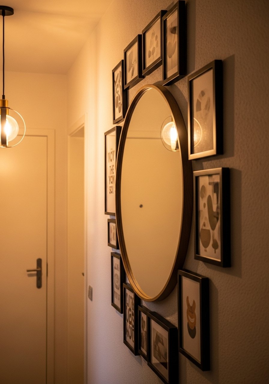
A mirror right in the middle of a gallery wall doubles light and makes narrow spaces feel wider. I hung a 24-inch round mirror with smaller 11×14 prints around it. Keep a 3-inch breathing space between mirror edge and frames so nothing reads crowded. For a budget mirror that still looks good, try round framed mirrors for about $80. Common mistake is using mirrors with visible plastic that cheapens the look. Invest in one decent mirror and build the rest around it.
Kids’ Art Gallery That Still Looks Put Together
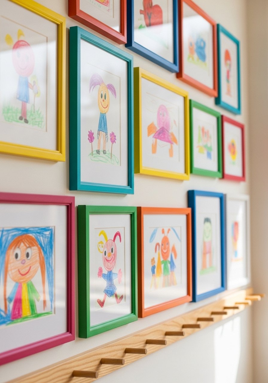
I turned a playroom wall into a rotating gallery with clip frames and a simple wire. Use matching clip frames or a tidy cork strip to avoid chaos. I hang kids’ pieces with bulldog clips and swap art every month. A set of clip frames keeps things inexpensive. Mistake parents make is taping art directly to the wall. The gallery should look curated, even when it is homemade. This feels energetic in playrooms and casual family spaces.
Small Prints Clustered Over a Console Table
If you have a narrow wall above a console, group 5 to 9 small prints in a loose cluster. Start by placing the bottom of the lowest frame about 4 to 6 inches above the table surface. I use a mix of 5×7 and 8×10 prints with 1.5 inches between frames. Affordable 5×7 frames make this budget-friendly. A common mistake is centering the cluster on the wall rather than the furniture below. Always align the gallery with the piece it sits above.
Metallic Accents for a Modern Glam Entry
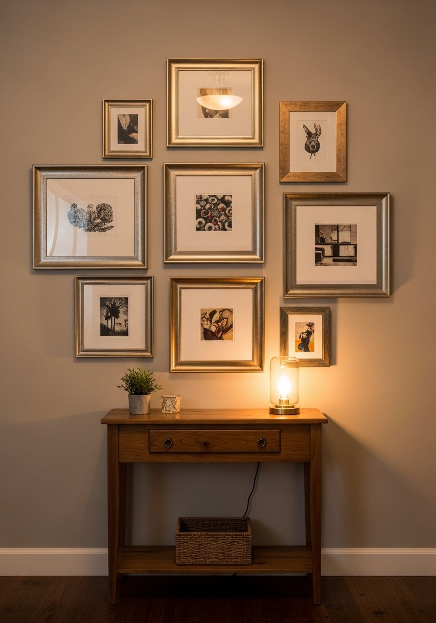
A few metallic frames can add a modern edge without feeling flashy. Mix brass and brushed nickel and repeat a small metallic element like a brass hook on the console to tie things together. I used two 11×14 gilt frames and balanced them with a small silver frame for contrast. Try mixed-metal picture frames if you need a quick route. The mistake is overdoing gold. Keep metallics to about 20 percent of the composition for a polished look.
Oversized Statement Piece Anchoring an Eclectic Mix
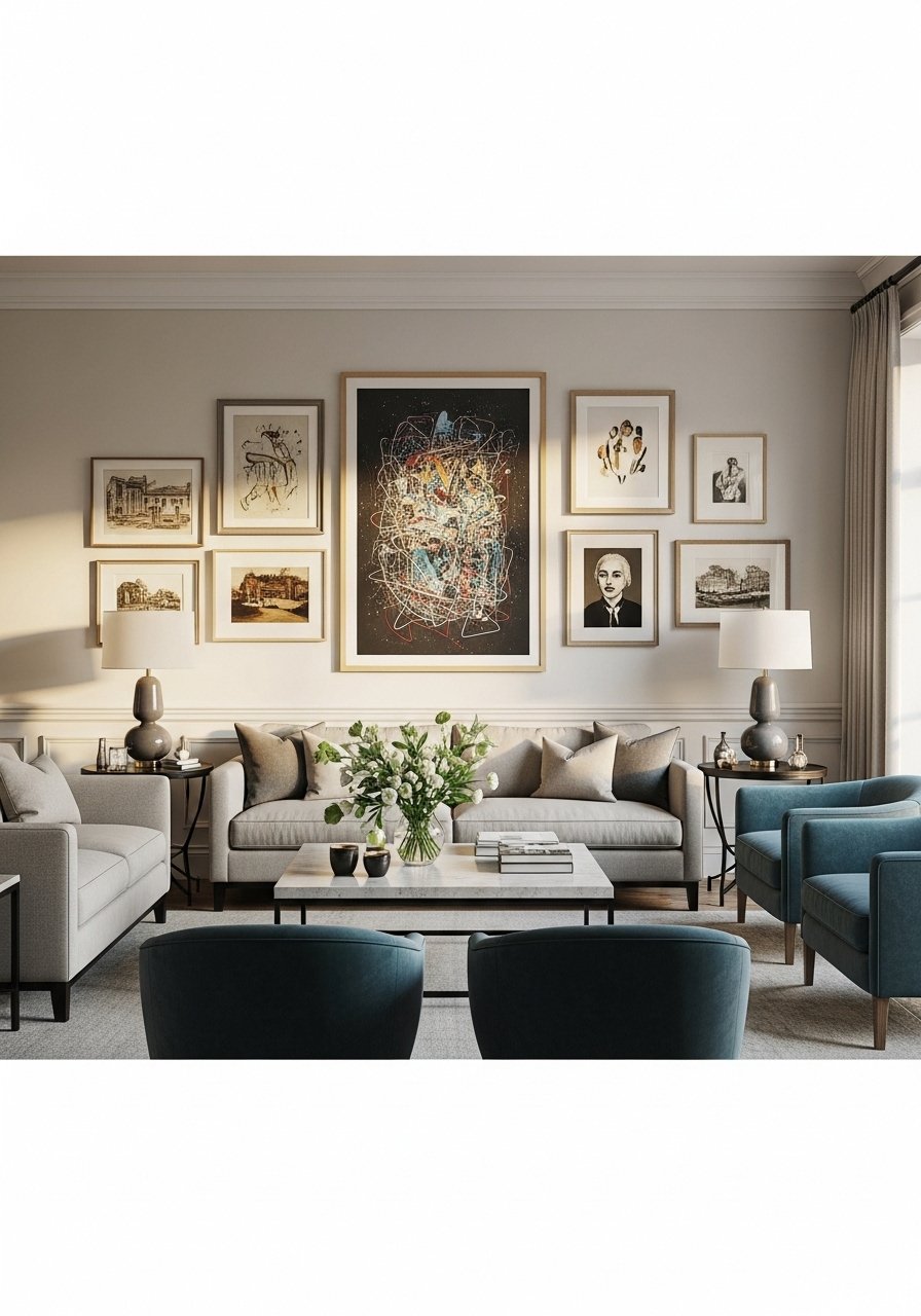
I like starting with one oversized piece, roughly 60 percent of the wall width, then building smaller works around it. A 36×48-inch print served as my anchor, then I added three 12x16s to balance. An oversized mirror or framed textile also works. For a ready option, large abstract canvas prints can be affordable around $120. People often hang the anchor too high. Keep the center close to 57 to 60 inches from the floor so seating interacts well with the art.
Floating Shelves and Plants for a Lived-In Wall
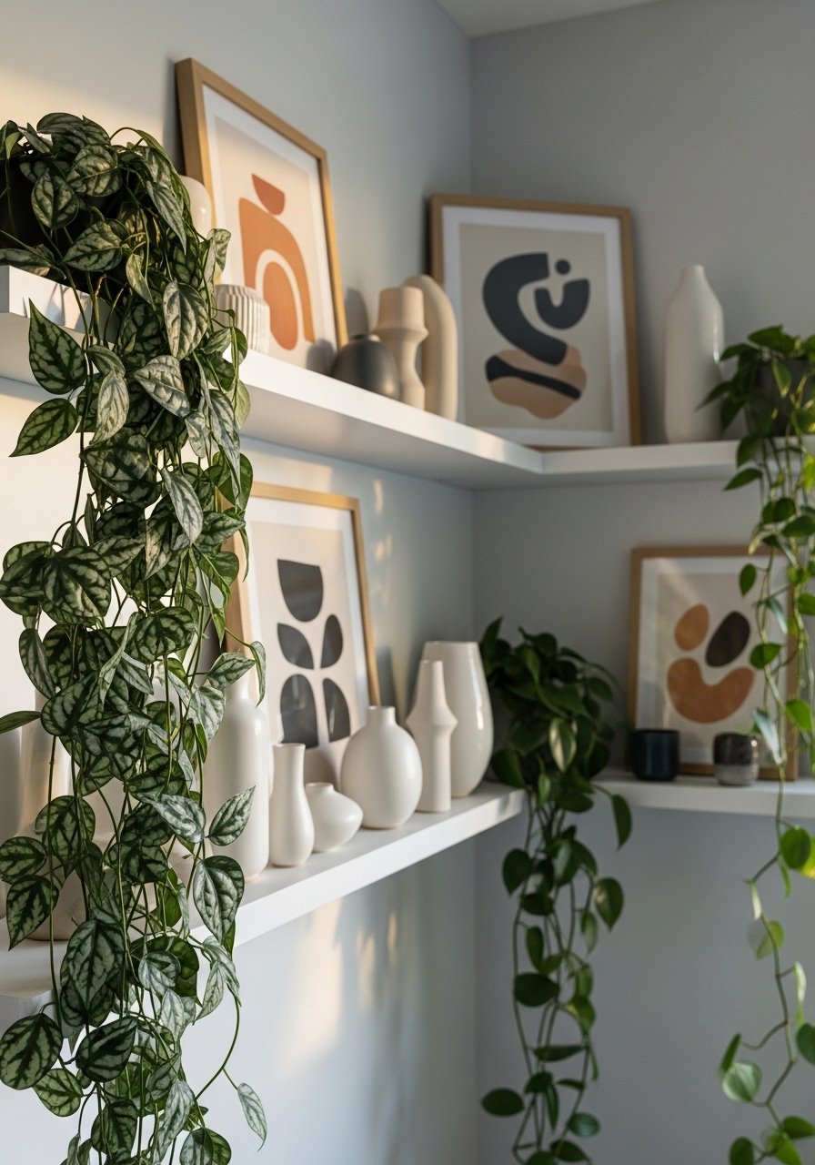
Plants make a gallery feel like a home rather than a staged photo. Use narrow floating shelves to mix framed art and pottery, and alternate green elements so the eye rests. I used 12-inch shelves spaced 10 inches apart vertically. White oak floating shelves look updated and are sturdy enough for small frames and planters. Common mistake is clustering all plants on one shelf. Spread them through the composition for balance. This works well in kitchens, living rooms, and small foyers.
Your Decor Shopping List
Textiles
- Honestly the best $40 I have spent. Chunky knit throw in cream 50×60 inches. Drape over a sofa arm for instant warmth
- Velvet pillow covers, set of 2 22-inch, down-fill friendly, mix two colors
Wall Decor
- Brass picture ledges 36-inch, great for renters
- Large abstract canvas print 36×48 neutral palette, focal piece
Lighting
- Warm table lamp with linen shade adds soft glow by gallery walls
Plants
- Artificial fiddle leaf fig 6ft for height without fuss
- Hanging pothos planter to weave into shelves
Budget Finds
- 8×10 lightweight frames, pack of 6 for grid walls
- Clip frames set for kids’ art rotating gallery
Shopping Tips
White oak beats dark wood in 2026. Design feeds have shifted completely. White oak floating shelves look current, not dated.
Grab velvet pillow covers for $12 each. Swap them seasonally and the whole room feels different.
Curtains should puddle or kiss the floor, never hang halfway up. Linen curtain panels 96-inch are right for standard 9-foot ceilings.
One large plant beats five tiny succulents in visual impact. Consider artificial fiddle leaf fig 6ft where real plants will struggle.
Frequently Asked Questions
Q: How high should I hang the center of a gallery wall?
A: Aim for the center of the gallery to sit around 57 to 60 inches from the floor in most rooms. For seating areas lower the center by about 4 inches so the art feels connected to the furniture.
Q: Can I mix modern prints with vintage frames without it looking messy?
A: Yes. Use one unifying element, like consistent mat color or a repeated frame finish. I mix a modern abstract with thrifted gilt frames by keeping mats white and spacing pieces evenly.
Q: What spacing works between frames for a dense cluster?
A: I use 1.5 to 2 inches between frames for a tight cluster and 2.5 to 3 inches for a looser layout. Keep spacing consistent and the wall reads intentional.
Q: How do I hang kids’ artwork so the wall still looks styled?
A: Use clip frames or a cork strip and rotate pieces regularly. Keep frame finishes consistent and anchor the display with one grown-up piece, like a small print or mirror.
Q: Should I match metals on a gallery wall?
A: No. Mix metals for a collected feel but limit metallic pieces to about 20 percent of the composition. That keeps the look modern without feeling over the top.
Q: Are faux plants acceptable in a gallery wall?
A: Both real and faux work. Use faux fiddle leaf figs or trailing plants where light is poor. Blend with real small plants where you can, and alternate greenery across the shelves so it reads natural
