
My living room used to feel like I rented someone else furniture. I finally fixed it by filling a single wall with art that mattered, not just pretty prints. I taped up a dozen small pieces, lived with them for two weeks, and then swapped frames and spacing until the rhythm felt right. That trial period saved me from buying and rehanging half a dozen frames.
These ideas lean soft cottagecore with a mix of thrifted finds and affordable Amazon pieces. Most projects run $10 to $75, with a few splurges for vintage frames. They work for living rooms, bedrooms, entryways, and that awkward stair landing you keep avoiding.
Pressed Flowers in Mismatched Vintage Frames, Living Room
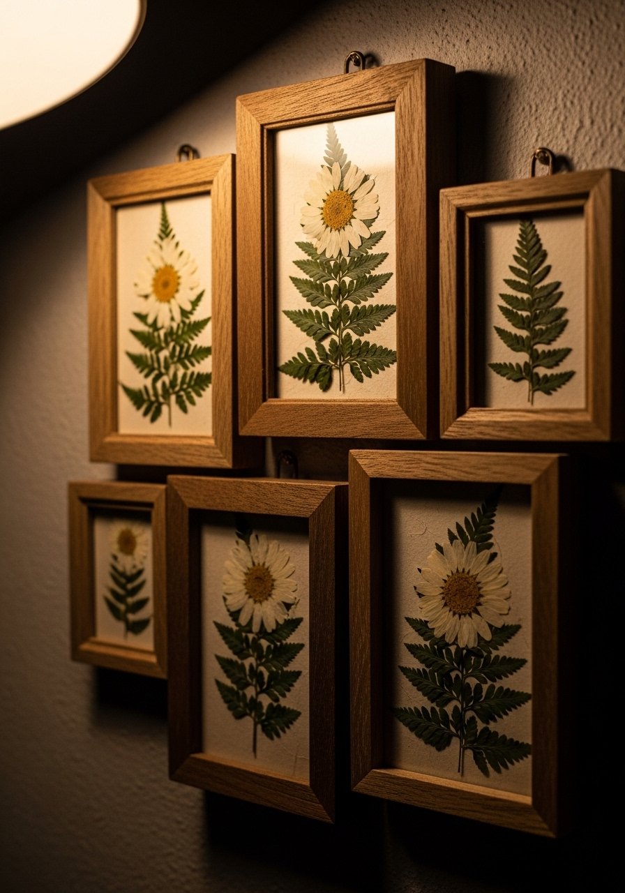
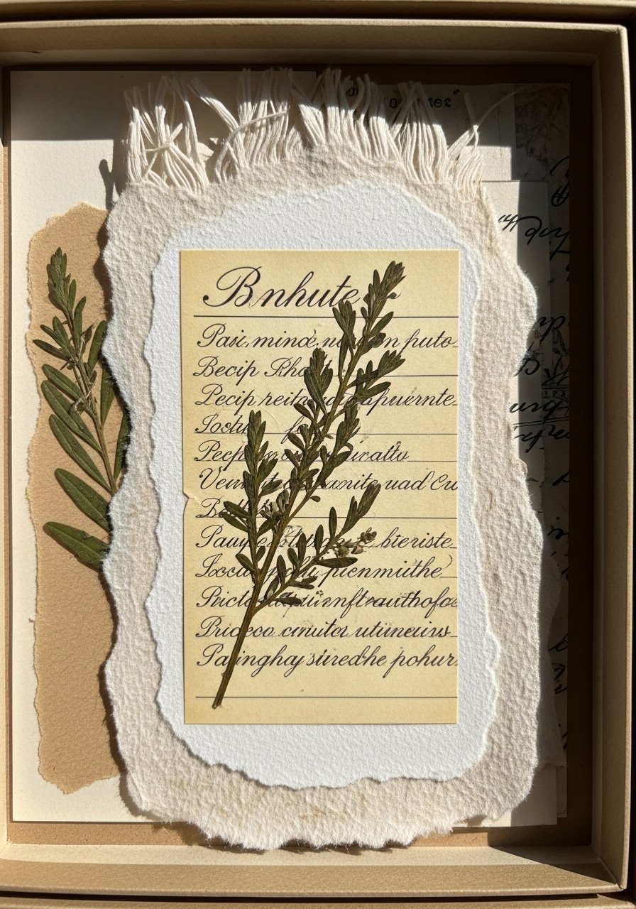
The first time I pressed flowers and framed them, people asked if they were antiques. Simple pressed blooms read like heirlooms when paired with mismatched wood frames. Aim for a 2:1 ratio of portrait to landscape frames to keep the cluster readable from the couch. I used a set of three 8×10 vintage-styled frames I found, and then layered two smaller 5×7 pressed blooms next to them for scale. A common mistake is sealing the flowers behind glass without archival tape. Use acid-free backing and a strip of linen to cushion the petals. Try vintage-style wood frames for about $25 to $45.
Botanical Print Grid with Thin Black Frames, Dining Area
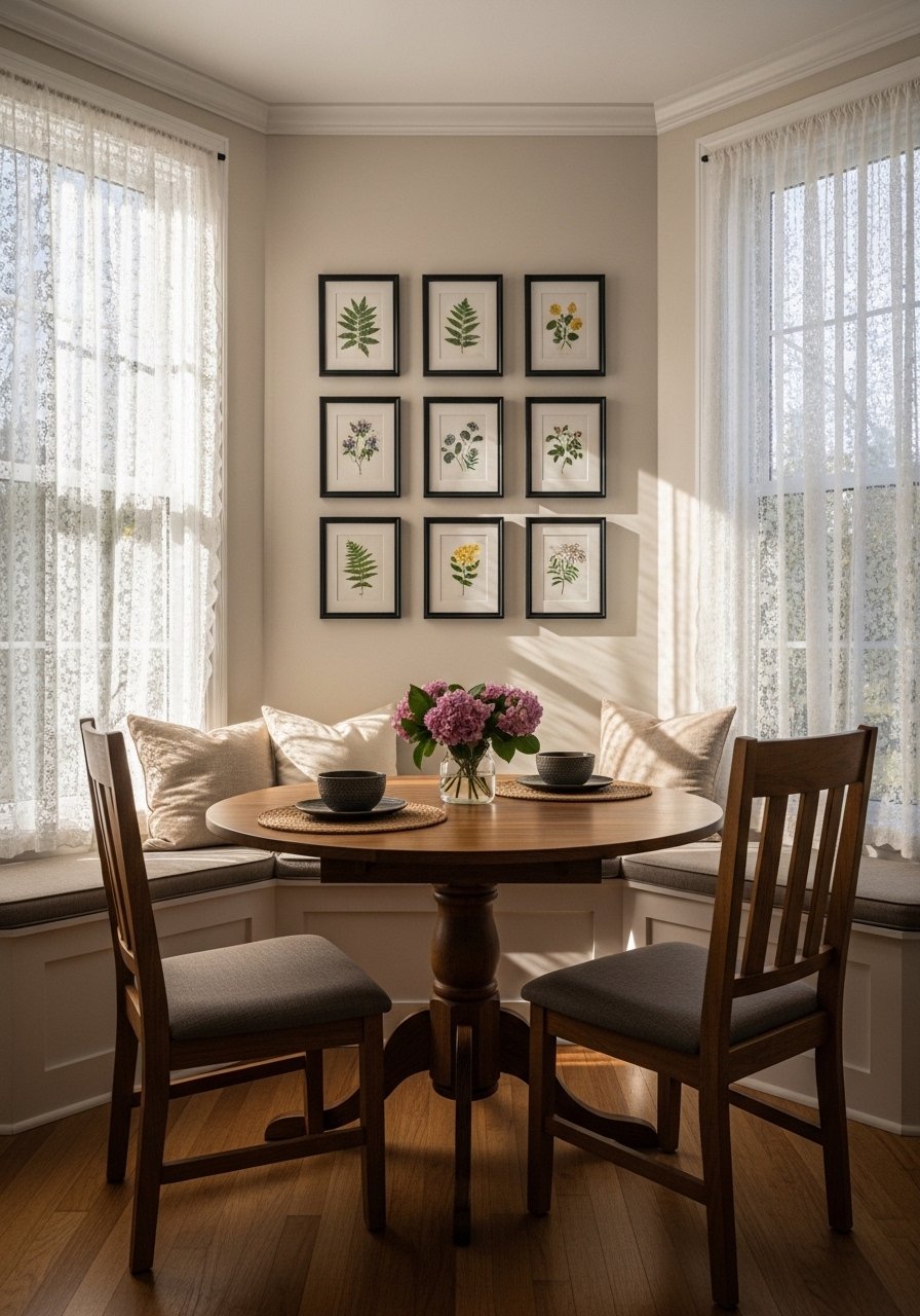
Symmetry is soothing in a breakfast nook. A tidy grid of botanical prints in slim black frames keeps cottagecore from looking too fussy. Measure the wall and pick a single print size that fills roughly 60 to 70 percent of the wall width. I hung nine 11×14 prints and left 3 inches between frames for clean breathing room. People often rush to uneven spacing which makes a grid look amateur. I mixed in one small gilt frame as a wink to thrifted finds. Pick up slim black frames with mats to make the install painless.
Embroidery Hoop Sampler for the Hallway, Narrow Space
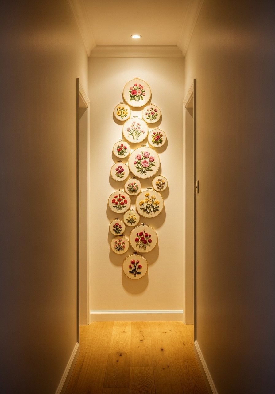
Embroidery hoops are cottagecore shorthand and they are light enough for a renter wall. Use a vertical stacking pattern that follows the eye up the hallway. I alternated 6-inch and 9-inch hoops and kept 4 inches between hoops. One mistake is picking hoops that are too similar in color. Swap a few painted hoops for natural wood to add depth. For casual swapping, hang with removable picture hanging strips rated for small loads. These wood embroidery hoop sets are inexpensive and ready to paint if you want a soft pastel palette.
Plate Gallery with Hand Painted Ceramics, Kitchen Wall
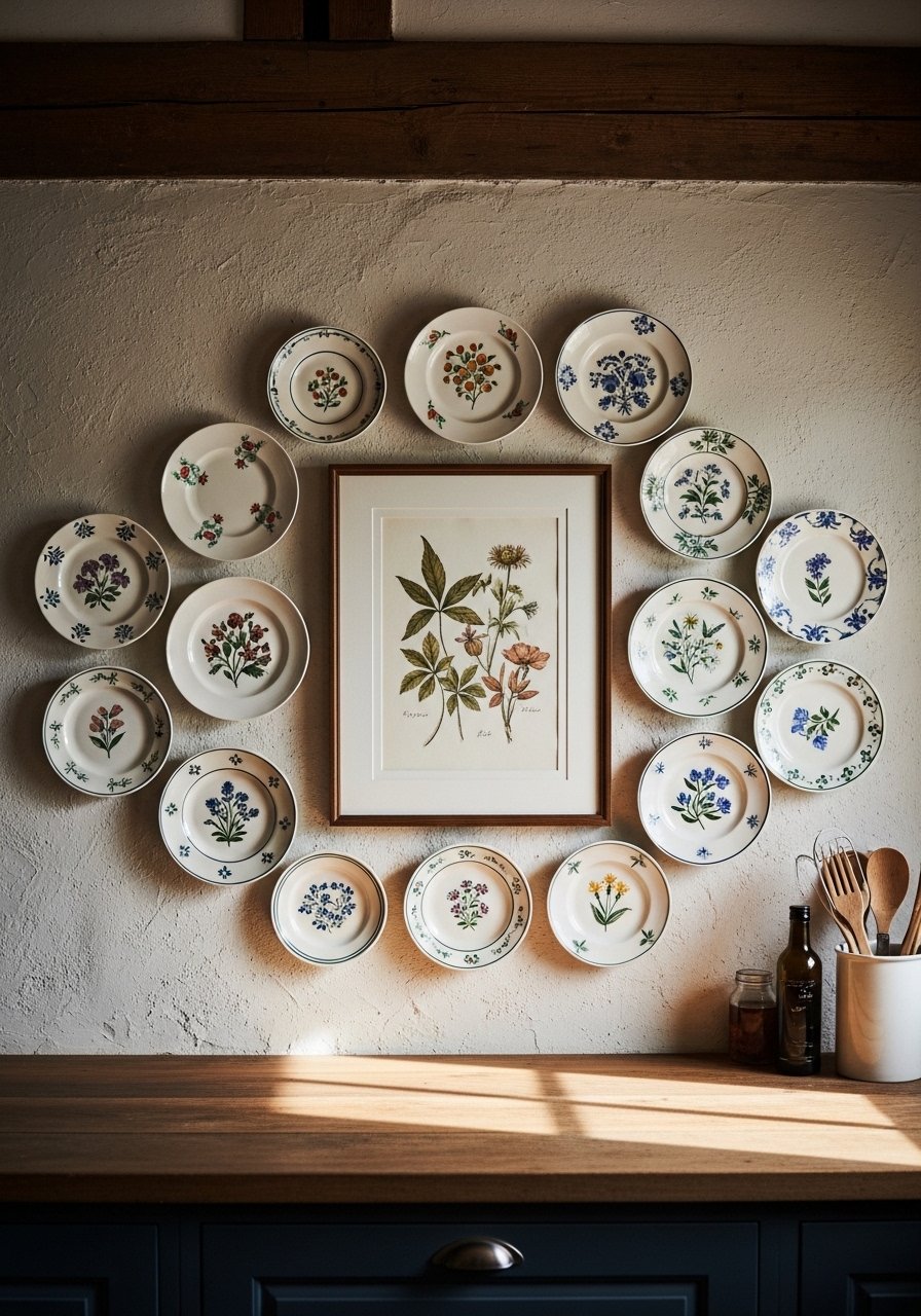
I collected plates over a year before deciding on a layout. The trick is to place the largest plate in the center and balance with odd numbers around it. Keep 2 to 4 inches between pieces so they read as a single composition. A typical mistake is drilling every hole without a template. Cut a paper template first to test placement. Lightweight ceramic plates can be hung on museum putty or plate hangers that grip without large screws. Try decorative plate hangers to avoid extra holes.
Miniature Landscape Paintings on Picture Ledges, Entryway
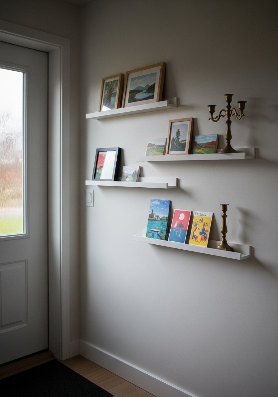
Picture ledges are a lifesaver when you want to swap art seasonally. I use a trio of 12-inch ledges and layer small 5×7 landscapes with postcards and a tiny ceramic jug. The visual result is layered without committing to nails. A common error is crowding the ledge so nothing reads. Leave the top ledge with one or two objects only. For renters, narrow picture ledges install with three screws and feel secure under regular use.
Fabric Swatch Wall with Framed Linen Squares, Bedroom
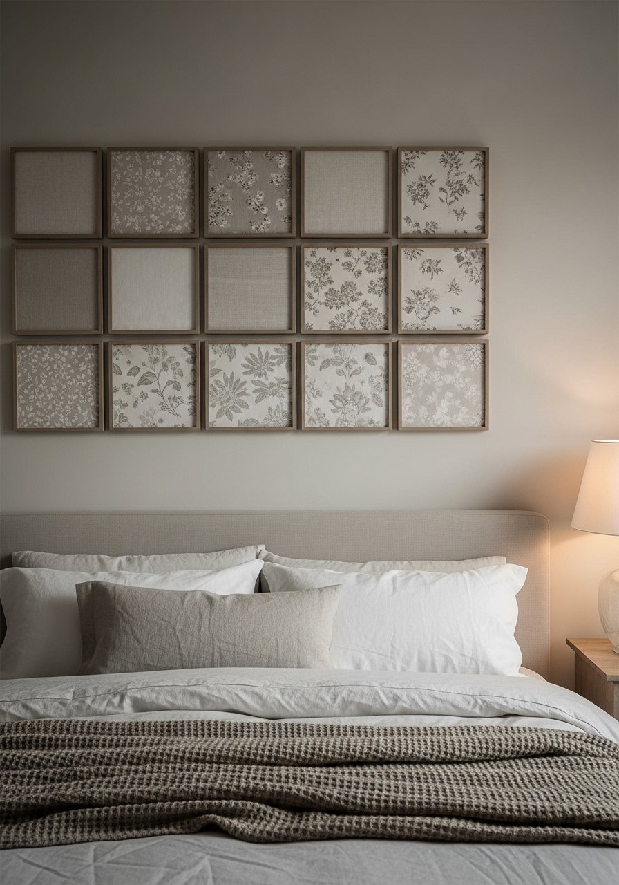
If you made curtains or have a favorite dress, cut 6×6 inch swatches and frame them in small shadow boxes. The tactile fabric brings cottagecore texture and ties textiles across the room. I grouped nine swatches in a 3×3 and used 1 inch of matting to give each piece air. People forget to secure fabric edges and over time they sag. Use a small stitch at corners or acid-free glue dots behind the mat. I used small shadow box frames for a clean look.
Found Object Shadow Boxes, Stair Landing
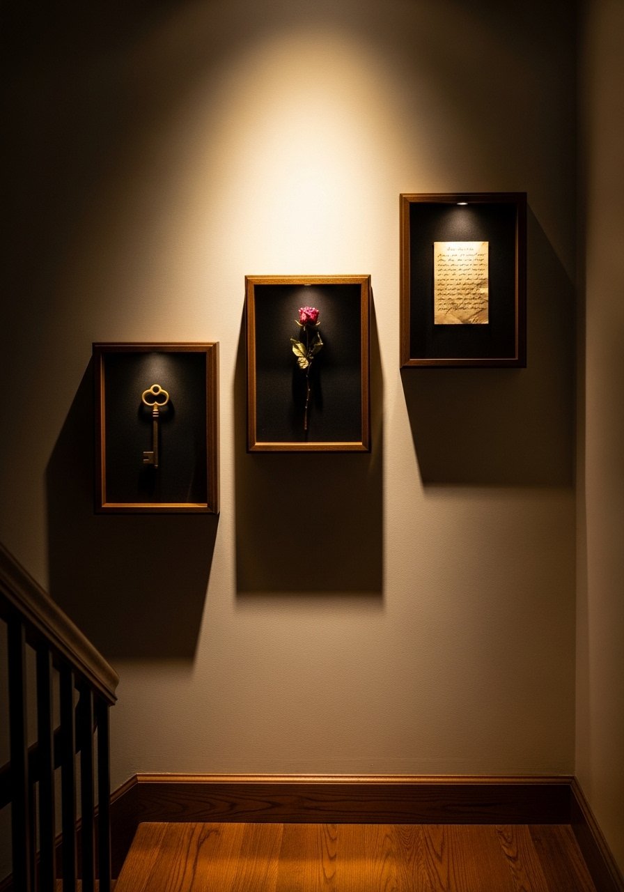
Cottagecore is as much about objects as art. Shadow boxes let you turn a found key or an old postcard into gallery-worthy pieces. Keep objects varied in scale and choose boxes with 1.5 inch depth to avoid crowding. One mistake I made was mixing reflective glass with matte objects which made photos hard to take. Swap in non-reflective acrylic if glare is an issue. For a starter kit try deep shadow box frames.
Botanical Watercolor Mix with Thrifted Frames, Living Room
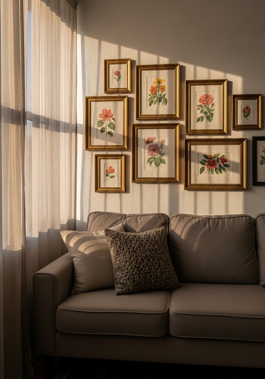
I love the contrast of a modern watercolor with a thrift-shop gilt frame. Keep a consistent color story so the variety reads as intentional. Use a rule of three for mixing frame finishes. For instance, three gilt, two painted, and one raw wood. A mistake is letting frames fight the art. Clean or repaint frames when needed to make them read as a set. I picked up a pack of assorted thrift-style frames for quick edits.
Layered Mats and Floating Frames for Depth, Study Nook
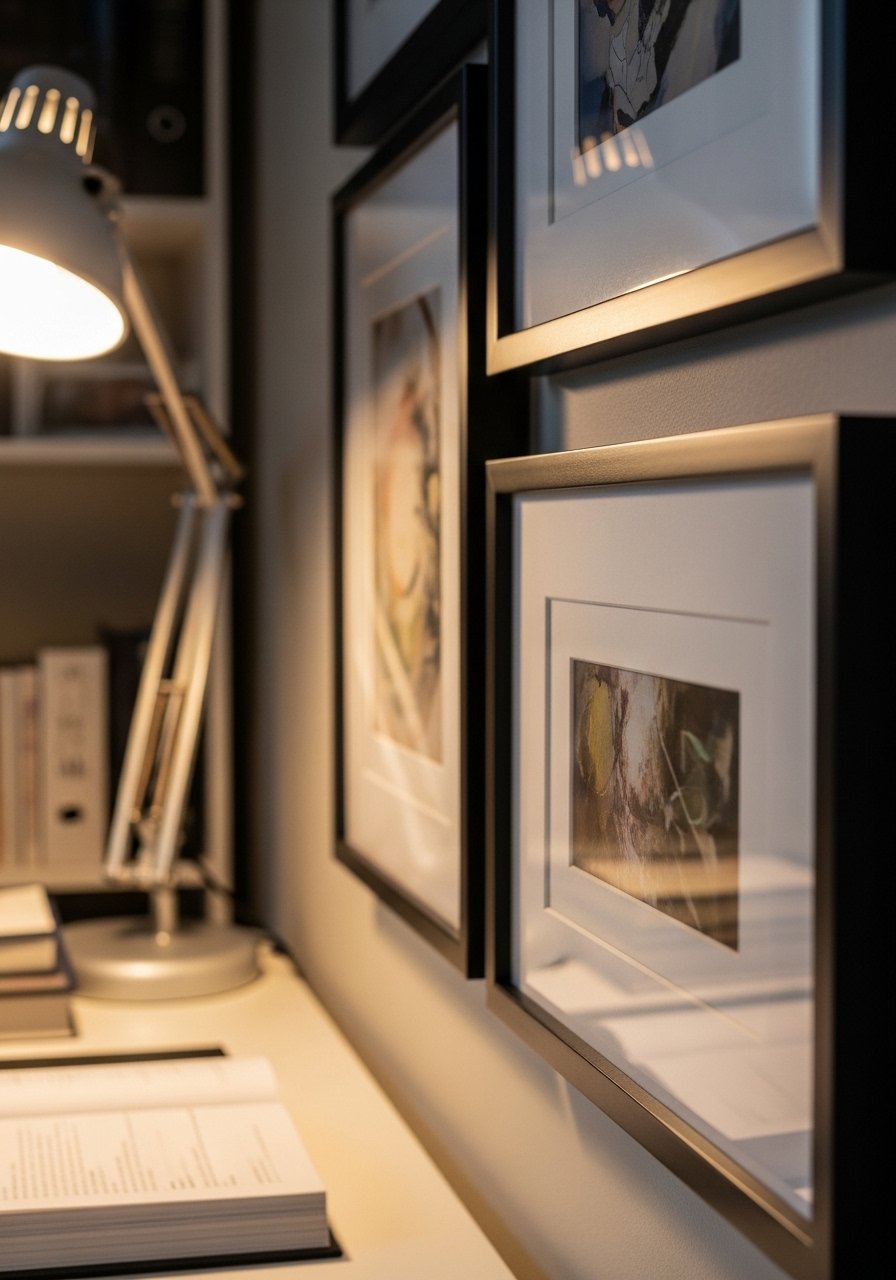
Floating frames with layered mats make small prints feel grand. I add a 2-inch inner mat in cream and a 1-inch outer mat in pale sage for contrast. The added breathing room changes how the image reads from across the room. Newbies often skip matting which makes small art get lost. Use archival mats to avoid yellowing. These floating frames with mats are an easy upgrade and protect the art.
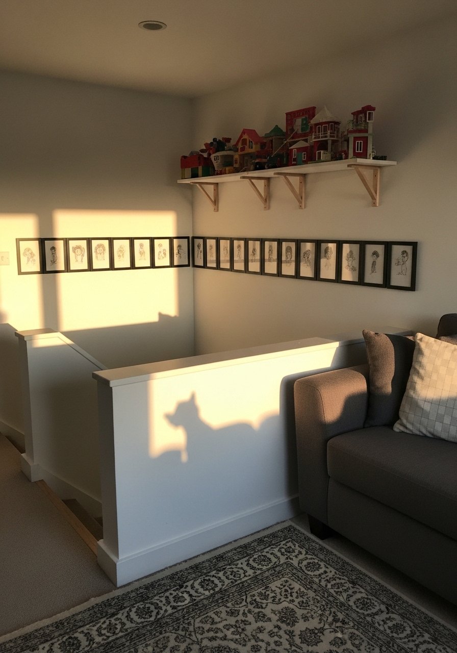
Child Art Gallery with Clothespin String, Playroom
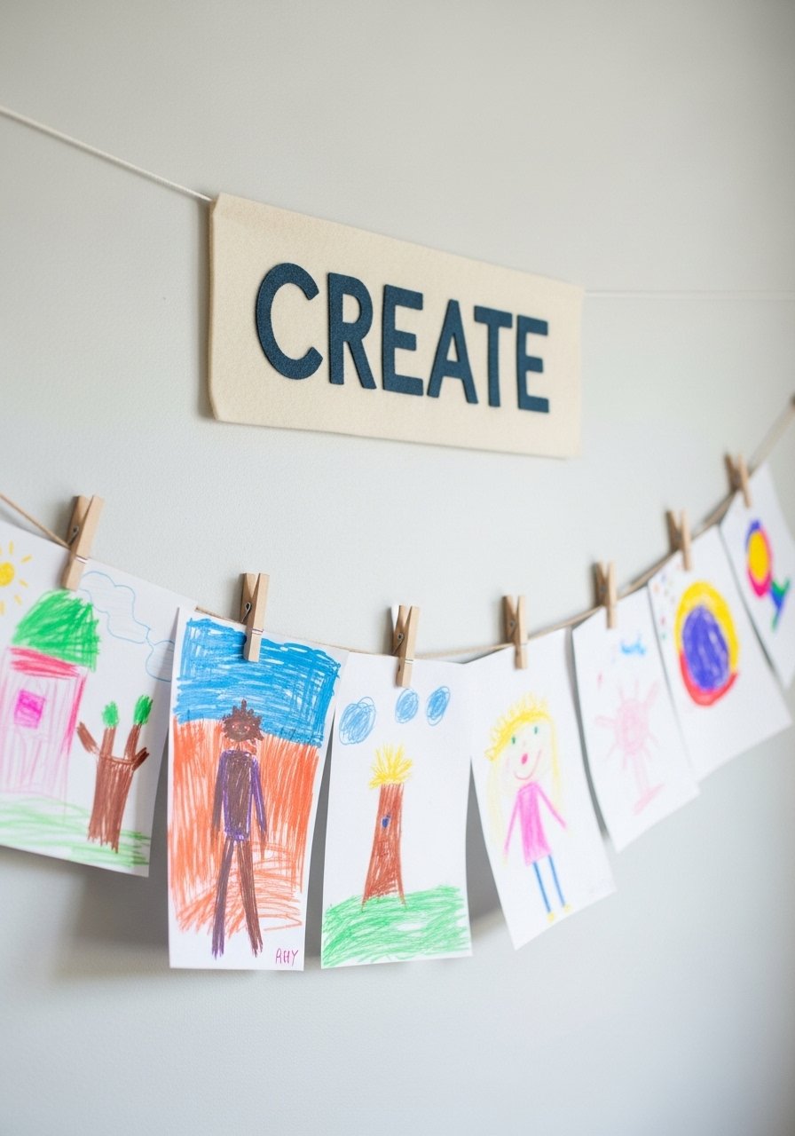
Kids art deserves a proper place. I stretch two lines of twine and rotate pieces weekly. Use tiny wooden clothespins and keep the lines at kid height so they can participate. I set a 4:1 keep to toss rule so the wall stays fresh. A single mistake is using permanent tape which ruins the art. Clothespins make swaps painless. Grab a pack of mini wooden clothespins and some natural twine to start.
Monochrome Pastel Cluster for the Bedroom, Soft Palette
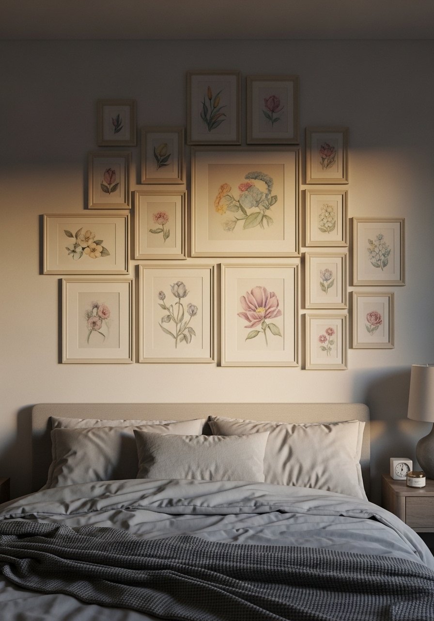
A monotone pastel cluster looks calm and considered. I picked dusty rose, sage, and butter yellow pieces and limited frames to white or pale wood. Keep a 2:1 small to medium piece ratio so the wall breathes. People often add in a bold piece and break the quiet. If you want one pop, make it off the wall with a throw pillow in the same hue. These matte white frames kept everything gentle.
Seasonal Rotation Shelf for Holiday Accents, Mantel Area
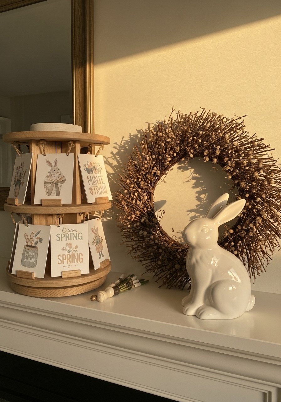
I use a narrow shelf to swap small prints each season. It keeps the same composition but changes mood. For spring I use botanical cards and a dried wreath. For winter I swap to muted snowy sketches and a vintage brass candlestick. A mistake is re-hanging everything each season. Shelf rotation saves nails and fuss. I rely on slim gallery shelves that take less than 30 minutes to change over.
Textured Paper Collage with Handwritten Notes, Home Office
Mixing paper types creates a tactile cottagecore moment. I add a handwritten recipe card from my grandmother behind a small glassine pocket. Layer deckle edges and leave tiny gaps so shadow plays over the paper. People often glue everything flat which removes depth. Use tiny foam tabs behind layers to add 1/8 inch lift. For easy framing, try small archival pockets and foam tabs.
Gallery Wall With Mirrors and Art for Light, Small Apartment
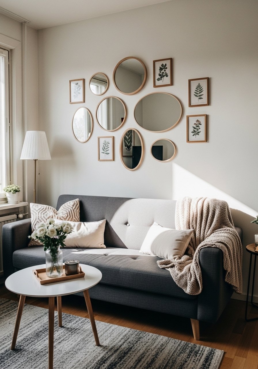
When light is scarce, mirrors in a gallery wall multiply what you have. I mixed three small convex mirrors with four prints and noticed the room looked brighter immediately. Space them so the mirrors catch window reflections only, not direct glare. A common mistake is using too many reflective pieces which makes photos hard to take. Start with one mirror per four art pieces. These small decorative mirrors are light enough for drywall anchors.
Floor-Level Gallery Strip for Pet-Friendly Homes, Low Wall
If you have pets, keep fragile pieces higher but make a curated floor-level strip for lower-impact art. I hung a 10-inch tall continuous strip of six small frames at knee height so my cat could not dislodge them while still letting me display favorites. The trick is to use secure anchors and a 1 inch gap between frames to avoid knocks. Many articles skip pet owner durability notes. Use gallery anchors or adhesive picture hangers rated for your wall type. I relied on heavy-duty removable picture hangers for peace of mind.
Your Decor Shopping List
Textiles
- Honestly the best $40 I have spent. Chunky knit throw in cream 50×60 inches.
- 22-inch linen pillow covers, down-filled inserts in sage and blush, set of 2.
Wall Decor
- Vintage-style wood frames set assorted sizes for pressed flowers.
- Slim black frames with mats 11×14 for a botanical grid.
- Small shadow box frames 6×6 for fabric swatches and keepsakes.
- Deep shadow box frames for found-object displays.
Lighting
- Small brass candlestick set for mantel styling.
- Warm LED picture lights to highlight watercolors.
Tools and Hardware
- Mini wooden clothespins pack for kid art lines.
- Heavy-duty removable picture hangers for renters and pet homes.
Budget Finds
- Decorative plate hangers under $20 for plate galleries.
Most of these items have similar alternatives at Target and HomeGoods if you prefer to shop in person.
Shopping Tips
White oak beats dark wood in 2026. Design feeds have shifted completely. White oak floating shelves read current and let your gallery breathe.
Grab mini wooden clothespins for quick kid art swaps. They cost pennies and keep the wall fresh without nails.
Curtains should puddle or kiss the floor, never hang halfway up. 96-inch linen panels are right for standard 9-foot ceilings and help frame a gallery wall.
Use a paper template before drilling. Cut kraft paper to the size of each frame and tape the layout to the wall. Painter's tape and a level make this a five-minute job.
If you are a renter, go for removable hangers. Heavy-duty removable picture hangers keep things secure and peel off clean.
Frequently Asked Questions
Q: Can I mix thrifted frames with new pieces?
A: Yes, mixing thrifted and new frames gives a collected feel. Keep a consistent color family or add matching mats so the collection reads cohesive.
Q: How should I space frames for a salon style cluster?
A: Aim for 2 to 4 inches between frames depending on size. Smaller frames can sit closer. Try the paper template trick to adjust before making holes.
Q: What about lighting for small watercolors?
A: Use warm LED picture lights or dedicated wall sconces. Avoid direct midday sun which can fade paper over time. Store originals in archival sleeves when not on display.
Q: I matched paint at the store and it looked wrong. What now?
A: Test samples on your wall under your lights first. Store scanners hit maybe 70% right without your lights check. A quarter of repaints happen because the match bombed on the wall, so sample pots save time and money.
Q: Can I hang a gallery wall in a small apartment?
A: Absolutely. Use narrow picture ledges or a single vertical strip to fit tight spaces. Start with smaller pieces and keep the composition centered on eye level.
Q: How do I avoid muddy mixes when creating custom frame colors or painted mats?
A: Pigment bias matters when you mix paints by hand. Stick to a simple 2-color mix and test on a scrap before committing. Also, brand swaps knock $15 off per can easy if you need more paint for multiple frames.
