
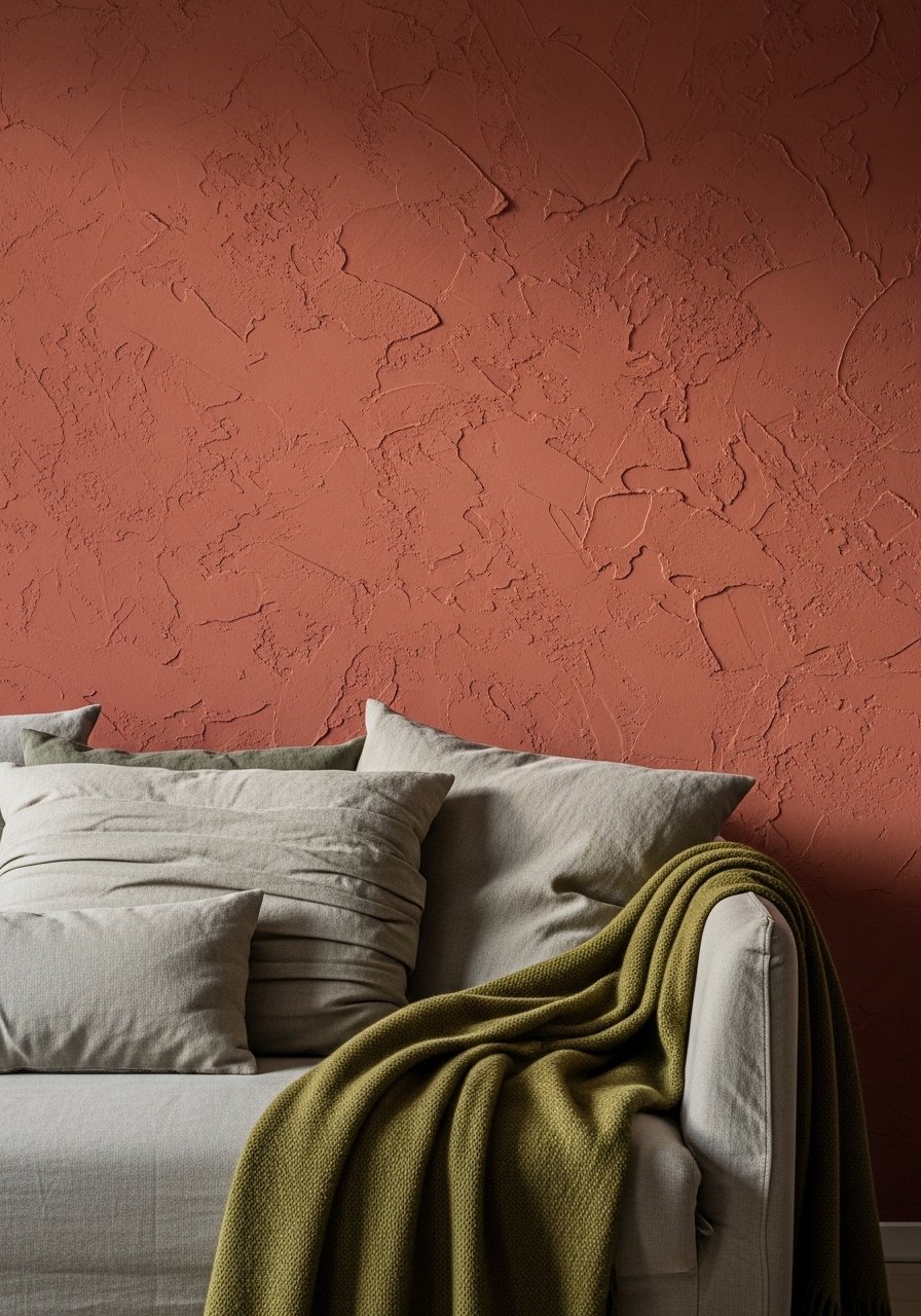
My living room had nice furniture and decent lighting but it still looked like a waiting room. Took me embarrassingly long to figure out it was missing texture. Every surface was smooth, every color was flat, and nothing invited you to actually sit down. After I added a warm terracotta wall, an olive throw, and a thrifted brass lamp everything clicked and the room started to feel like somewhere someone actually lives.
This leans rustic Tuscan with an eclectic 2000s twist. Most projects are under $250, with a couple that can hit $400 if you splurge on custom work. These moves work in living rooms, kitchens, entryways, and even small apartments, and many have renter-friendly swaps so you can test before committing. Most folks need two tries to nail a paint match.
Layered Terracotta Walls With Olive Accents for Living Rooms
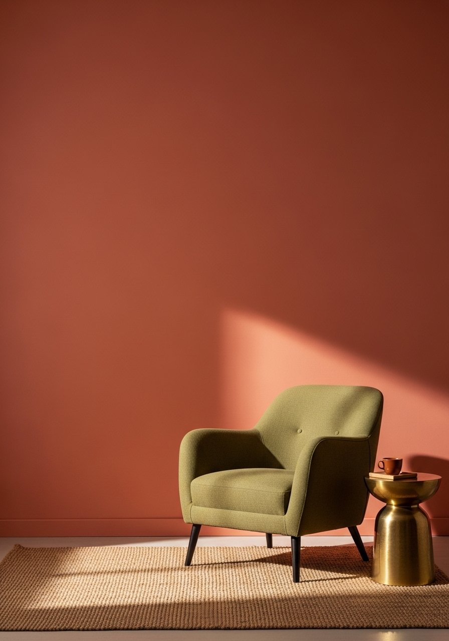
The terracotta wall is the anchor. I patched a 6×6 inch chip from my old wall and matched it at the paint counter so I did not rely on a photo. Use a 70 percent base neutral, 20 percent warm accent, and 10 percent metallic rule so the room does not feel muddy. For renter-friendly testing, try a large temporary canvas painted in the terracotta mix and lean it against the wall for a weekend before committing. I bought an olive woven throw to echo the accent without another paint can. Olive woven throw and terracotta paint sample kit are both cheap ways to see how the combo looks in morning and evening light. A common mistake is matching only under store fluorescents. Three in four swear by sticking to the original paint maker when you can.
Faux Stucco Texture Match on Trim for Entryways
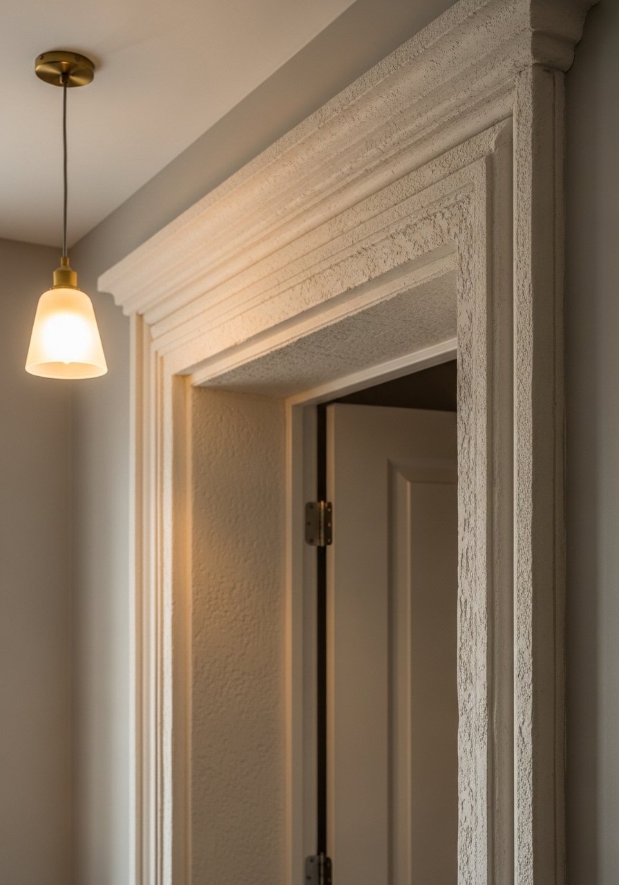
Flat trim kills the Tuscan vibe. I used a texture paint kit on a short section of trim first to avoid a full commitment. The trick I learned is to mix glaze at a one to three ratio with the base color to get that aged patina without sanding for days. For renters you can use textured peel-and-stick moulding and paint it. I grabbed a small tub of texture paint and a foam roller so the application was messy in the best way. Stucco texture paint kit and peel-and-stick moulding made this doable on a weekend. People often stop after one light coat. Let it dry 24 hours before touching up. Pro scanners get you 95% there on tough matches.
Warm Ochre Sofa Refresh for Living Areas
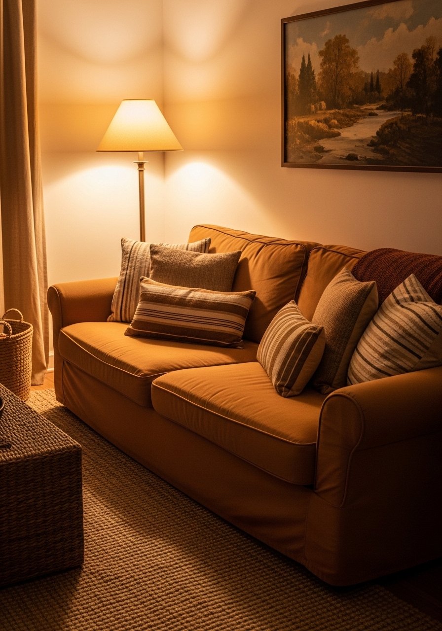
I had a leather sofa that read too cold against terracotta walls. Covering the seat with an ochre linen slipcover changed the whole mood. Buy a 22-inch down-filled linen pillow cover in a similar ochre and mix it with a jute lumbar so the sofa reads collected, not dated. Slipcovers are renter-friendly and cheaper than reupholstery. I matched a fabric swatch to my wall chip at the hardware store and ordered a swatch online first. Ochre linen slipcover and 22-inch linen pillow cover are quick swaps. A common mistake is buying the brightest ochre you can find. Pick a muted tone and test under three lights.
Metallic Gold Hardware Update for Kitchens and Dressers
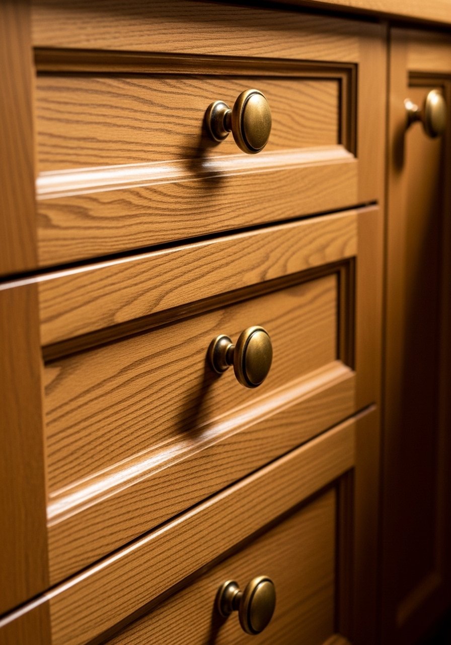
Brass pulls pull the whole look together. I swapped out builder-grade chrome for unlacquered brass and the kitchen instantly felt older and more layered. If you are renting, use command-strip friendly picture ledges or adhesive-backed hardware as a temporary swap. Match the hardware against your wall chip so the metal does not scream against terracotta. Antique brass cabinet knobs and adhesive-backed drawer pulls are good starting points. People often think all brass is the same. Buy one pull first and look at it in evening light before replacing the whole set. Eight out of ten end up tweaking their room colors later when metals clash.
Sienna Rug Dye Match for Floors and Layering
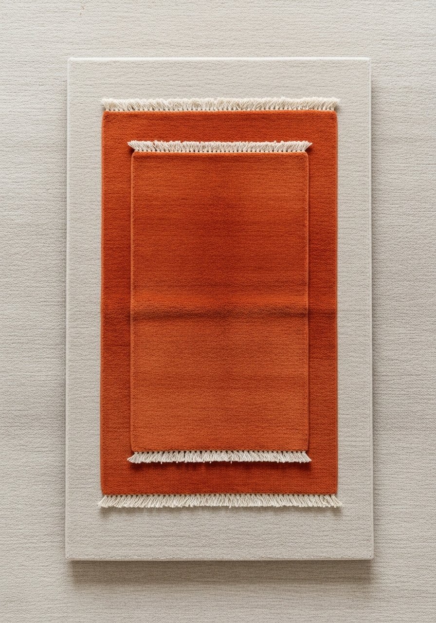
Rugs ground the room more than paint sometimes. I took the rug edge to the dye shop and matched the burnt sienna to my wall chip. You can do a smaller project at home with wool-safe dye and a 2×3 test patch to avoid mistakes. For renters, layer a smaller dyed rug on top of an inexpensive neutral jute rug. Wool-safe rug dye kit and 3×5 burnt sienna accent rug make this practical. A typical error is drowning the room in terracotta. Keep the rug as a color pull and let a neutral larger rug take the main traffic. Also try dyeing the fringe separately for a more realistic fade.
Faded Linen Curtain Tint for Windows in Bedrooms
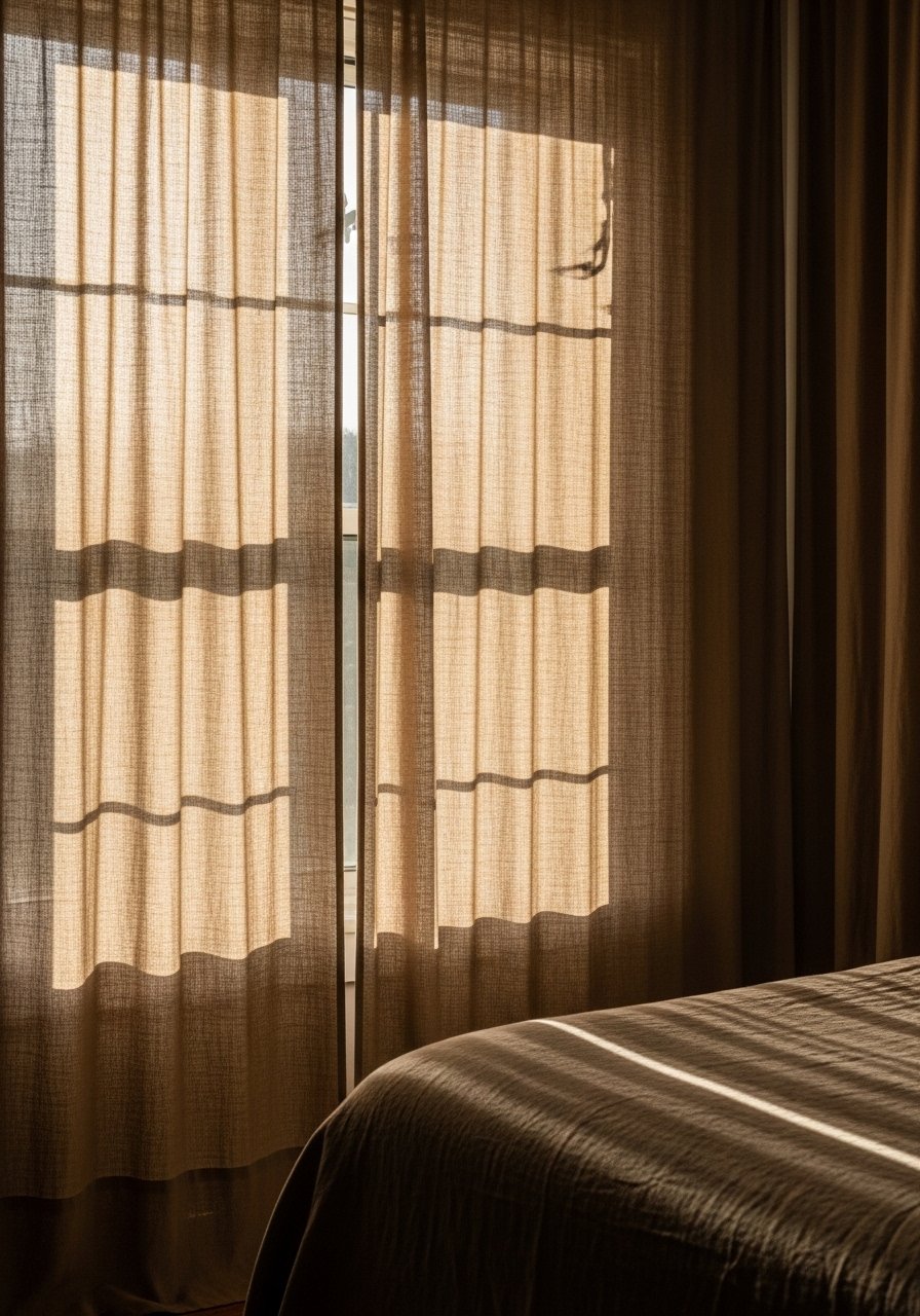
Most people hang curtains at the window frame and the room looks chopped. I moved curtain rods to the ceiling line and picked 96-inch linen panels that puddle slightly. For a Tuscan fade, soak new white linen in a diluted tea bath to knock back brightness before hemming. If you cannot alter fabric, use clip-on linen curtains for renters. 96-inch linen curtain panels and linen curtain clip rings were cheap wins. The texture makes more difference than exact color. Test panels in the room for two different times of day to avoid that store-to-home pink shift.
Patina Cabinet Glaze Overlay for Kitchens or Bathrooms
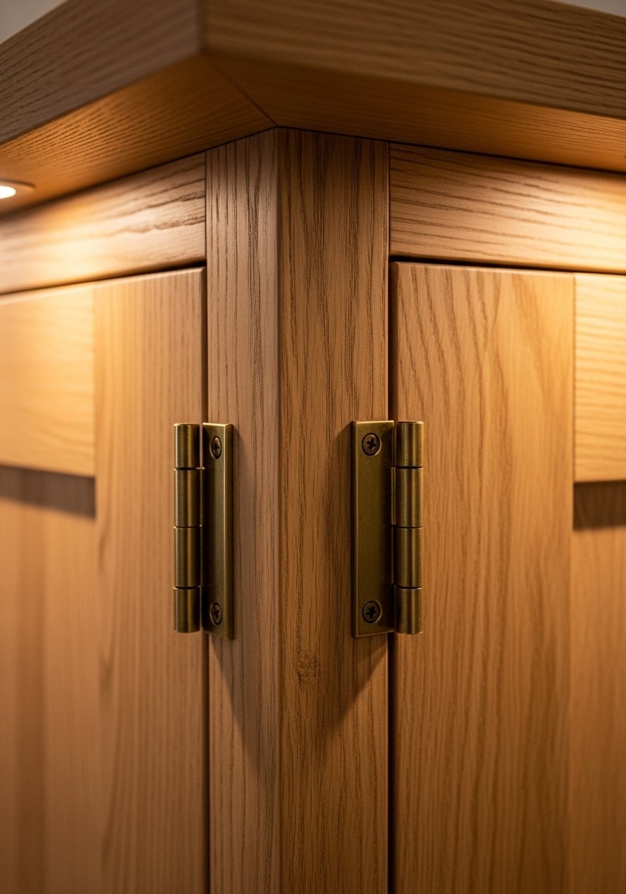
My plain IKEA cabinets looked like mass market until I layered a glaze. Mix one part glaze to three parts base and wipe off with a lint-free cloth for that weathered look. Use unlacquered brass hinges and a clear wax topcoat for protection. This is partial renter-friendly if you practice on a removable door first. Brown cabinet glaze and unlacquered brass hinges were inexpensive upgrades. People often forget to test on the back of a door. Do a 24 hour dry test and run your hand over the glaze to check for tackiness.
Tile Backsplash Color Pull for Kitchens
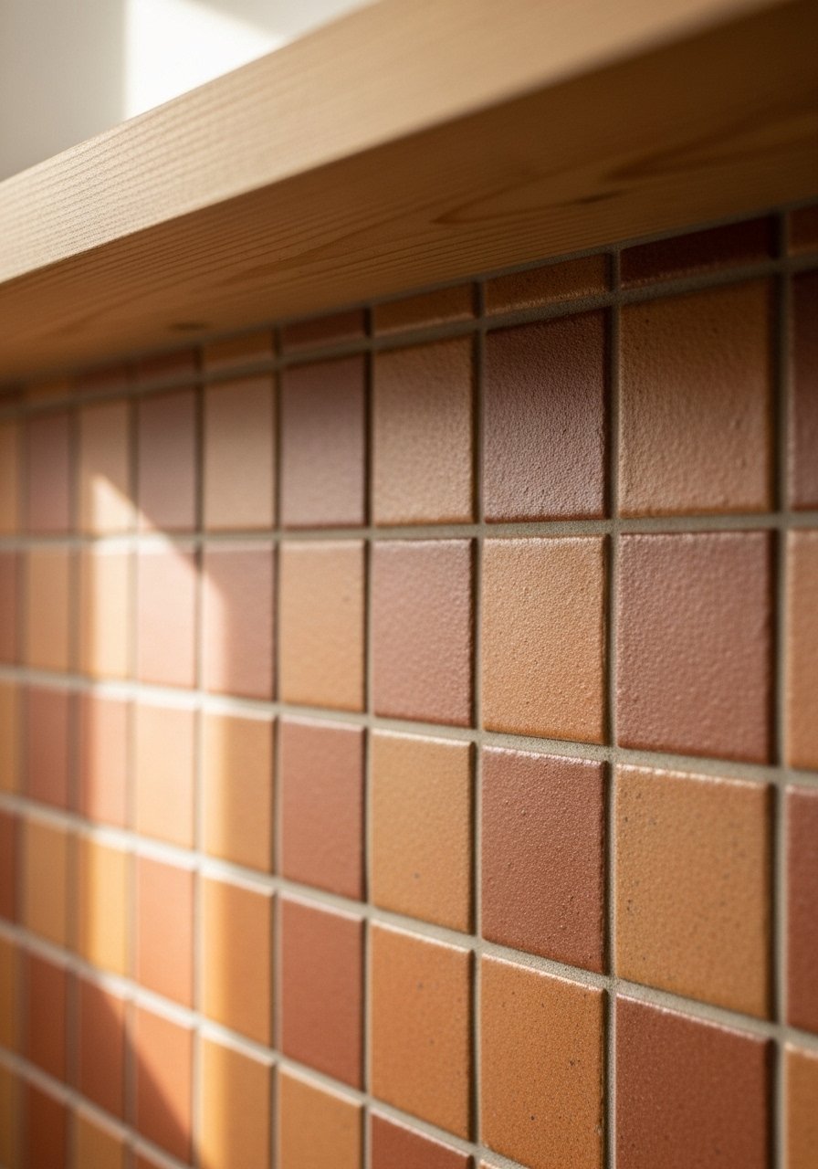
A backsplash can tie the whole palette together. I swapped glossy white for a warm terracotta tile and the kitchen read like it had always belonged in a villa. If you rent, use peel-and-stick tile sheets that mimic ceramic. When matching, bring a paint chip and ask for a tile sample to check under your light. Peel-and-stick terracotta tile sheets and small terracotta ceramic sample tile helped me avoid a muddy mismatch. A mistake I see is choosing tiles that are too red for an ochre wall. Aim for a slightly muted tile and test against the largest surface it will face.
Wrought Iron Rail Tint Refresh for Stairs and Balconies
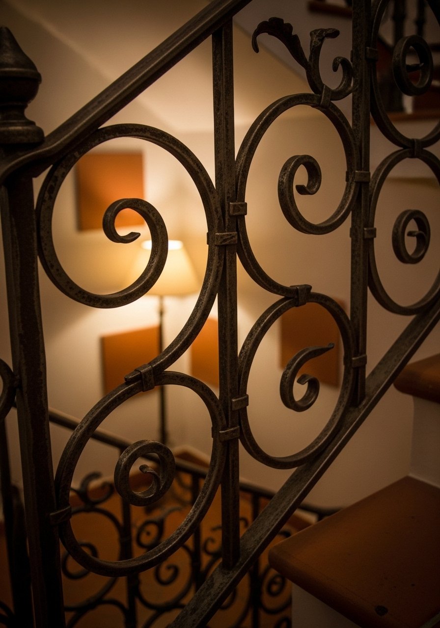
My stair rail was rusty and the new black paint looked heavy. I used an aged iron spray to add depth and then buffed a little bronze wax into the high spots. For renters, use a temporary wrap or removable spray cover on sections you can reach. Aged iron spray paint and bronze metal wax give that softened metal look. People often paint wrought iron glossy and it reads modern. Keep the finish slightly matte and add one warm metal elsewhere, like a brass lamp, for balance.
Clay Pot Planter Paint Sync for Porches and Corners
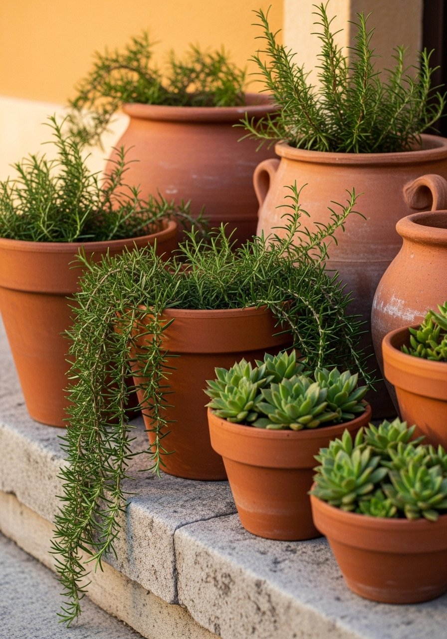
I collected old terracotta pots and painted the rims to match the wall chip so they looked like they came from the same courtyard. Use outdoor acrylic paint diluted slightly to allow the clay to breathe. Cluster large pots in odd numbers and balance with one tall plant for scale. Outdoor terracotta paint and large 18-inch terracotta planter are easy to find. A common mistake is painting every pot the same color. Leave a couple natural for variation and add trailing plants to soften the edges.
Distressed Frame Gallery Wall for Halls and Staircases
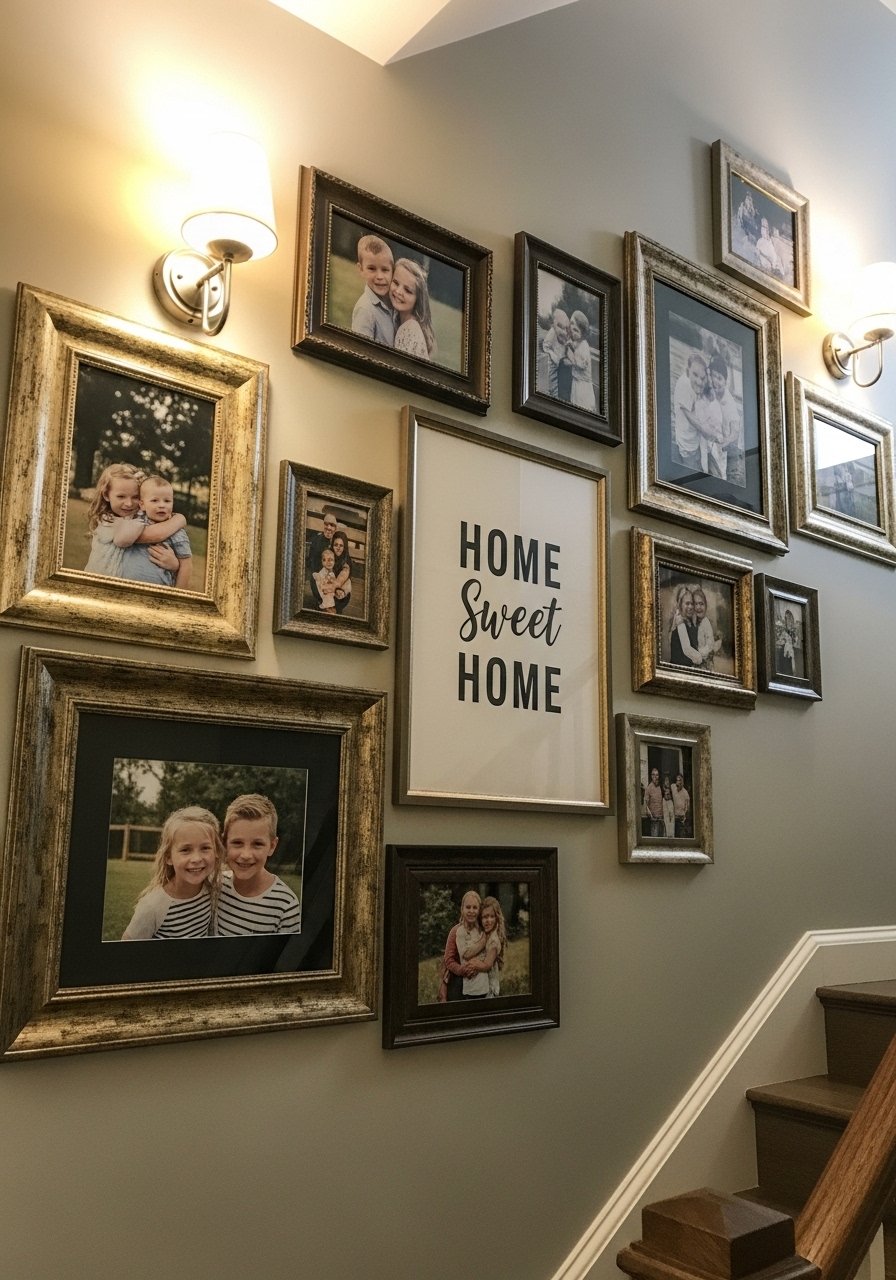
Frames make the walls feel lived in. I bought mixed metal frames and then lightly sanded and gilded edges so they read like heirlooms. Use ledges where you cannot put holes and rotate prints seasonally. For a Tuscan feel, pick warm mat boards and avoid stark white. Mixed metal picture frames and picture ledge shelf let you try layouts before committing nails. A detail most guides skip is spacing the frames so the average gap is 3 inches, not 1. That breathing room makes an old collection look intentional instead of cluttered.
Your Decor Shopping List
- Textiles: Honestly the best $40 I have spent. Olive woven throw in cotton, 50×60 inches, for sofa draping. Similar at HomeGoods.
- Curtains: For the curtain trick, you need length. 96-inch linen curtain panels in warm sand, set of two.
- Hardware: Found these while looking for something else. Antique brass cabinet knobs, set of 10 in unlacquered finish.
- Rugs: 3×5 burnt sienna accent rug for layering over a neutral 8×10 jute.
- Paint tools: Terracotta paint sample kit with 6×6 test panels.
- Planters: 18-inch terracotta planter and outdoor terracotta paint.
- Glaze: Brown cabinet glaze, pint for aging cabinets, mix one to three with base.
- Hardware alternative: Adhesive-backed drawer pulls for renters who cannot replace screws.
Shopping Tips
- White oak beats dark wood in 2026. Design feeds have shifted. White oak floating shelves read lighter and play nicely with terracotta.
- Grab velvet pillow covers for $12 each. Swap them seasonally and the sofa feels different without heavy spending.
- Curtains should puddle or kiss the floor, never hang halfway up. 96-inch curtain panels are right for standard 9-foot ceilings.
- One large plant beats five small ones. Artificial fiddle leaf fig, 6 ft gives height without maintenance.
- Match a 6×6 inch chip at the paint counter, not a photo. Terracotta paint sample kit makes multi-light tests easy.
Frequently Asked Questions
Q: How do I avoid a paint that looks great in the store but wrong at home?
A: Test a 6×6 inch chip on the wall and look at it in morning, midday, and evening light. Most folks need two tries to nail a paint match. If you can, use a pro shop spectrophotometer for tricky terracottas.
Q: Can I get a Tuscan look in a rental without painting?
A: Yes. Use slipcovers, peel-and-stick tile sheets, adhesive hardware, and layered rugs. Peel-and-stick terracotta tile sheets and adhesive-backed drawer pulls let you try the style temporarily.
Q: Should I match metals or mix them in a Tuscan eclectic room?
A: Mix them. It reads more collected. Keep one dominant metal, like brass, and add a second in small doses. Mixed metal picture frames are an easy way to test combinations.
Q: What size rug should I get for a living room anchored by a terracotta wall?
A: Bigger than you think. For a standard living room, go 8×10 minimum so at least the front legs of furniture sit on it. Layer a 3×5 accent rug on top for color that pulls from the wall.
Q: How do I make my gallery wall look intentional not cluttered?
A: Space frames about 3 inches apart on average and pick a consistent mat color in warm tones. Use ledges if you cannot make holes. Picture ledge shelf helps you rearrange without extra nails.
