
I kept repainting my living room because it felt like a polite waiting room instead of a place I wanted to curl up in. I tried brighter neutrals and crisp white, then cooler greys, and each version looked flat under our warm window light. The mistake was treating color like decoration, not atmosphere.
After the third repaint I stopped chasing a perfect shade and focused on balance. That is the shift here. It is about one dominant calm tone, measured accents, and texture that you can feel when you sit down. I still second-guess mid-process, but the rooms that follow this approach finally feel settled.
Step 1: Pick a dominant calm color and set the 60/30/10 rule
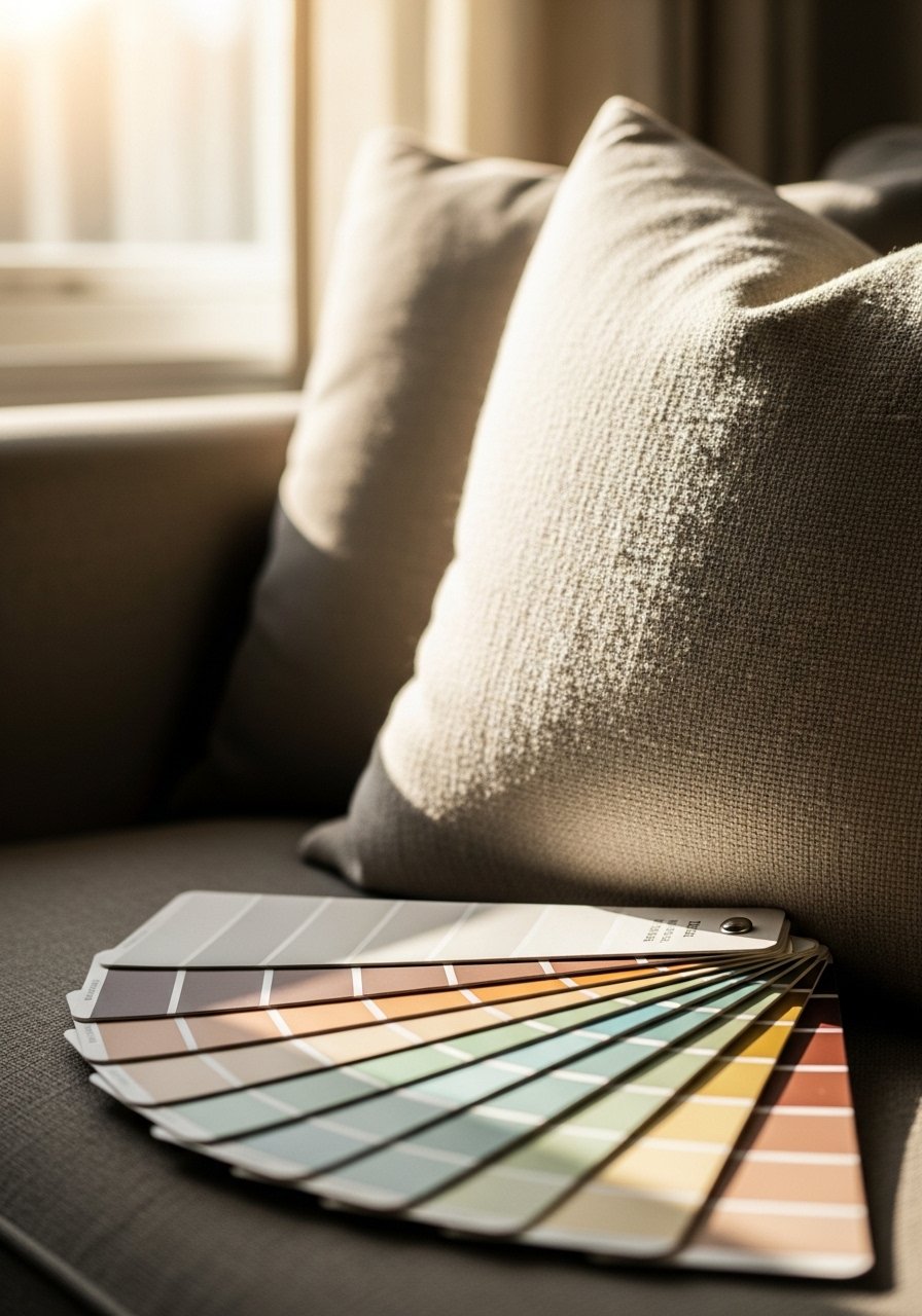
Start by choosing one main color that will cover roughly 60 percent of the room. Paint or large textiles take this role. Then pick a secondary color for about 30 percent, and an accent color for the remaining 10 percent. I once painted a whole room a soft grey and layered five competing neutrals on top. The result was confused and flat.
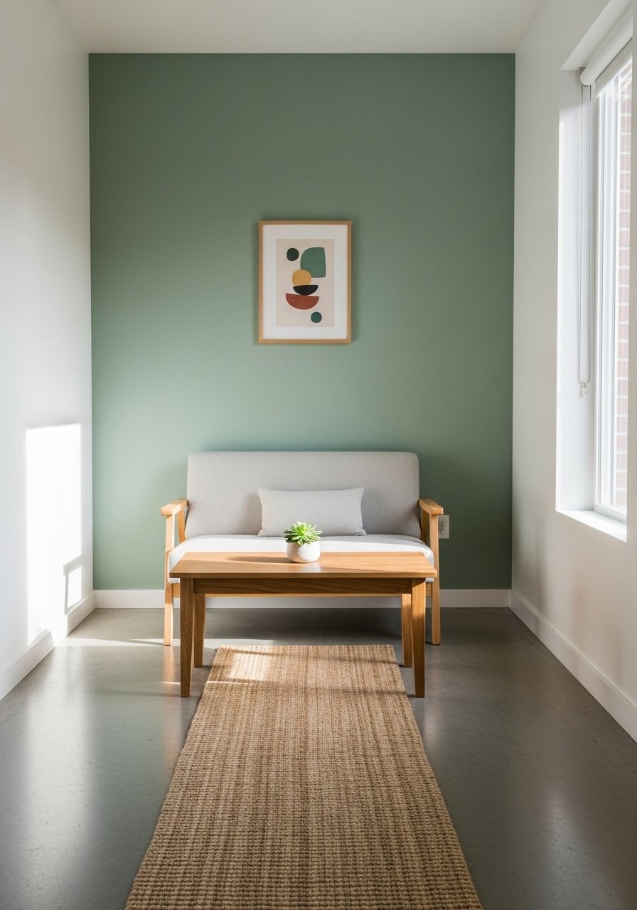
The 60-30-10 rule gives you permission to be simple. If your main color is a warm sage, use it on the wall or the largest rug. Use a muted blue for the 30 percent in a chair or curtains. Reserve a small punch, like a velvet lumbar pillow, for the 10 percent. You will notice the room breathe differently, and the palette will read as calming instead of bland.
Step 2: Ground the space with the right rug size and texture
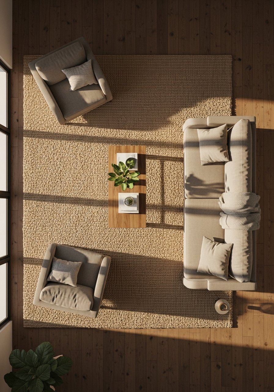
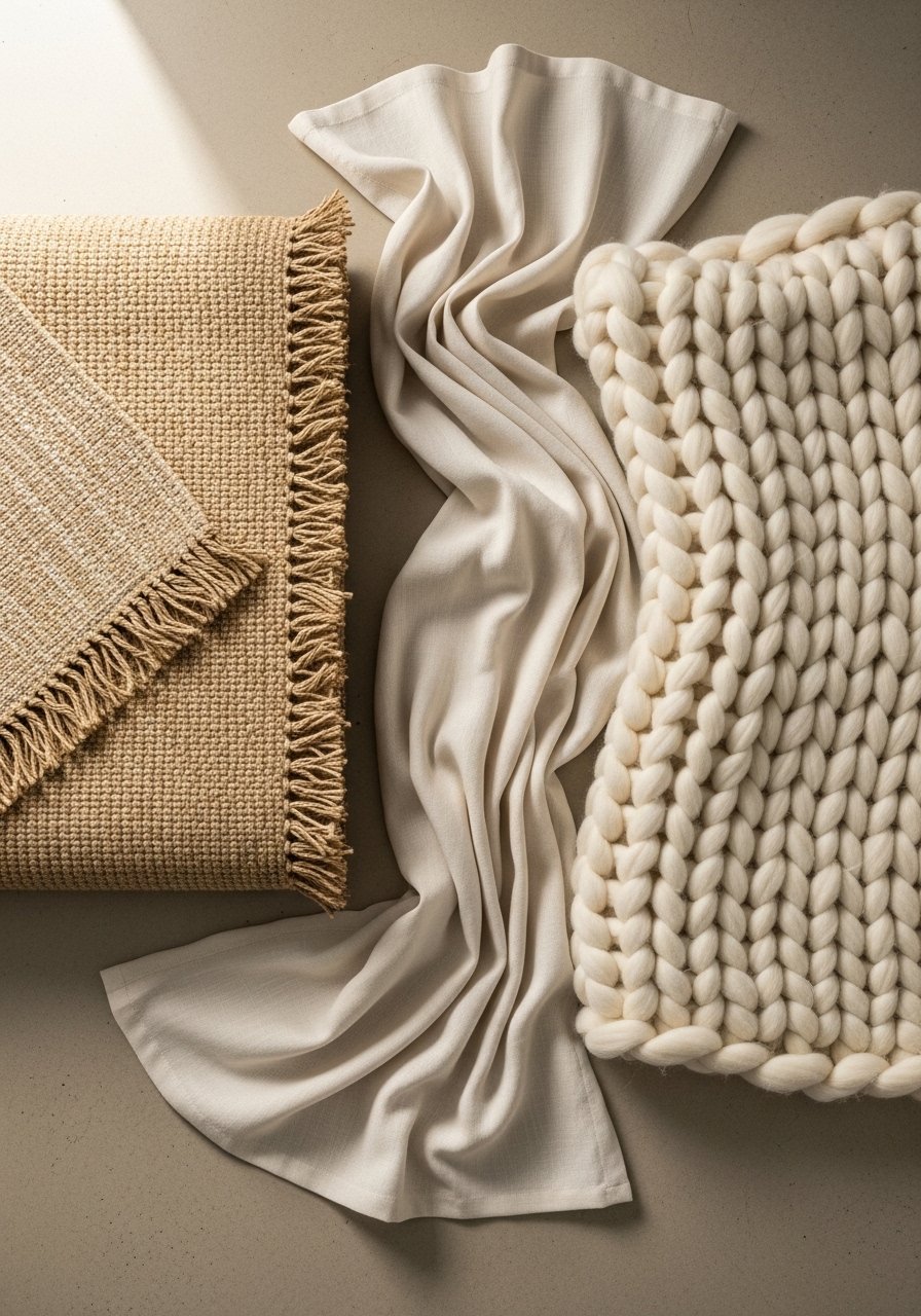
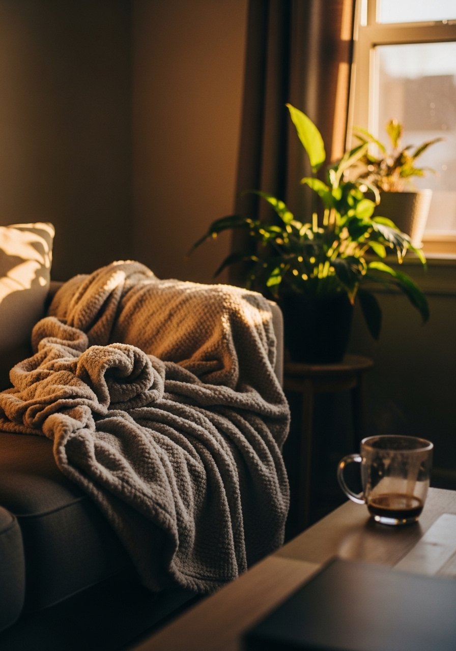
Nothing makes a color palette feel coherent faster than a grounding rug. Too small and the room reads disconnected. Aim for a rug that fits at least the front legs of your main seating, or go with an 8×10 if your living area is medium sized. A natural jute rug adds an earthy texture that feels cool under bare feet and holds warm colors together.
Avoid a pile that fights your vibe. I once picked a shag rug because it was soft, but it clashed with the clean linen textiles and made the room look messy. The rug should feel sturdy in your hands, not slippery or flimsy. Let the rug do the heavy lifting so your walls and textiles can stay calm.
Step 3: Layer textures, not patterns, and use odd number groupings
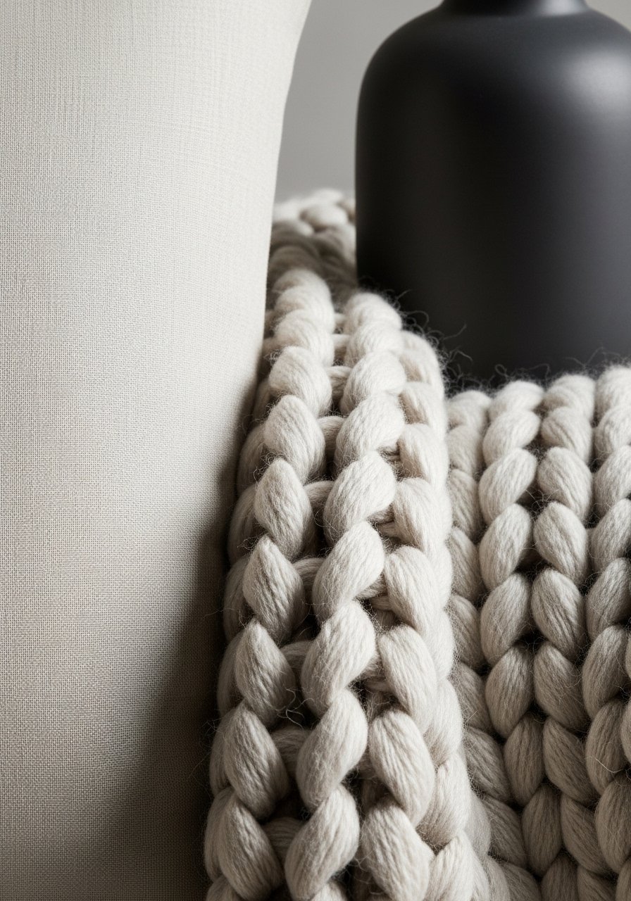
Calming does not equal boring. Mix linen, wool, matte ceramic, and a soft knit. I like three-texture groupings on a sofa: a cool linen pillow, a nubby wool cushion, and a chunky knit throw. Odd numbers feel natural, so group decor in threes on a side table or shelf. That gives the eye a restful rhythm.
Patterns should be quiet and different scale. If you have a subtle stripe on a curtain, keep pillow patterns smaller or more diffuse. The ceramic vase I use is matte and cool to the touch, which contrasts nicely with a warm, chunky knit. Small sensory contrasts like that stop the room from reading flat while keeping the overall mood calm.
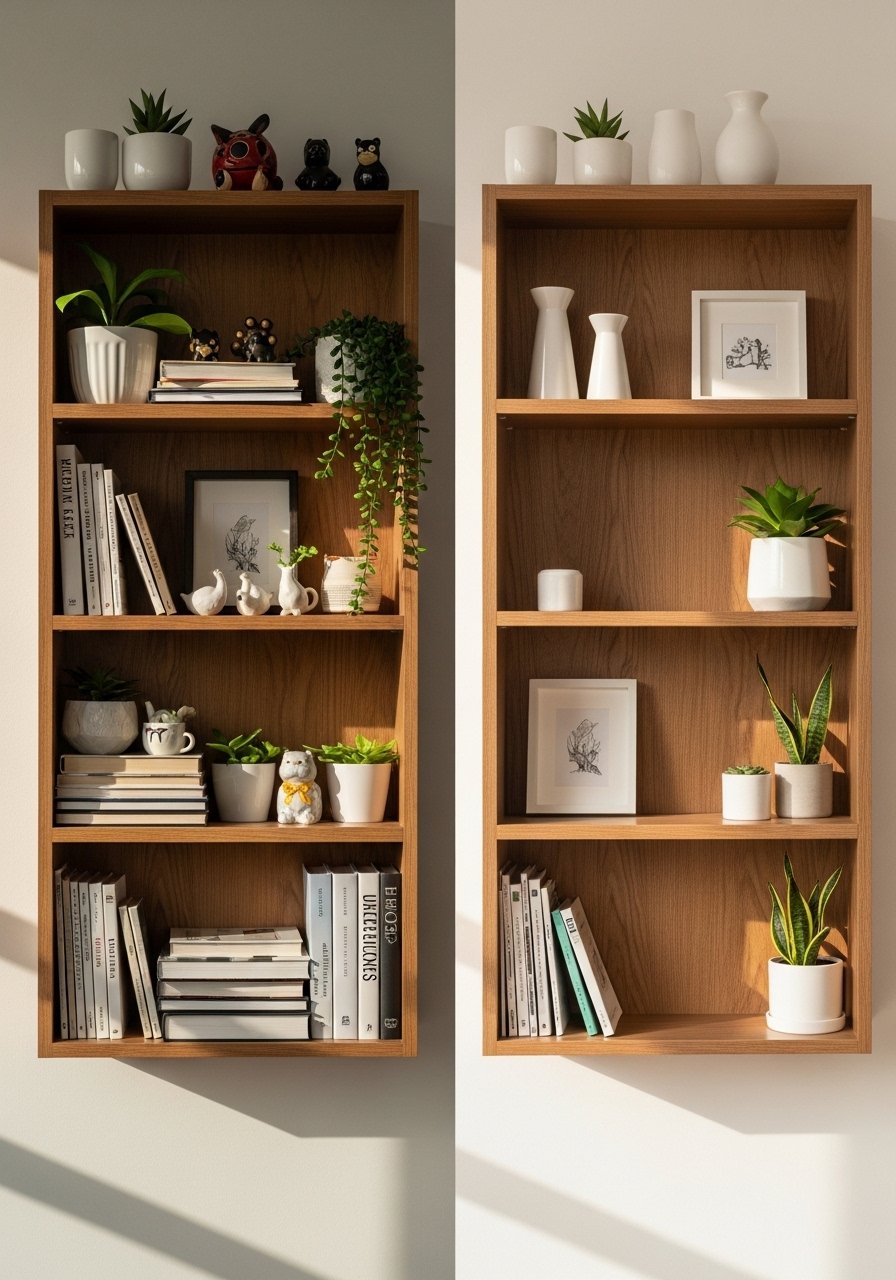
Step 4: Edit items with intent and learn to love negative space
Most people fill every shelf because empty space feels like failure. I did that at first and everything looked crammed. The better move is to remove half the items and step away for ten minutes. The empty space will let your calming colors show up and give weight to the pieces you keep.
Use a simple formula for shelves. Place a tall object, a medium object, and a low object, then repeat on other shelves in a different order. That gives balance without symmetry. My partner hated the asymmetrical look until he sat with it. After a week he admitted it made the shelf feel intentional, not cluttered.
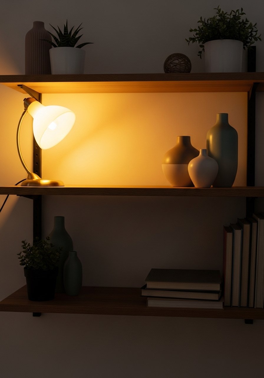
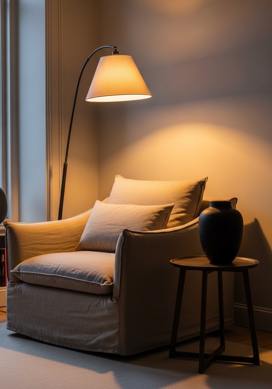
Step 5: Lock in lighting and small accents for the final calm layer
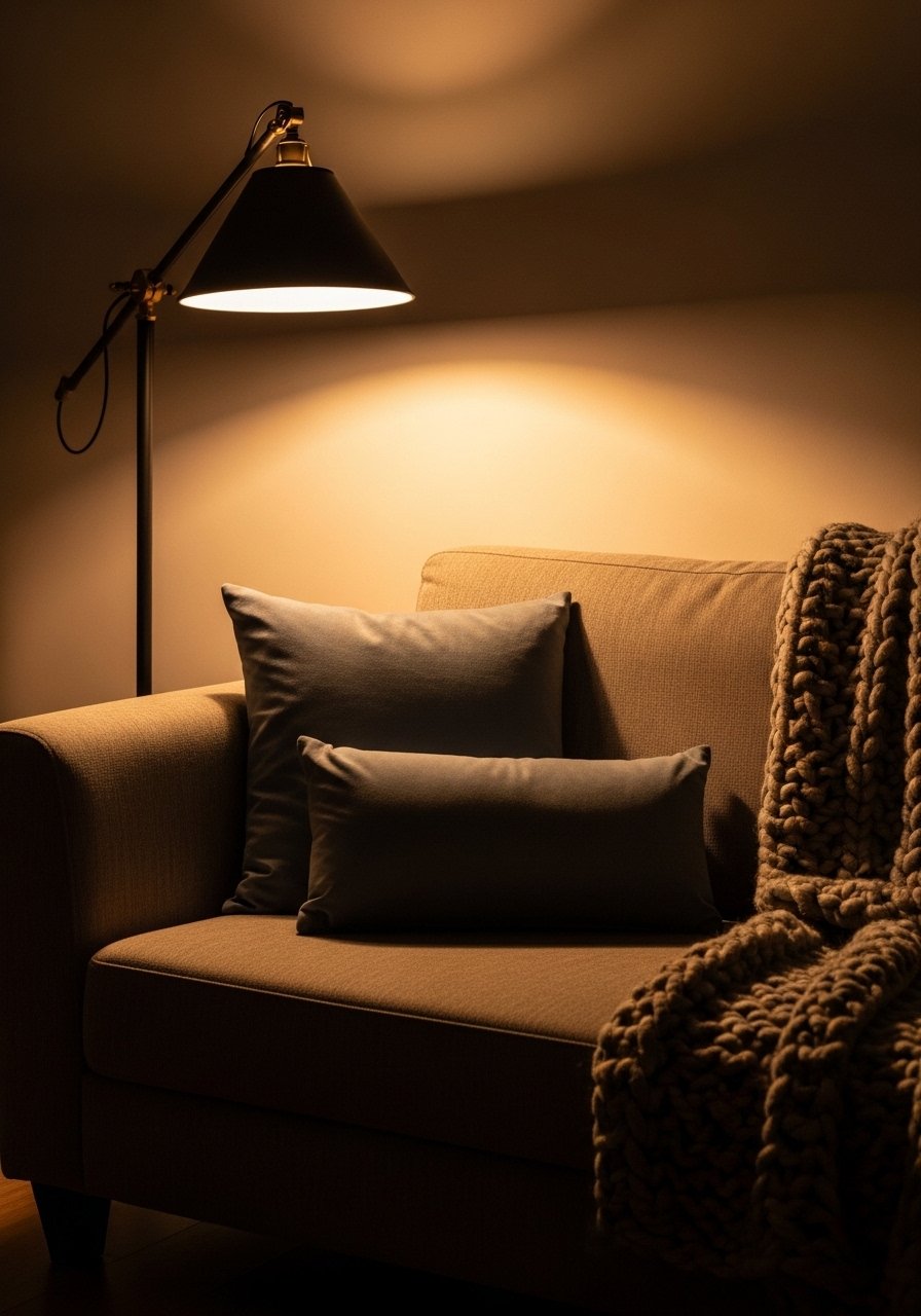
Light decides how your calming palette reads. Warm bulbs will make cool greens feel softer. Add a floor lamp or table lamp with a warm 2700K bulb and a dimmer if possible. Soft, layered lighting keeps the room cozy and prevents colors from washing out in the evening.
Finish with small accents that echo your 10 percent accent color. A 12×20 velvet lumbar pillow or a small matte vase gives a controlled pop. Be cautious with metallics. One brass ledge or lamp adds warmth; too many make the room look busy. I almost skipped the dimmer step and later regretted it. The small switch was worth the trouble.
What to Grab for a Calming Color Refresh
- Chunky knit throw in oatmeal, 50×60 ($40-65). I keep one on the arm of every sofa. Used in Step 3 and Step 5.
- Linen duvet cover in sage green, queen ($70-110). Texture that changes the whole bedroom. Referenced in Step 1.
- Brass picture ledges, 24-inch ($18-30). Great for an easy, low-commitment display. Used in Step 4.
- Jute area rug, 8×10 ($90-160). Natural grounding texture. Used in Step 2. Similar options available at Target.
- Ceramic vase set, matte white, set of 3 ($25-40). For Step 3 height and cool touch.
- Linen curtains in natural, 52×84 ($30-70). Softens light and adds the 30 percent layer from Step 1.
- Velvet lumbar pillow 12×20 in muted blue ($20-45). The small accent mentioned in Steps 1 and 5.
- Soft floor lamp with warm bulb, adjustable height ($60-120). For the layered lighting in Step 5.
Why Your Calm Palette Still Looks Flat After Styling
Often flat results come from matching too many items in the same scale. If everything is the same height and texture, the room will read flat even if the colors are calming. Try varying heights and materials. Another frequent issue is ignoring undertones. A green with a yellow undertone will fight a blue-grey sofa. Test a 4×4 foot swatch on the wall and observe it at morning and evening light before committing.
Also, people forget to factor in daily life. If you have kids or pets, pick washable textiles and keep breakables out of reach. My cat once knocked over a ceramic bowl twice before I moved it to a higher shelf. That small adjustment kept the calm look intact.
Making This Work in a Small Room
In small rooms, let one wall be your 60 percent and use the 30 percent on upholstery rather than curtains. Keep the rug close to 2/3 of the floor area so furniture feels anchored. Use vertical texture, like a tall slim lamp or a single long curtain panel, to draw the eye up and make the room feel taller. Choose fewer, larger accessories rather than many small items, because scaled-down clutter destroys calm.
If you are renting, stick to removable wallpaper or a large textile pinned to the wall as your main color. It gives the same visual weight without painting.
What This Actually Looks Like After a Week of Living With It
After a week the room should feel easier to use. The throw will be draped rather than perfectly folded, and the pillow will have shifted. That is fine. Calming colors are forgiving. If something feels off, remove one object rather than add another. The goal is to end up with a space you relax into without thinking about it. Mine still looks slightly lived-in, with a book on the ottoman and a small scuff on the rug. It reads warm and calm, not staged.
Start with One Corner
Pick a single corner and apply the 60/30/10 split there. Paint or hang a textile for the main color, add a textured rug or chair for the 30 percent, and place a small pillow or vase for the 10 percent accent. Live with it for a week before expanding. You will learn which textures wear well and which accents feel fussy. Start small, trust the quiet changes, and let the room settle into being calm.
