
I finally stopped treating color like something risky and started treating it like furniture: an honest choice that has to live with us, not just look good in a photo. I painted, unpicked, returned cushions, and kept the pieces that felt like home.
These are the things I actually used—small swaps, paint tricks, and textile mixes that made rooms feel lively and comfortable.
28 Vibrant Colorful Home Decor Ideas That Energize Any Space
These 28 ideas are practical and lived-in. I wrote every one from rooms I’ve redone for myself or friends. Expect paint-forward moves, textile layering, a few mistakes I learned from, and clear buy lists so you know what to look for.
1. Earth Tone Layered Textiles That Ground a Living Room
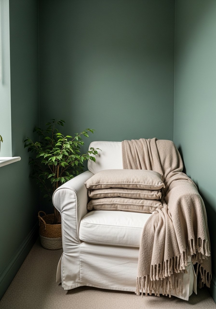
I used stacks of linen pillows, a woven green throw, and a small terra-cotta cushion to stop my living room from feeling like a photo shoot. It immediately read as calmer and more collected.
At first I grabbed everything in the same shade and it looked flat. I learned to mix undertones—cool linen with warm terra-cotta—and it finally felt intentional.
Pay attention to scale: one large textured pillow, a medium patterned cushion, and a small pop. The room felt finished without being cluttered.
What You'll Need for This Look
- Linen pillow covers in warm beige
- Green woven throw blanket (50×60)
- Terra-cotta accent pillow (16×16)
- Small jute rug (3'x5')
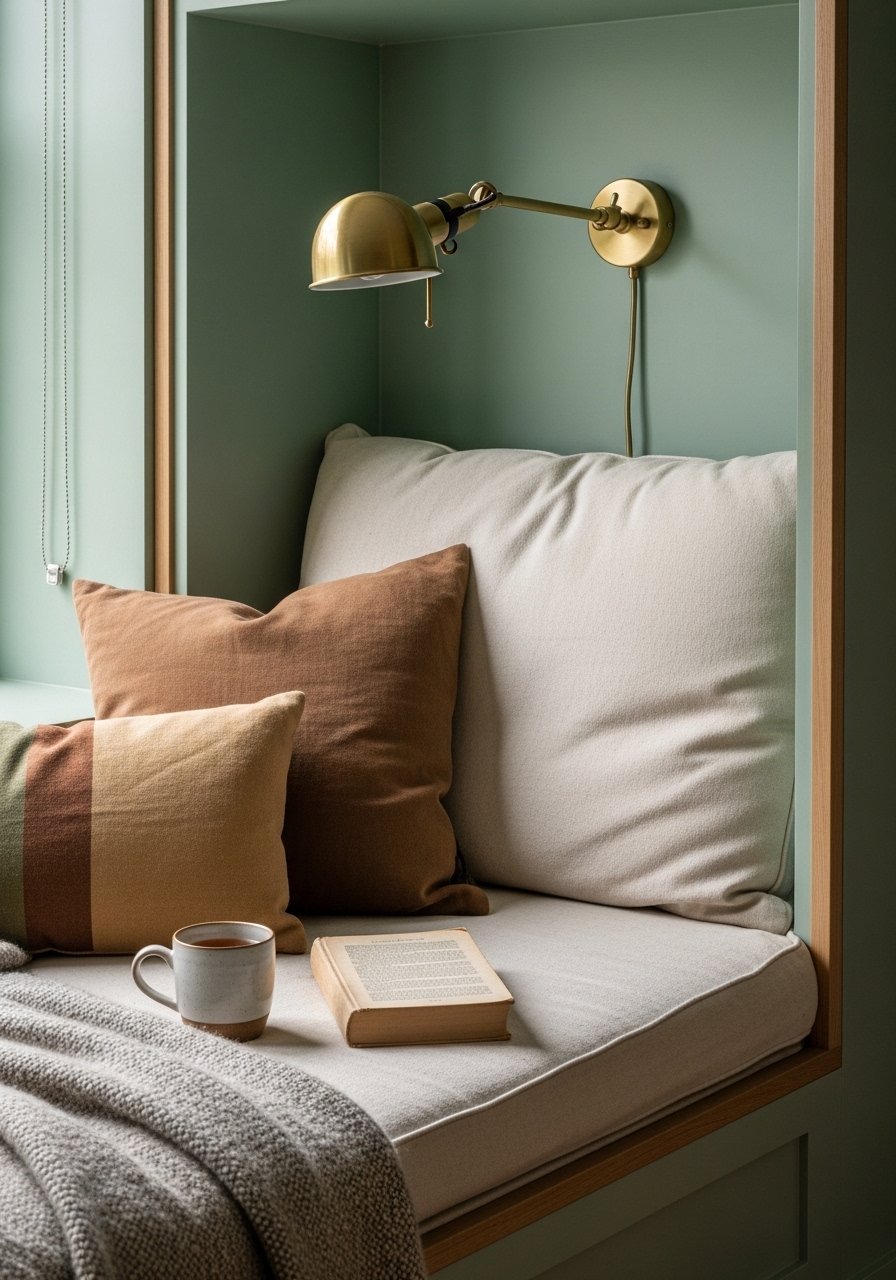
2. Warm Eucalyptus Color-Drenching in a Reading Nook
I painted a tiny nook Warm Eucalyptus and suddenly it’s the calmest spot in the house. The green feels nostalgic, like an old library, but softer and more modern.
The paint made the cream throw and handmade basket pop. I sit there to reset between calls now.
Be careful with light—cool light can make it look muted. I used a warmer bulb and a cream throw to keep it inviting.
What You'll Need for This Look
- Warm eucalyptus paint sample
- Cream chunky knit throw blanket (50×60)
- Small wicker storage basket
- Small potted indoor plant
3. Universal Khaki Neutrals with Timeworn Wood for Stability
I went full Khaki on my hallway and added a scraped wood shelf. It stopped the hallway feeling too white and gave our coats a warm backdrop.
My mistake: I bought the wrong wood tone at first—too orange. After swapping for a cooler, timeworn wood, the khaki finally read as calm and not muddy.
Use khaki as a base and add one wall-hung pot or artwork in deeper brown to anchor the eye.
What You'll Need for This Look
4. Peach-Washed Accents for Soft, '90s Warmth

I added peach pillows and a small peach print to the bedroom and it stopped the cool gray from feeling austere. It reads cozy without being saccharine.
What surprised me was how well peach pairs with brown leather. It reads modern, not dated.
Tip: use dusty peach, not neon. A small nod—pillows or art—works better than a full wall for first-timers.
What You'll Need for This Look
5. Silver Accents on Earth Tones to Refresh Hardware
I swapped brass trays for a nickel one and the whole coffee table felt lighter. Silver reads a touch younger against deep earth tones.
I did overdo it once—too many shiny pieces made things look like catalog props. I pared back to one nickel tray and one matte ceramic vase and it felt real.
If you’re tired of brass but don’t want coldness, pick aged silver or nickel finishes that have texture.
What You'll Need for This Look
6. Textural Layering in Warm Palettes to Fix Flat Rooms
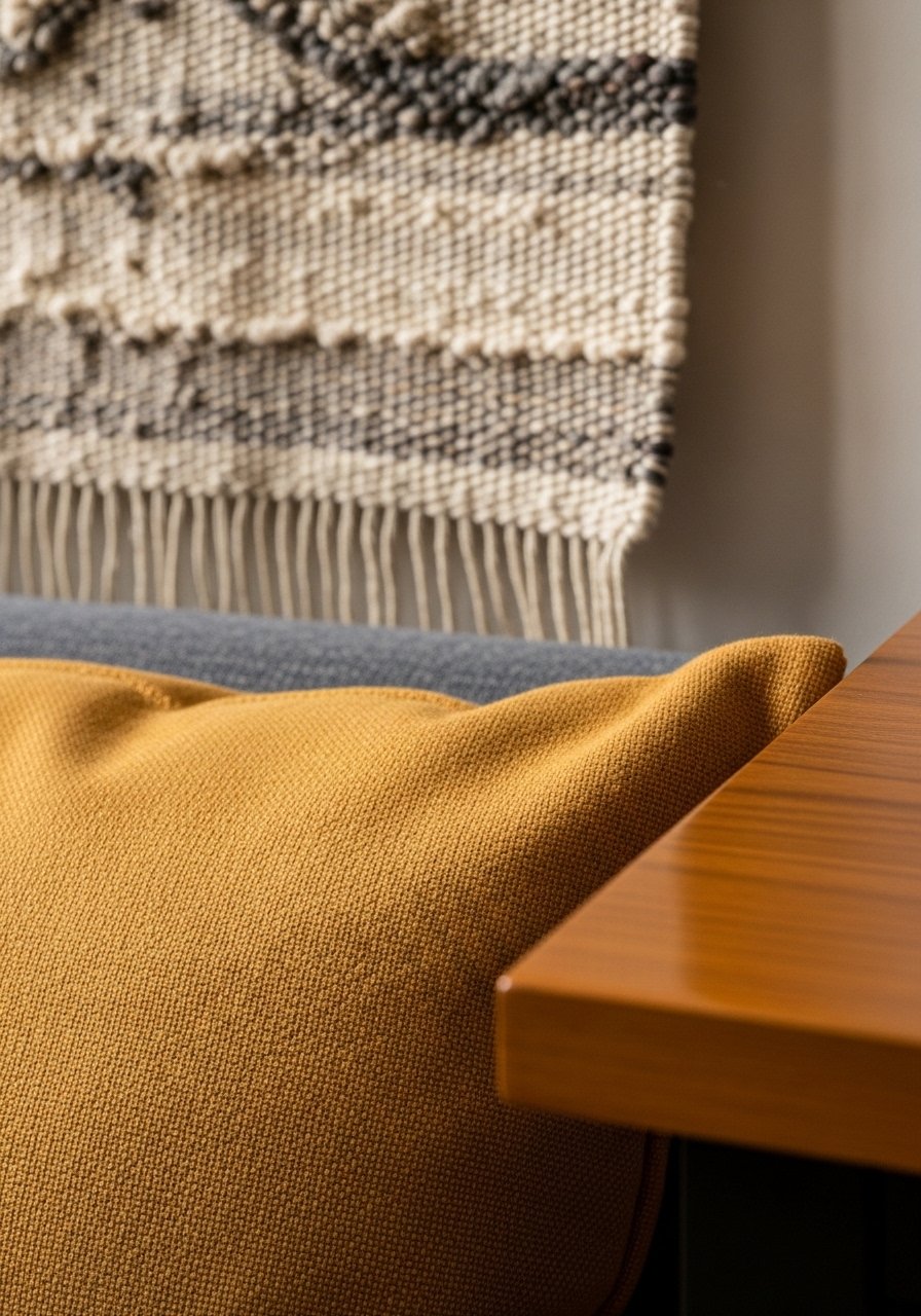
I stopped buying more art and started buying texture. A woven wall hanging, an oxblood cushion, and a raw wood side table made our living room feel tactile and lived-in.
At first I mixed too many patterns and it read busy. Narrowing the palette to warm tones kept it coherent.
Try one textile with a tight weave, one chunky knit, and one patterned cushion. That contrast is what brings depth without noise.
What You'll Need for This Look
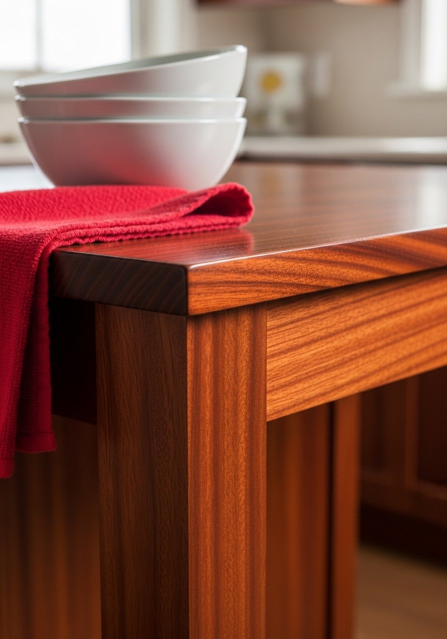
7. Warm Mahogany Intimates for Cozy Kitchens

I stained my island mahogany and the whole kitchen moved from generic to cozy. The deep wood took the edge off stainless steel and invited people to linger.
I tried mahogany in too-high gloss once and it read heavy. A matte or satin finish keeps it intimate, not fussy.
Pair mahogany with smoky brown accessories and a single red tea towel for a collected look.
What You'll Need for This Look
8. Dusky Pink Sophistication for a Soft Bedroom
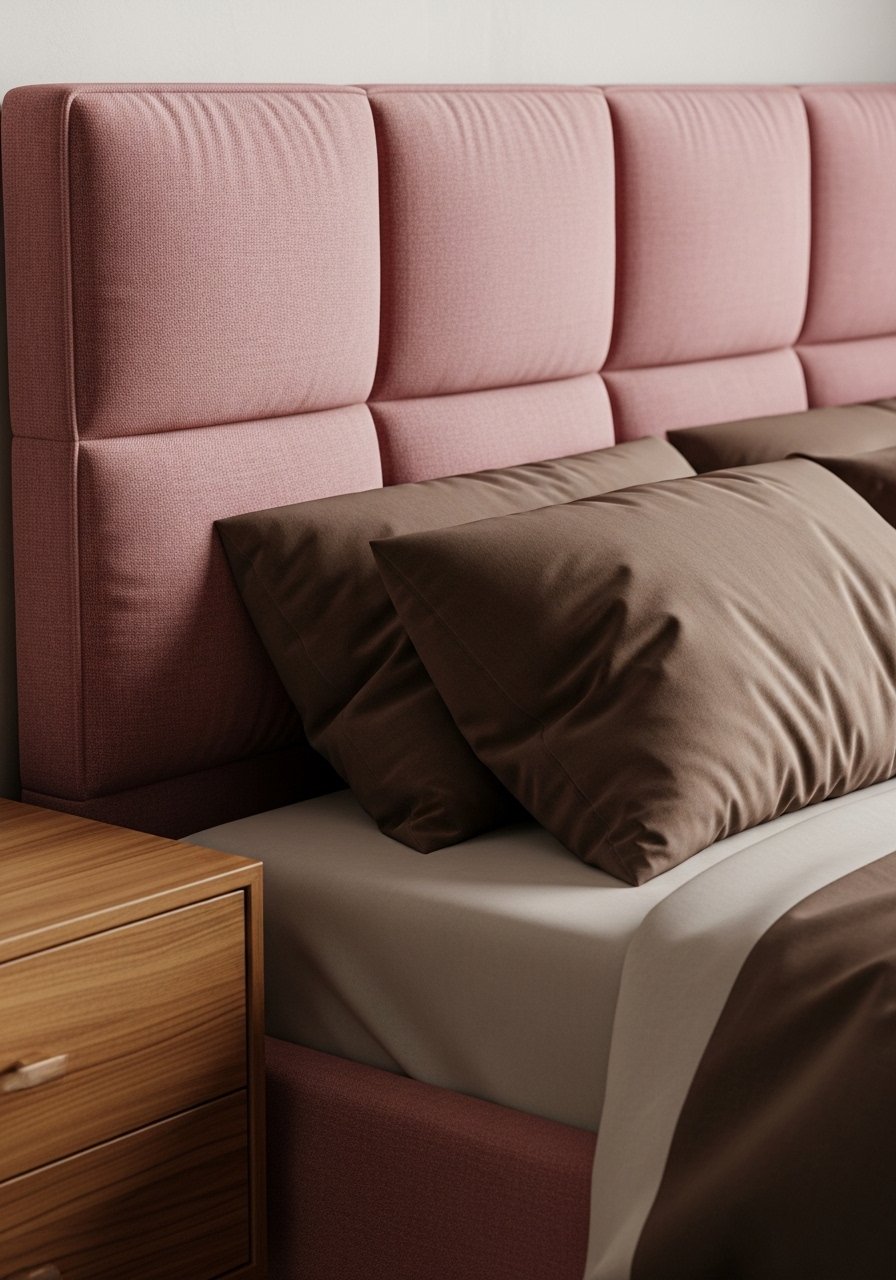
I painted a bedroom wall Dead Salmon (a dusty dusky pink) and paired it with brown-toned pillows. The room stopped feeling like a guest room and became ours.
I was nervous about pink being childish. The trick was the brown and orange pairings that ground it.
Add one sculptural lamp and leather accents and the pink reads adult and collected.
What You'll Need for This Look
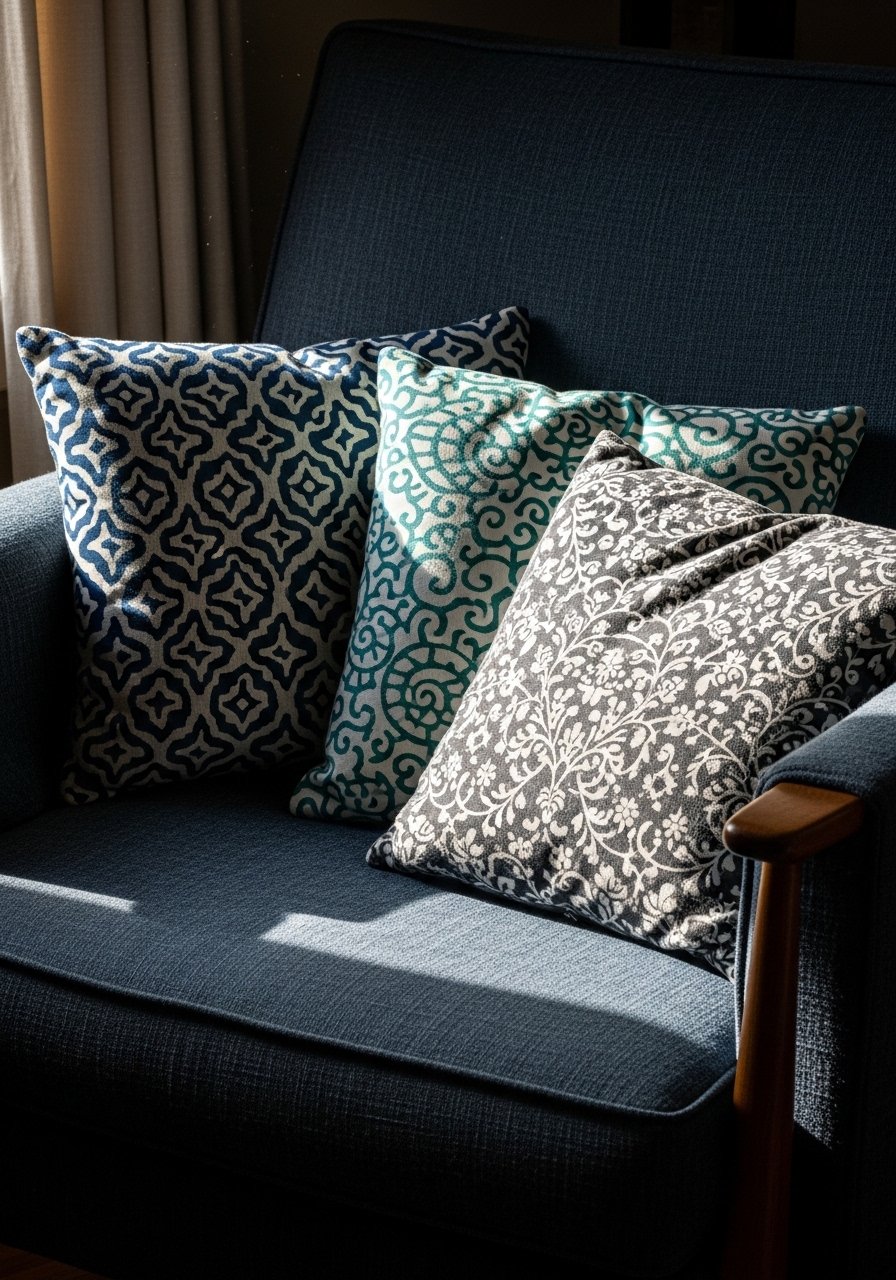
9. Jewel Tone Pattern Mixing for Moody Depth
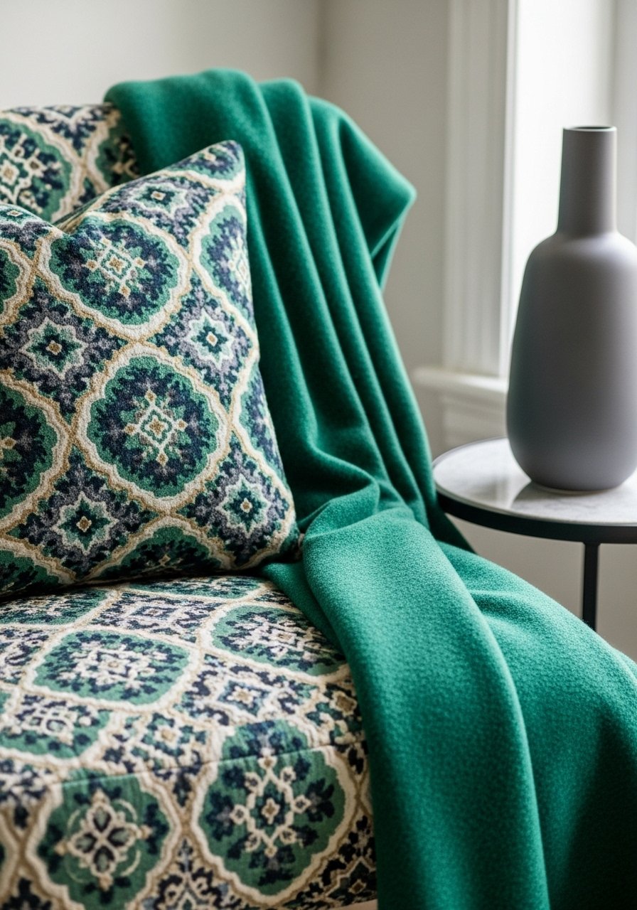
I mixed hidden gem cushions, an emerald throw, and a charcoal vase in a guest room and it stopped feeling generic. Jewel tones give depth without being loud.
I once piled unmatched jewel patterns and it felt chaotic. Now I pick one dominant jewel and echo its undertone in smaller accessories.
Keep one neutral anchor—like a cream rug—so the jewel tones read intentional and not heavy.
What You'll Need for This Look
- Jewel-tone patterned pillow (18×18)
- Emerald green throw blanket (50×60)
- Charcoal ceramic vase (small)
10. Melodious Ivory Foundations for Everyday Calm
I kept 80% of one room in a creamy ivory and used color for the remaining 20%. The result: a room that breathes and makes bright accents sing.
I used to paint everything white, which felt cold. Switching to creamy ivory made textures read warmer.
Use ivory on large surfaces and reserve saturated pieces for art, cushions, and small furniture.
What You'll Need for This Look
11. Hunter Green Neutrals for a Grounded Sofa Look
I swapped in hunter green pillows and suddenly the sofa felt intentional. The green reads neutral next to brown leather and faded denim.
My mistake was picking a bright green first; it looked dated. Hunter green is calm and pairs with both wood and rust.
Try three cushions—two solids and one patterned—to make the sofa feel edited and cozy.
What You'll Need for This Look
12. Colorful Cabinetry Pops on a Budget
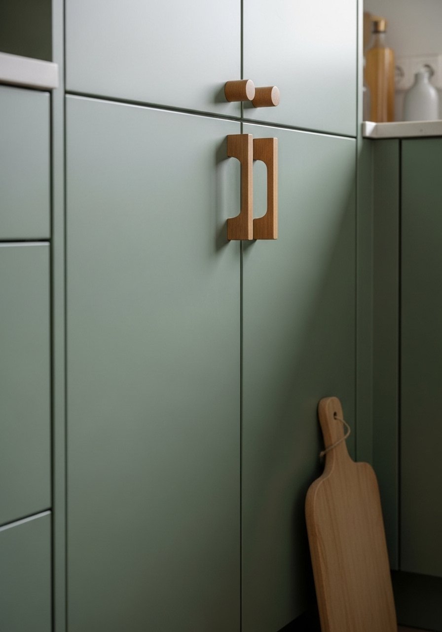
I painted my lower cabinets a muted green and added wooden handles. The kitchen felt like a real room, not a showroom.
I worried about resale but kept it reversible: paintable cabinet fronts and budget hardware. That gave me boldness without commitment.
If you’re renting, try peel-and-stick cabinet paint or removable adhesive drawer fronts.
What You'll Need for This Look
- Muted green cabinet paint (sample)
- Wood cabinet handles (5")
- Peel-and-stick cabinet film (removable)
13. Funhaus Stripes for a Playful Accent Wall
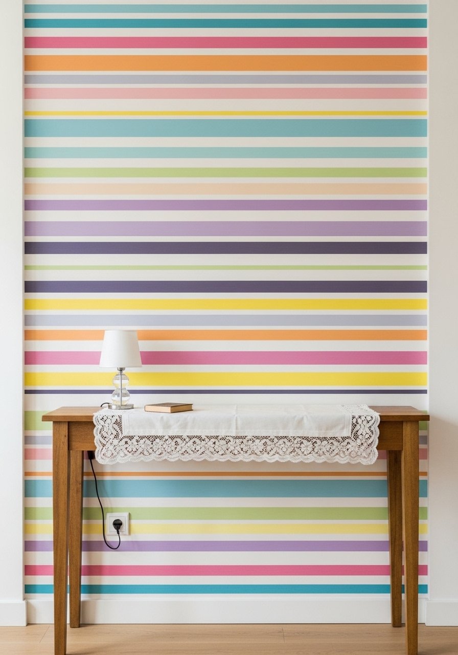
I painted three playful stripes behind a console and it made the entry feel like a personality statement, not a commitment. The stripes read upbeat without clashing.
I overcomplicated the first try with too many colors. Narrowing to three harmonized tones fixed it.
Use matte paint for fewer reflections and measure carefully—consistent stripe widths are worth the tape.
What You'll Need for This Look
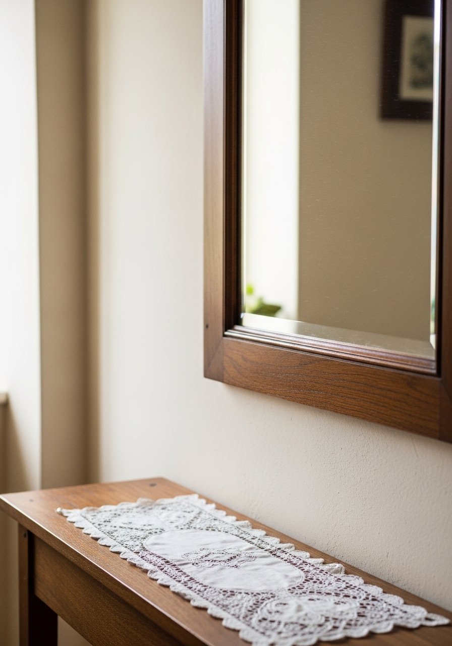
14. Lace and Doilies Reimagined in Earth Tones
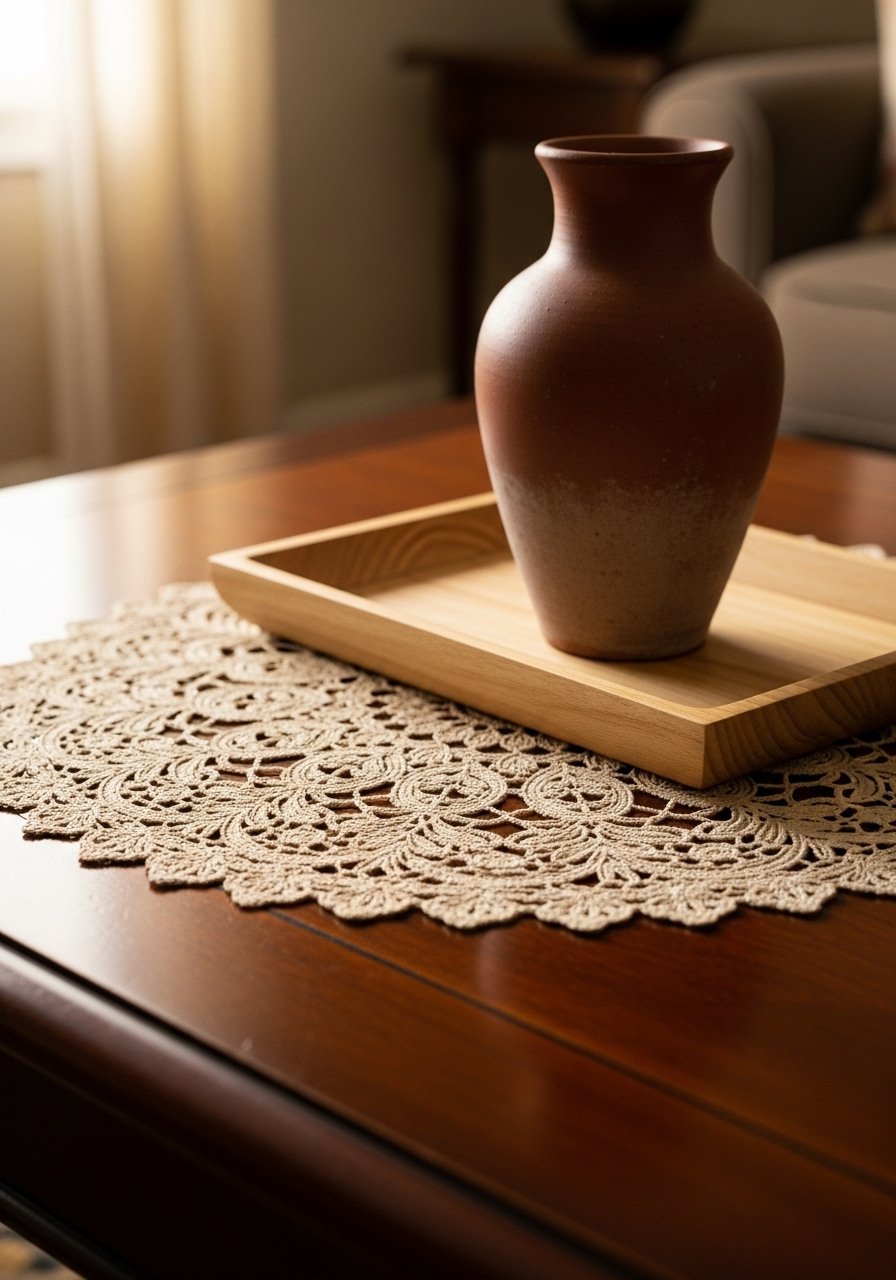
I found a few vintage doilies and dyed them in a soft terracotta wash. They stopped looking fussy and started reading like texture.
The trick is scale and color—earthy tones make lace feel modern. I now layer a dyed doily under bowls or on shelves.
If your first dye attempt is too intense, dilute and test on scraps before committing.
What You'll Need for This Look
15. Color-Drenched Reading Nooks in Eucalyptus
I painted my built-in nook top-to-bottom eucalyptus and added a creamy cushion. It became my daily reset spot.
My mistake was choosing a green that read too blue in north light. A warmer eucalyptus fixed that.
Add a warm lamp and neutral textiles to keep it restorative and not dark.
What You'll Need for This Look
16. Mahogany on Kitchen Islands for Intimacy
I painted my island mahogany and the kitchen felt quieter and more gathered. It reads like the room has been there a while.
The difference was subtle but real—people pause longer. I kept countertops light to avoid heaviness.
If you do this, pick matte finishes and test in the room’s light first.
What You'll Need for This Look
17. Pattern Layering with a Strict Cohesive Palette
I learned the hard way that pattern mixing needs rules. Now I pick one color family and vary scale and texture—one large floral, one small geometric, one textured solid.
That approach gave my guest room depth without chaos. The results felt edited and unforced.
Start with two patterns and one texture if you’re nervous, then add a third after living with it for a week.
What You'll Need for This Look
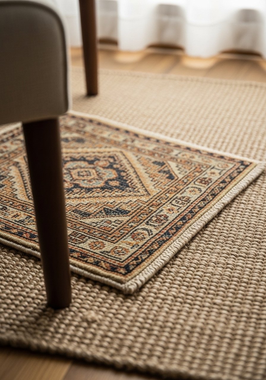
18. Budget Woven Rugs That Look Luxe Layered for Depth
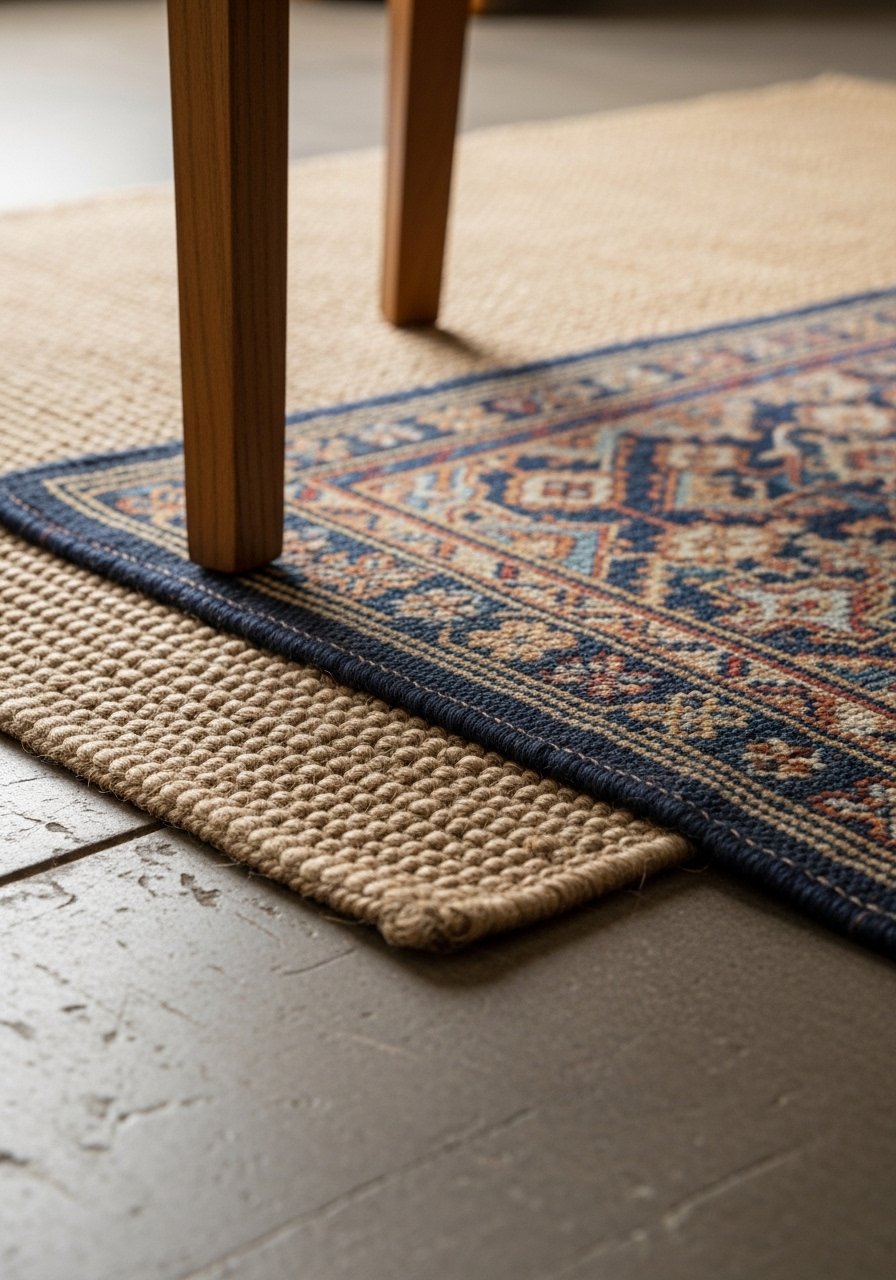
I layered an inexpensive jute rug under a patterned wool runner and the floor suddenly read expensive. Layering hides budget variations and adds warmth.
My early mistake was mismatching rug scales. Now I make sure the top rug is smaller and centered.
Layering also protects high-traffic spots—practical and prettier.
What You'll Need for This Look
19. Swap Brass for Silver Hardware and Trays
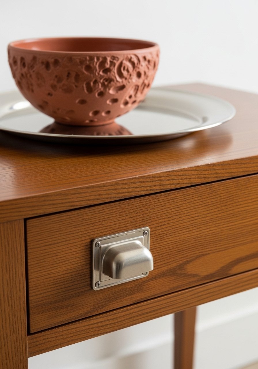
After years of brass, I swapped a few hardware pieces to nickel and the room breathed differently. Silver feels fresh against earth tones.
I over-rotated once and it lost warmth. The balance is one or two silver pieces among wood and clay.
Change hardware in key places—dresser pulls or a lamp—to test the look first.
What You'll Need for This Look
20. Saturated Trim and Millwork for Architectural Depth

I painted window trim a deep charcoal and it made the room feel layered, like architecture rather than boxy walls. Saturated trim reads intentional.
Be careful—very dark trims can make a small room feel closed. I kept walls light and trim deep for balance.
Use a satin finish for trim so it reads textile-like and not shiny.
What You'll Need for This Look
21. Layered Rugs for a Cozy, Collected Floor
I stopped fighting with the floor and started layering rugs. A neutral sisal under a patterned rug made the room richer and hid wear.
My first try slid everywhere. A good rug pad fixed that and improved the feel underfoot.
Keep the layers different materials for contrast—natural fiber under a soft wool top layer.
What You'll Need for This Look
22. Small Nook Color Drenching for a Restorative Spot
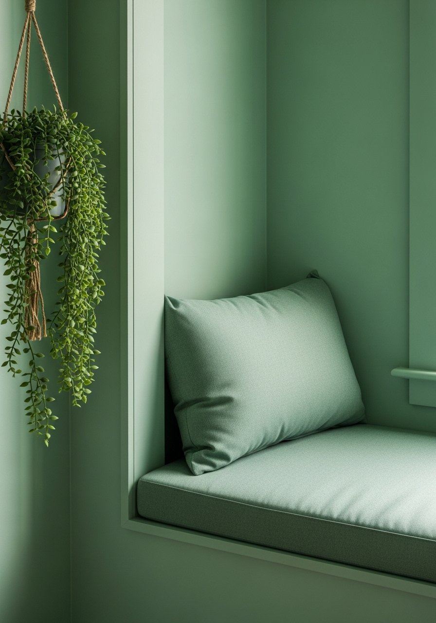
I painted a window recess color-drenched eucalyptus and added a hanging plant. It’s my go-to unwind corner now.
The color made the nook feel like a mini sanctuary. I keep textiles neutral so the green is the star.
If your nook is tiny, keep the color contained—don’t paint adjacent walls unless you want continuity.
What You'll Need for This Look
23. Boho Earth Tone Rugs for Warmth and Pattern
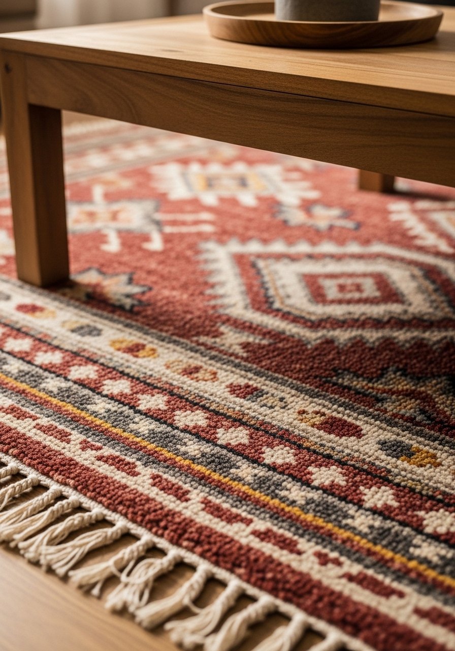
I swapped my plain rug for a boho earth tone option and the room felt friendlier. The pattern hides dirt and looks pulled together with woven cushions.
My early choice was too small—it made furniture float oddly. Upsizing created an anchored seating area.
Pick a rug size that fits at least the front legs of seating pieces.
What You'll Need for This Look
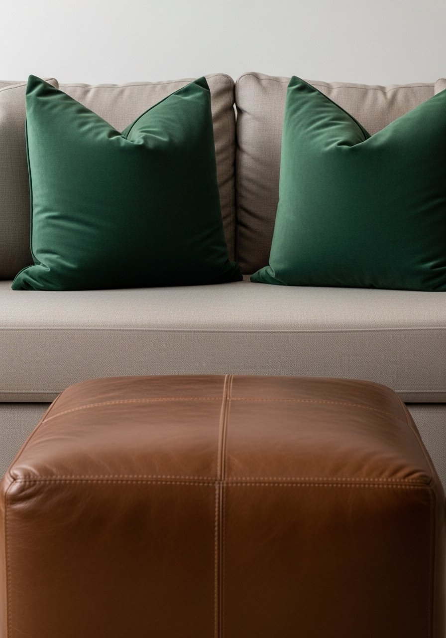
24. Jewel Tone Pillows for Moody Neutrals
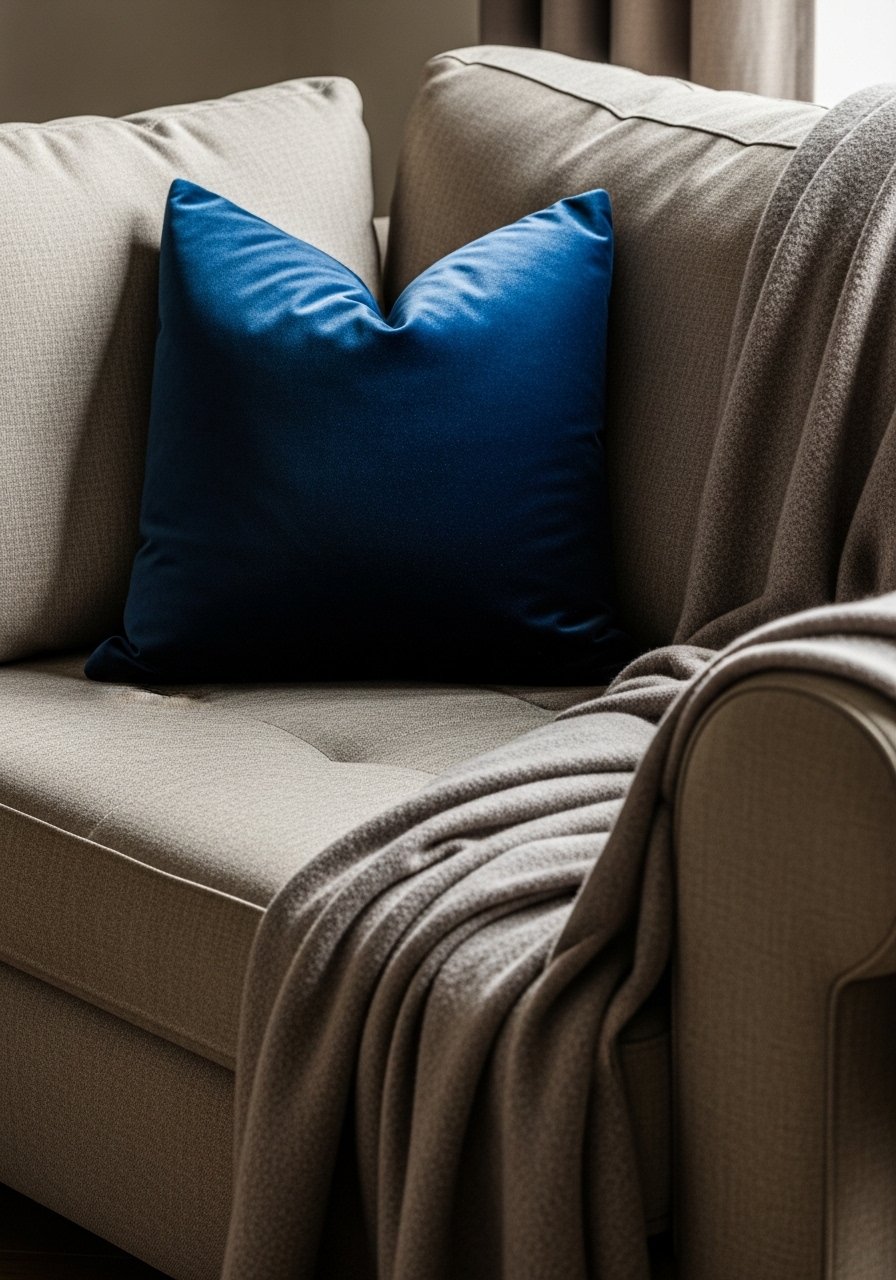
I started with neutral sofas and introduced jewel-tone pillows—sapphire, oxblood, and deep green. The sofa stopped blending into the room and became a focal point.
I once bought all velvet, which looked formal. Mixing velvet with linen and leather keeps it relaxed.
Start with two jewel pillows and a neutral to guide the look.
What You'll Need for This Look
25. Stop Short Curtains—Drench for Depth Instead
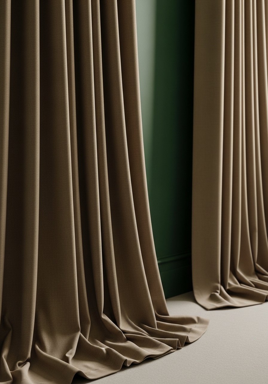
I used to hang curtains just below the window and it looked amateur. Hanging them from ceiling to floor and letting them drape makes the room feel taller and more intentional.
I made the mistake of choosing a flimsy fabric that showed the curtain rod. Heavier linens read richer and hide hardware.
If you’re renting, use tension rods and longer panels that can be hemmed later.
What You'll Need for This Look
26. Green-Forward Plant Groupings to Ground a Room

I grouped three different green plants by size and they made the corner feel intentional and alive. Plants add color without adding visual noise.
One mistake: I picked plants without checking light and lost a fern. Now I match plants to light and rotate them seasonally.
Use mixed pot materials—terracotta, glazed ceramic, woven basket—for texture.
What You'll Need for This Look
27. Art Groupings in Warm Palettes for Cohesion
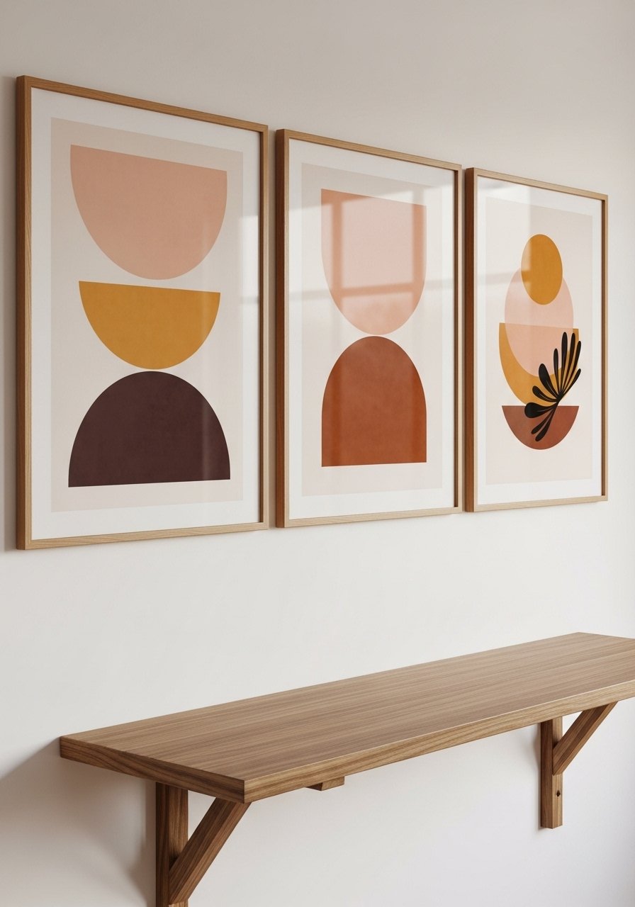
I collected small prints in warm palettes and grouped them above a console. The wall reads curated, not chaotic.
I once tried to hang too many sizes and it looked like clutter. Restricting scale and color family made everything read together.
Lay prints on the floor first to test arrangements before drilling.
What You'll Need for This Look
28. Mixed Metals with Silver Focus for Balanced Shine

I learned mixing metals makes a room feel edited when done sparingly. I favor silver on trays and small accents, then echo with one warm brass lamp to keep warmth.
My mistake was matching everything. Now I let metals converse—one shiny silver, one matte brass, and natural wood to soften.
If you’re nervous, keep metals at accessory scale instead of on big furniture.
What You'll Need for This Look
Final Thoughts
You don’t need to do all of these. Pick one corner, one paint sample, one pillow and live with it for a month.
I learned that small, honest choices—not perfection—make a home feel energizing and lived-in. Go slow and keep what feels like you.
