
My living room had nice furniture and decent lighting but it still felt like a waiting room. Took me embarrassingly long to figure out it was missing texture. Every surface was smooth, every color was flat, and nothing invited you to actually sit down. Once I started treating blue as a backdrop instead of the whole story, it warmed up fast.
These ideas lean transitional with a mix of modern and classic touches. Most are budget friendly, under $75, with a few splurges around $150. They work in living rooms, family rooms, or any seating area that needs balance between refined and relaxed.
Layered Blues with Warm Neutrals
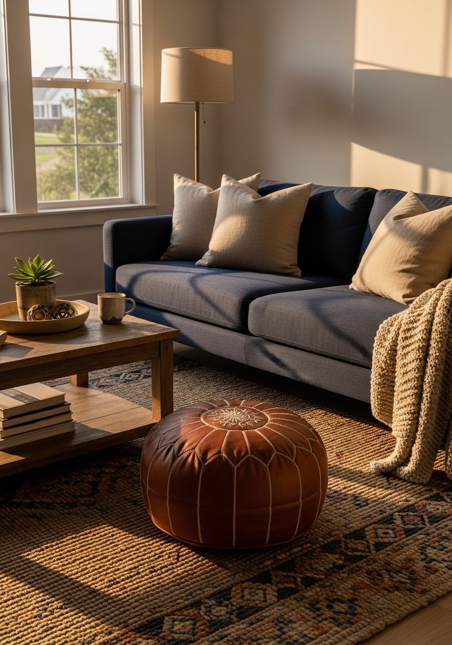
The moment I swapped one matchy blue pillow for a warm linen cover the whole sofa stopped screaming showroom. Aim for roughly an 80/20 ratio with blue as the dominant color and warm neutrals filling the rest. I use 22-inch linen pillow covers in sand tones against navy velvet ones. For an easy purchase, try these navy velvet throw pillows alongside 22-inch linen pillow covers. Common mistake is buying every pillow to match the sofa. Instead, pick one texture contrast per seat and stick to it. A photo tip, the camera flattens texture, so add one more pillow in real life than looks “right” in a photo.
Textured Throws for Instant Warmth
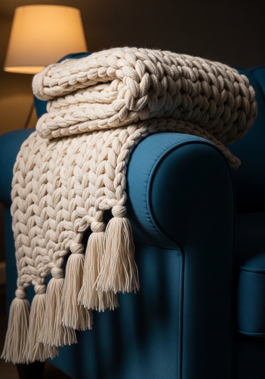
I spent $35 on a chunky knit throw and it made guests sit down immediately. Throws add weight and softness in seconds. Fold the throw into thirds lengthwise and drape it over an arm so one third hangs, two thirds fold back. That keeps the sofa looking intentional instead of tossed. I like a heavy knit around 50 by 60 inches, like this chunky knit throw in cream. A common mistake is using a thin cotton throw with a velvet sofa. It disappears. Texture matters more than pattern here, and layering a patterned lumbar later gives visual interest without clutter.
Floor-to-Ceiling Curtains to Add Height
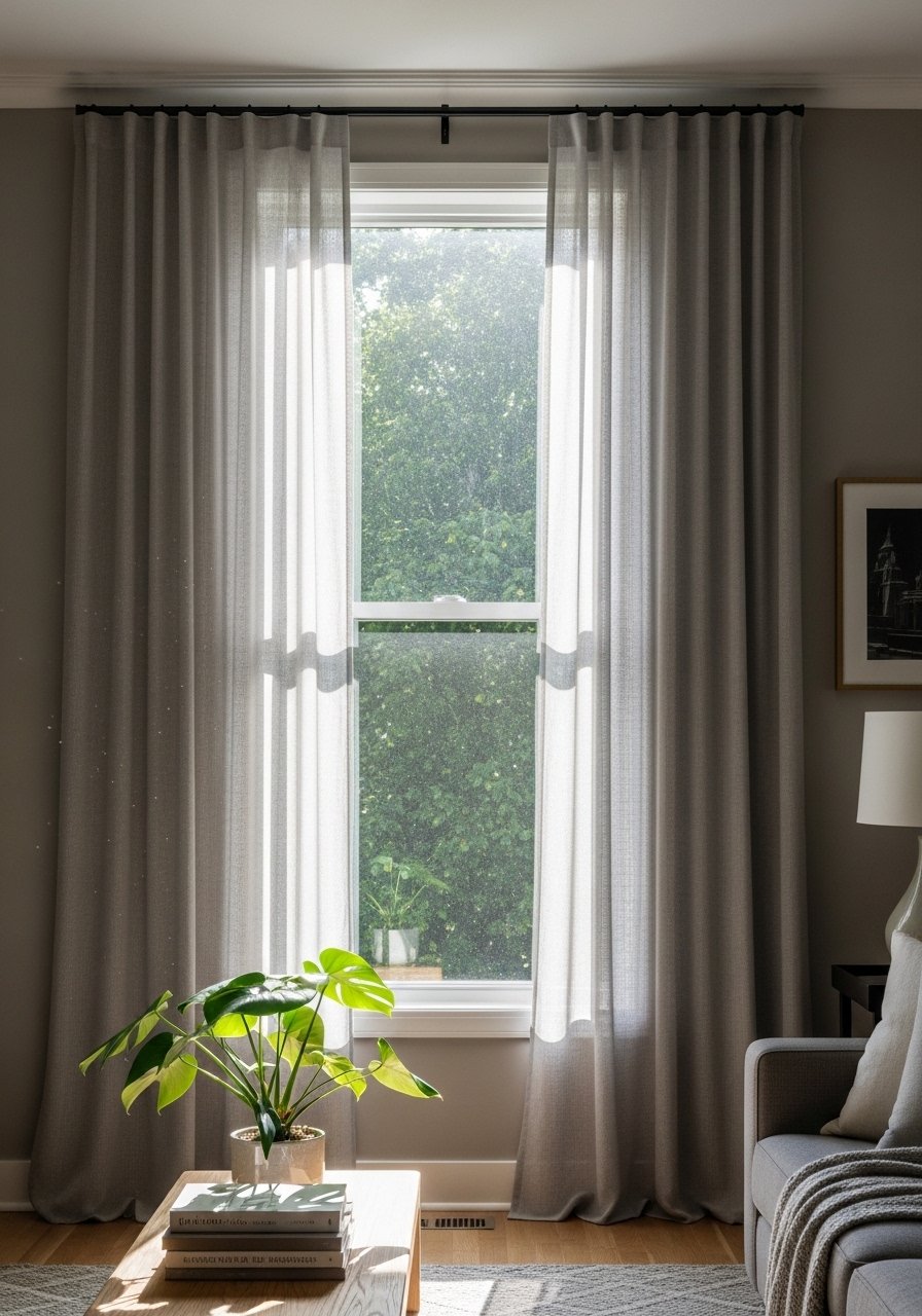
Most people hang curtains right at the window frame. That is why their rooms look shorter than they are. Mount the rod 4 to 6 inches below the ceiling or just under crown molding and choose panels that either kiss or puddle the floor. For standard 9-foot ceilings, 96-inch linen panels work well and read current instead of dated. I use linen curtain panels 96-inch in a warm gray. The mistake is matching curtains to the wall color exactly. Slight contrast adds depth. Small rooms visually gain at least a foot of perceived height with this trick.
Layered Lighting for a Relaxed Glow
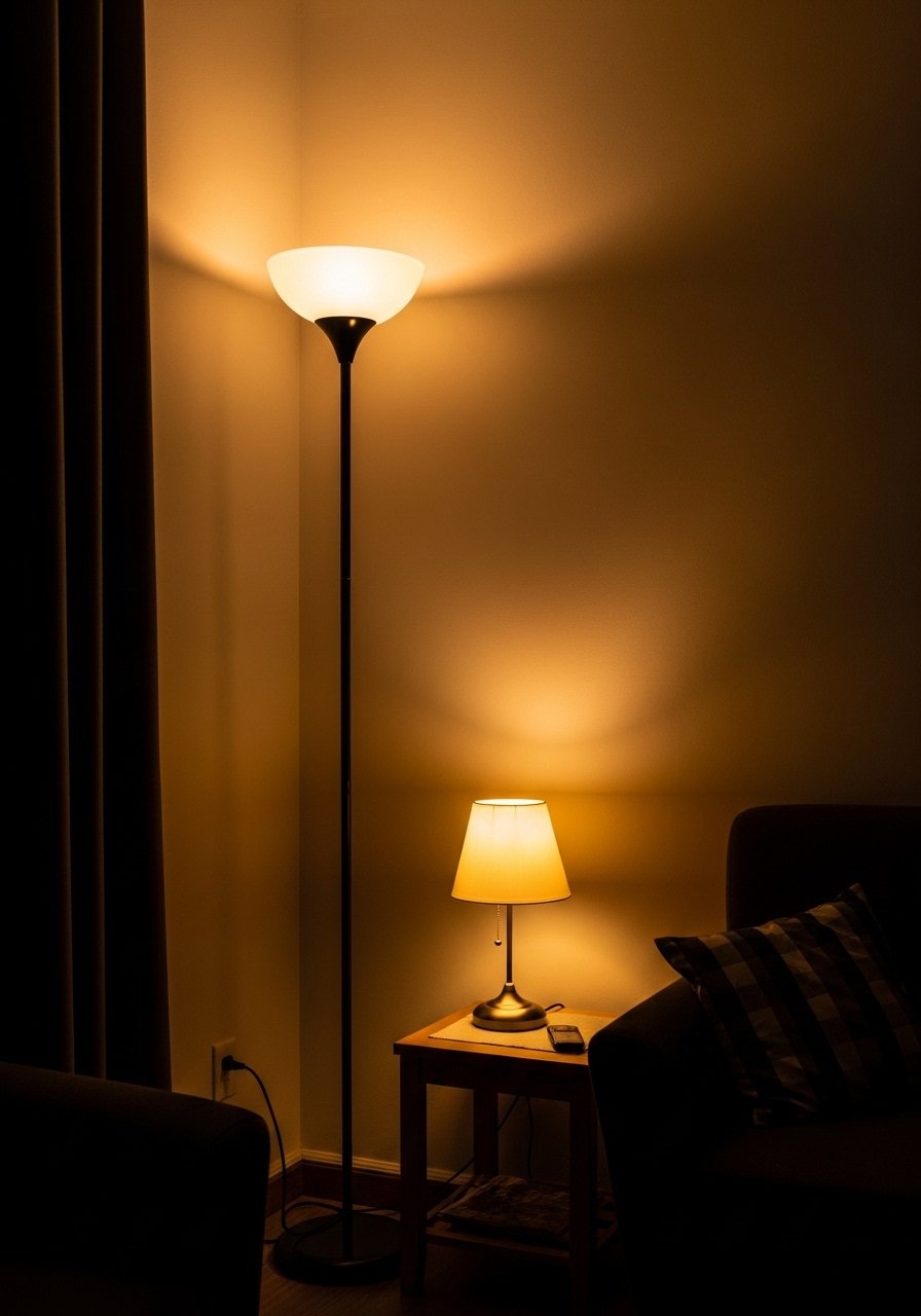
One overhead fixture cannot carry a room. I replaced a single ceiling light with three layers: a warm floor lamp, a table lamp next to the reading chair, and dimmable overhead. Aim for three sources within a 10-foot by 12-foot seating area. I like a brass floor lamp for warmth and a ceramic table lamp for texture. Try this brass floor lamp and a textured ceramic table lamp. A common mistake is mixing bulb temperatures. Keep every lamp warm white 2700K to 3000K so blue reads cozy, not icy.
Gallery Wall with Mixed Frames
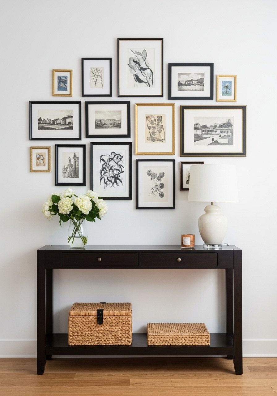
I found brass picture ledges on Amazon for under $25 and they solved my commitment problem with a gallery wall. Mix frame finishes and keep the center of the composition around 57 inches from the floor. Use 2 to 3 inches between frames when grouping tightly. These brass picture ledges let you swap art without new nail holes. The mistake is hanging everything too high or in a perfect grid that reads cold. A mix of frame widths and one sculptural object breaks the monotony. Pro tip, include one photo or print with a warm cream mat to tie into textiles.
Natural Wood to Soften Blue
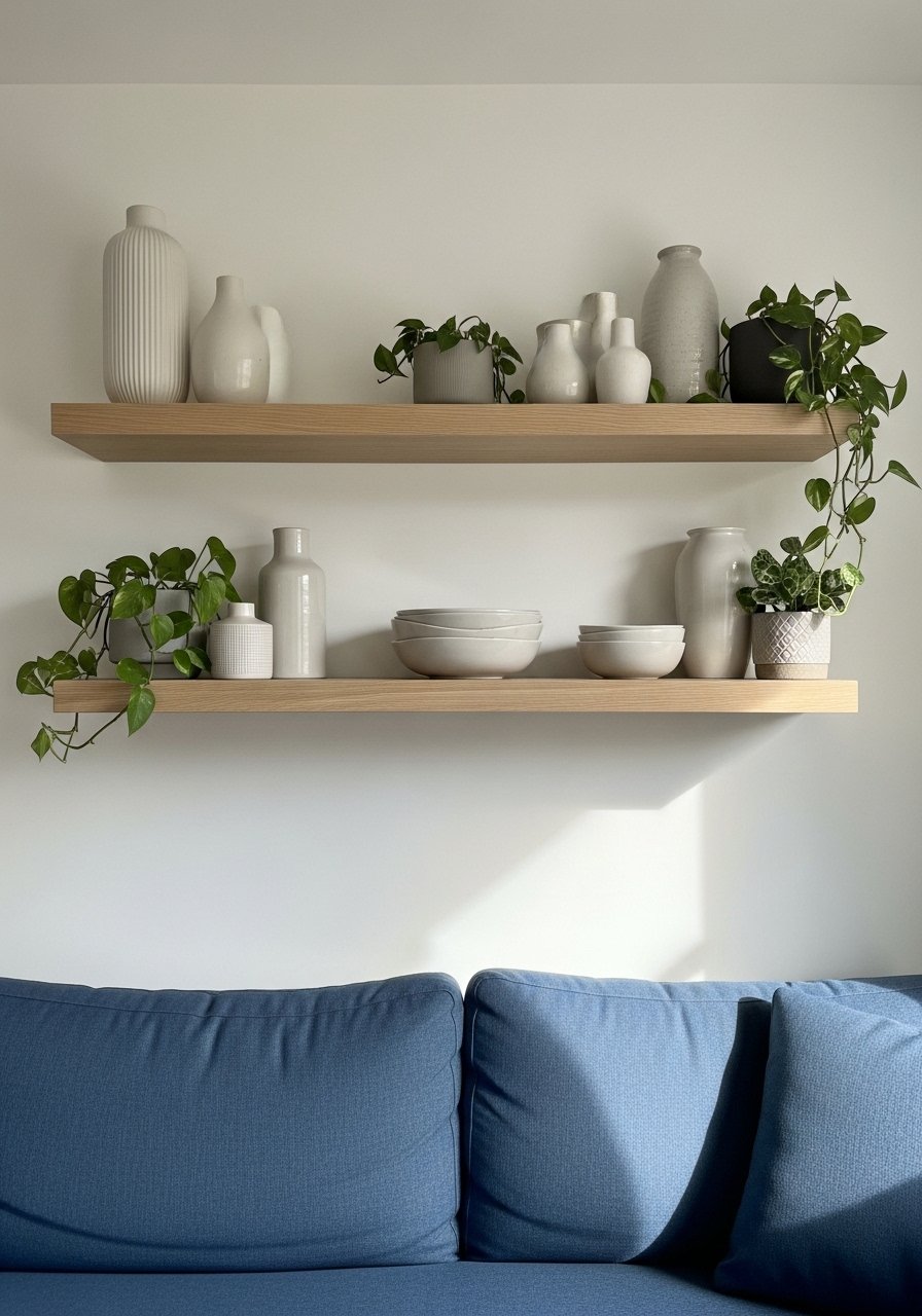
White oak shelves are in heavy rotation for a reason. A blue room often needs a warm wood to avoid feeling flat. I use floating white oak shelves above my console and balance them with a walnut coffee table. If you are pairing metals and wood, let wood take the visual lead at a roughly 2-to-1 ratio of wood pieces to metal pieces. These white oak floating shelves are budget friendly. A frequent mistake is pairing blue with only dark woods. That can make the blue look colder. Lighter wood warms and keeps the space feeling intentional.
Rug That Anchors Without Overpowering
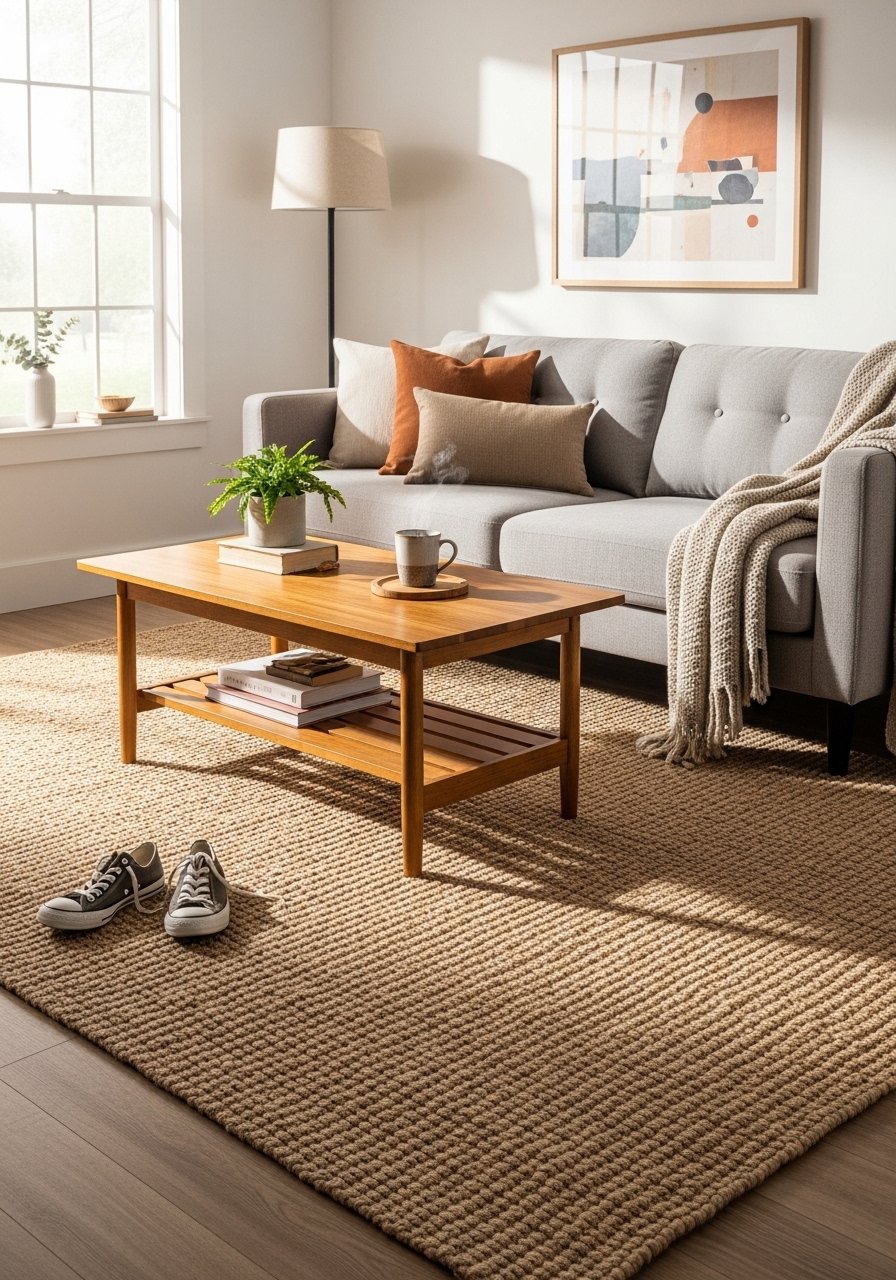
Bigger than you think is the rule with rugs. I once bought one that left all feet off it and the room felt disconnected. For a standard living room, go 8 by 10 so the front legs of the sofa and chairs sit on the rug. A neutral jute rug grounds blue without competing. I use an 8×10 jute area rug. People often pick busy patterns to hide stains, which is fine, but a single large neutral keeps a transitional look calmer. In photos, patterns read louder than in person, so if you are unsure choose one tone grayer than you think.
Mixed Metallics for Modern Classic Balance
I stopped matching all my metals and the room instantly felt curated. Mix brass, black, and nickel across fixtures and hardware. A good rule is two finishes in the main seating zone and a third as an accent. These mixed metal picture frames are an easy start. The mistake is swapping every small item to the same metal at once. Let metals appear in different finishes on different planes. That makes the space feel collected, not designed by a catalog.
Greenery for Scale and Life
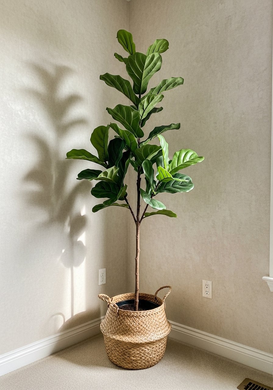
One single 6-foot fiddle leaf fig has ten times the visual impact of five small succulents. Plants give scale and break up the blue field. Place a tall plant near a window or lamp and leave about 12 to 18 inches between it and the wall so leaves can breathe. If you want low maintenance, try this artificial fiddle leaf fig 6ft. The mistake is clustering tiny plants where one tall shape would read as a design decision. A well-placed plant also covers awkward cords and corners in photos.
Cozy Reading Nook with Accent Chair
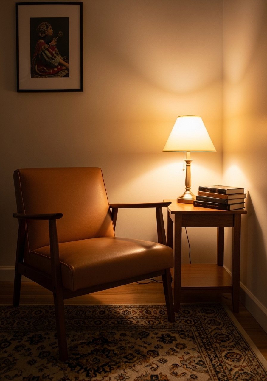
There is something about a reading nook with layered pillows that makes you want to cancel your plans. Pick an accent chair with a seat width around 30 to 36 inches and a seat height close to your sofa so side tables work for both. A comfortable toss pillow and a small throw make the chair inviting. Try this tan leather accent chair if you want contrast to blue. Common mistake is choosing a chair too narrow for daily use. If it looks tiny in the photo it will feel tiny in real life.
Statement Mirror to Brighten Dark Corners
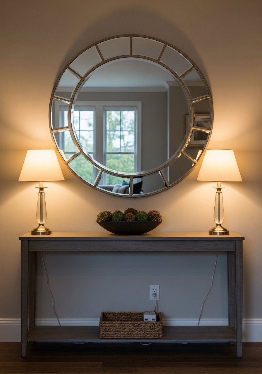
A mirror rescued my dim entry corner. I hung an oversized round mirror that is about two thirds the width of the console table it sits above. Mirrors bounce light and multiply visual space. This large round wall mirror is an easy swap when you need brightness. Avoid mirrors with tiny frames that get lost. The mistake is choosing a mirror too small to make a difference. If your room has one dark corner, a well-placed mirror plus a floor lamp often solves it.
Accent Table Styling with Books and Vessels
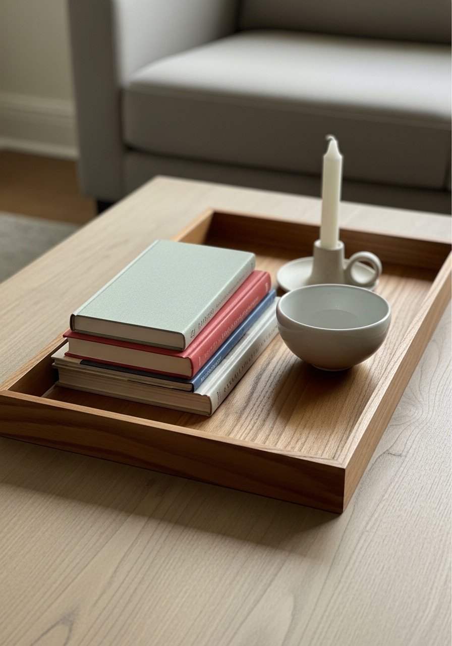
I once styled my coffee table with five tiny objects and it read cluttered. Stick to odd numbers and varied heights. A wooden tray anchors the setup, stack two to three coffee table books, then add a vessel and a low candle. For height contrast use something around 8 to 12 inches tall. This wooden serving tray and a ceramic bowl are simple buys that make styling easier. A common mistake is symmetry for its own sake. Asymmetry with balance feels lived in and looks more expensive.
Your Decor Shopping List
Textiles
- Honestly the best $40 I have spent, navy velvet throw pillows for layering
- Chunky knit throw in cream (~$35-55). Drape over the sofa arm for instant warmth
- 22-inch linen pillow covers in sand for contrast
Wall Decor
- Brass picture ledges (~$18-25). Swap art without new nail holes
- Large round wall mirror for dark corners
Lighting
- Brass floor lamp (~$80-150)
- Textured ceramic table lamp (~$40-90)
Plants
- Artificial fiddle leaf fig 6ft for scale if you lack sunlight
Budget Finds
- 8×10 jute area rug (~$120). Neutral and durable. Similar at Target or HomeGoods
Shopping Tips
White oak beats dark wood in 2026. Design feeds have shifted completely. White oak floating shelves look current, not dated.
Grab velvet pillow covers for $20 each. Swap them every season and the whole room feels different.
Curtains should puddle or kiss the floor, never hang halfway up. Linen curtain panels 96-inch are right for standard 9-foot ceilings.
One tall plant beats five small ones. Artificial fiddle leaf fig 6ft gives scale and hides cords without the upkeep.
If you are torn between two metal finishes, pick both and repeat them twice. Mixed metal picture frames make it intentional.
Frequently Asked Questions
Q: What size area rug do I actually need?
A: Bigger than you think. For most living rooms, go 8×10 so the front legs of sofas and chairs sit on the rug. If you have a sectional, measure the seating zone and aim for a rug that brings pieces together. This 8×10 jute rug is neutral and sturdy.
Q: Can I mix boho textiles with modern furniture without it looking messy?
A: Yes. Keep scale and color in mind. Use one boho textile as an accent, like a patterned lumbar, and repeat a neutral color elsewhere so it reads cohesive. Avoid mixing three bold patterns at once.
Q: Should I match my metals or mix them?
A: Mix them. It looks more intentional. Stick to two main finishes in the seating area and let a third appear as a small accent. Mixed metal picture frames are a low-commitment way to start.
Q: How do I stop a blue room from feeling cold?
A: Add warm textures and woods. Layer throws and pillows, use a warm wood coffee table, and pick warm white bulbs. I find about half the rooms I edit feel cold because they lack textiles, so start there.
Q: Real plants or faux?
A: Both. Real plants are great when you have light and want the upkeep. Fauxs work where light is poor or you want consistent scale. A single 6-foot faux fiddle leaf fig can make a space feel planted and finished.
