
I used to think more was messy. Then I started living with color, pattern, and the things I loved — not a Pinterest version of me. Rooms started to feel personal and alive, even when they were loud.
These ideas are the messy, joyful lessons I learned. They’re practical, real, and meant to be mixed into a life already in progress.
26 Bold Maximalist Decor Ideas That Make Rooms Unforgettable
These 26 ideas are ones I actually tried in homes that get used. I tested colors, swapped furniture, and kept what worked. Each idea is specific, honest, and ready to use in a real room. I’ll walk through what changed and what I bought to get it done.
1. Jewel-Toned Velvet Sofa Anchoring a Busy Living Room
I brought a jewel-toned velvet sofa into a room that previously felt forgettable. The color read as confident from day one. I noticed how other elements — rugs, art, pillows — started to relate to it instead of competing.
At first I ordered the wrong scale; it swallowed a small room. I returned it for a narrower version and the room finally exhaled. Now the sofa is where guests gravitate.
Pay attention to scale and leg style. Velvet shows every light, so keep nearby surfaces matte to balance shine.
What You'll Need for This Look
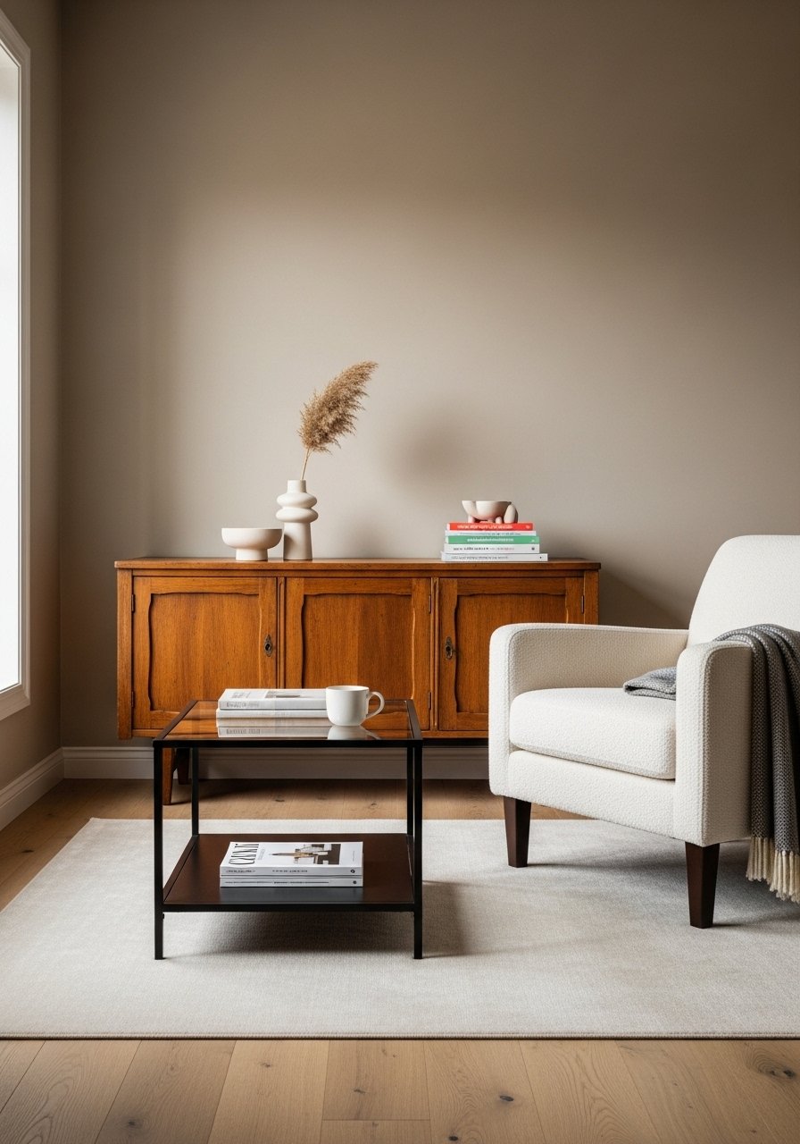
2. Layered Rugs to Anchor Zones in an Open Plan
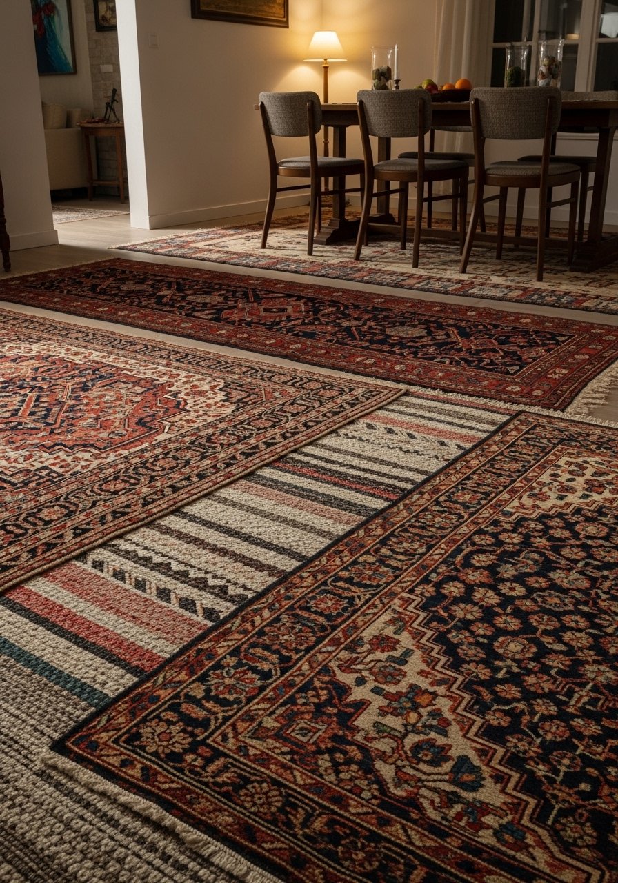
I stacked rugs to define seating and dining areas. The Persian rug gives pattern and history. A flatweave on top adds scale and ties furniture together. The layered look felt curated, not chaotic.
My mistake was starting with identical color families — it read flat. Adding a rug with warmer tones fixed that instantly. The layers also hid high-traffic wear.
Make sure rug sizes overlap logically. A small coffee table sitting across both rugs looks intentional.
What You'll Need for This Look
3. Mixed-Metal Lighting Clusters Over a Dining Table
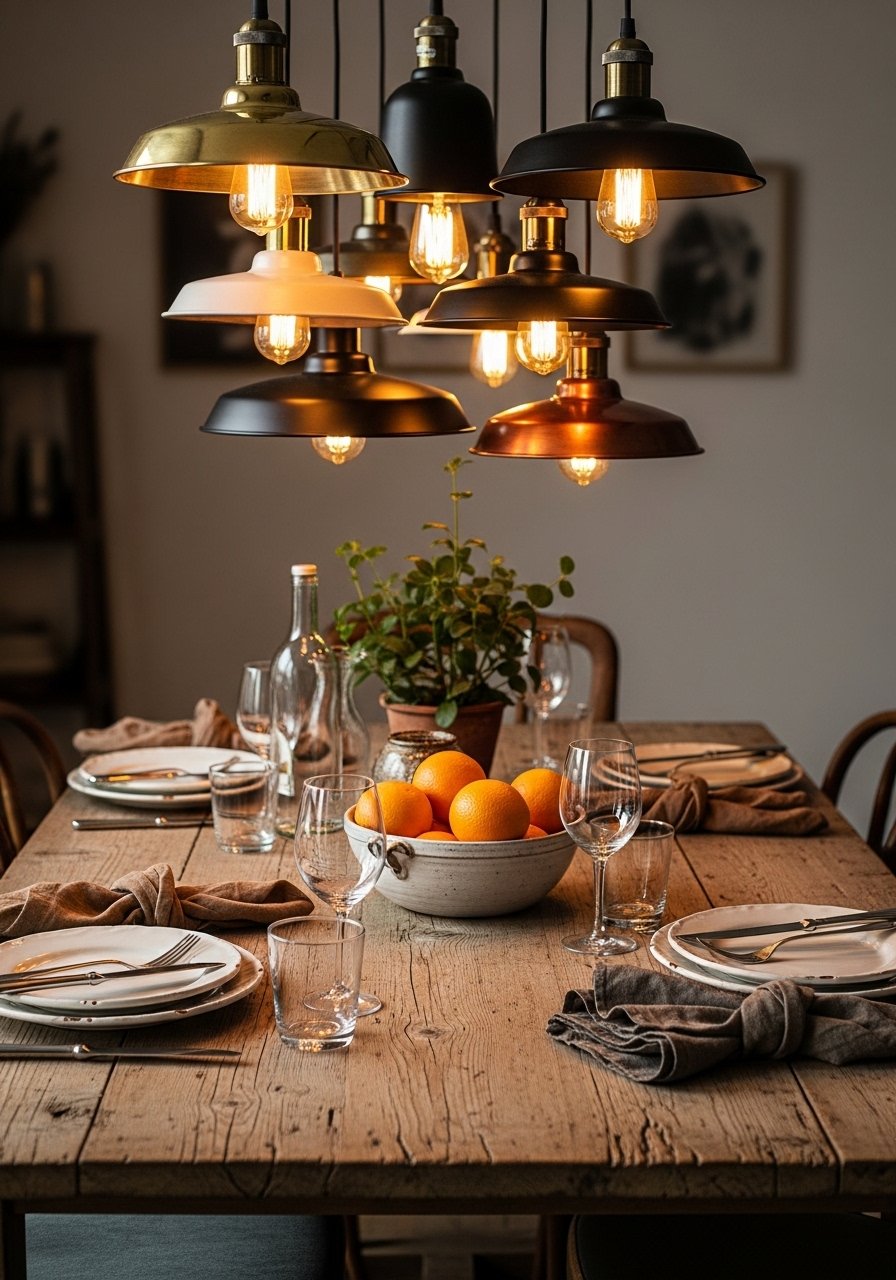
I stopped matching metals and started grouping them. A brass pendant, a copper shade, and a matte black sconce together created a lively focal point over the table. The mismatch felt intentional and relaxed.
At first I tried three identical pendants and lost the personality. Mixing finishes gave depth without cluttering the eye. Warm bulbs kept the metals cozy.
Mind the heights so pendants don’t block sightlines. Balance shiny pieces with matte surfaces nearby.
What You'll Need for This Look
4. Gallery Wall That Mixes Frames, Mirrors, and Objects
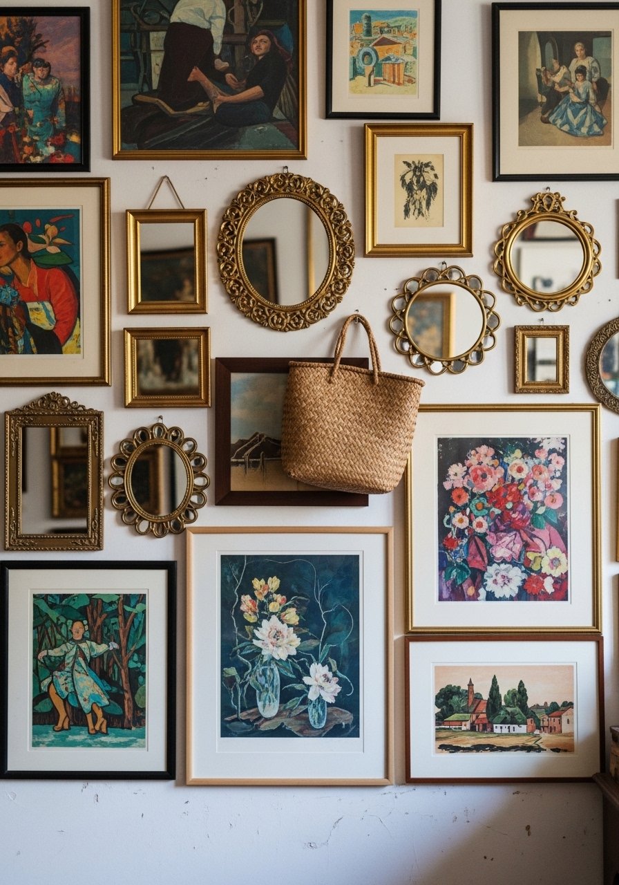
I built a gallery wall with frames, a vintage mirror, and a small woven tray. It started as random finds and became a story. The mirror catches light. The basket adds texture.
My early attempt used identical frames and the wall felt sterile. Swapping in varied frames added rhythm. I hung everything with removable hooks so pieces could move easily.
Spacing matters more than perfection. Keep an odd number of larger pieces to anchor the arrangement.
What You'll Need for This Look
5. Patterned Curtains That Read Like Wall Art
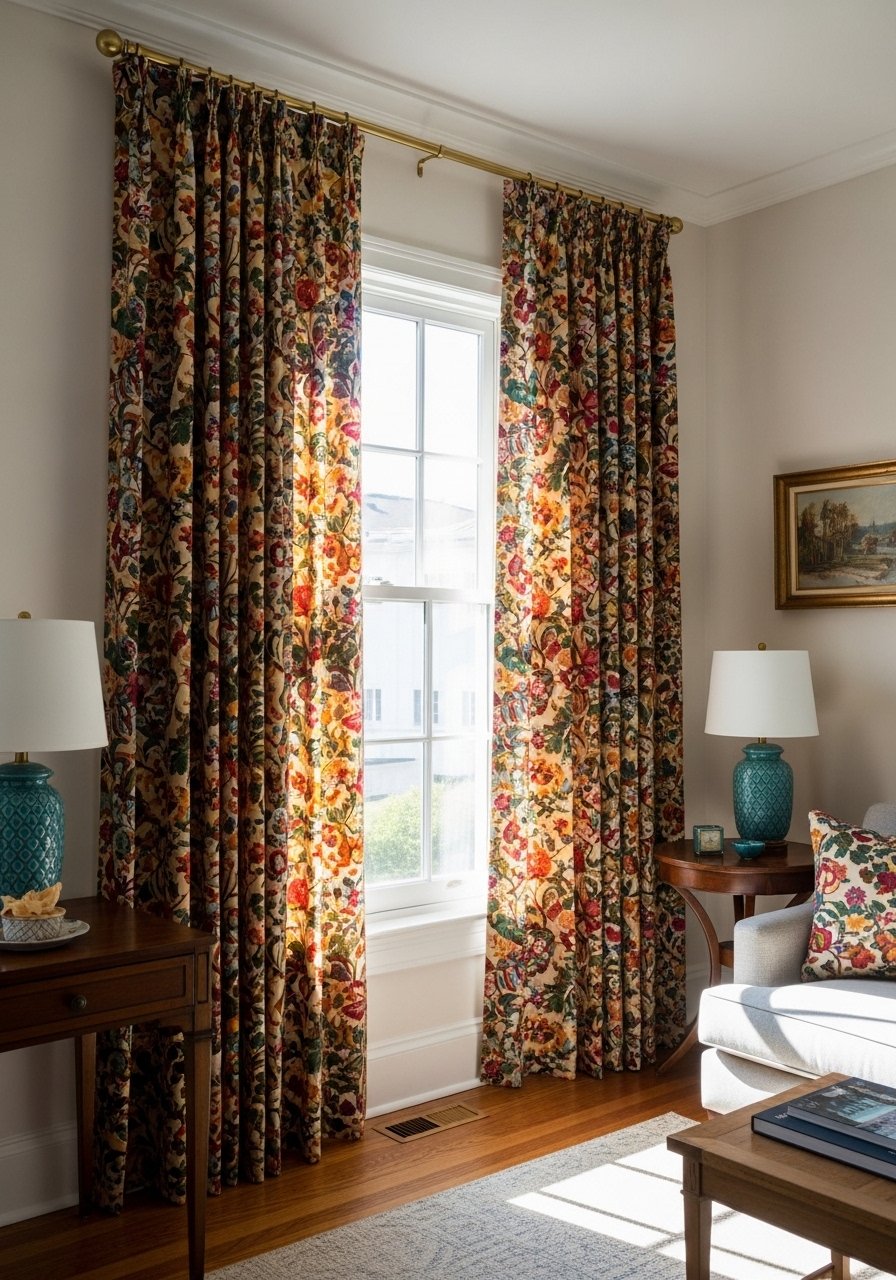
I swapped plain curtains for a bold floral that now reads like a wall. They bring scale, pattern, and color without permanent commitment. The room feels finished even when other things are simple.
I learned that cheap curtains look flimsy with big prints. Upgrading to weight gives the pattern presence. Hem length matters — too short looks off.
Hang curtains high to make windows feel larger. The pattern draws the eye up and out.
What You'll Need for This Look
- Floor-to-ceiling patterned curtains (84 in)
- Brass curtain rod (extendable)
- Linen blackout lining (panel)
6. Ceiling Paint That Creates a Cozy Cocoon
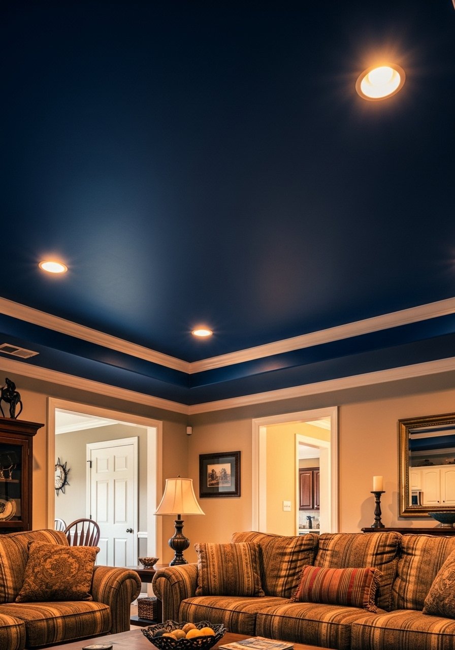
I painted a ceiling deep navy and the room instantly felt warmer. The low-slung effect is cozy but still airy because the walls are lighter. The color draws attention upward in a way that’s unexpected.
My first choice was too dark and made the space feel boxed. I lightened the hue slightly and it became intimate without oppressive weight.
Use a satin finish if light reflection is desired. Test a large swatch overnight to see how evening light changes it.
What You'll Need for This Look
7. Maximalist Mantel with Layered Objects and Books
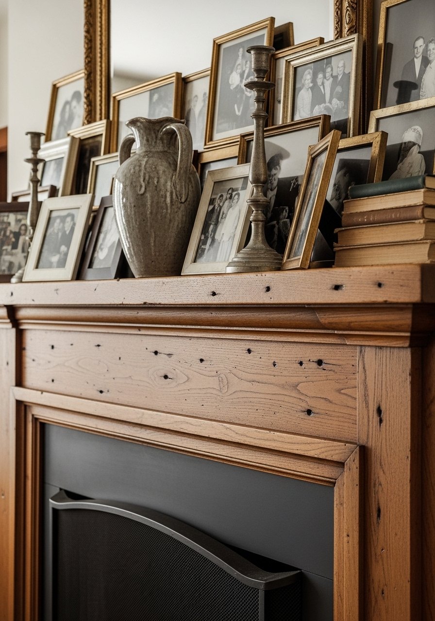
I stopped leaving the mantel minimal and started piling. Frames, a sculptural vase, a stack of books, and two candlesticks make it feel collected. The layers create depth and tell a story.
One mistake was placing everything symmetrically; it read staged. I shifted pieces off-center and added height variance. The mantel now looks curated rather than catalogue-perfect.
Combine items in groups of three or five for better balance. Let some pieces overlap slightly to avoid strict lines.
What You'll Need for This Look
8. Bold Wallpaper on an Accent Wall (Not the Whole Room)
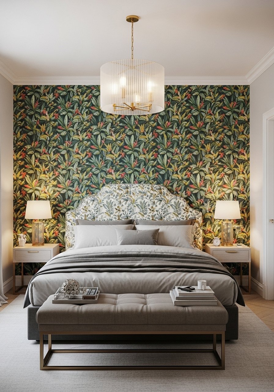
I used a dramatic botanical wallpaper behind the bed and left the other walls neutral. It reads like art and prevents overcommitment. The bed became the focal point without the room feeling busy.
I once papered the whole room and regretted it — it felt like being inside a pattern. Restricting it to one wall gives punch and keeps calm elsewhere.
Match bedding to a color in the wallpaper to make the scheme cohesive.
What You'll Need for This Look
9. Curated Shelf Styling with Odd Items and Plants

I stopped arranging books strictly by color and started mixing in ceramics, plants, and small frames. The shelves felt like someone lived there. A trailing pothos softens hard lines and hides artless gaps.
At first I over-accessorized and the shelves looked stuffed. I removed a few items and left breathing room. Now each shelf has a focal point and supporting pieces.
Think in odd numbers and vary heights. Rotate things seasonally so shelves evolve.
What You'll Need for This Look
10. Overscaled Art Leaned Against Walls for Easy Drama
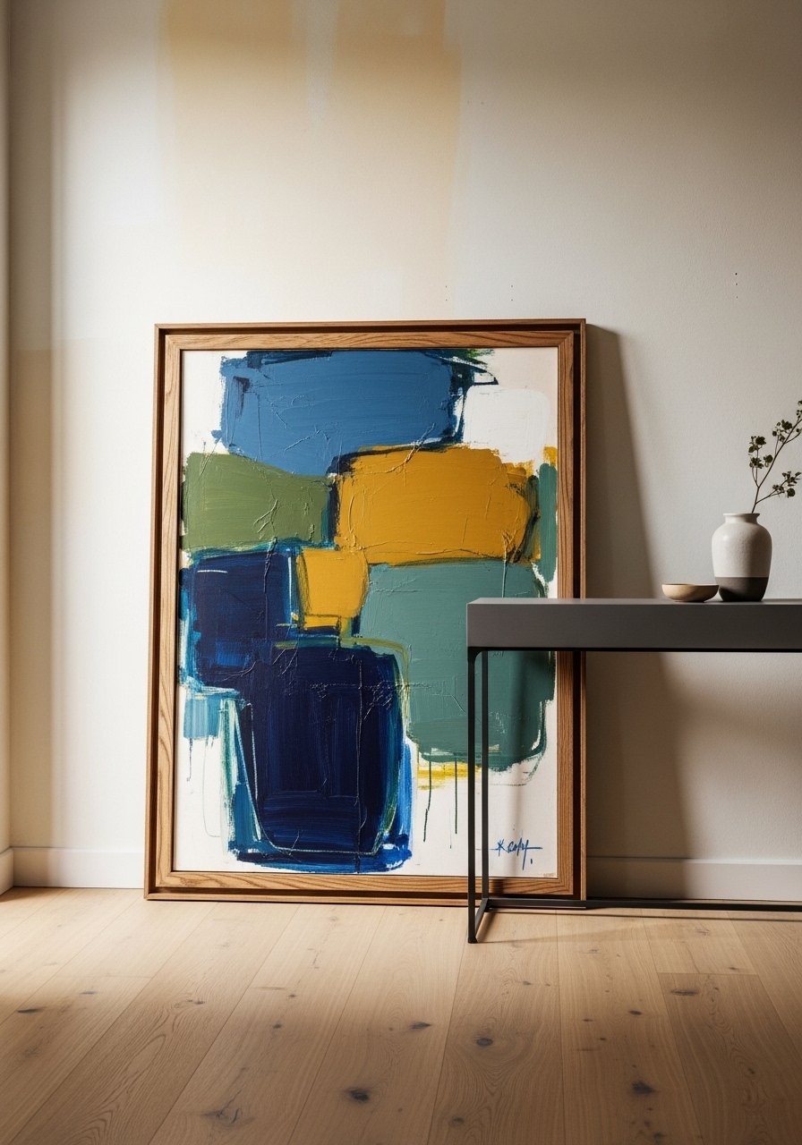
I leaned a large abstract painting against the wall instead of hanging it. The scale instantly grounded the console area and felt casual. It’s an easy way to make art feel more integrated.
I once hung a similar piece too high and the composition felt off. Leaning keeps sightlines flexible and forgiving.
If you have pets, anchor the frame with a small bracket. Otherwise it can tip in busy homes.
What You'll Need for This Look
11. High-Contrast Trim Paint for Graphic Impact
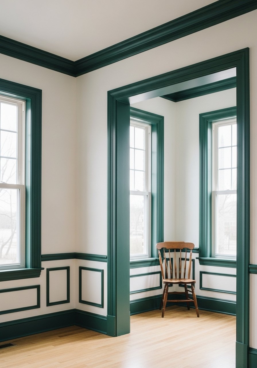
I painted my trim a deep green against white walls. The room looks architectural and intentional without extra decor. The trim reads like a frame for the whole space.
My first try used a gloss that emphasized flaws. I switched to eggshell and the finish looks softer. The contrast made modest molding feel significant.
Be patient with prep — taped edges matter. A steady hand pays off.
What You'll Need for This Look
12. Upholstered Headboard with Contrasting Trim
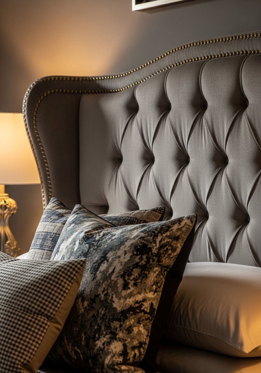
I had an upholstered headboard custom-covered in velvet with a contrasting nailhead trim. It reads tailored and bold. The trim outlines the piece and ties into metal accents around the room.
My first fabric was too thin and showed the plywood beneath. I upgraded to upholstery-grade velvet and the headboard gained presence. The trim saved the scale from feeling soft.
Choose a trim color that links to other metals in the room. It creates a subtle thread.
What You'll Need for This Look
13. Bold Tile Backsplash in the Kitchen for Unexpected Color

I installed a patterned blue tile backsplash behind the stove. It made the kitchen sing and hid grease better than I expected. The tile’s pattern brings energy without adding clutter.
I underestimated installation complexity and ended up hiring help. Worth it — the pattern anchored the whole space. The grout color choice also mattered; lighter grout aged messier.
Pick a tile scale that fits your range width. Small tiles can feel busy on a large wall.
What You'll Need for This Look
14. Maximalist Bed with Mixed Patterns and Rich Layers
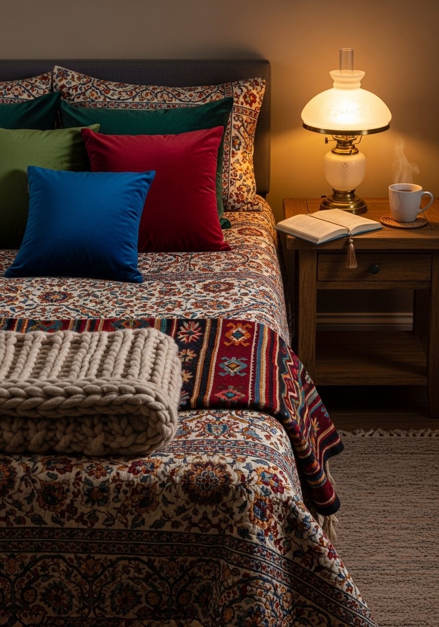
I embraced pattern mixing on the bed: a floral quilt, striped lumbar, velvet pillows, and a kilim throw. It reads collected and cozy. The layers invite lingering mornings.
I once stuck to a single pattern family and the bed felt flat. Mixing scales — small florals with bold stripes — gave it energy. Keep a shared color to hold it together.
Vary textures to avoid visual sameness. The bed becomes the room’s main statement.
What You'll Need for This Look
15. Ceiling Light as Sculptural Centerpiece in a Small Room
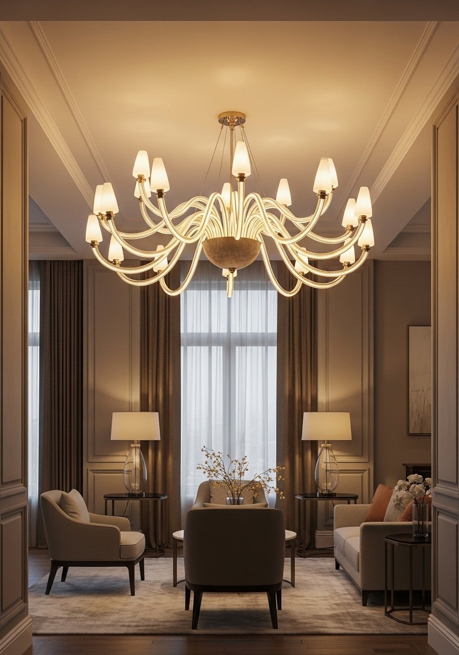
I replaced a generic fixture with a sculptural chandelier and the whole room felt intentionally furnished. The piece becomes jewelry for the ceiling and distracts from cramped corners.
I bought a scale too big once and it overwhelmed the space. Swapping to a slightly smaller but still bold fixture fixed proportion. Height matters — leave headspace over seating.
Pick a fixture that reads as art during the day and glows warmly at night.
What You'll Need for This Look
16. Painted Floors for a Graphic Base Layer
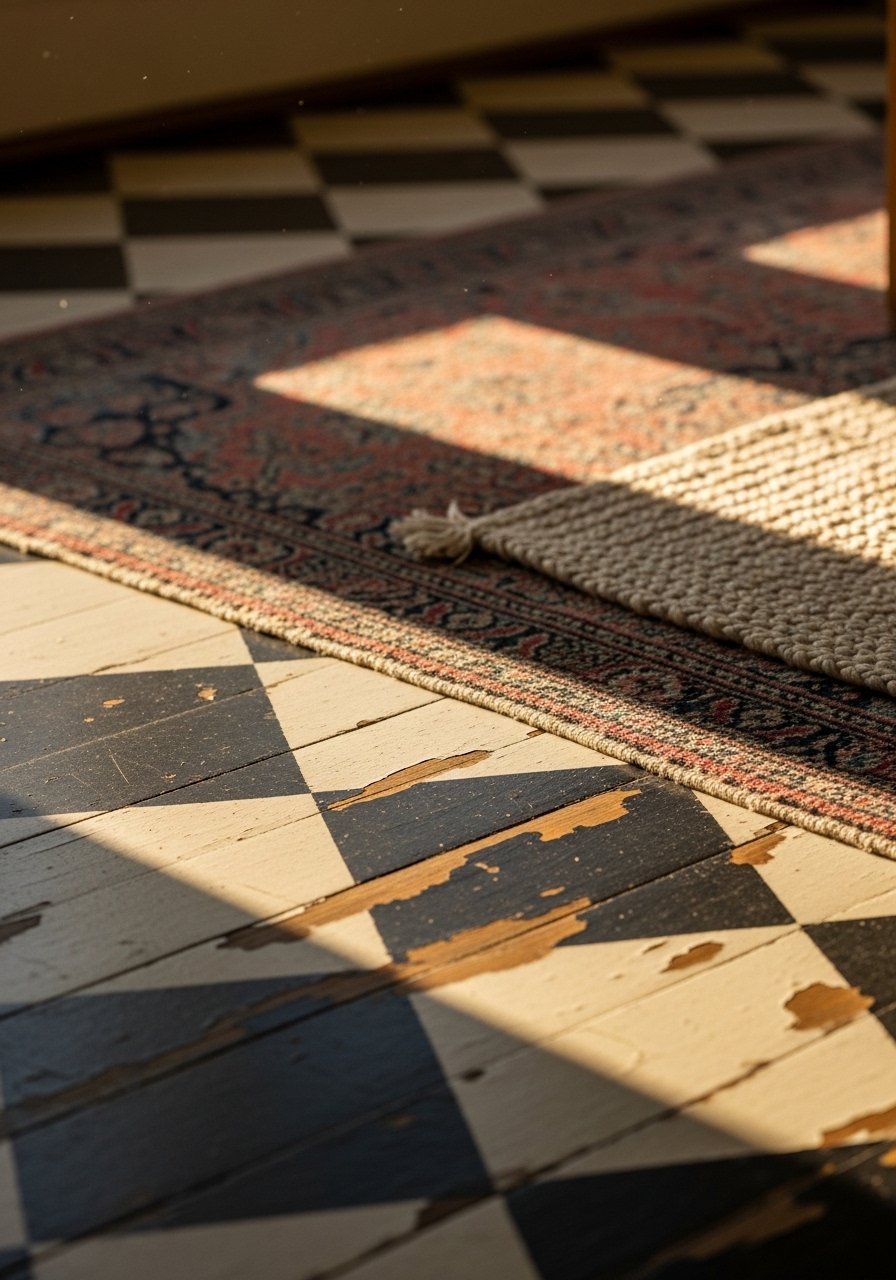
I painted my old hardwood in a checkerboard pattern. It felt brave and oddly timeless. The pattern anchors furniture and simplifies rug choices.
I underestimated prep time and skipped sanding in one corner; the paint peeled faster there. Fixing it taught me to prep thoroughly. Still, painted floors hide a multitude of imperfections.
Seal with a durable topcoat. It makes the finish liveable in high traffic.
What You'll Need for This Look
- Durable floor paint (latex, quart)
- Checkerboard floor stencil (large)
- Clear polyurethane floor sealer
17. Statement Mirror That Doubles as Art
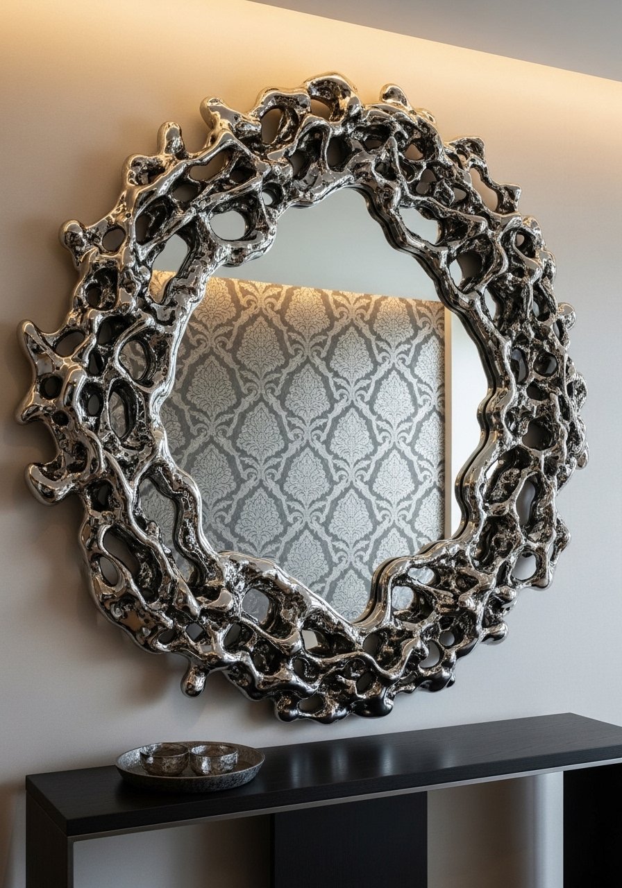
I installed an oversized sculptural mirror above a console and it functions as art. It reflects color, enlarges the space, and becomes a focal without extra frames.
At first I picked a mirror that was too ornate for the room’s scale. Choosing a simpler sculptural frame fixed the visual noise. Mirrors love balance — pair with a low vase or lamp.
Hang it securely; big mirrors shift over time. Use anchors rated for the mirror weight.
What You'll Need for This Look
18. Layered Lighting with Task, Ambient, and Accent Sources
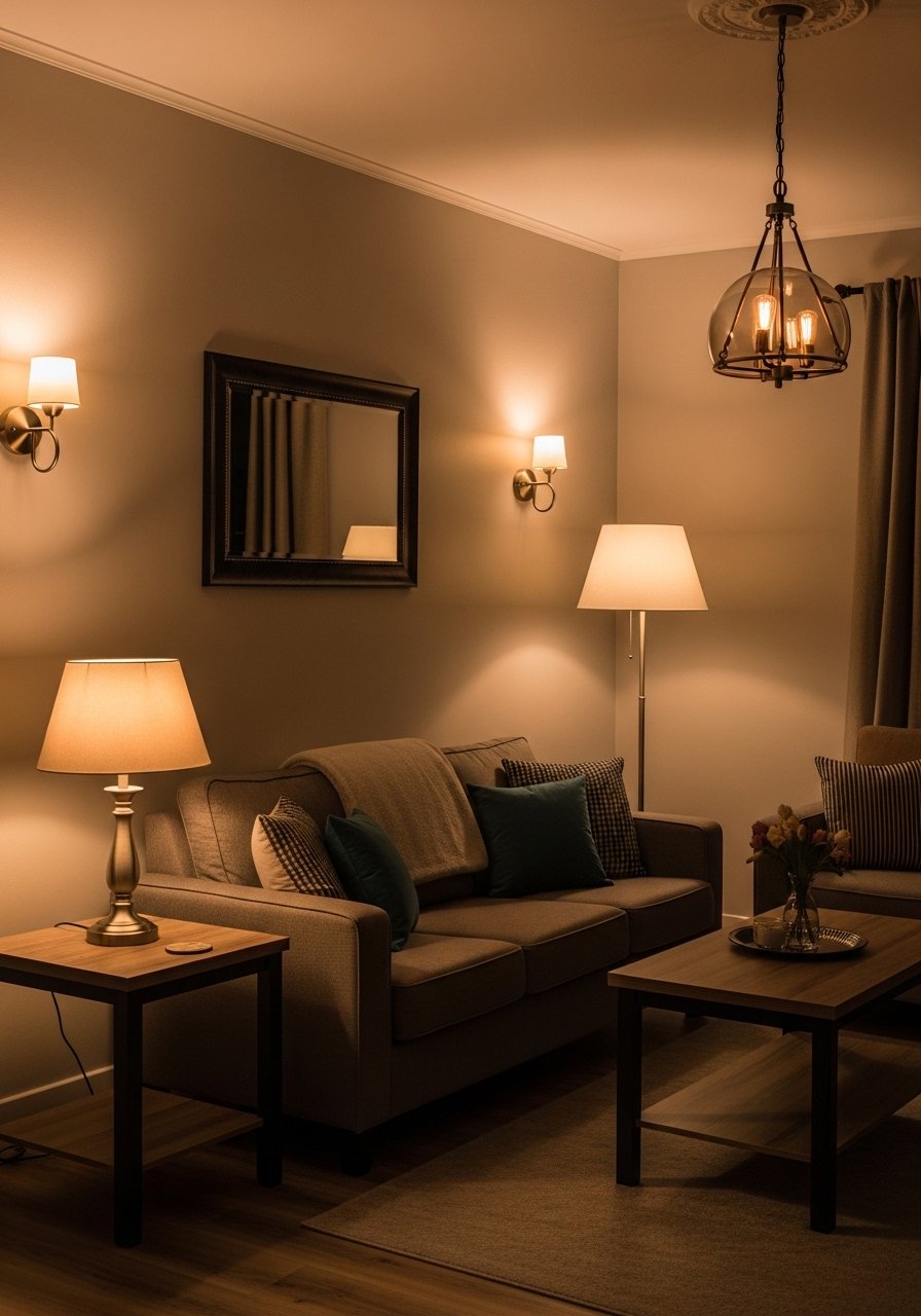
I stopped relying on the overhead light and layered lamps instead. A table lamp, floor lamp, and a sconce create pockets of light that feel inviting and human-scaled.
My only error was matching bulbs poorly; one lamp looked cold next to warm light. Swapping to consistent warm bulbs solved it. Layering helps functions too — reading, conversation, mood.
Place lamps at different heights for visual interest.
What You'll Need for This Look
19. Color-Blocked Furniture for Playful Contrast
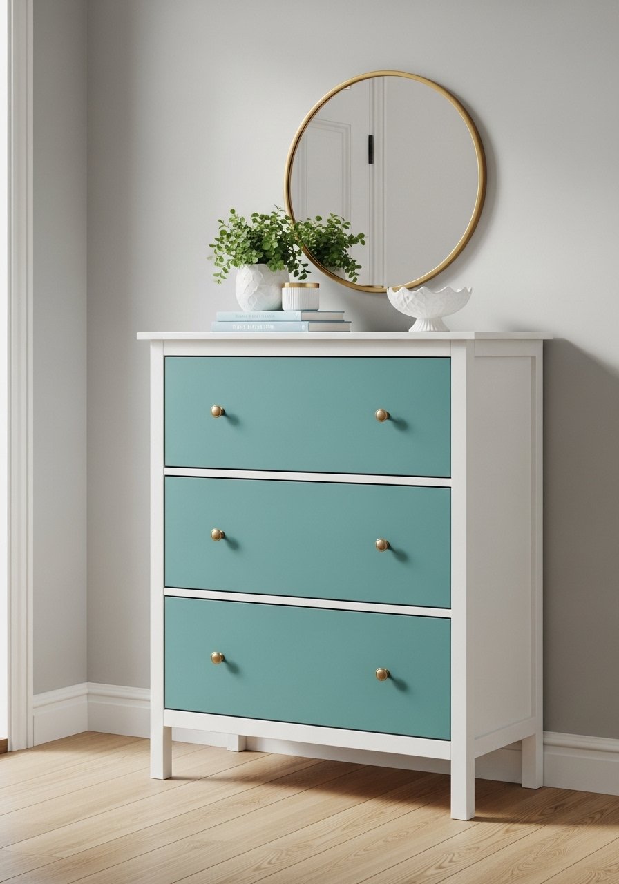
I painted the drawers of an old dresser in teal and left the frame white. The piece feels playful and intentional. Color-blocking furniture is a fast way to add personality.
I initially painted the wrong primer and the finish peeled. Using a bonding primer fixed adhesion. Color placement matters — darker on the bottom grounds the piece.
Use durable paint on heavy-use furniture to keep the finish looking fresh.
What You'll Need for This Look
20. Patterned Tile Rug in an Entryway (No Actual Rug Needed)
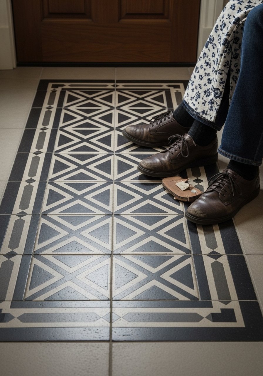
I installed patterned tiles in the entryway to read like a woven rug. It added color and stood up to wet shoes. The tile rug creates a focal and frames the doorway.
I ordered a ceramic that was too glossy and it showed every scuff. Choosing a matte finish made it liveable and gentler underfoot.
Use a border tile to define the “rug” shape for a finished look.
What You'll Need for This Look
21. Eclectic Dining Chairs in Mixed Colors and Styles
I mixed dining chairs: two rattan, a painted wood, and an upholstered armchair. The mismatched chairs make every meal feel lively and informal. Each seat tells a different story.
My first set used too many finishes and the group felt disjointed. Limiting to two finishes and repeating a color saved it. Repeat one element, like brass legs, to unify.
Comfort matters — keep one upholstered option at the head of the table.
What You'll Need for This Look
22. Small-Scale Bar Cart Filled with Collectibles and Glassware
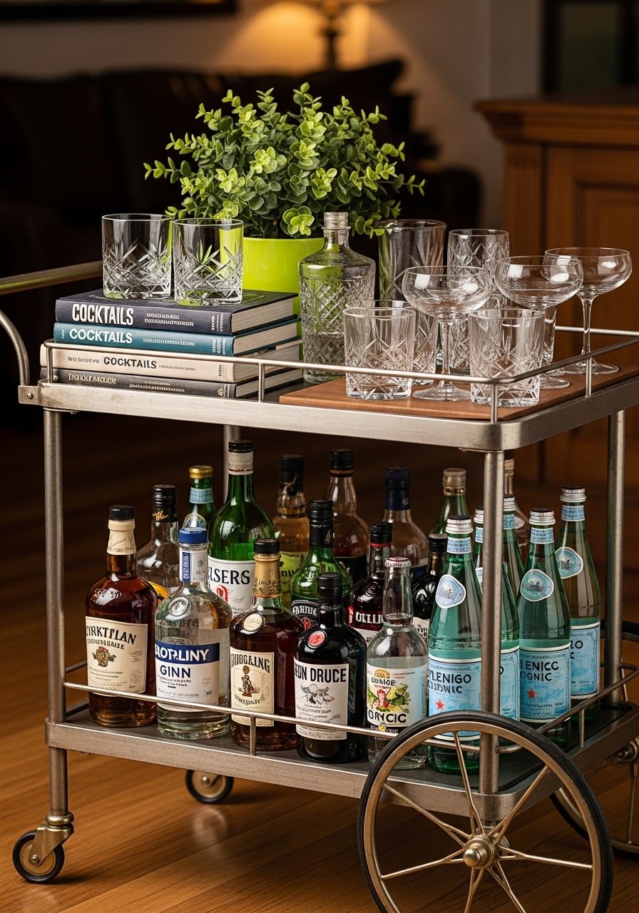
I keep a small bar cart styled with glassware, bitters, and a couple of favorite bottles. It’s movable and becomes a stage for seasonal objects. The cart adds charm without permanent installation.
I overstuffed it once and the top felt cluttered. Removing excess and leaving a small tray improved function and look. Cart styling benefits from a clear focal group.
Rotate bottles and books to keep it fresh.
What You'll Need for This Look
23. Layered Window Treatments for Texture and Privacy
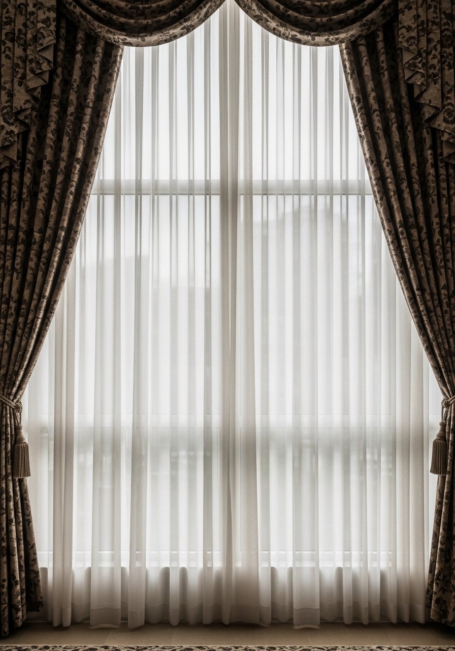
I layered sheers behind patterned drapes for texture and flexible light control. The sheers soften daylight. The drapes frame the window and add pattern.
I once used heavy drapes without sheers and the room felt dark midday. Sheers bring softness and keep the room usable during bright hours.
Mount rods so the drapes sit clear of the window frame. It makes the windows feel bigger.
What You'll Need for This Look
24. Mix of Vintage and New Furniture for Depth
I paired a thrifted sideboard with a modern coffee table and a new velvet chair. The contrast adds depth and prevents the room from feeling like a catalog. The vintage piece brings imperfection and story.
I made the mistake of buying a reproduction that looked generic; hunting for authentic vintage added character. Accept minor wear — it’s part of the charm.
Balance weight and finish so one piece doesn’t dominate.
What You'll Need for This Look
25. Bold Patterned Pillows in Unexpected Scales
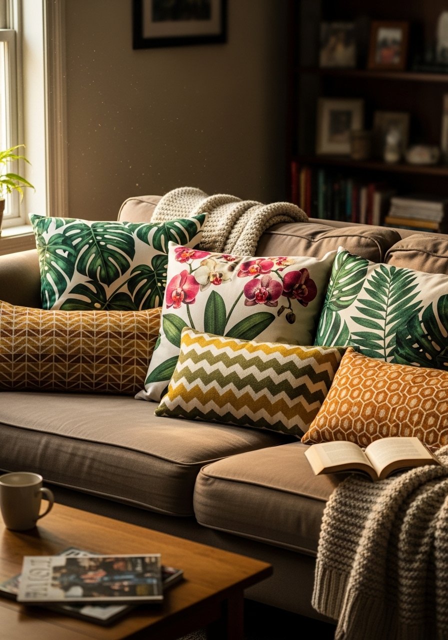
I swapped out safe pillows for oversized botanical patterns mixed with small geometrics. The scale contrast keeps the sofa visually interesting. The big patterns read from across the room; the small ones add detail.
I once matched pillow patterns too closely and the arrangement looked staged. Varying scale and texture gave it life. Fluff pillows often to keep shapes inviting.
Stick with a palette tie to keep the mix cohesive.
What You'll Need for This Look
26. Green Corners with Layered Plants and Sculptural Pots
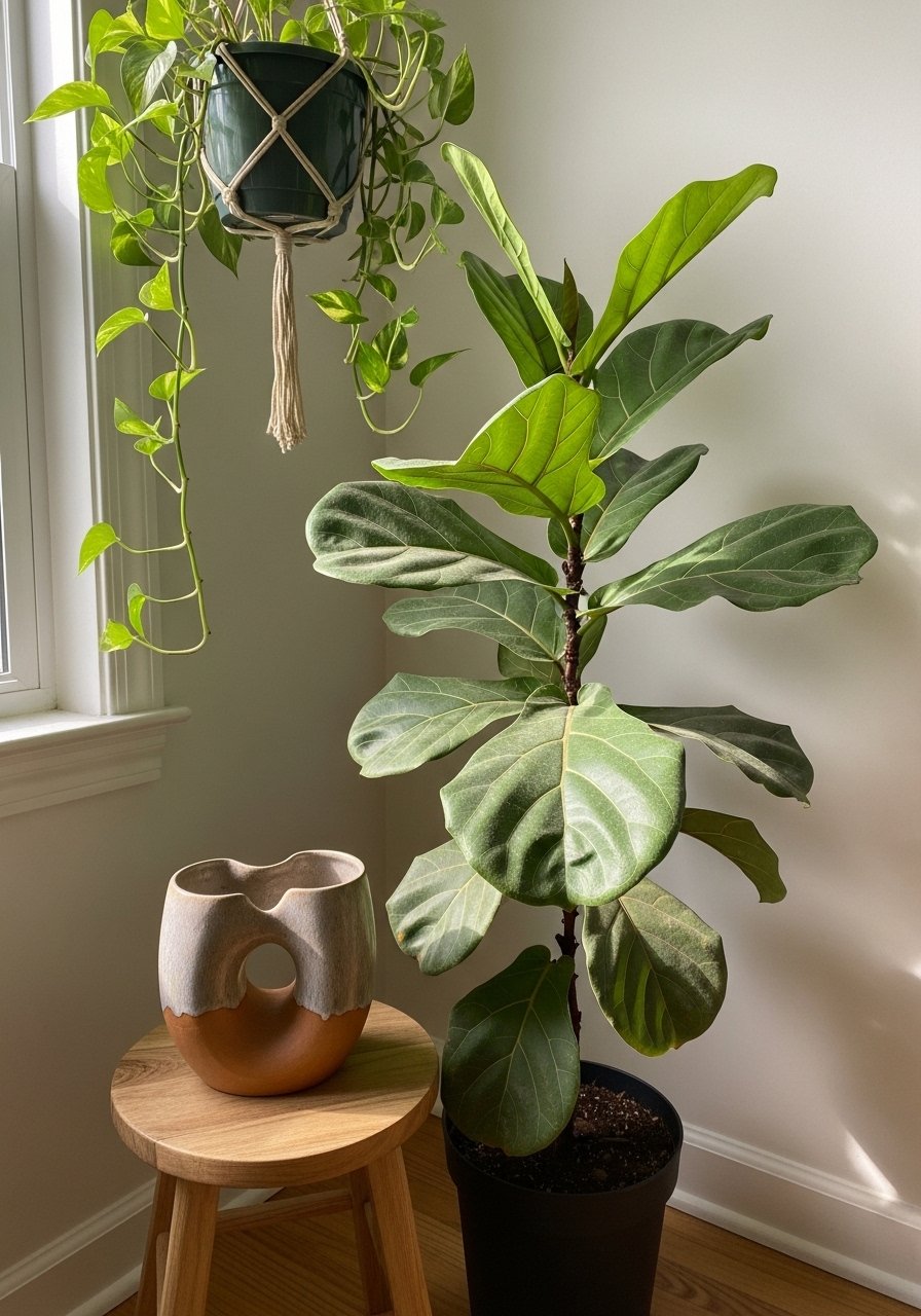
I created a green corner with a tall fiddle leaf fig, a hanging pothos, and a sculptural pot on a stool. The varied heights and leaf shapes make the corner feel intentional and lush.
I once put plants in the wrong light and lost leaves. Moving them to a bright, indirect spot improved health. Grouping plants also boosts humidity and looks more natural.
Rotate plants for even growth and prune sparingly to keep form.
What You'll Need for This Look
Final Thoughts
I learned that maximalism isn’t about buying more; it’s about making choices that reflect life. I mixed eras, trusted color, and kept what felt honest.
Pick a couple of these ideas and live with them. The room will tell the rest of the story.
