
My living room had nice furniture and decent lighting but it still felt like a waiting room. Took me embarrassingly long to figure out it was missing texture. Every surface was smooth, every color was flat, and nothing invited you to actually sit down. I started repainting small areas, testing pigments, and learning tricks that actually stick.
These ideas lean bohemian with earthy, sun-washed colors. Most projects are under $100 with one or two splurges. They work for living rooms, bedrooms, entryways, and small rental walls that need personality without permanent commitment. Most folks mess up their first paint match.
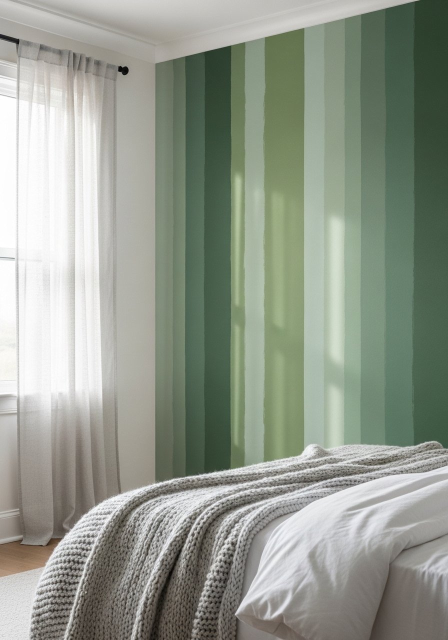
Layered Earthy Tones for a Boho Living Room
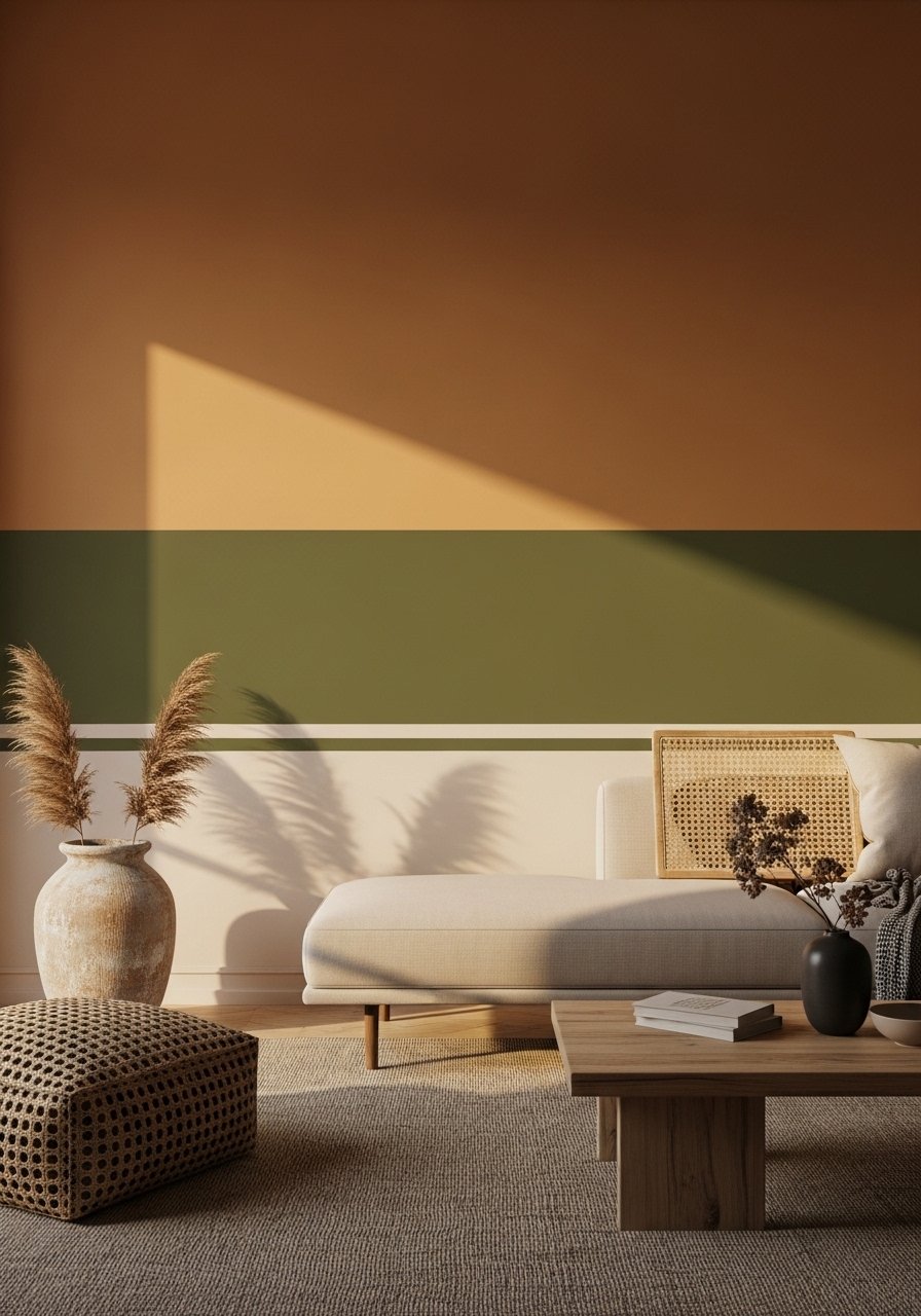
The trick here is not a single color but three related earth tones stacked horizontally to create depth. Paint the lowest third the darkest, the middle a mid-tone, and keep the top third light to keep the ceiling from feeling heavy. I used sample pots first, painted 2×2 foot swatches on three walls, and lived with them for 48 hours. Tech scanning beats guessing by a mile when you need a precise dupe, but for boho vibes the swatch test will tell you more than the desk sample. Try a sample paint pot while you test. A common mistake is matching to catalog photos instead of your own light. For scale, keep each horizontal band about 30 to 36 inches high on an 8-foot wall so the proportions read right from the couch.
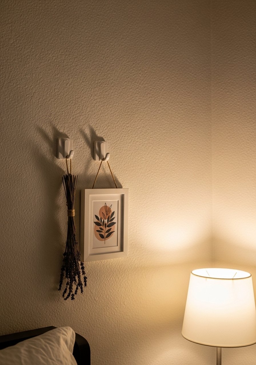
Hand-Painted Mural with Organic Shapes in a Bedroom
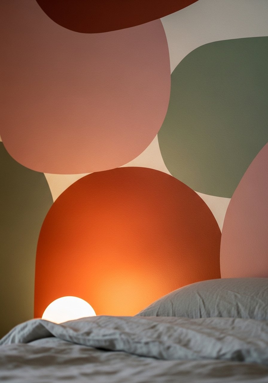
I painted an organic mural the weekend my partner declared the room boring. No need for perfect lines, boho is forgiving. Map simple rounded shapes with pencil, then block in colors with sample pots. Use a matte finish to hide brush strokes and add a topcoat only if you need wipeability. People often try to copy viral murals and get overwhelmed. Keep the design to three shapes per wall and let one anchor behind the bed. I used a small angled brush and a matte sample pack for testing. A detail most articles skip, pressured drying can shift shade, so check again after 7 days when the paint fully settles.
Clay Wash Accent Wall for Warm, Textured Vibes
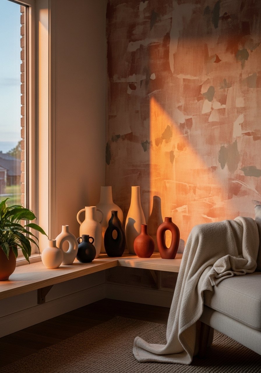
Clay washes soak into plaster and give that imperfect sun-bleached look without a full mural commitment. Mix a sample pint with equal parts water for a translucent first coat, then layer until you like the depth. I do a dry brush pass across vertical strokes to avoid streaks. This works great behind a sofa or in a bedroom headboard area. A common mistake is overworking the wash, which makes it look muddy. If your walls are textured, ask for 10% extra tint at the counter so the color reads as intended. I keep a small terracotta sample on hand when testing.
Stenciled Border for a Vintage Boho Entry
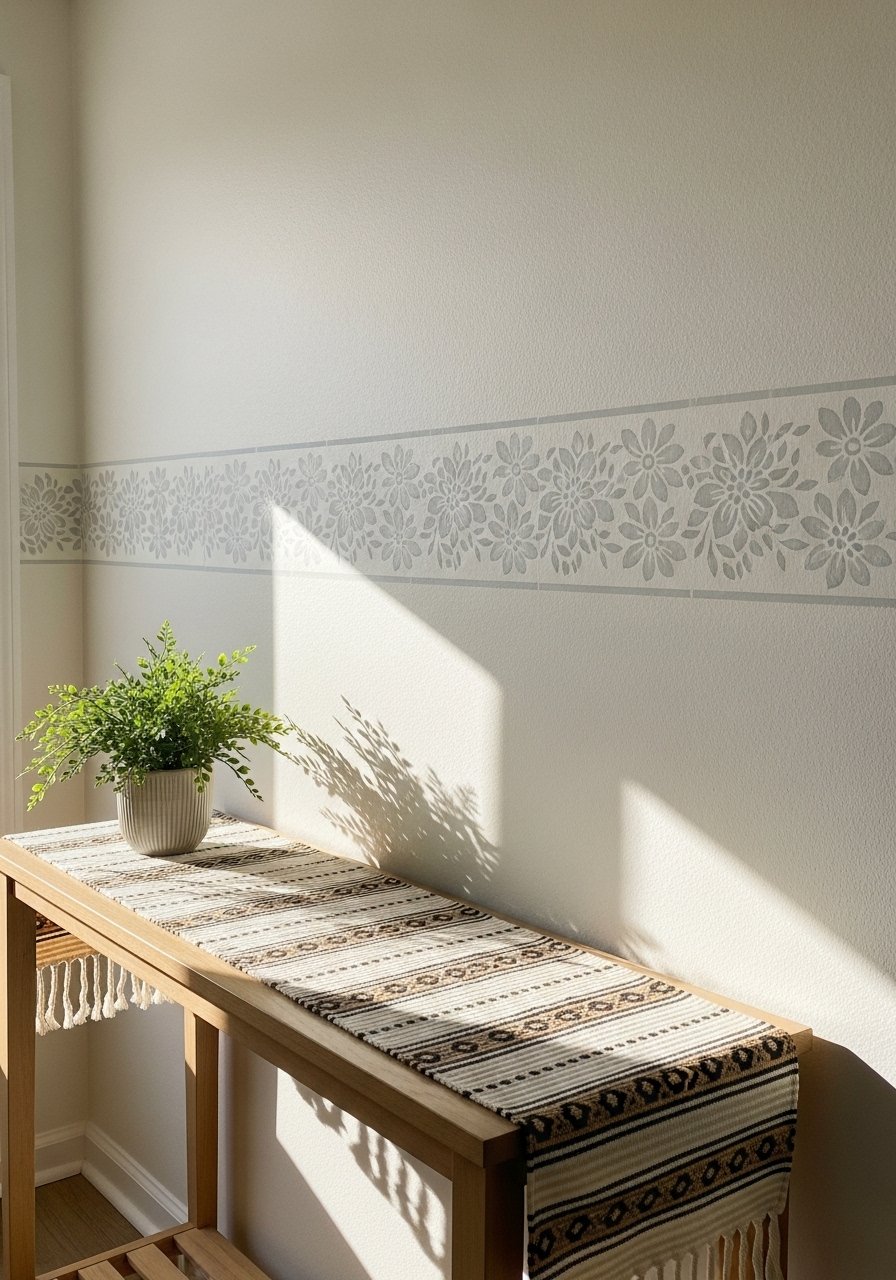
Most people assume borders belong in another decade. I added a narrow stenciled band at about 54 inches high and it immediately anchored the wall without fighting the space. The border is one color darker than the top coat to read like a deliberate trim. Use painter's tape to keep repeat spacing accurate and wipe the stencil clean after each pass. A common fail is placing the band too high near the ceiling which visually shortens the room. For touch-ups, keep a small artist brush set ready. Budget friendly and renter-safe, this reads vintage boho without permanent molding.
Ombre Wall from Floor to Ceiling in a Reading Nook
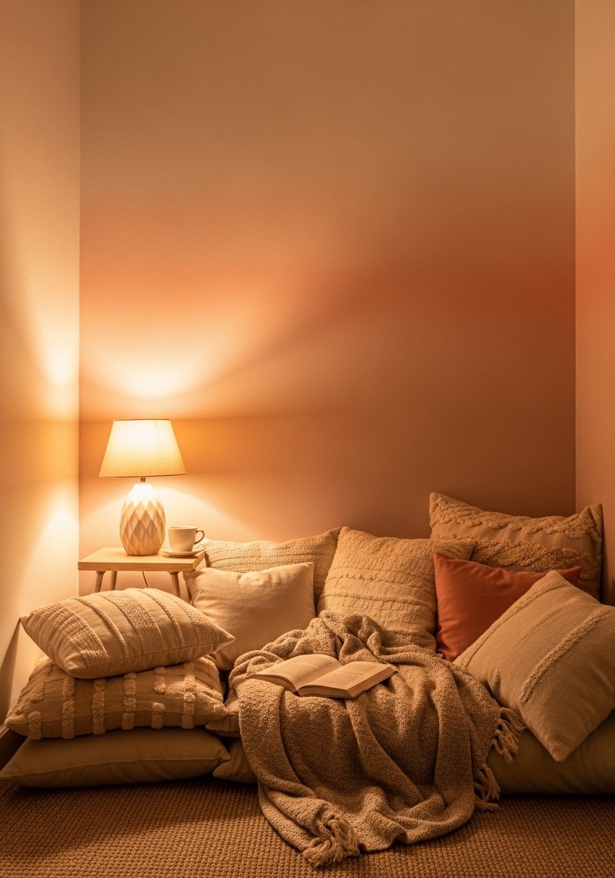
Ombre makes small niches feel intentional. Blend three sample shades, paint the darkest at the base and feather upward with a dry brush. The technique depends on working quickly while edges are wet. I tape a horizontal guide at the midpoint so my bands align across the wall. One thing people miss is that the ceiling paint influences the top shade, so keep at least six inches of the existing ceiling visible while you test. I used sample blending sponges for the soft fade. This project is under $50 if you use sample pints and will make the nook feel like a destination.
Painted Wainscoting with Warm Neutral Top in Dining Room
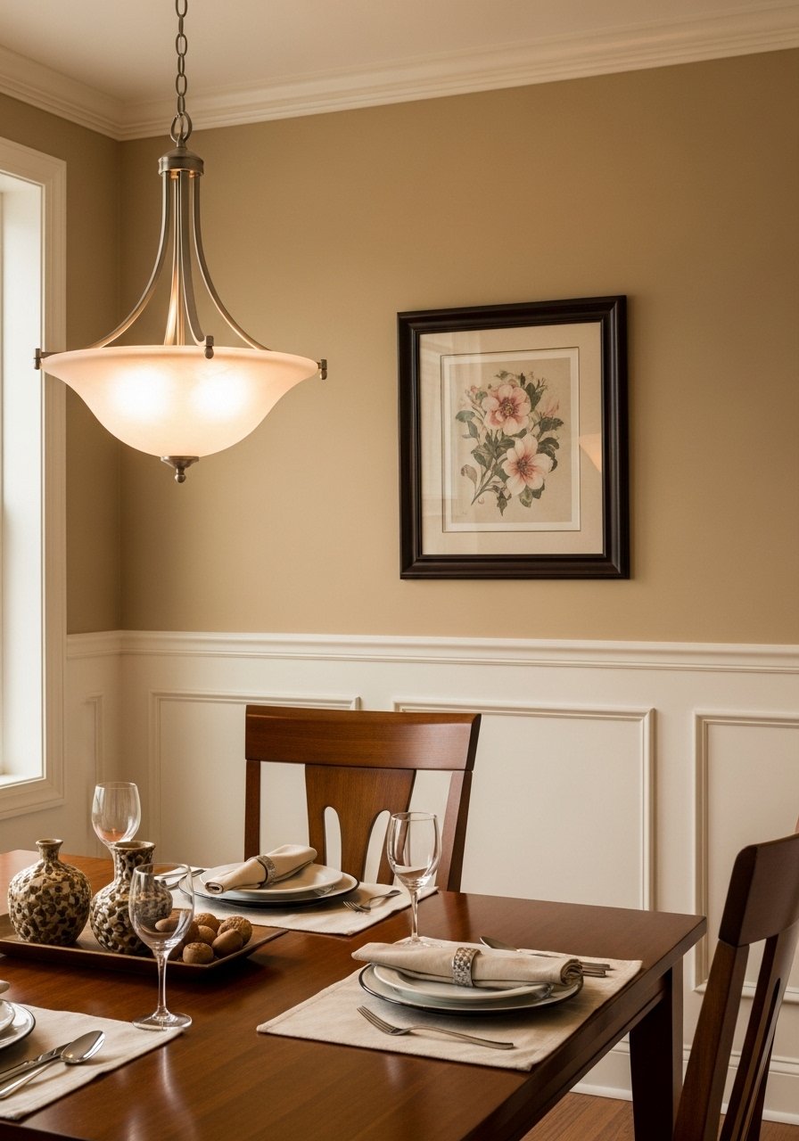
If you want structure but still want boho softness, paint wainscoting in a slightly lighter sheen than the wall above. Use a satin or semi-gloss for the lower boards because it cleans easier. Match the top wall color to a fabric swatch, and bring the swatch into the store for a spectrophotometer scan if you need a true match. Four in ten matches flop when lights change, so test under your dining pendant before buying a gallon. A common error is skimping on trim prep, which shows through glossy finishes. I keep sanding pads and primer nearby for quick fixes.
Geometric Tape Lines for an Eclectic Hallway
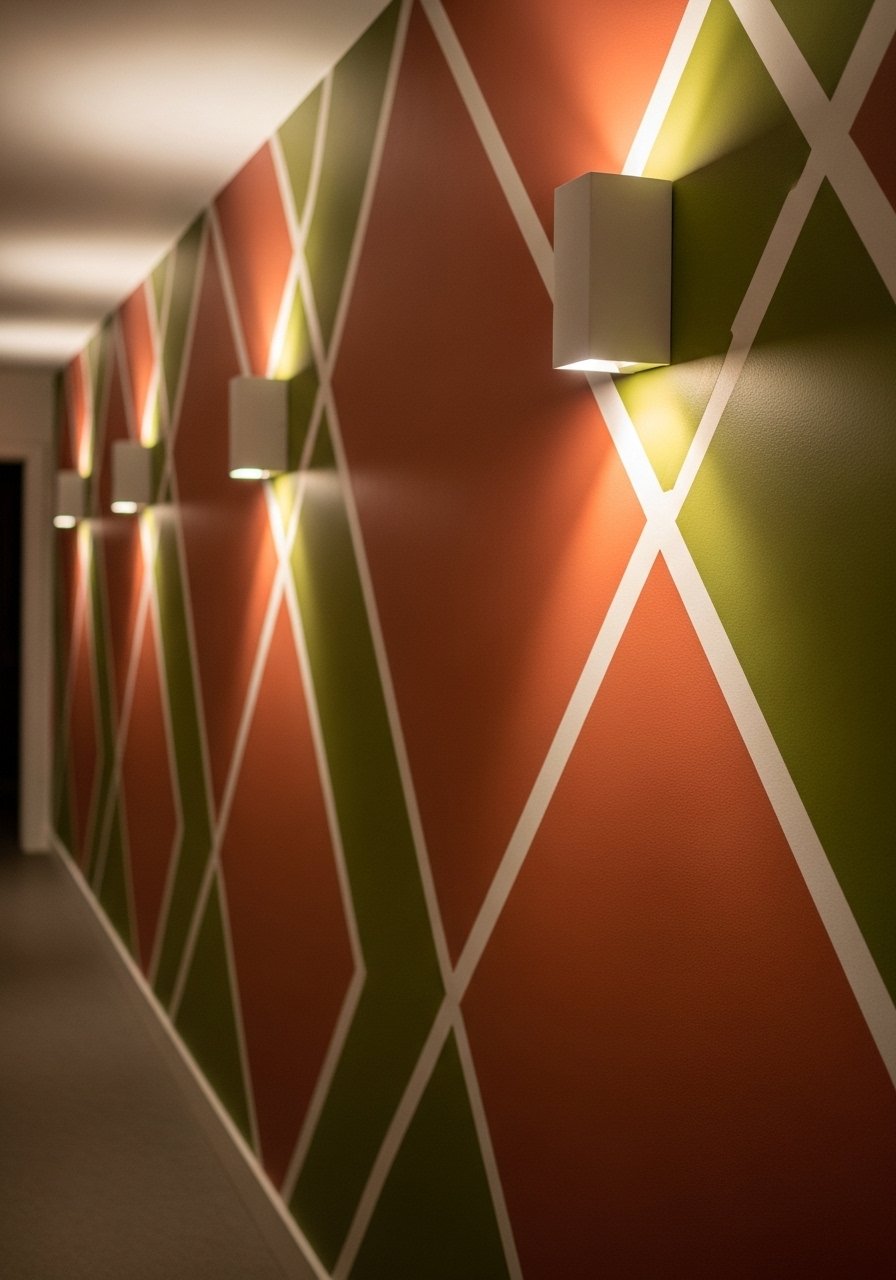
Painter's tape can be a boho tool not just a practical one. I mapped a repeating diagonal grid and painted alternating diamonds in two tones. Use a high-quality tape and press the edge firmly to avoid bleed. One tip most posts skip is to remove the tape at a 45-degree angle while the paint is still slightly tacky to keep lines crisp. For bold color combos, test with 2×2 foot swatches first. I used a high-adhesion painter's tape that saved me from redoing edges. Budget under $40 if you buy sample sizes.
Chalky Matte Backdrop for Gallery Walls in a Boho Lounge
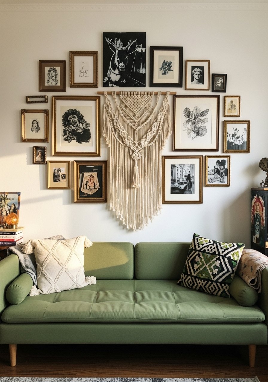
A chalky matte finish hides imperfections and makes art pop. Paint a full wall in a soft moss or clay and arrange your gallery with a mix of frames for that collected-over-time feel. A frequent mistake is hanging art before the paint cures. Wait at least 48 hours and test your hanging spots with small swatches first. If you collect thrift frames, unify them by painting the backs to prevent paint bleed. I used mega-matte paint samples and mounted frames with picture ledges so I can swap art without more holes.
Strie Technique in Muted Greens for a Calm Bedroom
Strie creates subtle vertical texture that feels handmade rather than shiny. Load a wide brush lightly and pull vertical strokes top to bottom, blending each pass. Keep the base color close to your ceiling so the vertical lines elongate the space. A mistake is overloading the brush which makes the finish look streaky. For a reliable result, practice on a 2×2 foot board first. I kept a 22-inch trim brush for the long pulls. People skip that practice step and then blame the paint.
Terracotta Base with Painted Plant Motifs in a Kitchen Nook
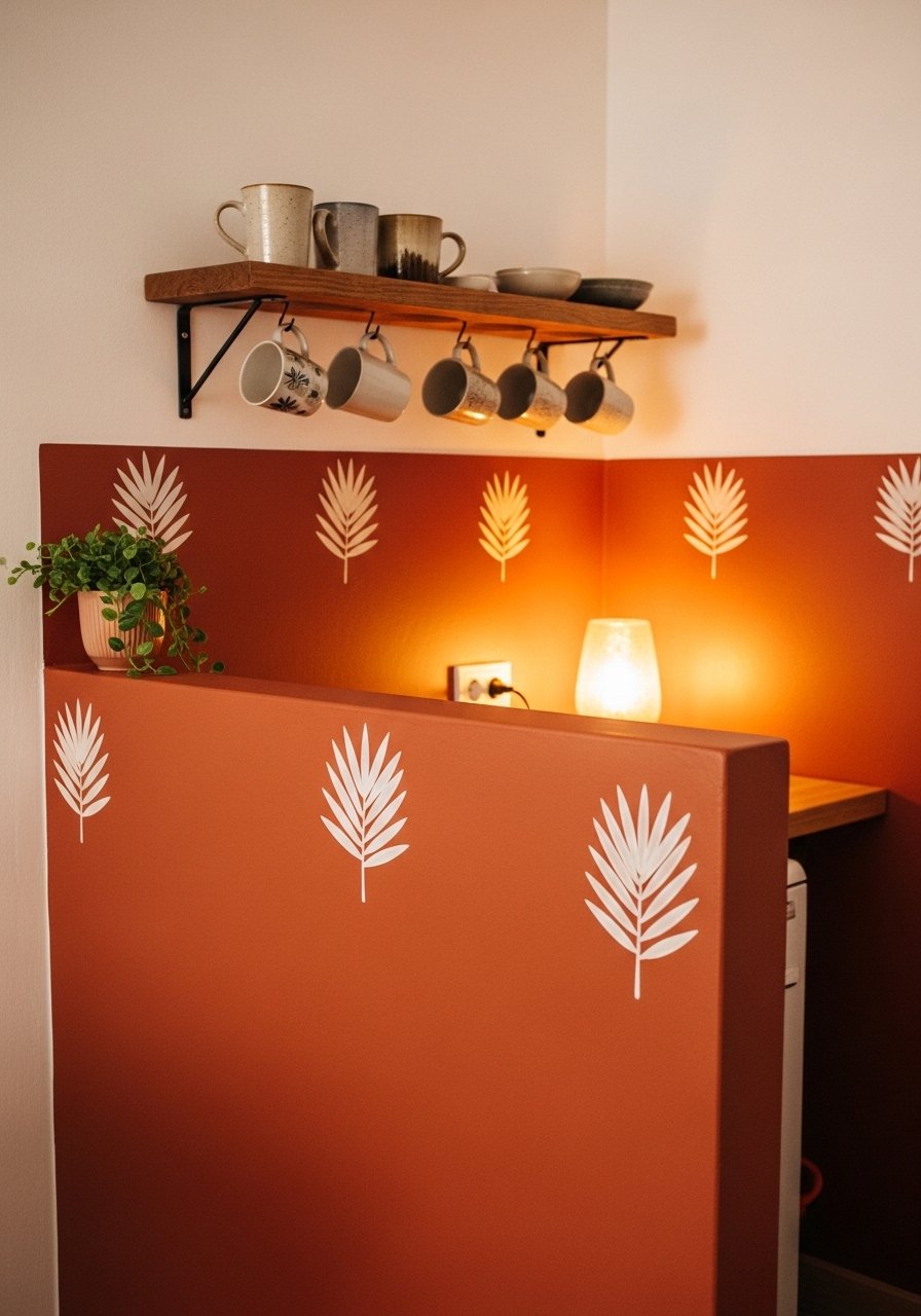
Painted plant motifs make a kitchen feel handmade without being literal. Use a terracotta base for warmth and sketch simple leaves in a darker tone above the counter. Keep motifs under cabinets and around shelves so they read as art, not wallpaper. One mistake is painting too high where splashes happen. Leave the bottom 18 inches wipeable with semi-gloss. For brushes that hold detail, I keep a round detail brush set in my painting kit. Budget under $75 and it makes a small kitchen feel like it has a story.
High Contrast Trim and Wall for Boho Modern Bedroom
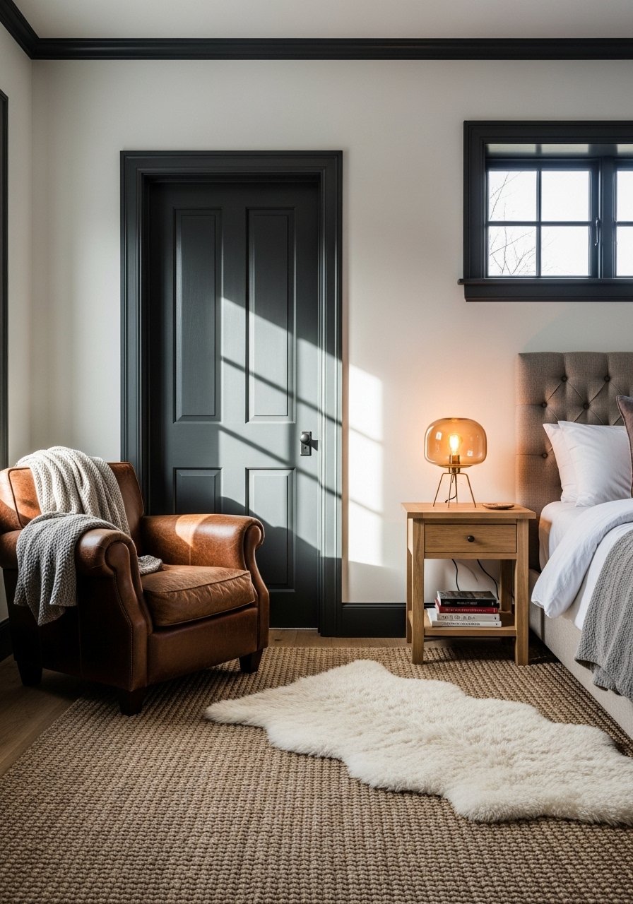
Dark trim frames a room in a modern boho way. Paint the walls a warm neutral and the trim a deep charcoal or espresso for contrast. Use a waterborne alkyd or trim paint that cleans easily if you have kids or pets. A common mistake is using the same sheen for wall and trim which flattens the effect. Ask for a semi-gloss for trim and a matte for walls. I bought trim paint sample pots to test sheen and color together. This reads current without abandoning the relaxed boho palette.
Washable Satin Finish for Pet-Friendly Boho Living Room
If you live with pets, matte paints can snag and mark easily. I switched to a washable satin for my main living wall and it cleans without looking glossy. The trade-off is less texture, so I add textiles to compensate. One frustration people have is paint that looks right by day but looks off under evening bulbs. Four in ten matches flop when lights change, so test under your actual lamps. I keep washable satin sample pots and a soft cloth for spot testing. A small tip competitors skip, wipe your swatch after it dries to see how washable finishes wear.
Pebbled Texture Accent with Tinted Primer for Rental Walls
Renters can get texture without permanent commitments by layering tinted primer and a light faux pebble glaze that peels up with heat if needed. I ask for a pint of tinted bonding primer in the final shade and top it with a thin glaze. For safety, test a command strip swatch grid first so you can remove if the landlord objects. Most folks mess up their first paint match when they try to match to a fabric without testing on the actual wall. Keep a removable-surface test kit handy and document the process with photos in case you need to revert.
Your Decor Shopping List
Textiles
- Honestly the best $40 I have spent. Chunky knit throw in cream, 50×60 inches, acrylic blend
- 22-inch down-filled linen pillow covers in soft rust and olive, set of two
Wall Decor
- Found these while looking for something else. Brass picture ledges 24-inch, set of two
- Mixed metal picture frames in 8×10 and 11×14
Paint and Tools
- For swatches, grab paint-sample-pots, assorted 8-oz
- High-adhesion painter's tape, 1-inch roll for crisp lines
- Matte paint sample pack, includes three coordinating shades
Plants and Pots
- Artificial fiddle leaf fig 6ft in a woven basket for corners
- Terracotta ceramic vases set for styled shelves
Budget Finds
- Artist paintbrush set for murals and detail work, assorted sizes
Notes: Similar alternatives can often be found at Target or HomeGoods, especially textiles and small decor.
Shopping Tips
White oak looks current for shelves right now. White oak floating shelves are a simple swap for dated dark wood.
Grab velvet pillow covers for about $12 each. Swap them seasonally and your room feels refreshed without repainting.
Curtains should either puddle or just kiss the floor, never hang five inches short. 96-inch linen panels work well for standard 9-foot ceilings and instantly make windows read taller.
One tall plant beats five small ones. Pick a 6-foot faux fiddle leaf fig if you need impact without green thumb stress.
When testing paint, paint 2×2 foot swatches on two opposing walls and check them at night under your actual bulbs. Paint-sample-pots are cheap insurance.
Frequently Asked Questions
Q: Can I mix boho textiles with modern furniture without it looking messy?
A: Yes. Keep the color story tight by repeating two or three accent colors across pillows, art, and a rug. Use one modern line like a clean sofa silhouette to balance the layered textiles.
Q: How do I prevent a paint match from looking wrong at night?
A: Test under your actual bulbs. Four in ten matches flop when lights change, so paint a 2×2 foot swatch and view it at night before you commit to a gallon.
Q: Can renters try boho wall techniques safely?
A: Some yes, some no. Stenciled bands, removable decals, and command strip swatch grids are renter-friendly. If you want texture, try a removable faux glaze test and document the original wall color for touch-up.
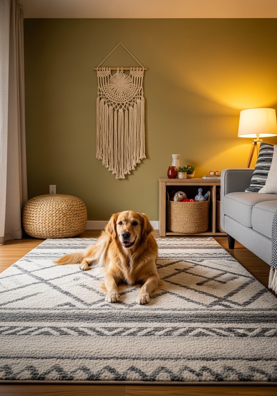
Q: What size area rug should I use with layered rugs?
A: Go bigger than you think. For a living area aim for an 8×10 under the main seating so at least the front legs of furniture sit on the rug.
Q: Is a spectrophotometer scan worth it for matching fabric to a wall?
A: If you need a close match it helps. Tech scanning beats guessing by a mile, but always paint swatches on the wall after the scan to account for light and texture.
Q: How much paint should I bring to the store when asking for a dupe?
A: Bring the fabric swatch or a chip. If the surface is textured, plan to ask for 10% extra tint because textured walls grab pigment differently.
