
My living room had nice furniture and decent lighting but it still felt like a waiting room. Took me embarrassingly long to figure out it was missing rhythm. Everything was the same height and nothing led your eye around the room. Once I built one focused wall with a mix of objects and art, the whole space started feeling lived in.
These ideas lean modern cozy with a touch of vintage. Most projects cost under $75, with a few splurges around $150. They work for living rooms, bedrooms, narrow hallways, and small rental walls that need personality.
Layered Neutrals With One Bold Accent Color for Living Rooms
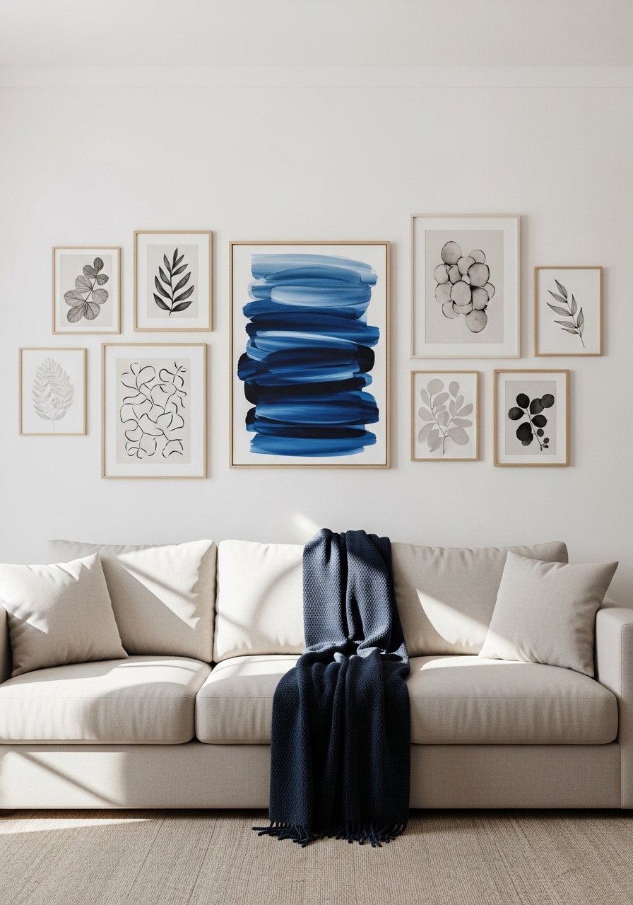
I like starting a gallery with a neutral base and one bold piece that pulls everything together. Visually it gives your eye a landing spot, and in practice it means most frames can be inexpensive, under $20 each, while one larger print commands the budget. Hang the center of the main piece at about 57 inches from the floor so it reads as eye level from a seated position. I used matted archival prints and a larger 24×36 framed print. Common mistake is making the accent too small. Aim for the bold piece to be roughly one third the total gallery width.
Salon-Style Eclectic Wall for Staircase Nooks
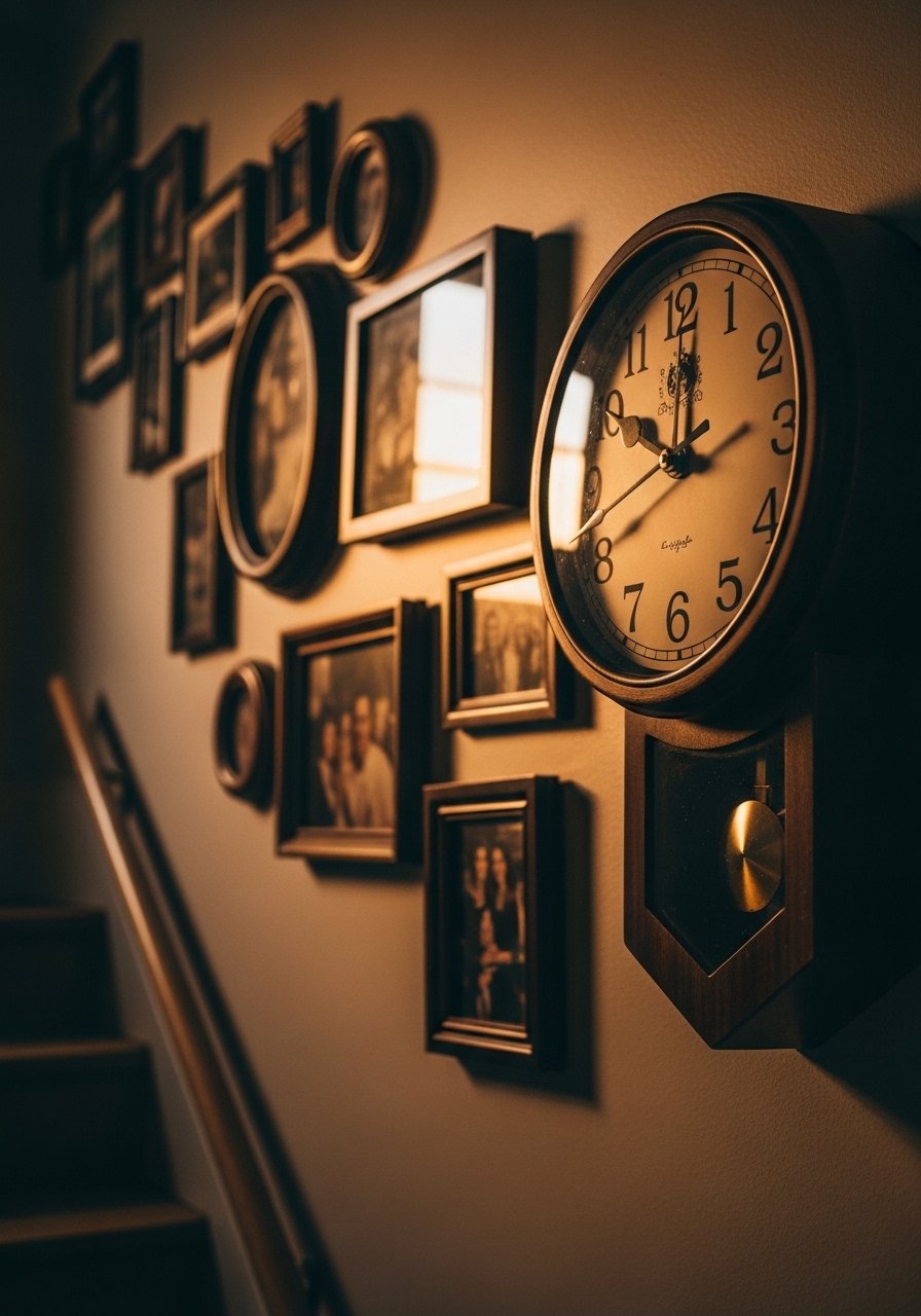
Staircase walls are perfect for a salon-style mix because the diagonal motion helps tie different frame sizes together. I map it out on the floor first and keep frame spacing tight, around 2 to 3 inches, so it reads cohesive when viewed from below. I paired small brass frames with a vintage-look wall clock. A mistake I see is aligning everything to the stair railing. Instead, follow the sightline of the staircase and use the rail as negative space to balance the cluster.
Minimalist Grid in a Home Office for Clean Lines
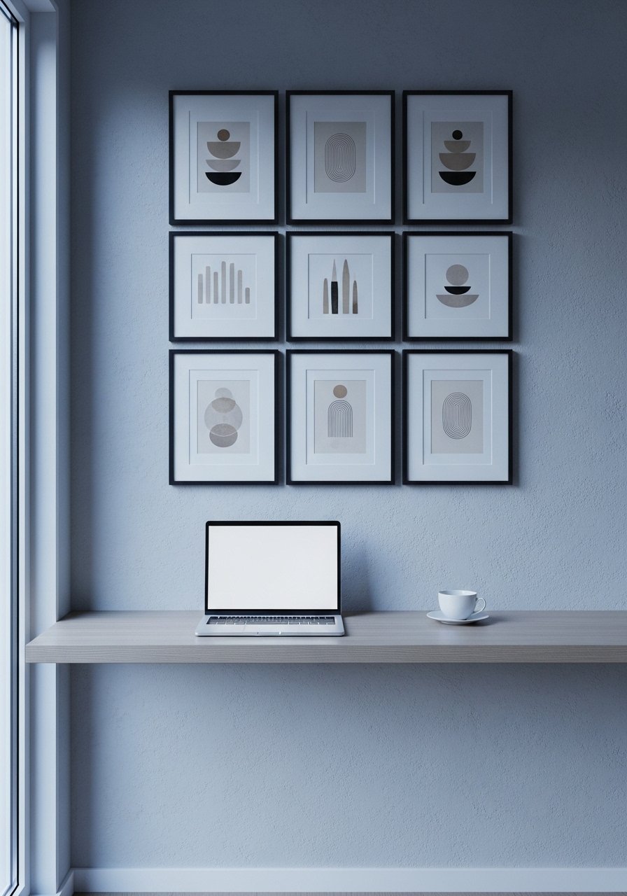
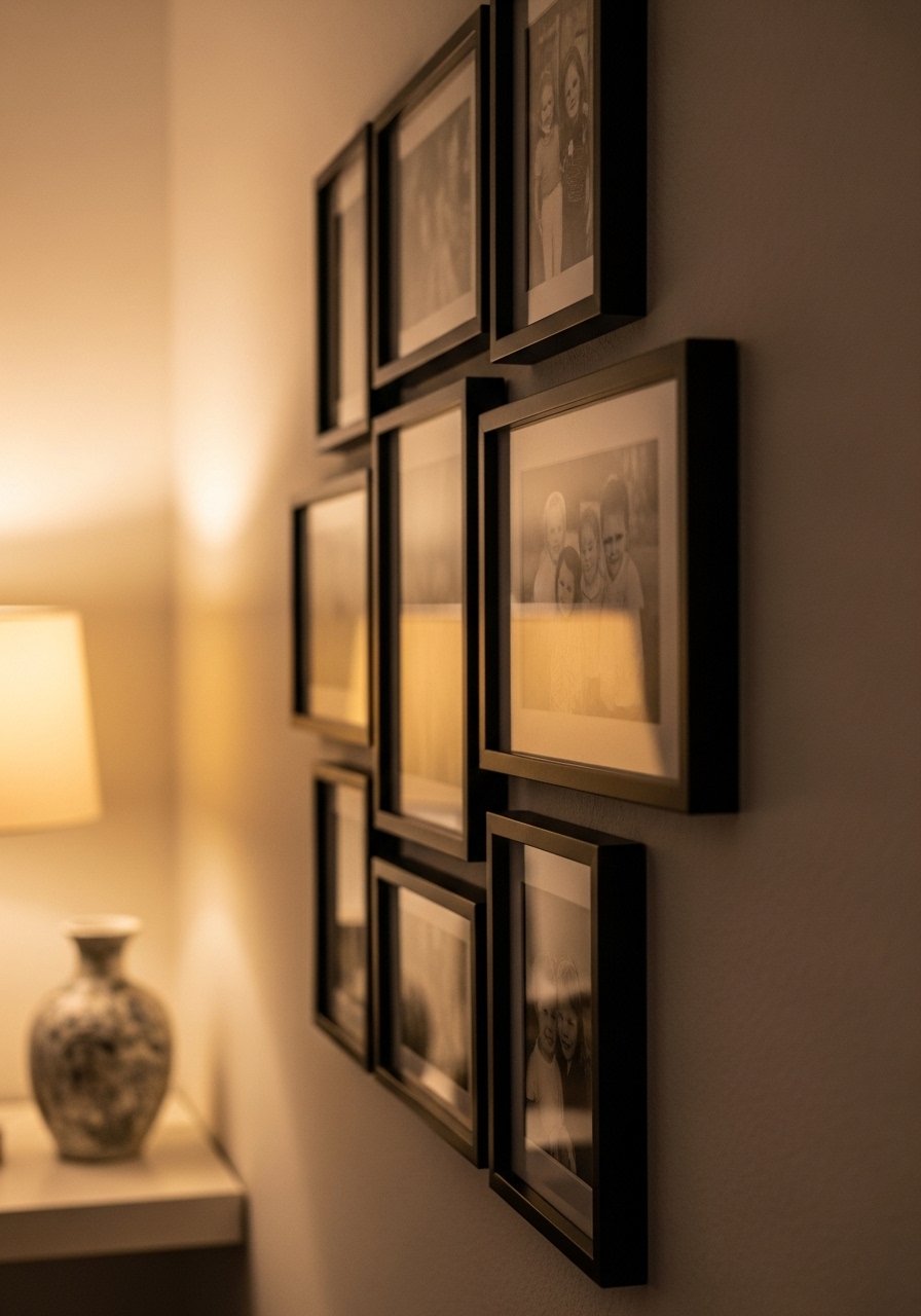
If you want order and calm, a perfectly spaced grid delivers. Measure so the whole grid is about two thirds the width of the desk or sofa beneath. For a 3×3 grid with 8×10 prints, I kept 3 inches between frames and 6 to 8 inches from the desk surface. I used matching black frames with white mats to maintain that editorial look. People often try to mix frame sizes in a grid. That kills the intention. Keep size uniform and let texture in the room do the rest.
Mix of Mirrors and Art in a Small Entry for Instant Warmth
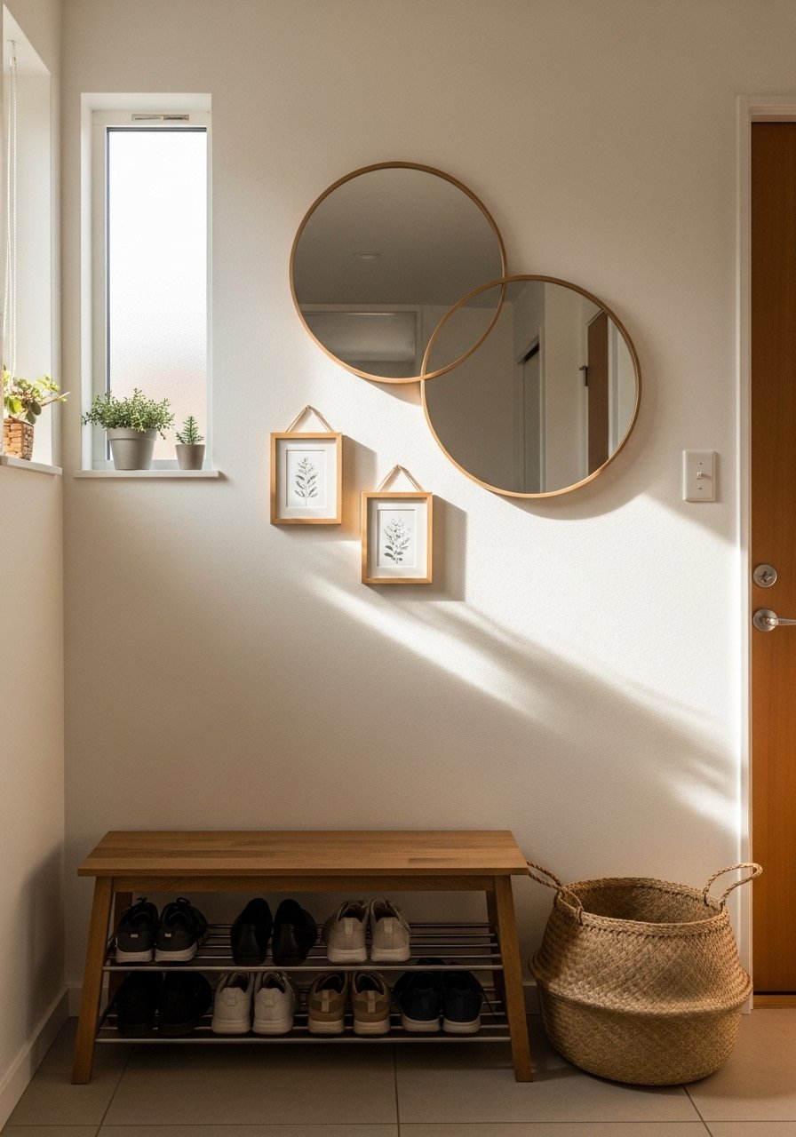
A mirror right in the gallery stops a tiny entry from feeling cramped. Mirrors add depth and bounce light, especially in narrow halls. Use one larger mirror plus two small frames or objects and keep the bottom of the gallery 6 to 10 inches above a bench. I used a 24-inch round mirror with 8×10 art prints. A common mistake is hanging a mirror too high so it reflects the ceiling. Check the reflection before you nail it in.
Vintage Finds and Modern Frames for a Timeless Mix in the Bedroom
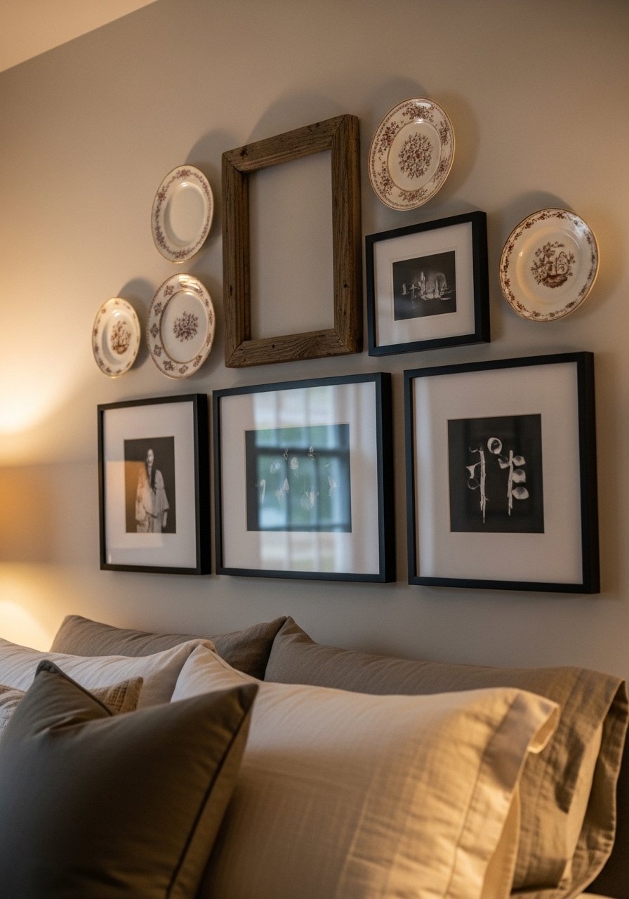
Combining a thrifted ceramic plate or old embroidery with crisp modern frames makes the wall feel collected instead of staged. I keep the color story muted and let texture do the talking. For a standard headboard, aim for the cluster width to be about two thirds of the bed. I framed a family sketch in a thin black frame and used plate hangers for ceramics. People often try to perfectly center over the bed. Slight off-center creates a relaxed look that reads intentional.
Frame Ledges for Rotating Art in a Living Room
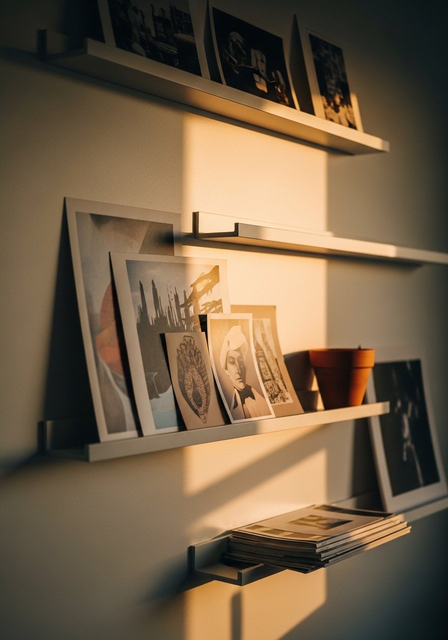
If you love swapping art but hate patching holes, picture ledges are a lifesaver. They let you layer prints, books, and objects with no commitment. I chose ledges that are 4 to 6 inches deep so a thin frame and a small object can sit together. These brass picture ledges were under $25 each and solved my fear of commitment. A mistake is leaning only one size of frame. Mix a 5×7, 8×10, and a taller slim frame for depth. This also pairs nicely with the minimalist grid approach if you want a seasonal swap.
Botanical Prints and Real Plants for a Fresh Vintage Vibe in Hallways
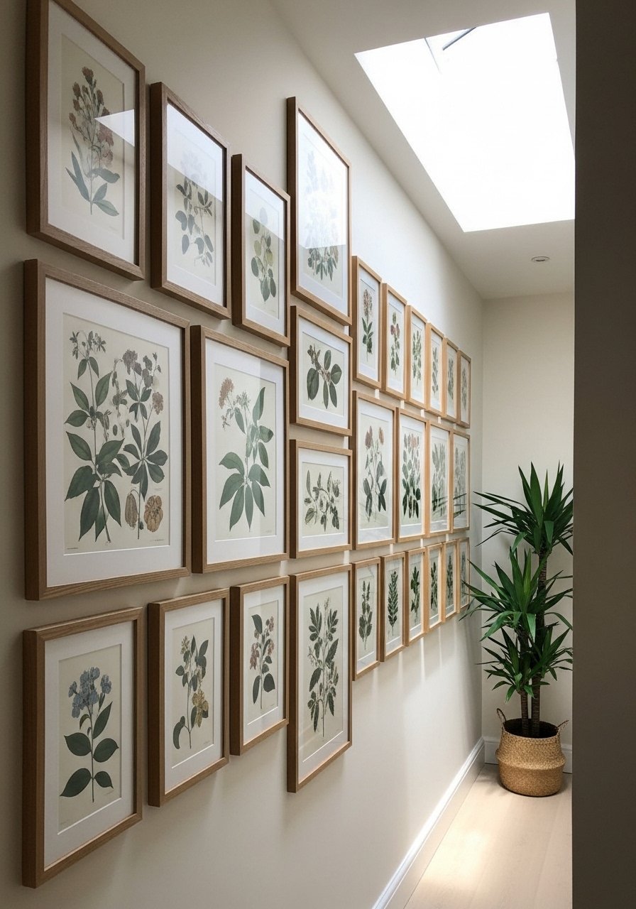
Real leaves plus old botanical prints create a livable herbarium look. Keep the color ratio about 80 percent neutrals and 20 percent green so the wall feels grounded. I used wood frames in natural finish and hung prints 2.5 inches apart vertically. A common mistake is crowding plants underneath and blocking the art. Give plants room to breathe so the prints remain the star.
Black and Brass Contrast for Modern Glam in Dining Areas
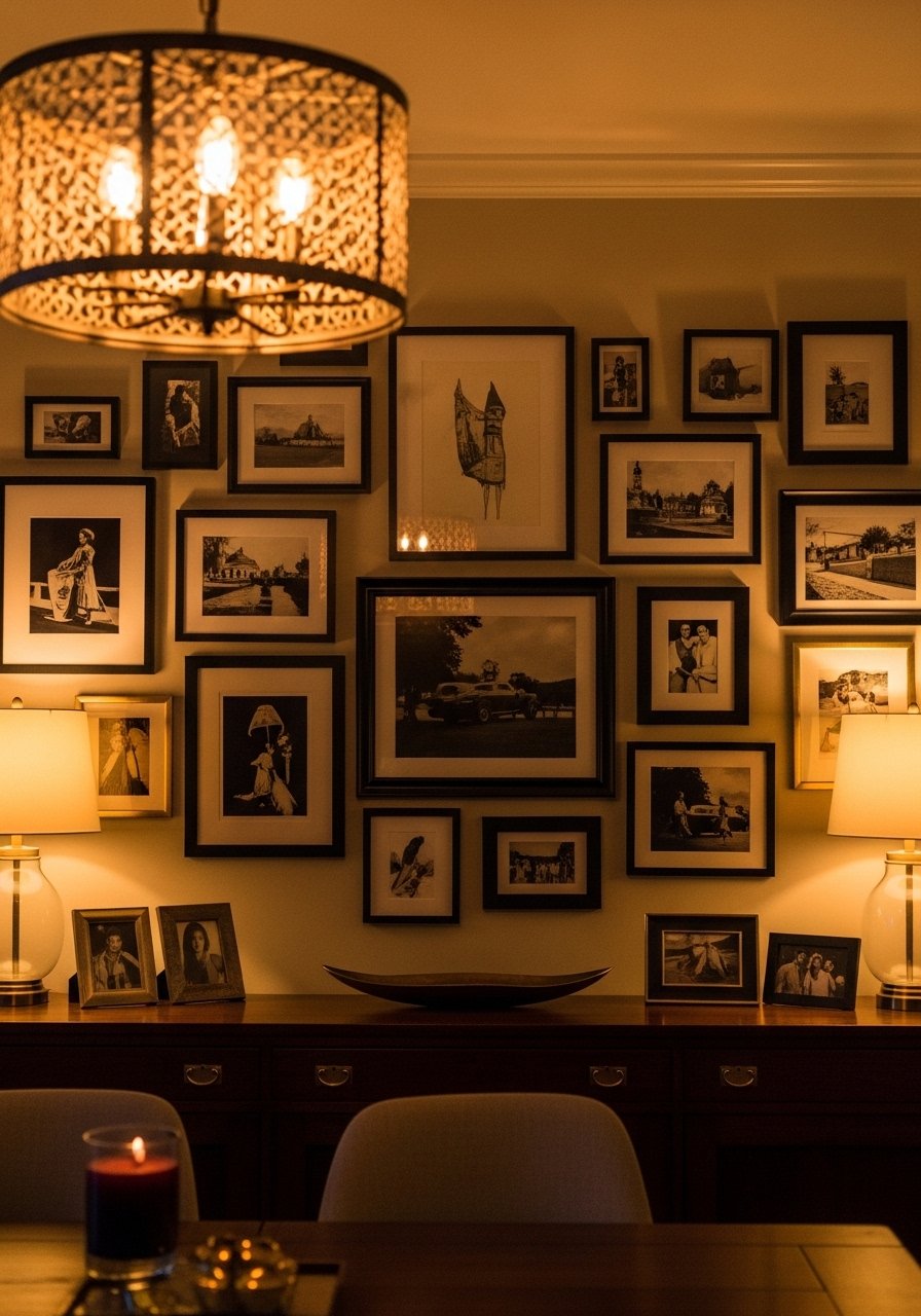
Mixing black frames with a few brass pieces gives a modern glam feel without going over the top. Use brass in small doses, like a shelf or mirror frame, and keep most frames matte black. I hung the gallery about 6 inches above the buffet and used mixed metal frames with a single brass ledge. People often overdo matching. The contrast reads intentional and slightly collected. Keep spacing tight, around 2 inches, to maintain cohesion.
Maps and Travel Photos for Narrow Hallways That Tell a Story
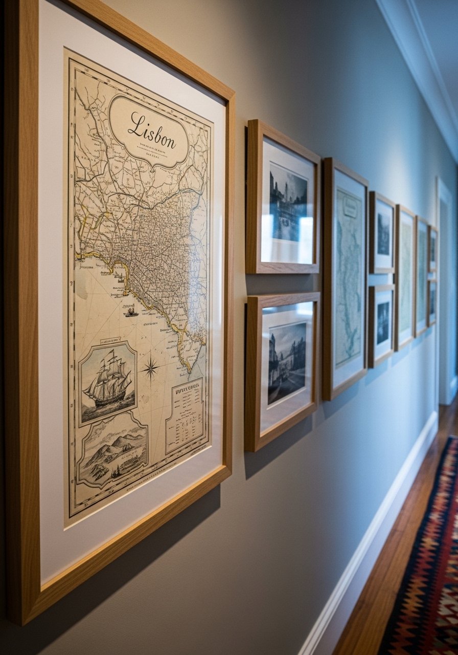
A linear timeline of places you have been makes a narrow hallway feel personal. Mix one larger map with small 5×7 travel snaps for variety. I keep the grouping height centered at 57 inches and leave 2 to 3 inches spacing. I used vintage map prints and small black frames. A mistake is mixing too many color palettes. Stick to two dominant tones and let texture in frames add interest.
Textured Objects and Woven Art for Cozy, Layered Corners
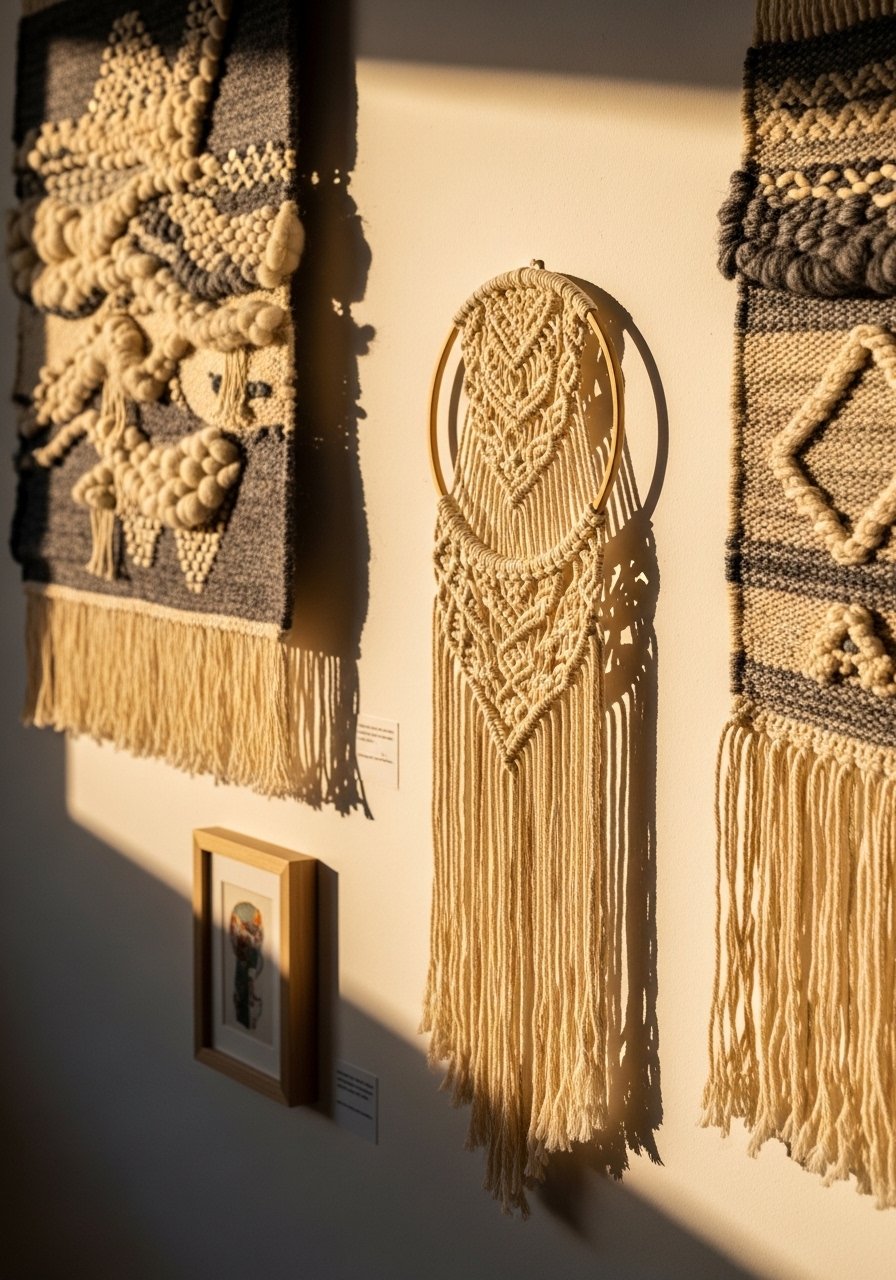
If your space feels flat, add fiber and weave to the gallery. A macrame piece next to framed art introduces soft edges and changes how light plays on the wall. I keep woven pieces smaller than the main art and place them off-center for balance. I used a handwoven wall hanging and a small framed print. People sometimes make woven art the exact same size as framed pieces. Keep it slightly smaller so texture complements scale.
Oversized Single Piece With Supporting Mini Gallery in Open Plan Living
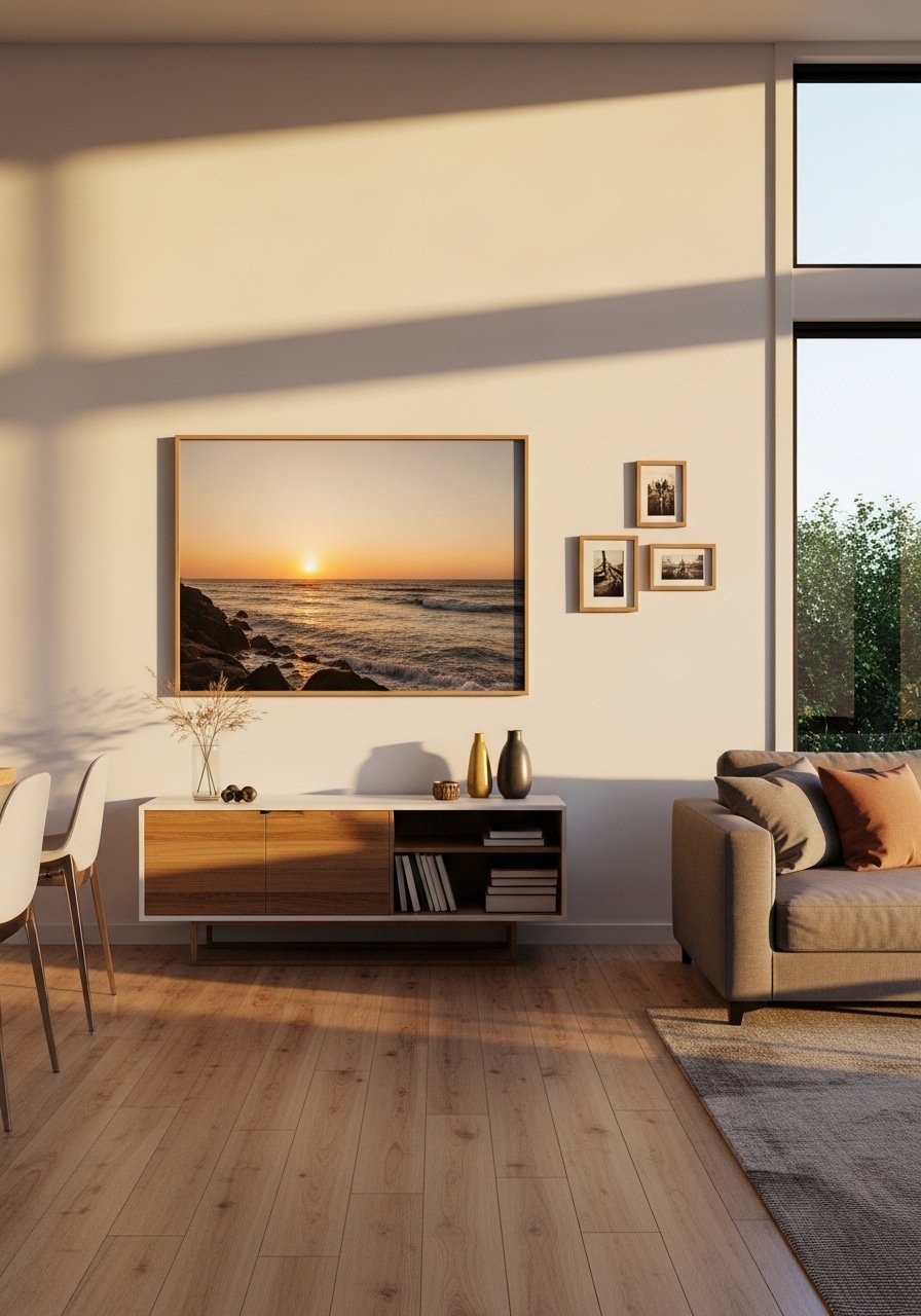
One large statement piece plus a small supporting cluster reads curated without clutter. The big piece should be about half to two thirds the width of the furniture it sits above. I hung a 30×40 framed print and balanced it with three 8x10s. The frequent mistake is making the small cluster too large so it competes. Keep the supporting group small and at least 12 inches away from the main piece.
Black-and-White Photo Strip for a Modern, Timeless Look
A vertical strip of black-and-white photos is a simple way to feel intentional. I print at 5×7 and mat to 8×10 for consistent spacing. Keep the strip roughly the height of a tall bookcase nearby to create balance. I used archival photo paper prints and slim black frames. People make the mistake of mixing color photos in this setup. Stick to monochrome to keep the mood clear and modern.
Gallery Wall With Floating Shelves for Playful Layers in Kids Rooms
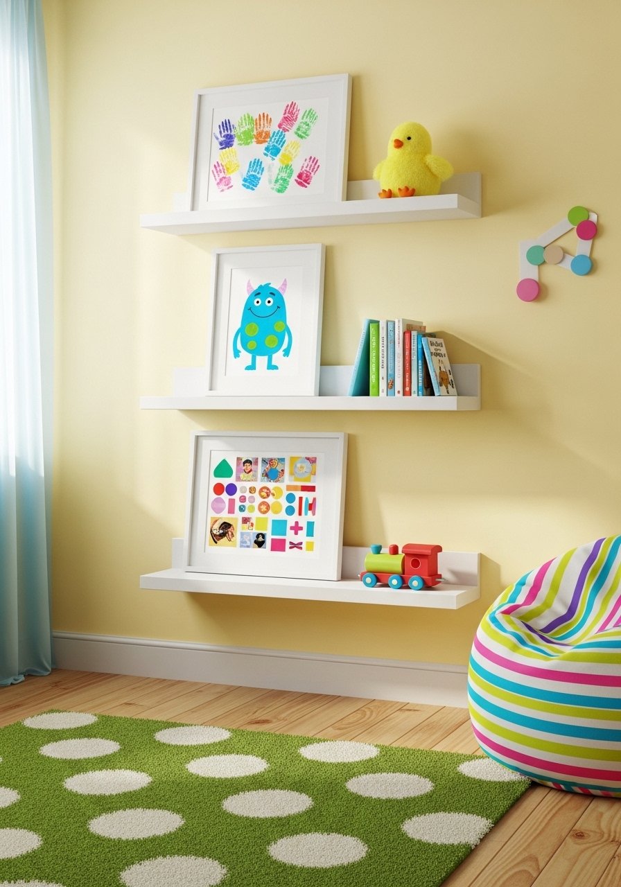
Kids rooms need flexibility because art changes fast. A low gallery made of shallow floating shelves lets kids swap drawings without tools. I mounted shelves at kid eye level and used durable picture frames with plastic fronts for safety. A common frustration is hanging everything too high. Keep the gallery reachable and plan for a 3:1 ratio of display items to storage so it never feels messy.
Mixed Scales and Negative Space for a Calm, High-End Look in Living Areas
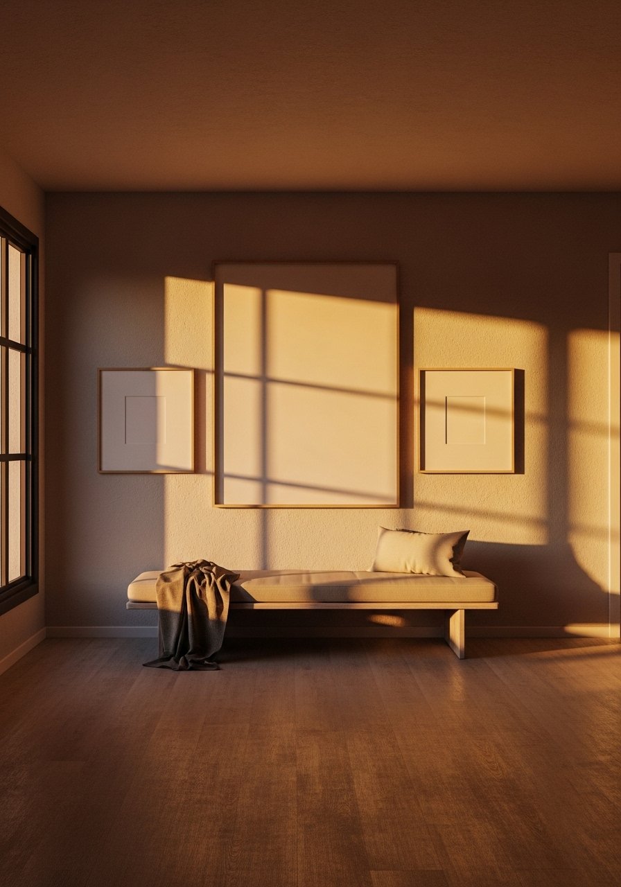
Leaving negative space is a styling skill most people skip. A sparse gallery with varied scale reads high-end because each piece has room to breathe. I use the rule of three for focal points and keep the overall grouping at two thirds the furniture width. I paired a large canvas print with two smaller works. The usual mistake is filling every inch. Try spacing pieces twice as far apart as you think you need to; it often looks better in real life than on the floor mockup.
Mixed Media Gallery Above a Fireplace for Layered Interest
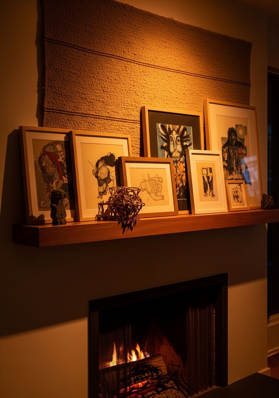
Fireplace walls are dramatic, so mix media for depth. I anchor the composition with a single large piece and layer one or two sculptural elements on the mantel. Keep the bottom of the gallery at least 6 inches above the mantel so it reads connected, not stuck. I used a textured canvas and a small metal sculpture. The common error is hanging art flush with mantel decor. Give the art breathing room and let the mantel be its supporting actor.
Your Decor Shopping List
Textiles
- Honestly the best $40 I have spent. Chunky knit throw in cream (50×60 inches), drape over the sofa arm for instant warmth
- Velvet pillow covers, set of 4 in jewel and neutral tones, 22-inch square, down insert recommended
Wall Decor
- 24×36 framed print in matte black for a bold anchor piece
- Brass picture ledges, 36-inch (~$18-25), great for rotating art
Lighting and Mirrors
- 24-inch round wall mirror with thin frame, hangs well over a console
- Plug-in wall sconce in aged brass for flanking gallery clusters
Plants and Greenery
- 6-foot artificial fiddle leaf fig for corners that get no light
- Terracotta planters set of 3
Budget Finds
- 5×7 slim black frames, pack of 6 (~$25) for photos and kids art
- Vintage map print set, various sizes for travel galleries
Extras
- Plate hangers set for ceramic wall art
- Command picture hanging strips, variety pack for renter-friendly hanging
Similar at Target or HomeGoods for many frames and textiles if you prefer to shop in person.
Shopping Tips
White oak beats dark wood in 2026. Design feeds have shifted completely. White oak floating shelves look current, not dated.
Grab velvet pillow covers for $12 each. Swap them every season and the whole room feels different.
Curtains should puddle or kiss the floor, never hang halfway up. 96-inch linen panels are right for standard 9-foot ceilings.
If you are indecisive, use picture ledges. They let you play without extra nail holes.
One tall plant beats five tiny succulents. Try a faux fiddle leaf fig, 6-foot when light is limited.
Frequently Asked Questions
Q: What spacing should I use between frames for a curated look?
A: For a cohesive gallery, 2 to 3 inches between frames is a safe start for dense clusters, and 4 to 6 inches if you want more breathing room. Keep the whole grouping about two thirds the width of the furniture below it so it reads intentional.
Q: Can I mix vintage frames with modern art without it looking messy?
A: Yes. Use a consistent color story and keep the dominant tone neutral. Mixing a couple of vintage wood frames with mostly modern black or brass frames works well when you stick to the rule of three for focal points.
Q: How high should I hang art above a sofa or console?
A: Aim for the center of the main piece at 57 to 60 inches from the floor. For a gallery, hang the bottom about 6 to 10 inches above the furniture. If you have low seating, lower it slightly so the art sits with the furniture, not above it.
Q: What size gallery works best above a bed?
A: Go roughly two thirds the width of the bed for a cluster. If you prefer one large piece, aim for half to two thirds the width. Keep the bottom of the art 6 to 12 inches above the headboard depending on headboard height.
Q: Should I use real plants or faux near a gallery wall?
A: Both. Real plants like pothos and snake plants handle neglect well. Use a faux fiddle leaf fig where you need height without maintenance or in dim corners.
Q: How do I avoid a gallery wall that looks cluttered?
A: Start with a focal piece, keep a consistent spacing plan, and limit your color palette to two main tones plus a metallic. Try laying the layout on the floor and photograph it to judge spacing before committing to holes.
