
A friend walked into my apartment last month and said "this looks like a real adult lives here." Highest compliment I have ever received. I did it mostly with wall art, some thrift finds, and learning to stop hanging everything at eye level.
These layouts lean modern cozy with a few eclectic twists. Most builds cost under $150, with a couple of splurges for frames or an oversized mirror. They work in living rooms, entryways, hallways, and even small bedrooms where the wall needs personality.
Layered Neutrals With One Bold Accent Color
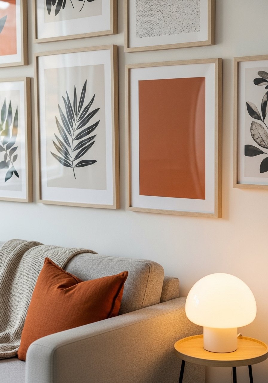
The trick I use is an 80/20 color ratio. Keep 80 percent of the wall in warm neutrals and pick one bold accent color to repeat in three pieces. It reads intentional without being fussy. Hang the center art at about 60 to 62 inches from the floor, then build out with 2 to 3 inches between tight frames. I buy 22-inch linen pillow covers in the neutral palette to tie the sofa into the wall, and these thin black frames for the accent prints are under $25 each. Common mistake is using too many accent pieces. Keep repetition, not chaos. A small detail people skip is offsetting one piece 1 inch lower to create a deliberate, lived-in feel.
Minimal Black Frames For Modern Living Rooms
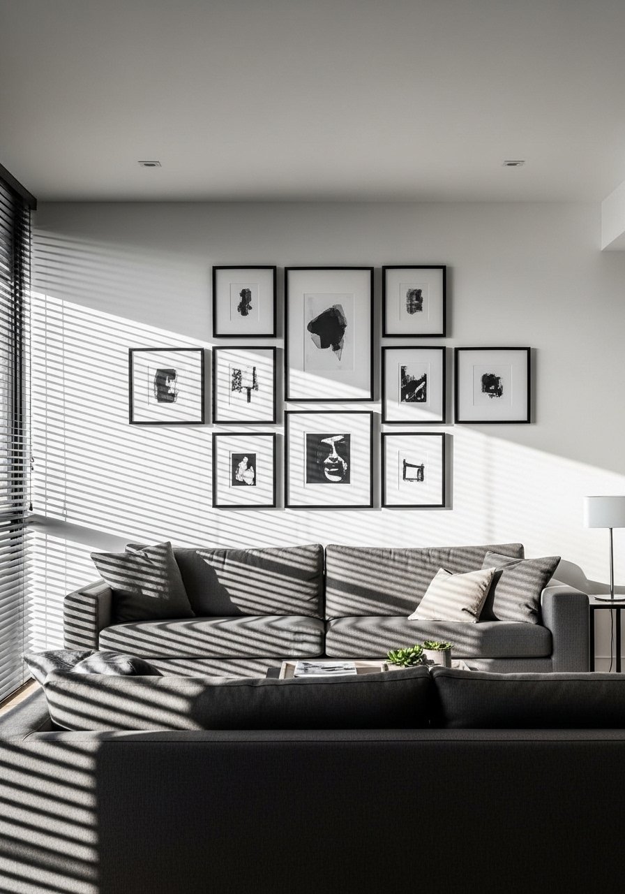
When I want a clean look I go all black frames with white mats, spaced 3 inches apart in a tight grid. It feels modern and calm. This is great above a low media console or a sectional. I use a center height of 60 inches unless the furniture back is tall, then I leave 6 to 8 inches between the top of the furniture and the lowest frame. I grabbed a set of mixed-size black frames that matched in finish so the grid reads cohesive. People often hang grids unevenly. Measure twice and use a level. A tiny detail that helps is lining up the inner mat edges, not the outer frame edges, for a tidier read.
Salon Style Mix For Eclectic Hallways
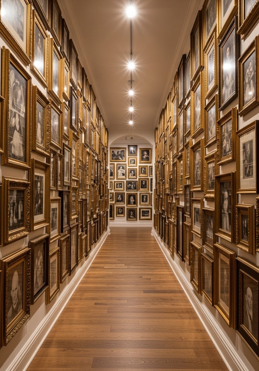
Salon style is forgiving. I leaned into it when my hallway felt like a tunnel. Start with a large anchoring piece at eye level, then fill in with smaller frames and a couple of three-dimensional items like a small woven basket or shadow box. Keep at least one repeating element, like matching gold frames or two identical botanical prints, to avoid visual chaos. I used brass picture ledges on a few shelves so I could swap pieces without new holes. Most people cram everything at the same height. Varying vertical placement, by 4 to 6 inches, gives the wall movement. A detail lots of posts skip is placing the largest pieces slightly off-center for a more natural flow down the hall.
Symmetrical Grid For Dining Room Focus
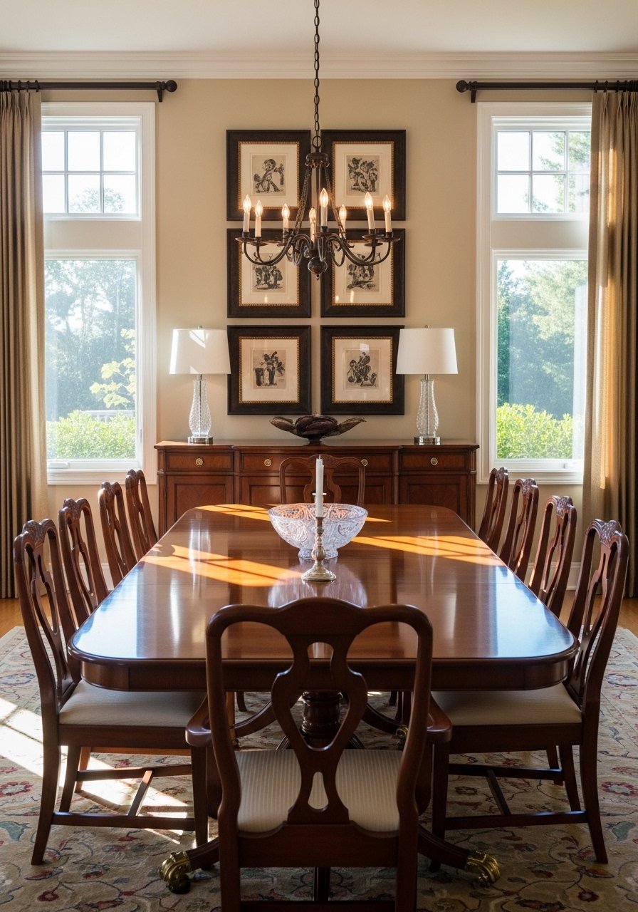
I did a six-piece symmetrical grid over my dining buffet and suddenly the room had a focal point for dinners. Symmetry reads formal but relaxed if you keep the frames simple and the mats uniform. Use even spacing, 3 to 4 inches between frames, and align the grid with the table center so it feels anchored. For prints, I picked a cohesive series and ordered museum-quality archival prints that matched the room tone. People hang art too high above buffets. If the buffet top will hold lamps or trays, allow 6 to 10 inches between the top of the buffet and the lowest frame.
Asymmetrical Cluster Around A Mirror In Entry
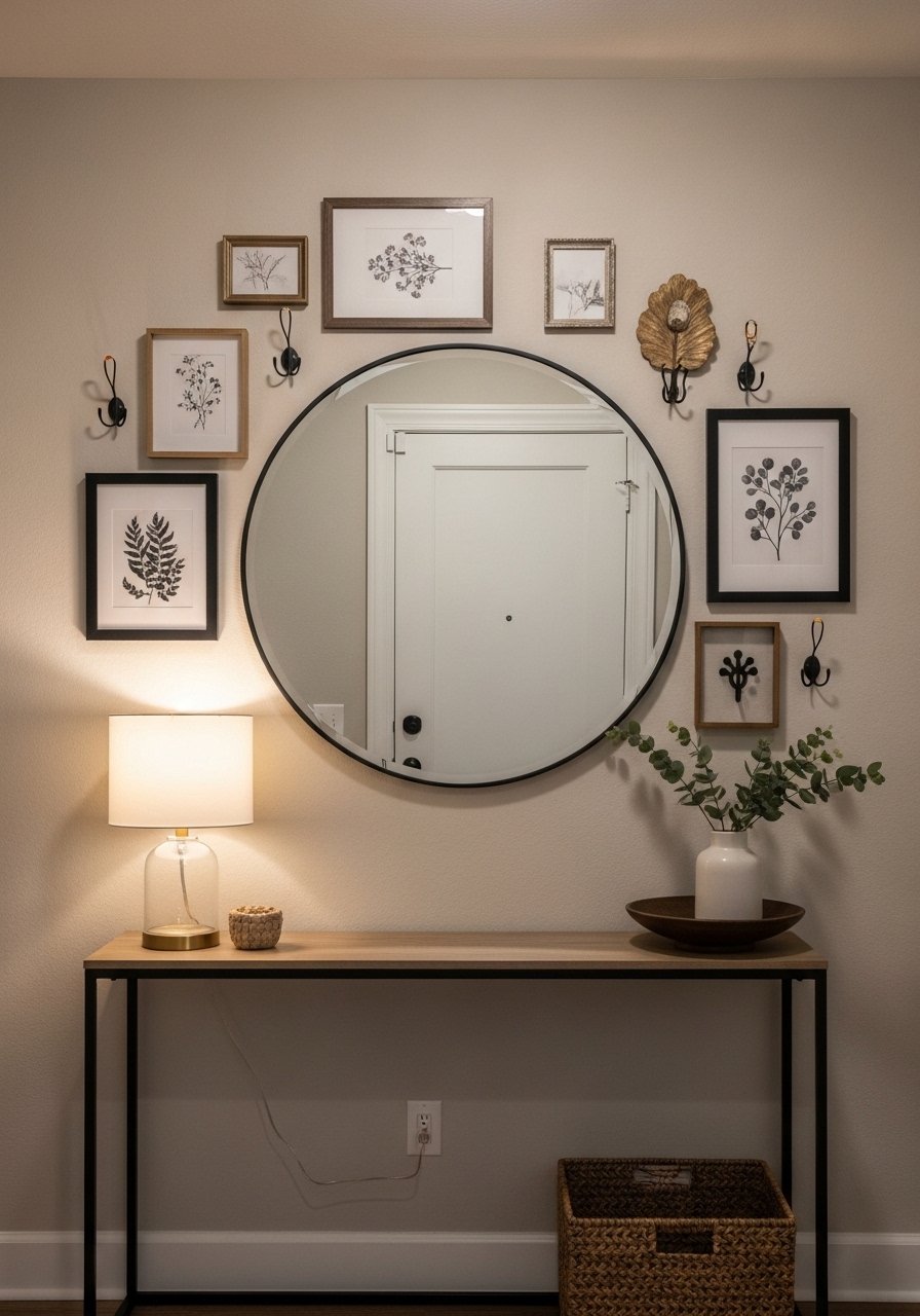
My entryway used to swallow everything until I hung a round mirror and built an asymmetrical gallery around it. Start with the mirror as your anchor and add frames that graduate in size outward. Keep negative space on one side to make the arrangement breathe. I like to add a personal object like a wooden toy or vintage postcard in a small frame to keep it approachable. A common mistake is matching every frame. Mixing a couple of metals reads modern. I used a 30-inch round mirror and then balanced it with black and brass frames. The tiny detail many miss is leaving 2 to 4 inches between the mirror and the nearest frame so reflections don’t compete with art.
Linear Shelf Gallery For Renter-Friendly Styling
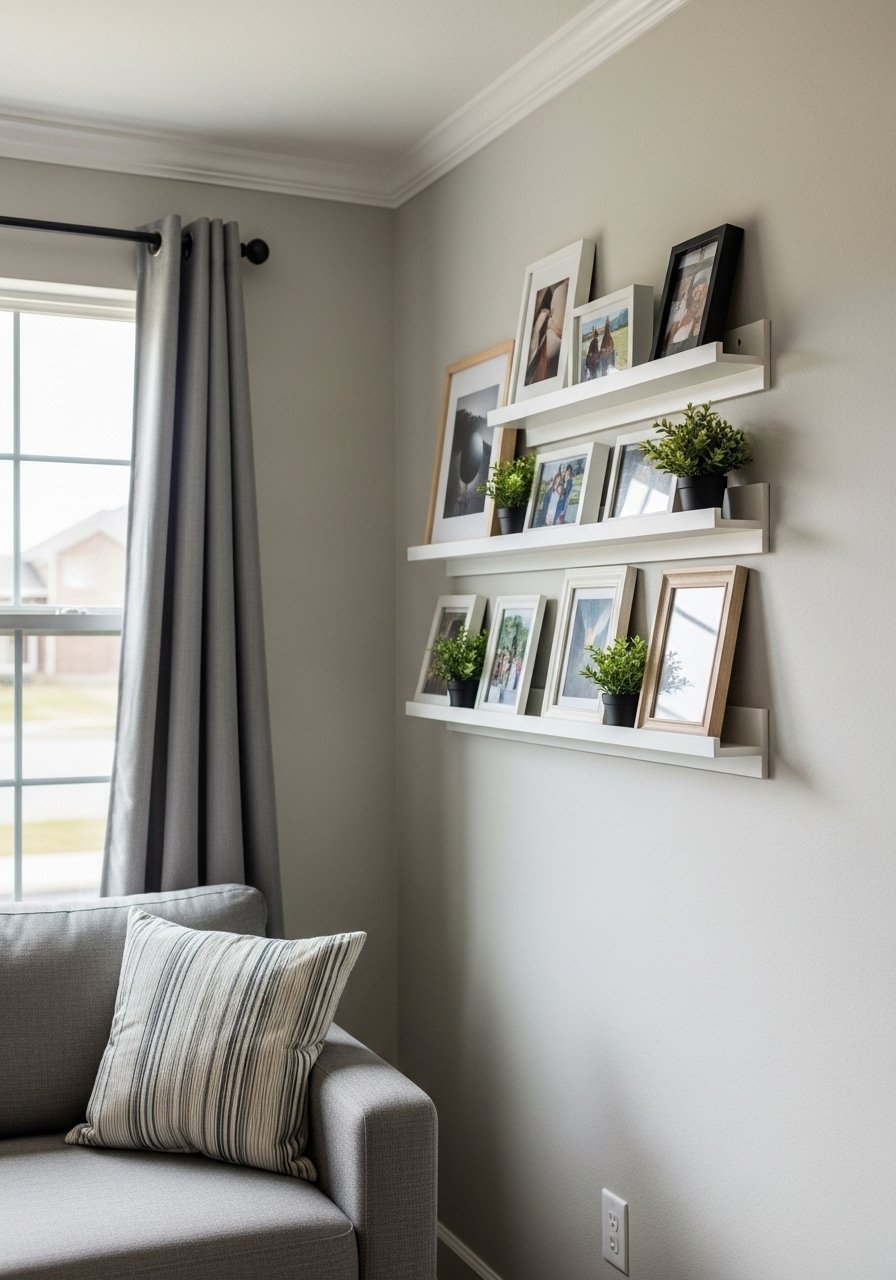
I cannot recommend picture ledges enough when you rent. They let you shuffle sizes and heights without patching a dozen holes. Install two staggered shelves, and lean frames so the arrangement feels casual. Start with the largest pieces on the bottom shelf and smaller on top to anchor the eye. I use wood floating shelves in white oak because White oak shelves are in every design account I follow this year. People put all frames on the same shelf height. Vary the depth by leaning smaller frames in front of larger ones. A detail that makes it look expensive is adding a slim ledge plant and a single stacked book between frames for scale.
Floor-To-Ceiling Vertical Gallery To Add Height
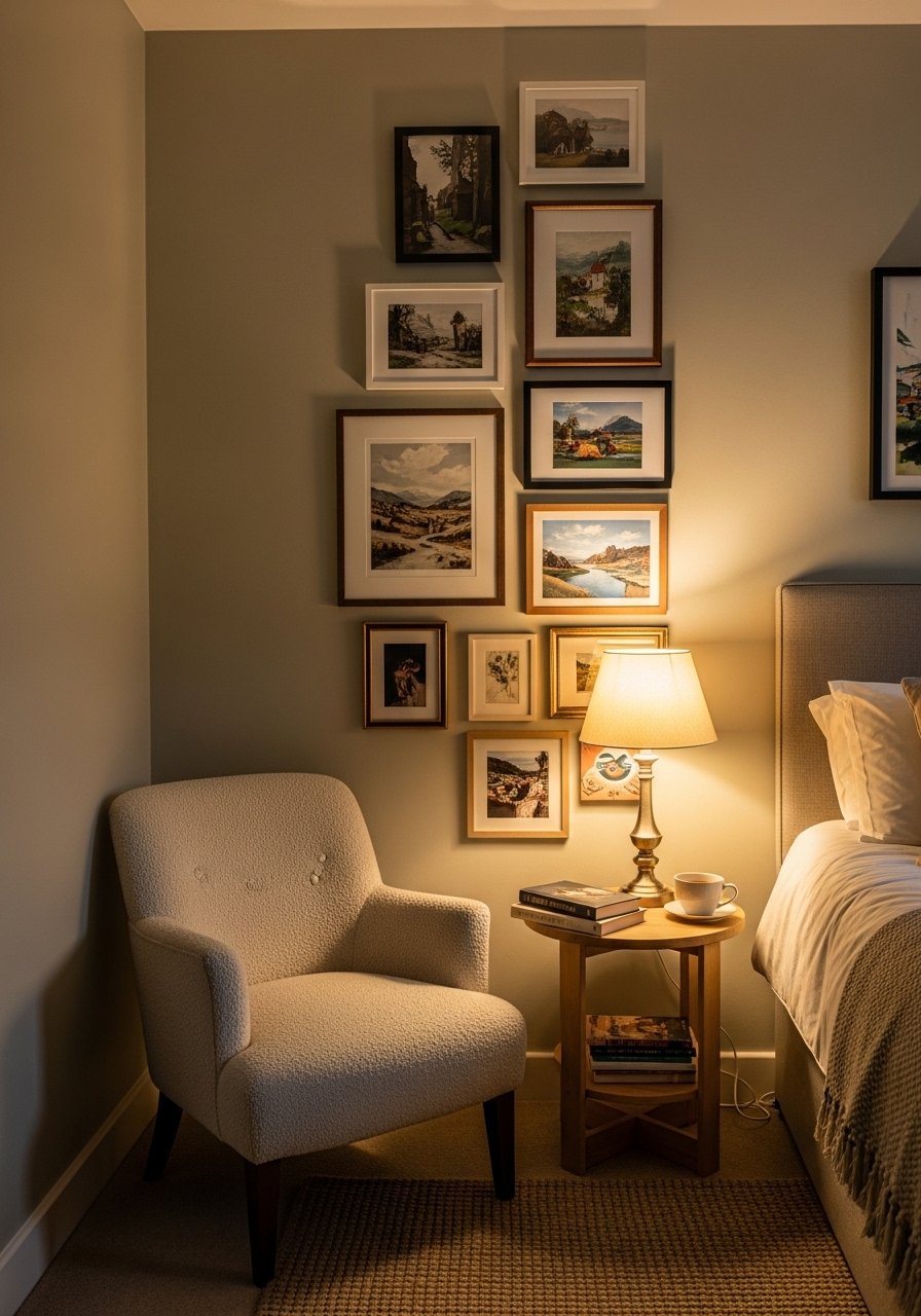
There is something about a reading nook with layered pillows that makes you want to cancel your plans. I used a vertical column of art next to my tall bookcase to emphasize ceiling height. Space pieces 4 inches apart and keep the column narrow so it reads as a line that pulls the eye up. This works great in small bedrooms or narrow walls beside doorways. I like to include a slim print and a carved wood piece for texture. I used slim vertical frames that are affordable and light for wall anchors. Common error is making the column too wide, which shortens the visual height. Keep it lean and stagger the center points slightly.
Mixed-Metal Eclectic For Glam Bedrooms
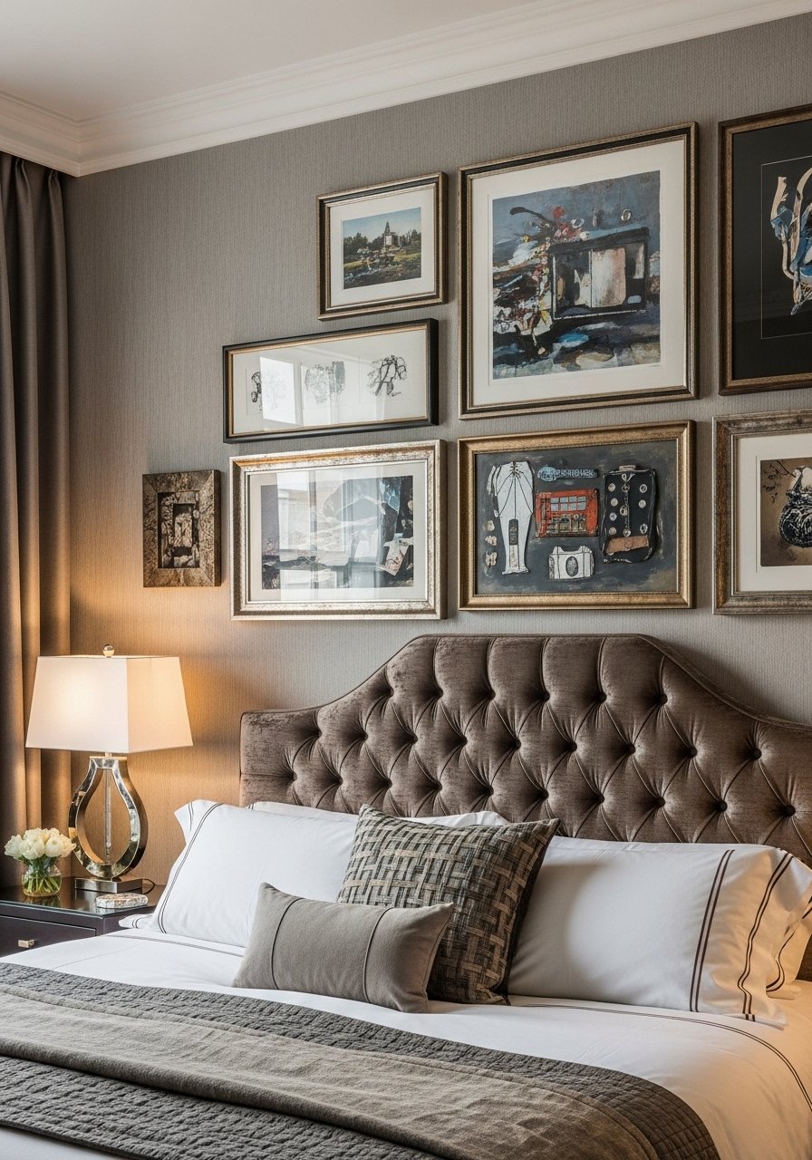
Mixing brass, black, and brushed nickel in a single gallery wall makes a bedroom feel curated not matched. I paired a velvet headboard with a trio of mismatched frames above. Repeat metals in small accessories like lamp bases and curtain rods so the mix reads deliberate. I use mixed-metal frames set that come in two finishes so the wall ties to hardware. A mistake I see is using glossy frames that reflect the bedside lamp and compete with the art. Matting helps. A detail I like is to place one frame on the diagonal very slightly for a modern wink.
Oversized Single-Piece With Small Supporting Prints
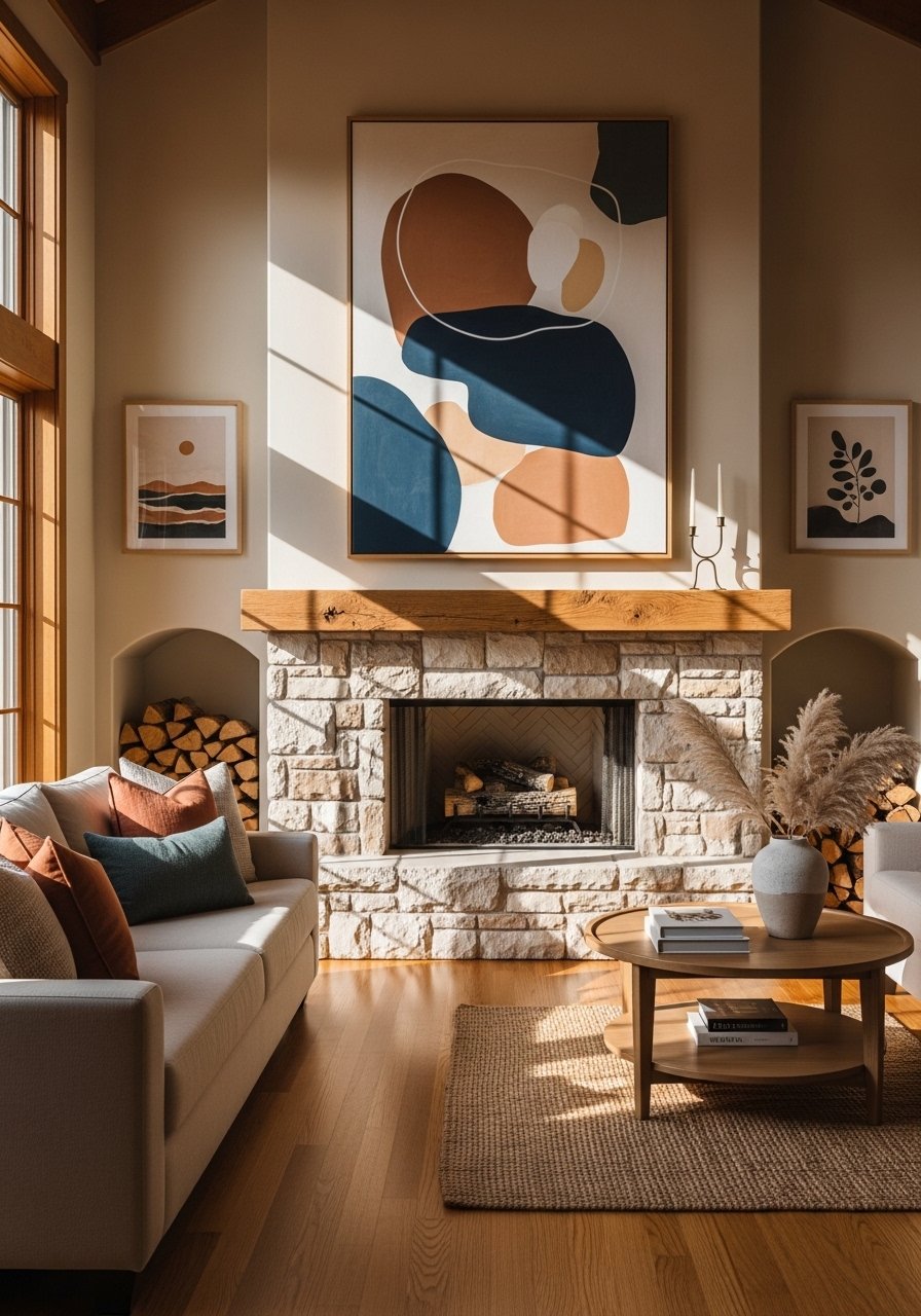
Once I stopped trying to fill the wall with many pieces I discovered the impact of one oversized work with a couple of small supporting prints. The main piece should take up roughly two-thirds of the wall width above a sofa or fireplace. Place the smaller prints 6 to 8 inches away so the support feels intentional. I invested in an 36×48-inch stretched canvas print and paired it with two 8×10 prints. The common mistake is making the supporting prints the same size as the hero piece. Let them play sidekick. A practical tip is to secure the large piece with two anchors so it stays level over time.
Photo Ledge Rotating Gallery For Kids Rooms
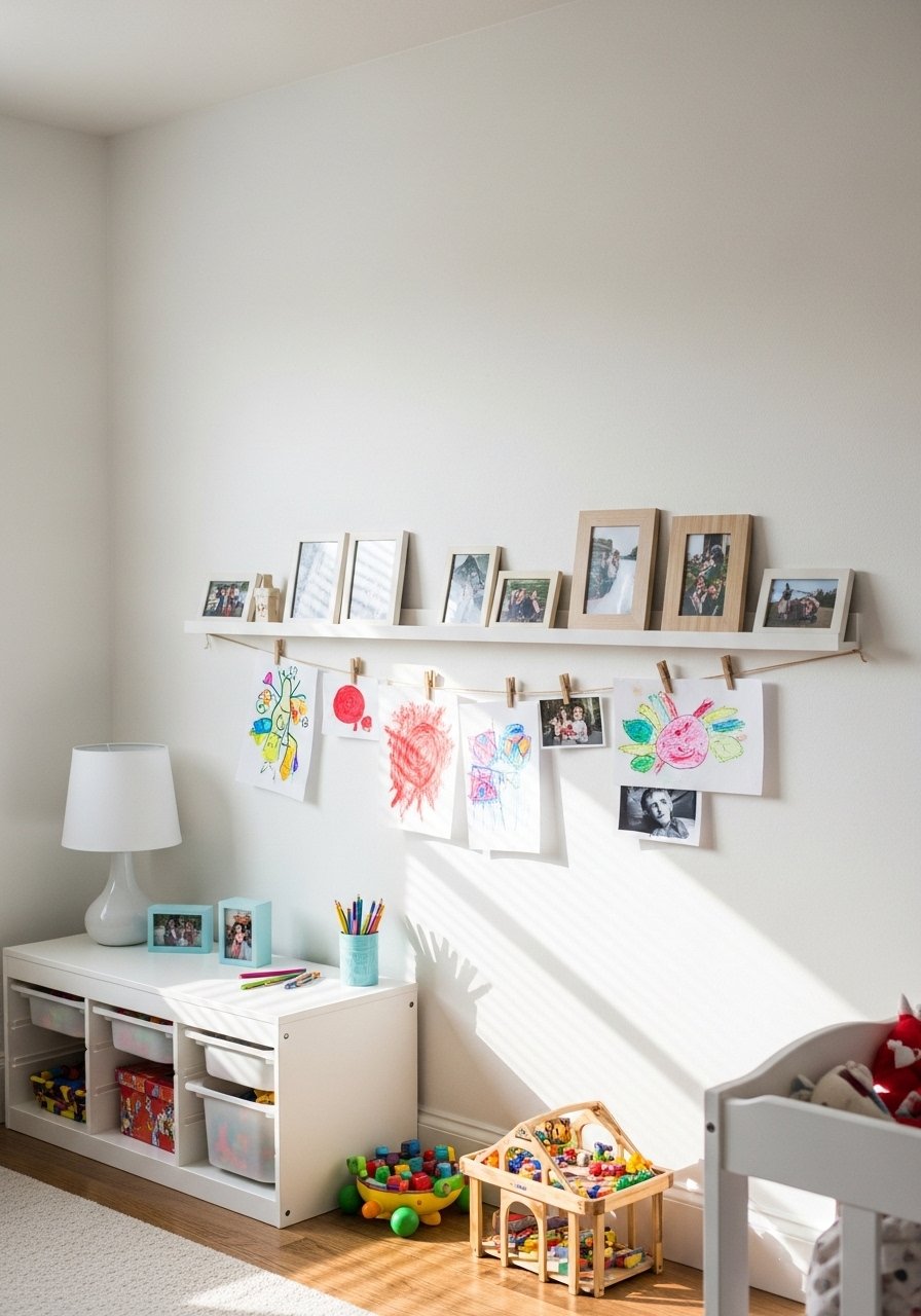
My niece likes swapping her art weekly and this ledge system saved me from constant hammering. Install a low ledge at child height so they can reach and curate. Mix family photos, kid drawings in frames, and a couple of small canvases. I use clear adhesive strips on lightweight frames for easy swaps. A mistake is hanging everything too high for kids which kills ownership. Also think about safe, shatterproof frames where possible. A detail I add is a tiny chalkboard framed at the end of the ledge so they can sign their name to each rotation.
Your Decor Shopping List
Textiles
- Honestly the best $40 I have spent. Velvet pillow covers, set of 4 in two colors for a layered look
- Chunky knit throw in cream (~$35-55). Drape over the sofa arm for instant warmth
Wall Decor
- Brass picture ledges (~$18-25) let you swap art without new nail holes
- Mixed-metal frames set for the eclectic glam look
- 36×48-inch stretched canvas print for a bold focal piece
Lighting & Hardware
- 30-inch round mirror to anchor entry walls
- Picture hanging kit with level includes anchors and a mini level
Plants & Pots
- Faux fiddle leaf fig 6ft for corners without sunlight
- Similar finds at Target or HomeGoods for good-looking pots and planters
Shopping Tips
White oak beats dark wood in 2026. Design feeds have shifted completely. These white oak floating shelves look current not dated.
Grab velvet pillow covers for $12 each. Swap them every season and the whole room feels different.
Curtains should puddle or kiss the floor, never hang halfway up. These 96-inch linen panels are right for standard 9-foot ceilings.
Buy a picture hanging kit with a small level. This kit stops lopsided gallery walls before they start.
One large plant beats five tiny succulents. This faux fiddle leaf fig adds scale without maintenance.
Frequently Asked Questions
Q: How high should I hang my gallery wall above a sofa?
A: Aim for the center of the gallery at 60 to 62 inches from the floor, or place the lowest frame 6 to 8 inches above the sofa back. If the sofa is tall, allow a bit more breathing room so the art does not feel crowded.
Q: Can I mix photos, prints, and textiles in one gallery?
A: Yes, mix materials for more personality. Keep a repeating element, like frame color or mat style, and use the rule of three for accents to avoid a cluttered look.
Q: What spacing works best for a grid versus a salon wall?
A: For tight grids use 3 inches between frames. For salon or eclectic clusters use 2 to 4 inches between nearby pieces and slightly larger gaps outward. A tiny detail I use is 2 inches for a tight cluster and 3 to 4 inches when pieces are larger.
Q: Are faux plants okay in gallery vignettes?
A: Both real and faux work. Use faux tall plants where light is low, like a faux fiddle leaf fig. Real plants are great where you get light and want the texture to change over time.
Q: How do I hang art without making extra holes as a renter?
A: Use picture ledges and strong adhesive strips for lightweight frames. Brass picture ledges let you lean pieces and swap them without new holes.
