
I kept rearranging the same coffee table items for weeks and nothing clicked. Everything felt safe and flat, like someone turned the saturation down on the room. I tried matching everything, one neutral after another, and it all blurred together.
What finally worked was deciding where to add contrast, in color, texture, and scale, and then committing to just a few moves. My first pass was clumsy. I piled on small bits because I was scared of empty space and it looked noisy. After the third attempt I learned to remove more than I added, and the room breathed.
Step 1: Pick one dominant contrast and place it first
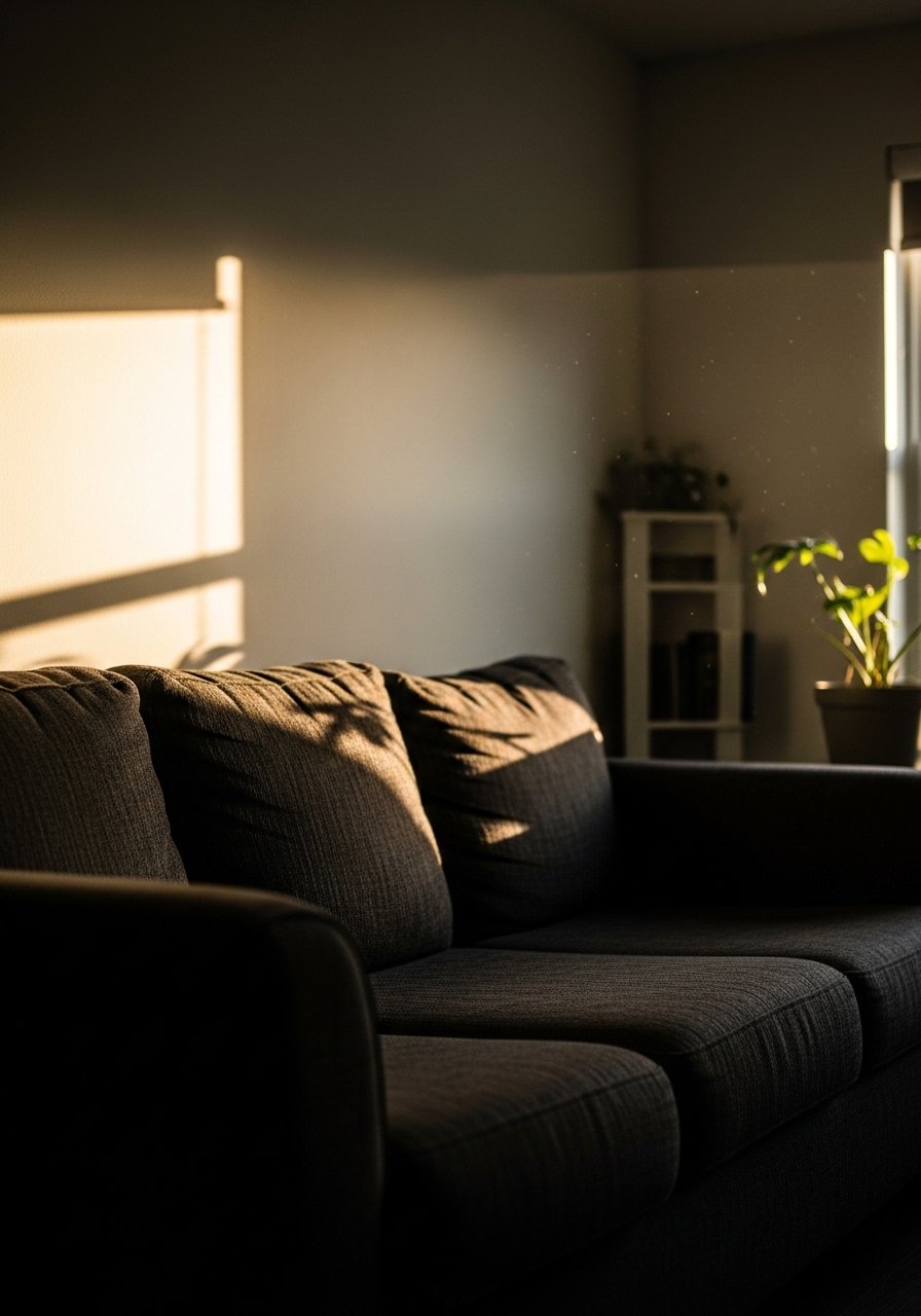
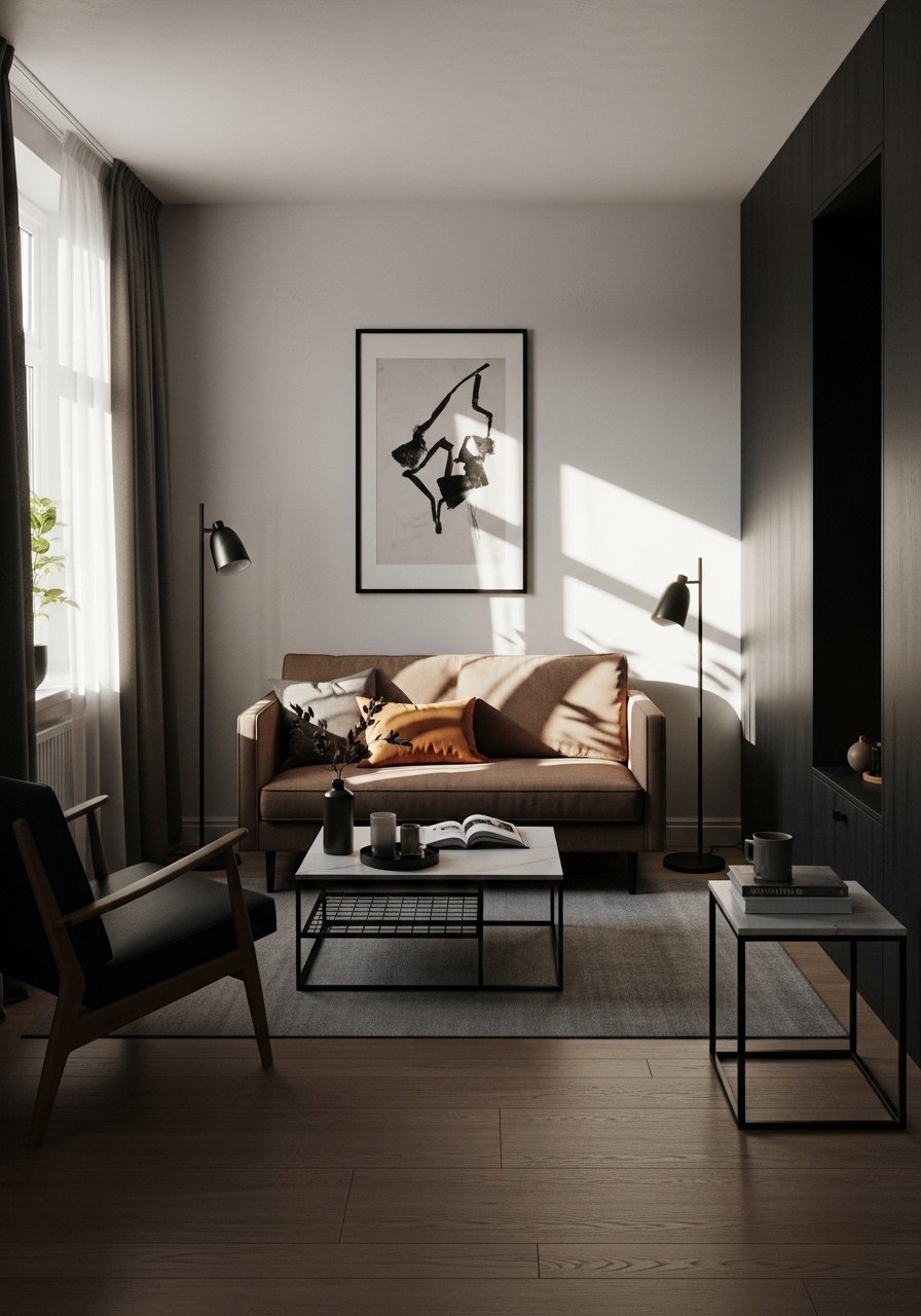
Start by choosing the one contrast that will anchor the room. For me that was a charcoal sofa against pale walls. Choosing one thing first stops the dithering. The mistake I kept making was trying to make everything pop at once. That leaves the eye nowhere to rest.
Visually, the first contrast should take up roughly 60 to 75 percent of the seating area, or be the largest single shape in the room. Physically touch it. A linen cushion feels cool and breathable, a boucle throw has nubby, grabby texture. Commit to that first choice and build around it.
Step 2: Anchor the floor with a rug that sets the tone
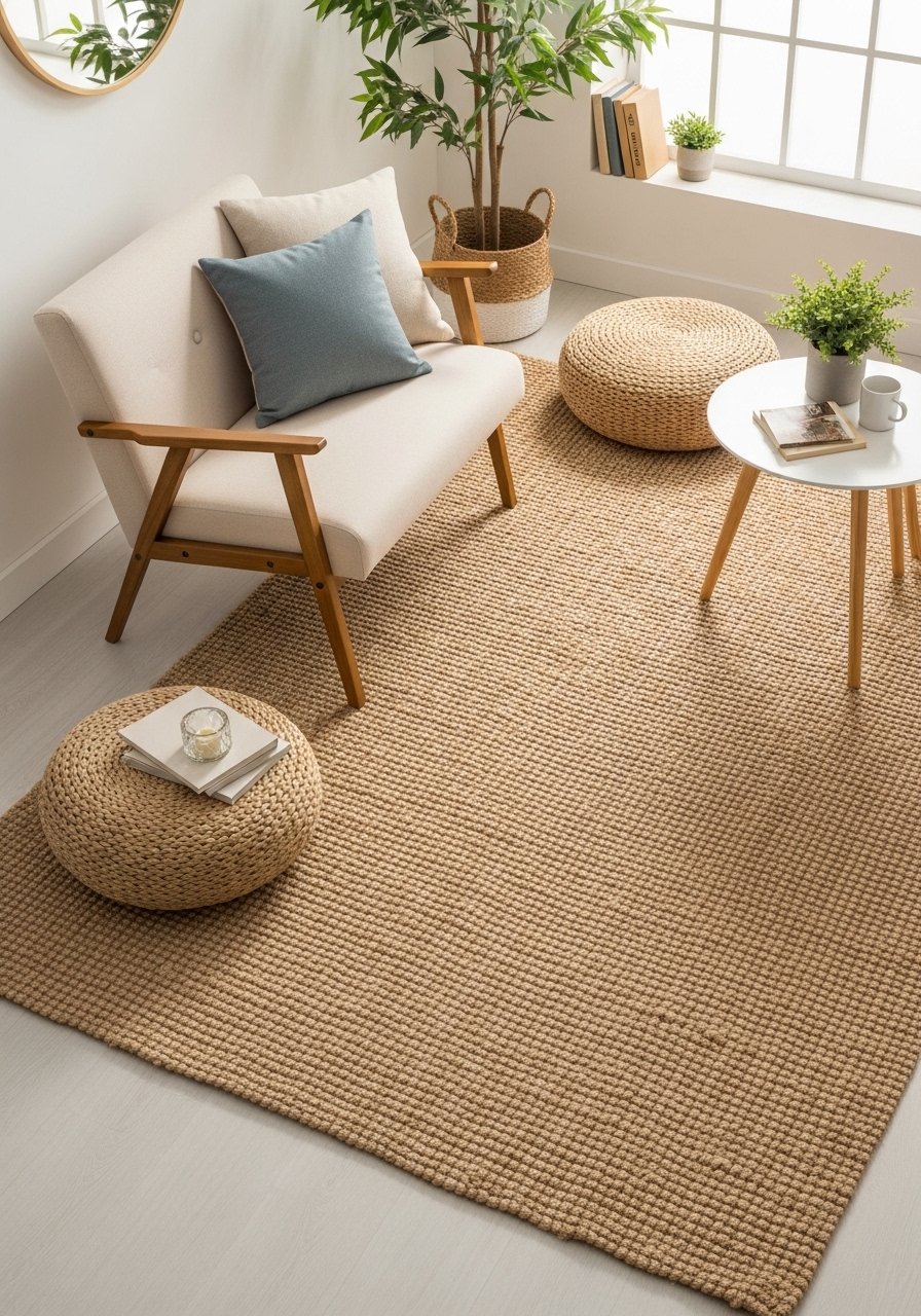
A rug is the easy place to introduce contrast by color and texture. I learned to size mine so the rug covers at least 60 percent of the floor in the seating zone or so that the front legs of furniture sit on it. Too small, and the room feels like everything is floating.
If you pick a natural jute rug for warmth, it will feel slightly rough underfoot compared with a velvet pillow. That roughness gives the eye something to balance a soft sofa. Common mistake, I used to buy the cheapest size available and then cram the furniture onto it. Buy the right size once and you will feel the room settle.
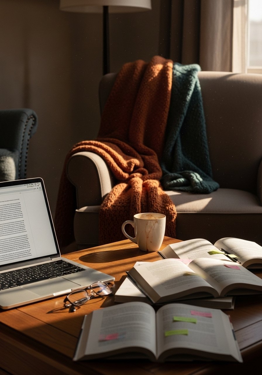
Step 3: Layer three textures and leave breathing room
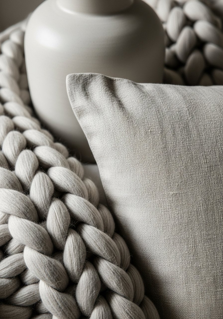
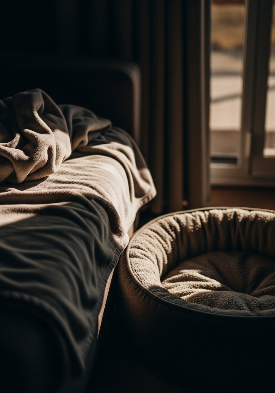
Aim for three distinct textures, not ten. A soft throw, a woven rug, and a matte ceramic vase create contrast without chaos. Place items so there is 2 to 4 inches of visible space between objects on a shelf or table. That small empty margin gives each piece weight.
I used to cluster tight because empty space scared me. Editing is the hard part. Touch each material as you place it. The throw should feel like a warm hand, the vase should be cool and heavy. If something feels insubstantial in your hand, swap it for an object with presence.
Step 4: Balance light and dark with a simple proportion
A practical proportion to aim for is about two thirds to one third when it comes to visual weight. If your main anchor is dark, balance it with lighter large planes in about one third of the room. The mistake most people make is chasing symmetry. Symmetry is safe, but asymmetry with an odd number of objects feels more deliberate.
Group items in threes on a side table or shelf. Odd numbers read as intentional. If one side of the room has a chunky metal lamp, add a tall plant or a stack of books on the other side so the eye moves across the space.
Step 5: Edit, live with it, then tweak
This is the step I almost skipped every time. Put the room together, then walk away for an hour. Live in it for a week. The temptation will be to add more. Resist it. When I ignored this, I made the room busy and brittle. When I waited, I noticed the one lamp that felt too cold, or the shelf that needed a taller object.
Expect to swap one small thing after a week. That is normal. My partner hated the asymmetrical shelves at first. He admitted he liked them after a few days. Let time be the final editor.
What to Grab for Your Contrast Styling Refresh
- Chunky knit throw in oatmeal, 50×60 ($40-65). I keep one on the arm of every sofa I own. Used in Step 3.
- Jute area rug, 8×10 ($90-160). Neutral base for contrast, recommended in Step 2.
- Ceramic vase set, matte white, heights 8/12/16 inches ($25-40). For height in Step 3 and Step 4.
- Brass picture ledges, 24-inch ($18-30). Solved my commitment issues for art, used in Step 4.
- Linen pillow covers, 20×20, sage and oatmeal ($12-25 each). Texture and color swaps in Step 3.
- Arc floor lamp, matte black, 62 inches ($70-140). Anchors a dark corner in Step 1 and Step 5.
- Rattan storage basket, medium, 16-inch diameter ($20-45). Adds tactile contrast and hides clutter, suggested in Step 5.
Why Your Room Still Feels Flat After Adding Color
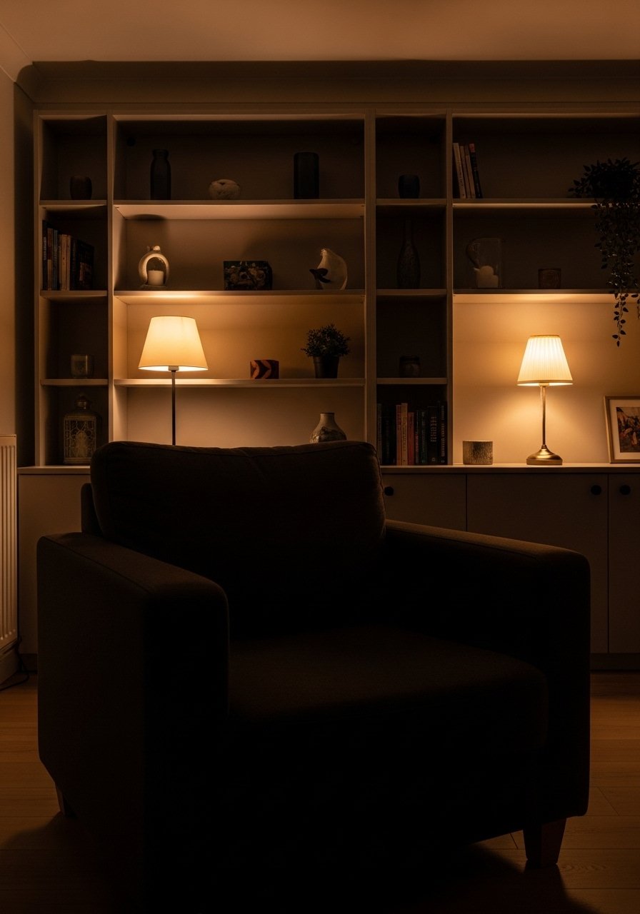
The problem is usually scale and texture rather than color choice. You can pick a bold paint and still end up flat if everything else has the same surface quality. Try adding one tactile material, like a woven rug or a ribbed ceramic lamp. That creates a sense of depth.
Also check where the light falls. Flat, even light will reduce contrast. A single directional lamp can bring out texture and make the room read with more layers. One more honest point, I thought mirrors would fix flatness. They helped with light but not with texture, so I kept experimenting.
Making This Work in a Small Room
Small rooms need the same contrast ideas but with tighter proportions. Use a rug that allows all furniture legs to touch it if possible. Keep the dominant contrast smaller, like a deep-toned chair instead of a full sofa. Bulky pieces will overwhelm.
Quick checklist:
- Choose one bold element no larger than 40 percent of the room.
- Use vertical contrast, like a tall lamp or plant, to add height.
- Favor open-legged furniture to keep the space airy.
I learned to avoid oversized coffee tables in small rooms. They killed the flow.
What This Looks Like After a Week with Real Life
After a week, you will notice the places that collect clutter and the pieces that hold up to use. The chunky throw will collect fuzz and feel loved. The ceramic vase will make it through being brushed by passing coats, if it is heavy enough. If a setup falls apart, it is usually because I chose fragile, light items for high traffic spots.
A small edit often saves the style. Move the fragile vase to a higher shelf and replace it with a sturdy bowl on the coffee table. That change kept the contrast without sacrificing function.
Start with One Corner
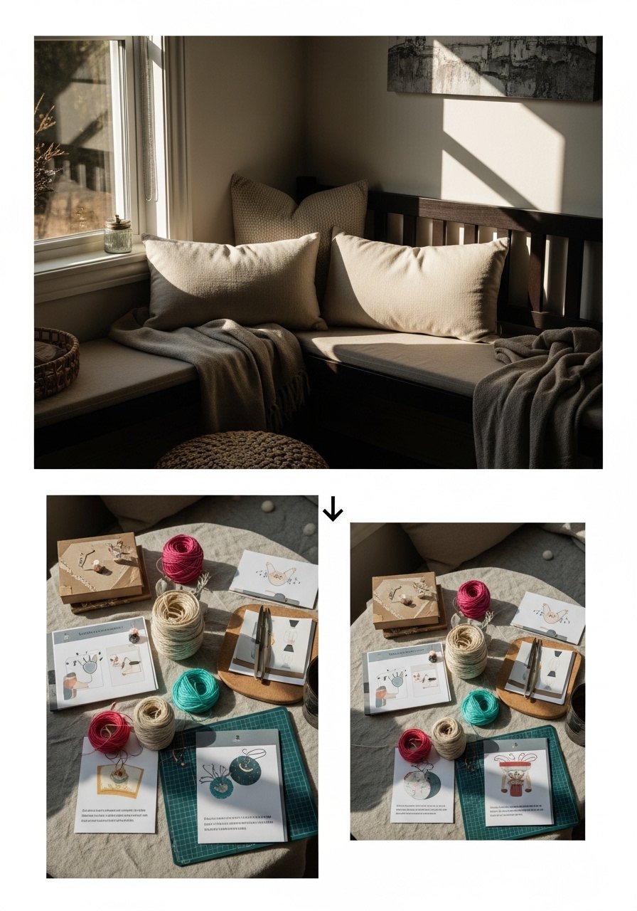
Pick one corner or wall and apply the method: anchor, layer textures, balance proportion, then edit. It is easier to commit to contrast in a single area and see the payoff quickly. My first successful corner was the confidence booster I needed to redo the whole room.
If you only try one thing, make it the rug or the main seating piece. Live with that choice for a week, then tweak one small object. You will be surprised how much clarity that one corner gives the rest of the room.
